22 Best Ghost Website And Blog Examples 2026
Do you want to boost your inspiration with the best Ghost website and blog examples?
Welcome to our comprehensive collection that has something for everyone.
With its sleek design, intuitive interface, and robust features, Ghost has become a go-to platform for creators looking to share their stories, ideas, and works with the world.
In this article, we’ll review some of the best examples of sites and blogs powered by Ghost.
(Many large online platforms use Ghost, which might surprise you.)
From stunning visual designs to captivating content, these sites showcase the versatility and creativity that Ghost empowers its users to unleash.
So sit back and relax – you’ll surely find something that catches your eye among these stellar examples.
Let’s dive in!
This post covers:
- Best Ghost Website & Blog Examples
- How To Make A Website Or Blog With Ghost
- FAQs About Ghost Websites & Blogs
Best Ghost Website & Blog Examples
These handpicked gems represent the pinnacle of what can be achieved with Ghost’s powerful platform, inspiring creators and readers alike.
1. Kickstarter Updates
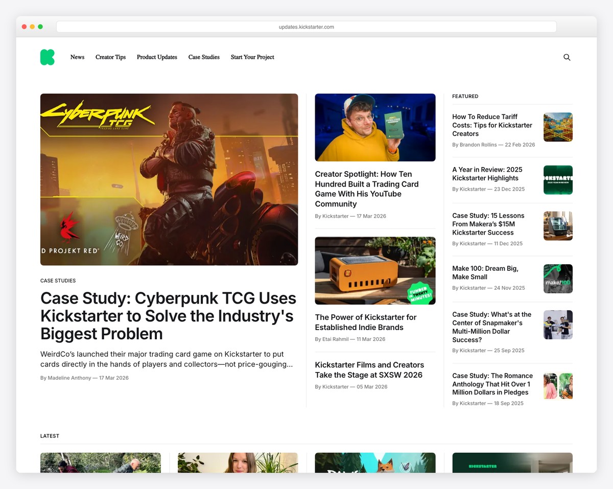
While Kicktarter’s main platform isn’t built on Ghost, it’s Updates/News section is. I’m sure you didn’t see this one coming, did you?
The page is very clean and minimal, with a simple header and footer (see more website footer examples), all on the same background to ensure smoothness.
It has a featured section and a four-column grid with static and animated thumbnails for a more dynamic engagement.
What stands out: One of the best approaches to designing your website or blog is simplicity/minimalism. (Check these fantastic minimalist website examples for more ideas.)
What stands out: Ghost is an excellent choice for both small and large players because of its seamless adaptation.
2. SAVEE
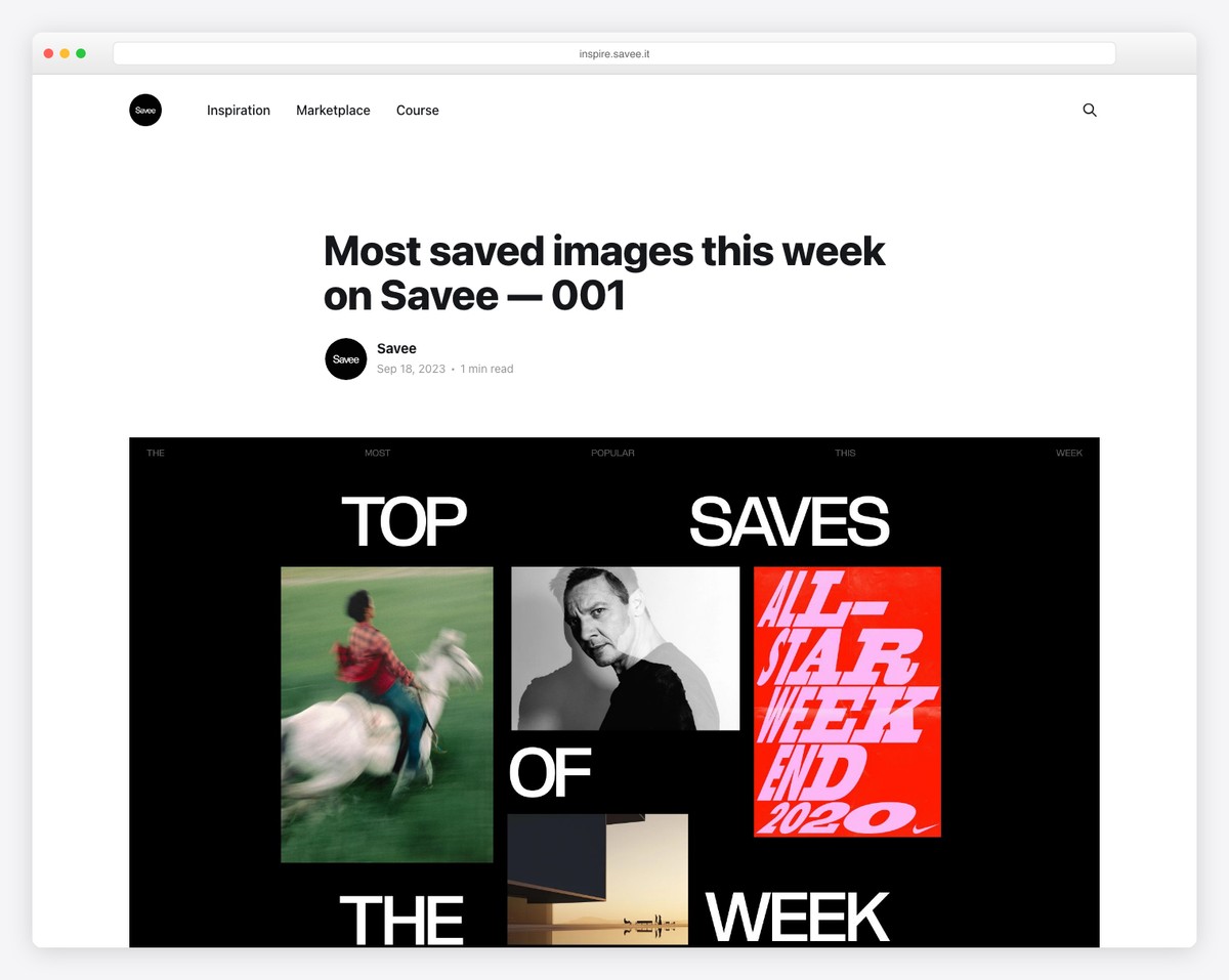
The SAVEE website exemplifies the elegance of Ghost. It boasts a minimalist header featuring a subtle search icon, leading to a clean and easily navigable layout. Besides, you’ll also find a link to the main SAVEE page.
Its boxed design and contrasting white background ensure readability and focus, while the footer, with its dark backdrop, maintains simplicity.
With a sleek interface and attention to detail, SAVEE offers a seamless user experience, making it a standout example of Ghost website design.
What stands out: Push cleanness with a simple header and footer (but we recommend creating both practical with the necessary links and other must-have content).
What stands out: SAVEE stands out as a Ghost website example for its minimalist design, intuitive navigation, and focus on user experience.
3. Whitepaper
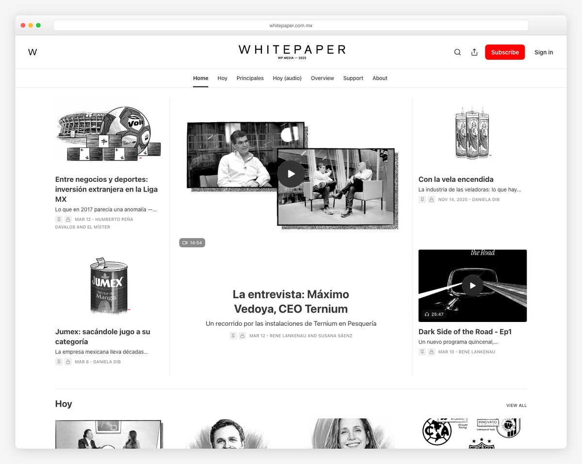
Whitepaper’s distinctiveness lies in its captivating black-and-white aesthetic, complemented by sleek design elements.
With a feature-rich header housing a search bar, menu links, a prominent CTA button, and a floating subscription button for user engagement, Whitepaper offers a flawless browsing experience.
Its dynamic carousels and social icons in the footer further enhance interactivity, making it a prime example of innovative Ghost website design.
We also like how sections are separated with thin lines while maintaining the same white background.
What stands out: Make a practical header with links, a search bar, and a (optional) call-to-action button.
What stands out: Whitepaper grabs attention with its black-and-white design and user-centric features, setting a new standard for looks and functionality.
4. Tangle News
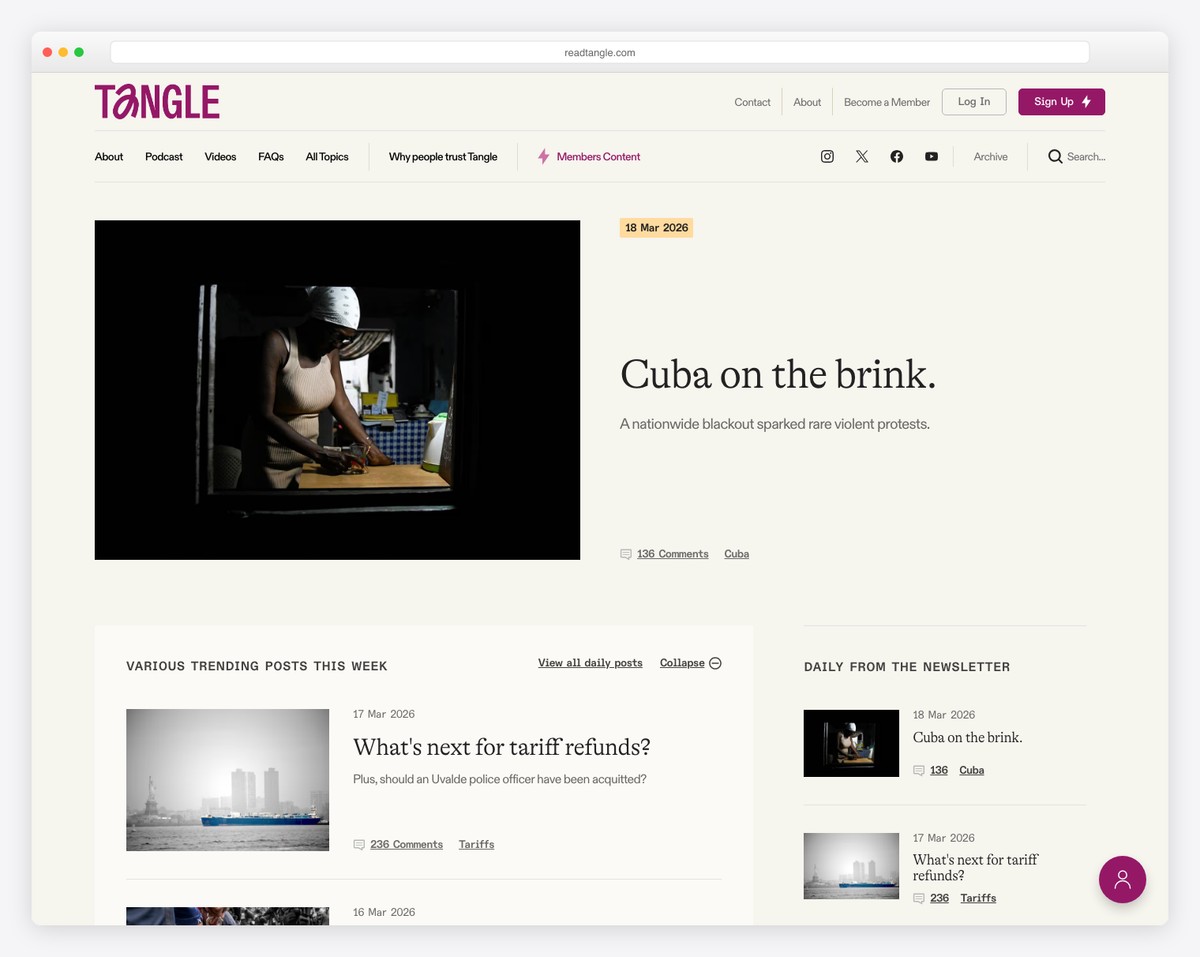
Tangle News is a Ghost site with a neat boxed layout, a user-friendly navigation bar, and a day/night mode switcher for enhanced readability.
It prioritizes user engagement by featuring a dynamic slider, convenient sidebar, and floating subscription button.
Tangle News exemplifies usefulness in modern web design. Its dark footer adds a touch of sophistication. The site’s simple one-column blog post layout ensures focus on content.
What stands out: Have some important news you’d like to push? Use a slider!
What stands out: Tangle News seamlessly integrates modern design elements, intuitive navigation features, and a commitment to enhancing user experience.
5. Quillette
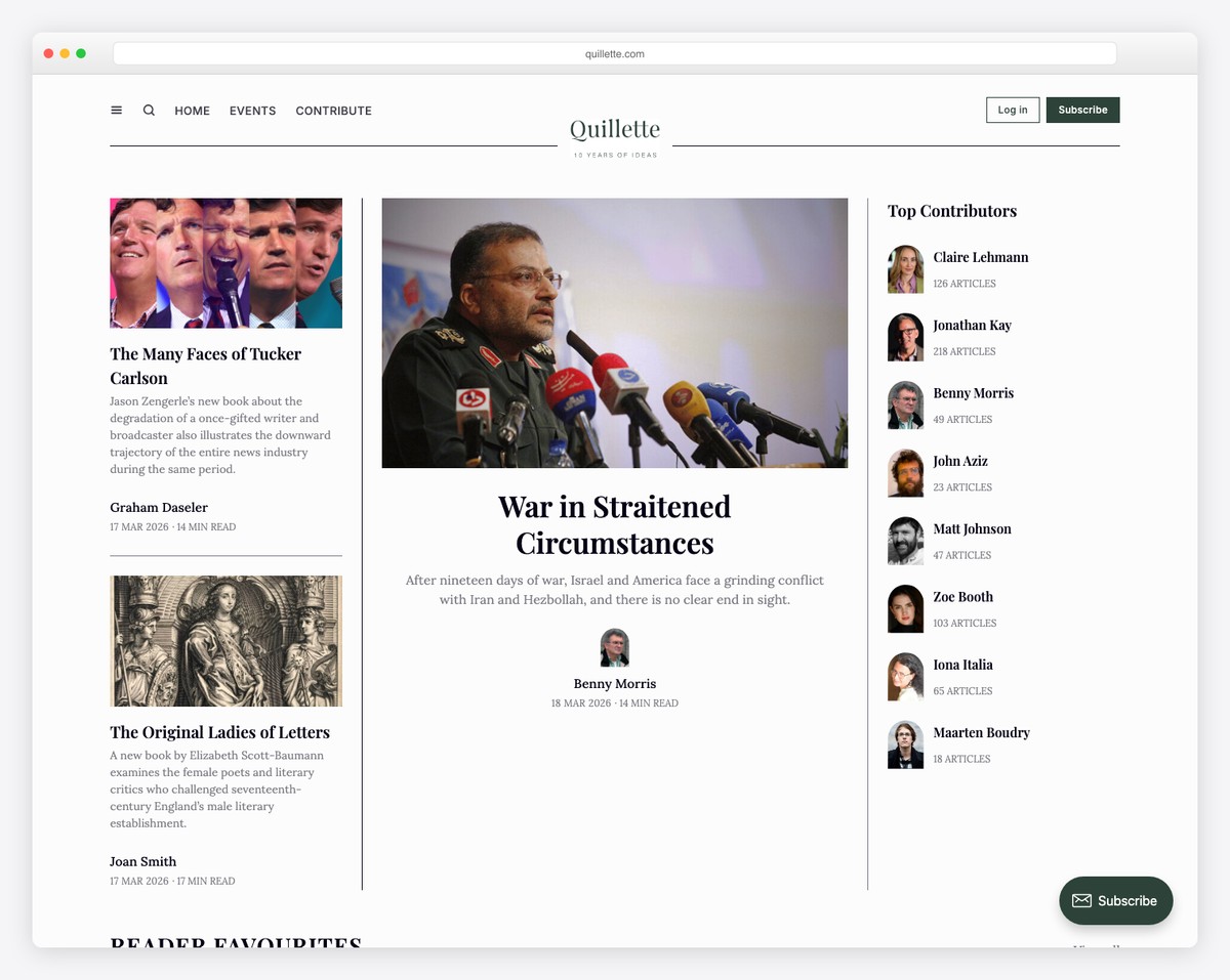
Quillette’s distinction lies in its dual-part header, integrating links and compelling CTA buttons.
It ensures dynamic browsing by offering user-friendly features such as a dismissible notification bar and a multi-section layout with grids and carousels.
With convenient sidebars, a prominent newsletter subscription form, and a comprehensive three-column footer, Quillette prioritizes user engagement and handiness.
This Ghost site is clean and simple but with everything necessary to ensure usability.
What stands out: Use a notification bar to promote particular content, special news, an update, etc.
What stands out: Quillette shines with its cool features, handy design, and focus on engagement.
6. Yardeni QuickTakes
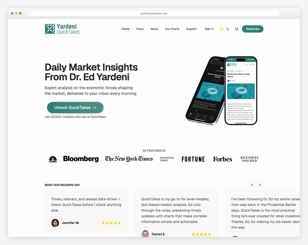
Yardeni QuickTakes puts an opt-in form above the fold to capture as many visitors’ emails as possible.
This Ghost blog example is simple and concise, with easy navigation for quick content finds.
Moreover, it has a dark and light mode switcher alongside CTAs, a search bar, and menu links in the header.
Additionally, the footer pops nicely because it uses a contrasting dark background.
What stands out: Allow visitors to change between dark and light viewing for an even better reading experience.
What stands out: Yardeni QuickTakes is an excellent demonstration of how you can use your above-the-fold section strategically for an opt-in form.
7. Overwrite Media
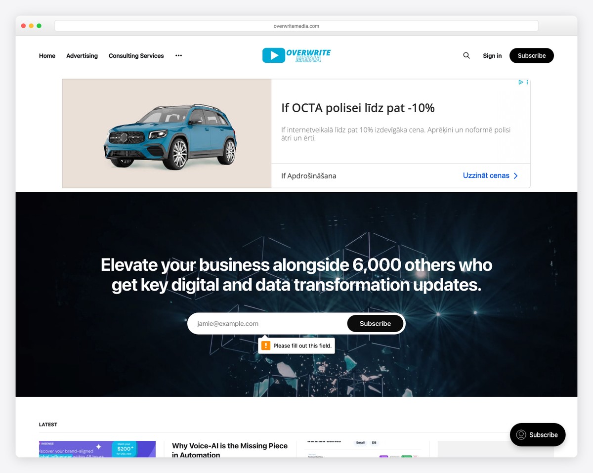
Overwrite Media rocks a minimalist header and footer while directing focus to its prominent subscription form section above the fold. (Similarly like Yardeni QuickTakes does.)
It prioritizes simplicity and functionality, featuring a sleek three-column post grid layout, a sticky sidebar, and a floating subscription button for sound user interactivity.
Additionally, an extra newsletter subscription form in the footer ensures easy access for users to stay connected.
What stands out: Use a grid layout for posts to display lots of content in an organized manner.
What stands out: Overwrite Media excels in minimalist design, user-friendly features, and a focus on clarity and efficiency.
8. HNGRY
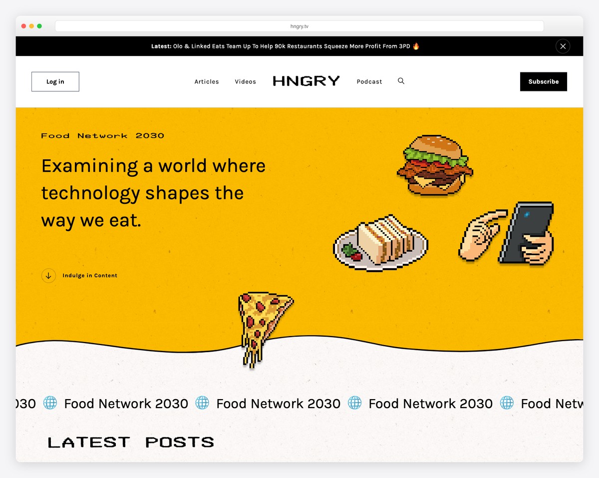
HNGRY’s Ghost website has a top bar notification set against a dark background for enhanced visibility.
The site features a floating header that neatly centralizes menu links, offering a streamlined navigation experience. Uniquely positioned, the login button on the left and the subscription button on the right cater to user convenience.
Catchy pixelated details and smooth animations elevate the site’s appearance, adding a dynamic layer to the browsing experience.
Furthermore, a practical back-to-top button ensures effortless navigation, making the reader’s journey through the page user-friendly.
What stands out: Unique design elements and animation can significantly enhance your website’s UX. (Just don’t overdo it!)
What stands out: HNGRY has a unique blend of striking design elements, efficient navigation, and interactive features.
9. Creator Science
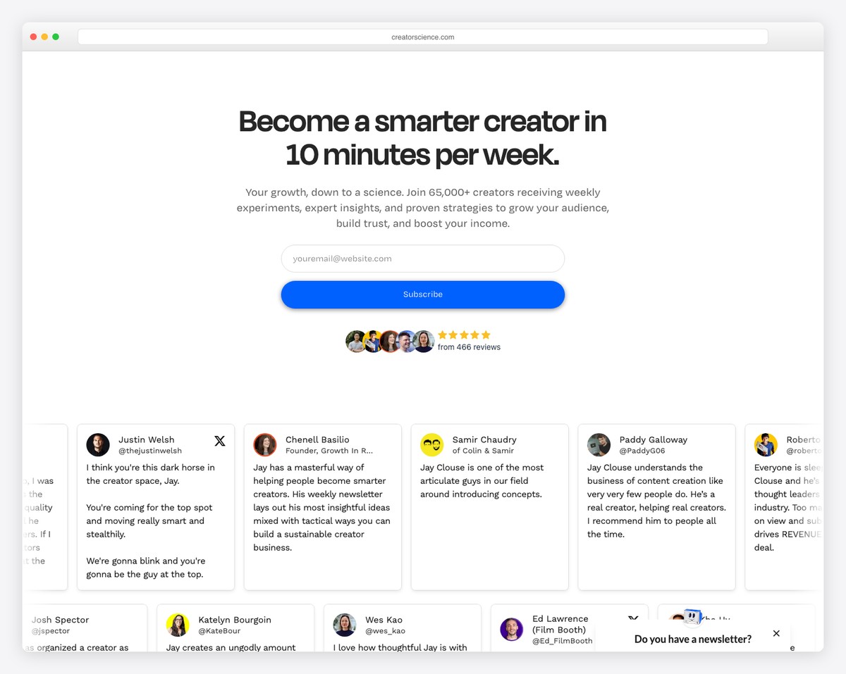
Creator Science’s website has breezy navigation, featuring a drop-down and hamburger menu for easy access.
The navbar is equipped with compelling CTA buttons, and the header smartly vanishes when scrolling down and reappears when scrolling up for a seamless experience.
A prominently placed subscription form above the fold, alongside smartphone scroll screen preview animation, enriches user engagement.
The site boosts its credibility with a “Featured In” section, a number of reviews with five golden stars and a sliding testimonial carousel.
Moreover, it also has sticky elements that enhance functionality and user retention and a pop-up that appears on exit.
What stands out: Do you want a cleaner navigation bar/header? Then use a hamburger menu.
What stands out: Creator Science contains seamless navigation, engaging interactive features, and credible presentation.
10. The Browser
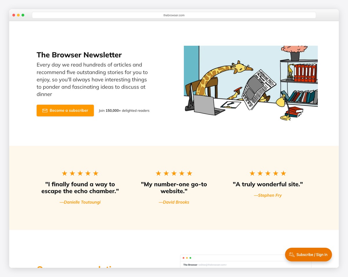
The Browser’s Ghost website represents smooth elegance without a header, prioritizing content over clutter. (You don’t see many sites without a header, that’s for sure.) What’s more, a basic footer houses essential links, maintaining simplicity.
Noteworthy is the floating subscription button, facilitating easy access to subscribe and a dedicated newsletter form for seamless engagement.
Testimonials peppered throughout the site lend credibility and authenticity to its offerings, making The Browser a prime example of refined design and user-focused convenience.
What stands out: Feel free to go against the grain and create a website without a header, promoting content right away.
What stands out: The Browser triggers attention with elegant minimalist design, user-friendliness, and focus on content delivery.
11. Welcome To Hell World
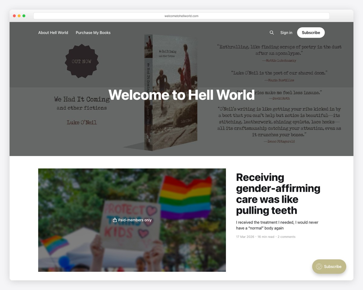
Welcome To Hell World kicks things off with a top bar notification promoting a new book. (Remember, you can close the bar or click the link to learn more.)
It then continues into a pretty large header section with links, a search bar, a sign in and a subscription button.
The infinite scroll, which loads content automatically, is unique to the Welcome To Hell World’s Ghost website example.
Finally, the site has a super simple dark footer with copyright text on the left and “Powered by Ghost” on the right.
What stands out: Let visitors continue to enjoy your website without clicking “next” by integrating infinite scroll functionality.
What stands out: Welcome To Hell World ensures fantastic readability and practical scrolling, so readers get the most out of the site without doing too much work, except – well – reading.
12. The Berkeley Scanner
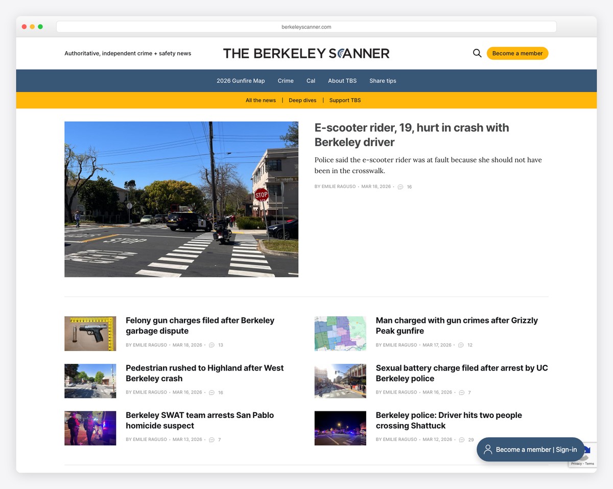
The Berkeley Scanner is a great example of a Ghost website, showcasing a multi-part header that includes a main section alongside primary and secondary menus.
Its magazine-like layout is meticulously designed, offering ample white space to enhance readability and provide a clutter-free user experience.
The site’s expansive footer is thoughtfully arranged, featuring a prominent subscription button, social media icons, and convenient menu links, all contributing to its user-friendly and aesthetically pleasing interface.
What stands out: Take your website navigation to the next level with primary and secondary menus.
What stands out: The Berkeley Scanner pushes elegant design, seamless navigation, and exceptional readability, setting a high standard for online publishing.
13. The Maple
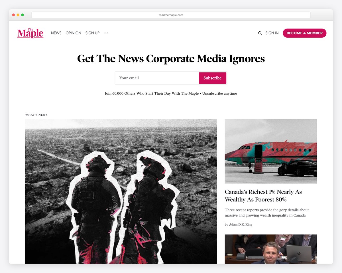
The Maple website shines as an exemplary Ghost website. Its consistent white background throughout the header, base, and footer ensures a cohesive visual experience.
Its user-friendly interface features a drop-down menu and a call-to-action (CTA) in the navbar for immediate engagement.
Above the fold, visitors are greeted with a subscription form, encouraging prompt interaction.
The site’s post grid layout, well-spaced thumbnails, titles, and excerpts, and a comprehensive five-column footer offer easy navigation and abundant resources.
What stands out: Make your CTA button easy to access by placing it in the navbar/header section.
What stands out: The Maple is a top choice for its cohesive design, intuitive layout, and actionable features.
14. The Diff
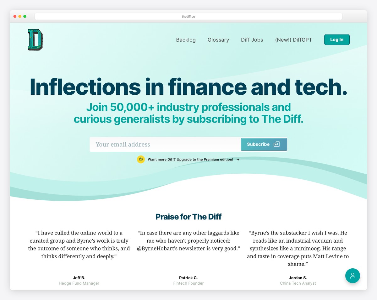
The Diff has a transparent header, which gives the design an airy, open feel.
Dominating the above-the-fold area, a prominently placed subscription form immediately engages visitors, underscored by persuasive testimonials.
The website embraces a text-heavy layout, balanced with large, readable typography and generous white space, enhancing overall readability.
A floating button for the members’ area adds a convenient navigational element, while the simple footer maintains the site’s uncluttered aesthetic, focusing on content and user experience.
What stands out: Don’t feel like using visual content on your website? That’s OK – go text-only!
What stands out: The Diff excels for its clear focus on content engagement through a clean website design and strategic subscriber integration.
15. BLAG
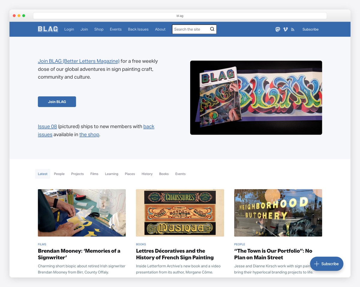
BLAG has a strategic top bar that promotes membership, enhancing user engagement right from the outset.
The navigation bar is thoughtfully designed, incorporating search functionality and social media icons for easy connectivity.
Tags are cleverly utilized to simplify content discovery, making navigation intuitive. The website employs a three-column grid layout for posts, offering a structured yet visually appealing content presentation. Besides, it includes a “load more’”button for continuous exploration.
The dark footer elegantly concludes the page, featuring copyright information, useful links, and social media icons, encapsulating functionality and style.
What stands out: Benefit from the “load more” button so visitors continue to browse your content without jumping from page to page.
What stands out: BLAG incorporates user-focused features, elegant design, and seamless integration of social and membership elements.
16. Maker Stations
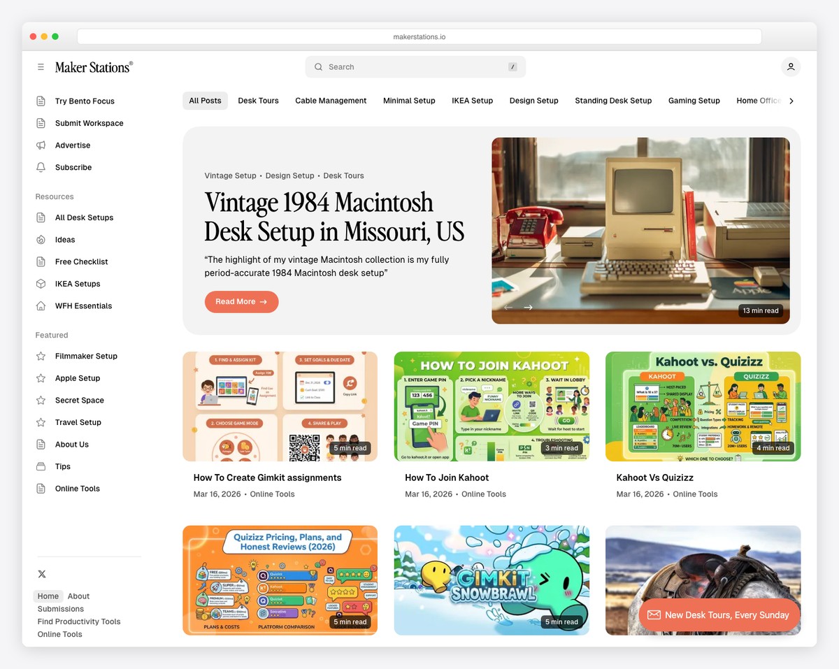
Maker Stations is a Ghost blog example with its dual-menu system, offering both primary and secondary navigation options for better user orientation.
The site’s white, minimalist design speaks to modern sensibilities, promoting clarity and focus.
A sidebar feature adds an extra accessibility layer, while the two-column post layout presents content organized and engagingly.
The “more posts” button invites extended exploration, encouraging deeper engagement.
Completing the design, a three-column footer provides additional resources and information.
What stands out: Use a sidebar for additional widgets, content, social media, etc.
What stands out: Maker Stations showcases a perfect blend of minimalist design, structured content layout, and simple navigation.
17. Buffer Blog
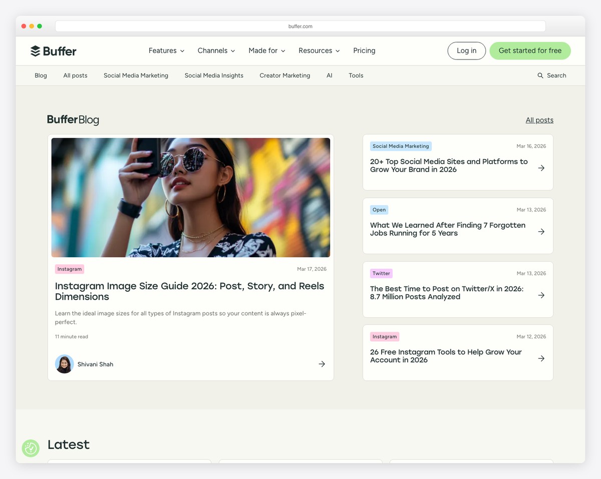
The Buffer Blog sets a high standard as a Ghost website with its dynamic floating header, which elegantly vanishes or reappears based on the user’s scroll direction.
Its intuitive drop-down menu and strategically placed CTA in the navbar facilitate effortless navigation and engagement.
The site organizes content into distinct categories for quick access, while a prominently positioned newsletter subscription form encourages ongoing connection.
The footer is a treasure trove of resources, featuring additional links, social media, and app download CTAs.
What stands out: Ensure content categorization so visitors can find what they’re interested in much quicker.
What stands out: Buffer Blog shows its amazingness through its adaptive navigation, strategic engagement points, and comprehensive resource integration.
18. The DESK Magazine
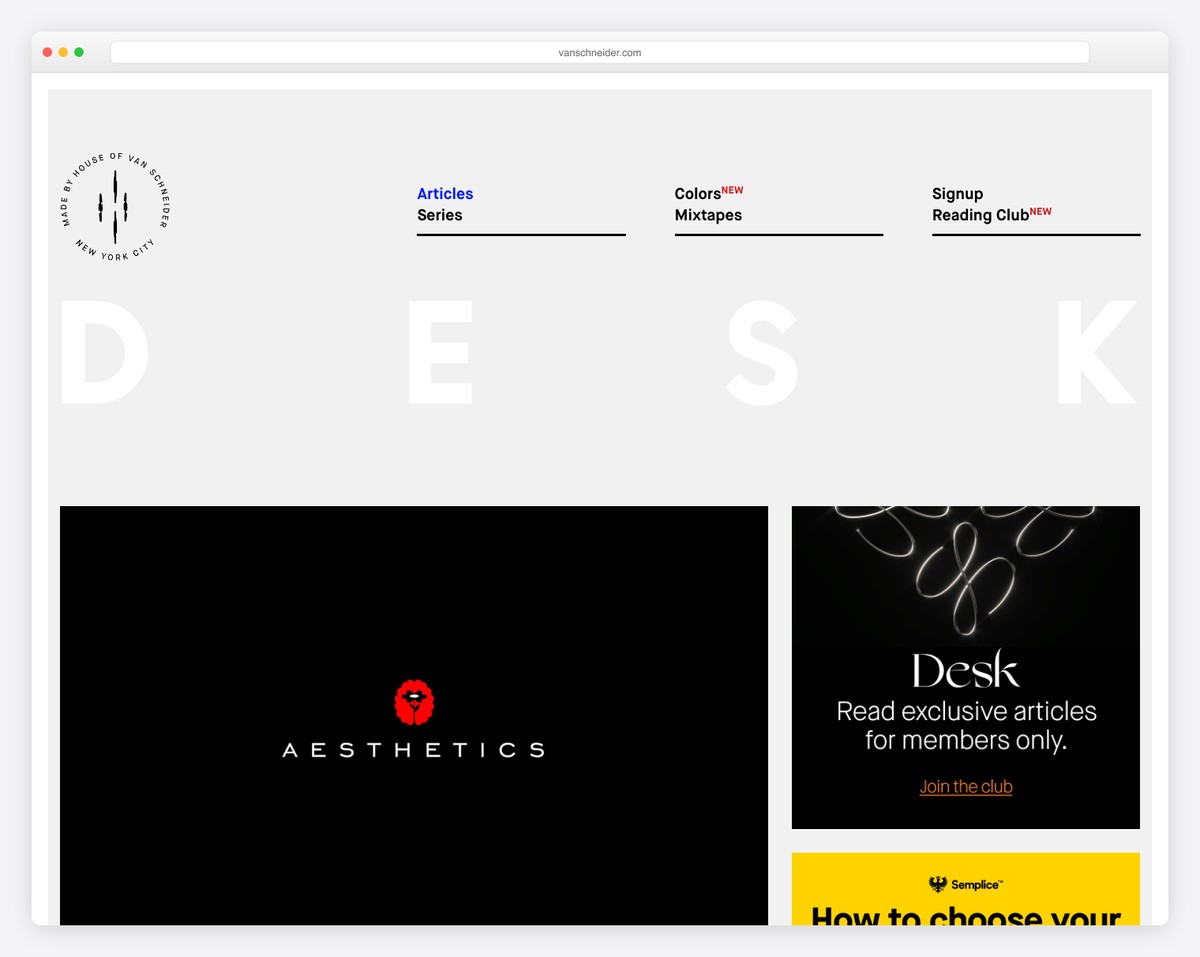
What makes The DESK Magazine website unique is its distinctive framed design, boxing content within a visually engaging boundary that sets it apart.
Its modern, minimal header is designed to minimize and float upon scrolling, maintaining accessibility without sacrificing style.
The layout is thoughtfully organized with a main blog post section flanked by a sidebar adorned with diverse widgets, enhancing user interaction.
Anchoring the design is a large, bold black footer, making a strong visual statement while offering additional navigational aids.
What stands out: Ensure navigation is always available by sticking it to the top of the screen.
What stands out: The DESK Magazine impresses with its framed layout, dynamic header, and striking footer.
19. The Lever
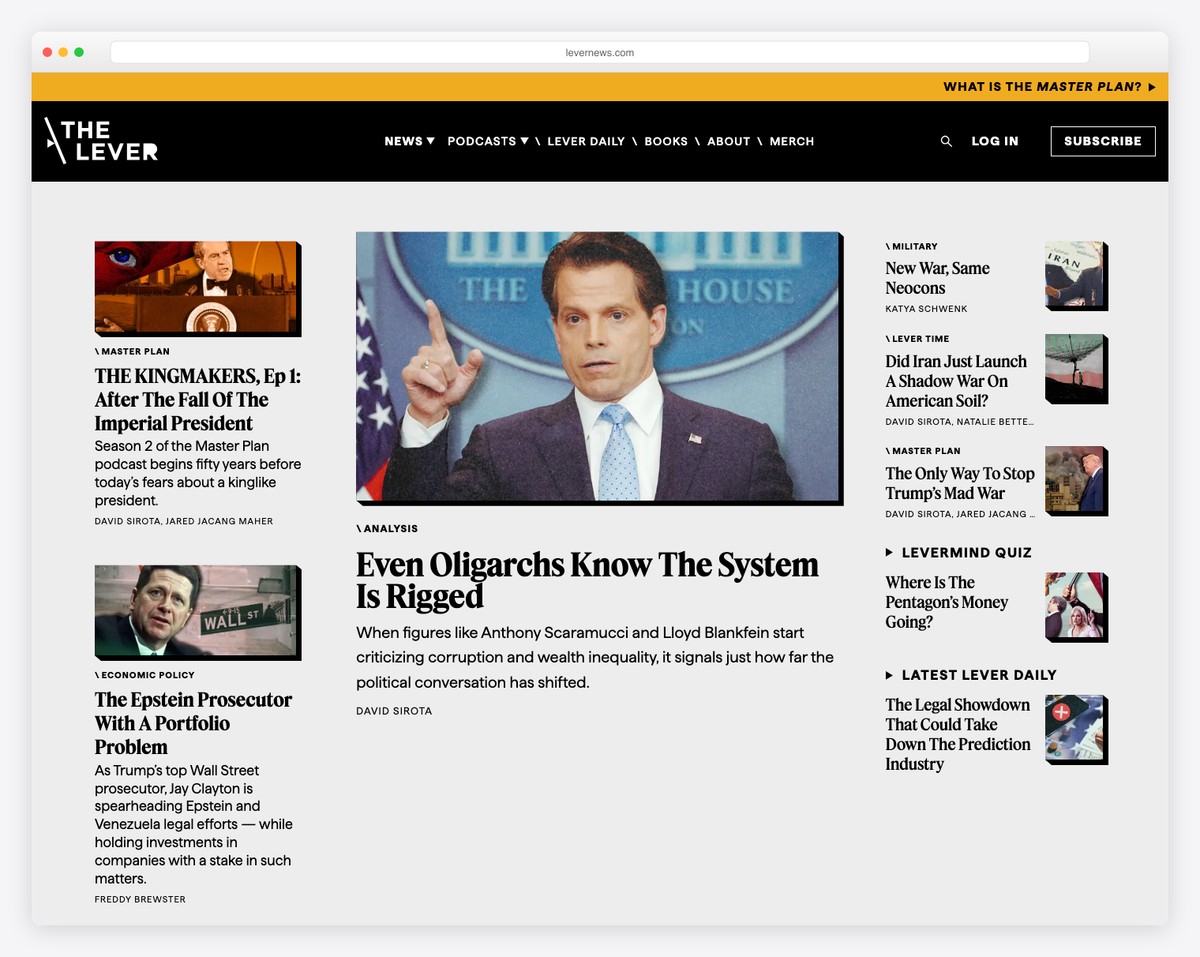
The Lever gets things moving with an eye-catching contrasting top bar, instantly drawing attention.
Its sticky header with a drop-down menu ensures seamless navigation through the site’s content. No more scrolling back to the top!
The website is organized into multiple sections, each structured for intuitive user engagement, including a prominently featured team section.
Its simple yet functional dark footer finishes off the site, providing essential links and a subscription form, making it easy for visitors to connect and stay updated.
What stands out: Use a top bar for a special announcement, product promotion, etc.
What stands out: The Lever is a top example for its engaging design, clear content organization, and practical features.
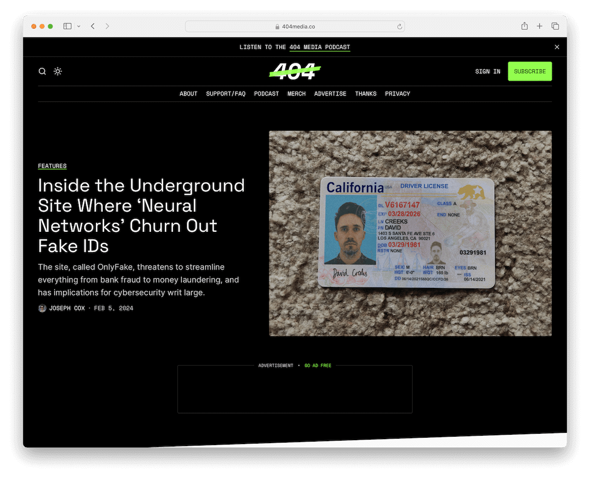
20. 404 Media
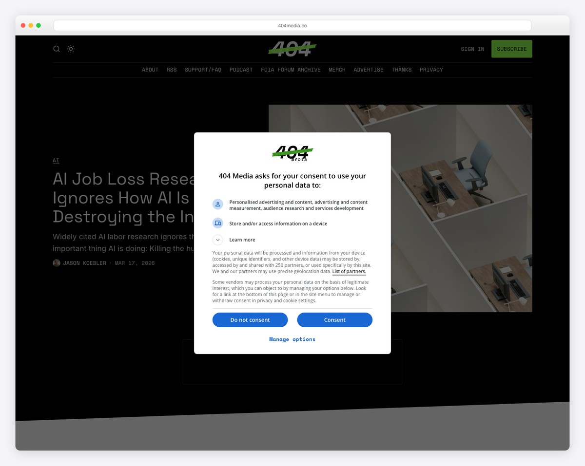
404 Media captivates as a Ghost website with its bold black design, punctuated by contrasting light sections for visual interest.
The light mode switcher is a unique feature that allows users to customize their viewing experience.
The site employs a sticky header, distinctively without a navigation bar, streamlining the interface.
Content is presented in a three-column blog post layout, complemented by a “load more posts” button for a continuous reading experience.
The footer is efficiently designed (with a light background), incorporating business information, useful links, and a subscription form.
What stands out: Stand out from the masses by creating a black website and create a strong first impression.
What stands out: 404 Media amazes with its striking contrast design, user customization options, and streamlined content presentation.
21. Platformer
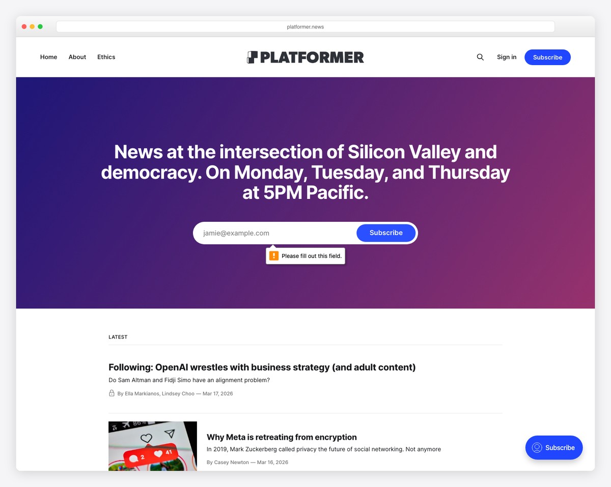
Platformer sets itself apart as a Ghost website with its straightforward header. The latter features essential “home” and “about” links, a search icon, a clear “sign in” link, and a “subscribe” button for immediate user engagement.
The site adopts a single-column format for news presentation, ensuring content is the focal point and is easily digestible.
A dedicated section prominently displays the subscription form, encouraging user interaction.
Finally, its minimalist footer caps off the design, embodying the site’s ethos of simplicity and focus.
What stands out: Use a white/light design to make your content pop more.
What stands out: Platformer inspires with its clean design, focused content delivery, and straightforward user engagement mechanisms.
22. Snipette
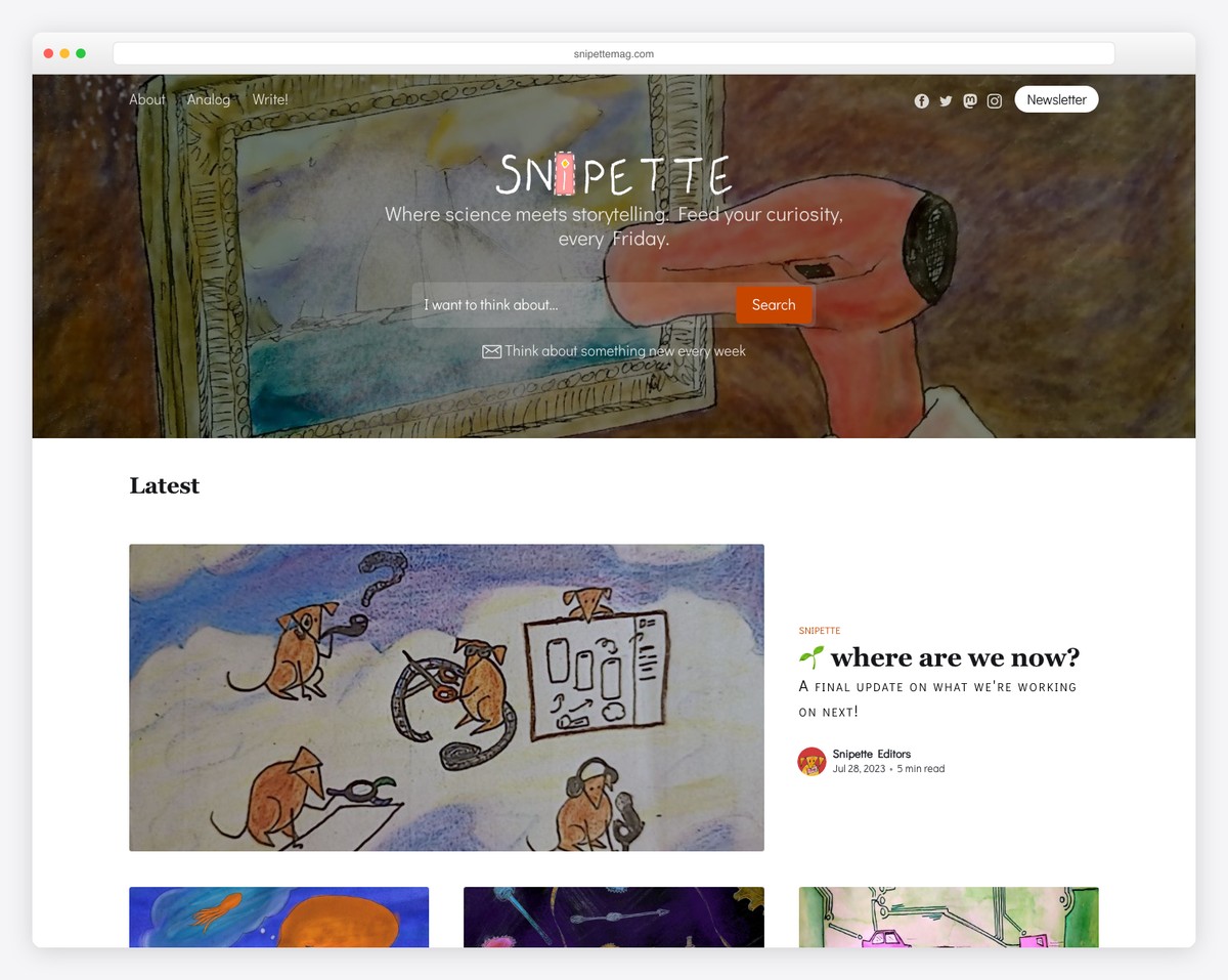
Snipette is an independent digital magazine where science meets storytelling, publishing articles across science, technology, psychology, culture, history, and philosophy every Friday. The clean editorial design built on Ghost prioritizes readability with generous spacing and thoughtful typography.
The newsletter-first approach is a perfect match for Ghost’s built-in membership features. Multiple contributing writers bring diverse perspectives while maintaining a consistent editorial voice, demonstrating how Ghost can power a full multi-author publication beyond simple personal blogs.
What stands out: A newsletter-first publication on Ghost leverages the platform’s strongest feature — built-in membership and email — turning a blog into a sustainable media business with direct reader relationships.
How To Make A Website Or Blog With Ghost
Here’s a simple seven-step process on how to get started with Ghost:
- Sign up for Ghost: Visit the Ghost website and sign up for an account. You can choose from their hosting plans or opt for self-hosting if you prefer.
- Choose a domain name: Select a domain name for your website. Make sure it reflects your brand or the content you’ll be sharing. You will then need to connect it to your Ghost setup.
- Install Ghost: Install the Ghost platform on your chosen hosting provider or set up self-hosting following the provided instructions. (Ghost officially recommends an Ubuntu server with at least 1GB of memory if self-hosting. But we hand-picked some more great Ghost hosting services for you.)
- Customize your theme: Explore the available themes in the Ghost marketplace or create your own using HTML, CSS, and JavaScript to tailor the design to your preferences. (Don’t miss these fantastic Ghost themes!)
- Create content: Start creating content for your website using Ghost’s intuitive editor. Write articles, upload images, and organize your content into categories or tags.
- Optimize for SEO: Utilize Ghost’s built-in SEO features to optimize your website for search engines. This includes adding meta descriptions, optimizing images, and creating SEO-friendly URLs.
- Launch your website: Once you’re satisfied with the design and content of your website, it’s time to launch. Share your website with the world and promote it through social media, email newsletters, and other marketing channels.
FAQs About Ghost Websites & Blogs
Is Ghost easy to use for beginners?
Yes, Ghost’s user-friendly interface and intuitive editor make it accessible for beginners to create and manage websites and blogs effortlessly.
Can I customize the design of my Ghost website?
Yes, Ghost offers a variety of customizable themes, and you can also create your own themes using HTML, CSS, and JavaScript to achieve the desired look and feel.
Does Ghost support SEO?
Yes, Ghost includes built-in SEO features such as customizable meta descriptions, optimized URLs, and sitemap generation to help improve your website’s visibility in search engine results.
Can I migrate my existing website to Ghost?
Yes, Ghost provides migration tools and documentation to facilitate the seamless content transition from other platforms like WordPress, Blogger, or Tumblr to Ghost.
Does Ghost offer hosting services?
Yes, Ghost offers hosting plans for users who prefer a hassle-free experience. Alternatively, you can self-host Ghost on your own server or opt for 3rd-party hosting providers.
Is Ghost suitable for large-scale websites and blogs?
Yes, Ghost is designed to handle websites and blogs of all sizes, offering scalability and performance optimization features to ensure smooth operation even as your audience grows.
Related Posts


Comments (0)