
19 Best Electrician Website Examples 2026
Ten of the nineteen electrician websites below put a tappable phone number in the first screen. One puts the quote form there.
These are working electrical businesses, not template demos or agency concept work. Each one was opened in a browser and checked against the same six things a homeowner or a project manager looks for, and each entry reports what that check actually found — including where a good-looking site fails one of them badly. Several are here precisely because the one thing they do well is worth stealing.

Looking to build a website?
Here are all the best electrician website templates to speed website building process
What we looked for
An electrical contractor’s site has a narrower job than most: convince a stranger you are licensed, reachable and local, in about ten seconds. We checked six things on every one of the nineteen and counted the results rather than rating them.
The six things we checked, and what each count means
Electrical faults are urgent and electrical work is licensed, which makes this a narrower test than “is the design nice”. Each row below is why the criterion matters, then what the count actually tells you.
| What we looked at | Why it matters |
|---|---|
| Phone number above the fold | Electrical faults are urgent. If someone has to scroll or hunt through a menu to call you, they call the next result instead. |
| Licence and insurance stated plainly | It is the first thing a homeowner checks and the first thing a commercial client asks for. Burying it costs jobs. |
| Service area named | “Serving Greater Manchester” answers the question every visitor has. A site that never names its area reads as a franchise or a lead broker. |
| Photographs of real work | Stock images of a smiling man with a clipboard say nothing. Panel upgrades, rewires and finished installs do. |
| Emergency versus scheduled work split | A 2am fault and a kitchen rewire are different visitors with different urgency. The good sites route them separately. |
| How little a quote request asks for | Every extra required field costs enquiries. The best examples ask for a postcode and a phone number and nothing else. |
These are counts, not opinions: whether the thing is actually present, measured in a browser at 1280×860.
| What we checked | Sites doing it | What the number tells you |
|---|---|---|
| Tappable phone number above the fold | 10 of 19 | Nine make an urgent caller scroll or hunt through a menu first. |
| Tappable phone number anywhere on the page | 13 of 19 | Six print the digits as plain text, so tapping them does nothing at all. |
| Licence or insurance stated on the homepage | 12 of 19 | Only five publish an actual licence number. The other seven say “licensed and insured” and stop, which is the claim anyone can make. |
| Service area named | 10 of 19 | Nine never name a town or county anywhere in the first screen. |
| Emergency or 24/7 cover mentioned | 5 of 19 | The biggest gap by far. Fourteen send the 2am fault down the same path as a planned kitchen rewire. |
| Quote form on the homepage | 10 of 19 | Nine have no form at all. The ones that do ask between 4 and 8 fields, median 5. |
| Quote form above the fold | 1 of 19 | One site out of nineteen. Everybody else puts the conversion step behind a scroll. |
Best Electrician Website Design Examples
Table of contents — all 19 electrician websites
- Green Electrical
- CSI Electrical Contractors
- Kollmann Electric
- Kleinberg Electric
- O’Connell Electric Company
- New Electric
- Gator Electric
- JTM Electrical
- Bitz Electrical
- Randy’s Electric
- Contract Electrical
- Beel Electrical
- Hall Electrical
- Atkins Electric
- Industrial Electric Services
- JMCorp & Son
- Gibbs Electric Company
- Withrow Electric
- High Class Electric
1. Green Electrical
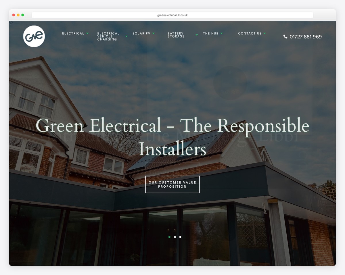
The navigation is doing the work here. Where most electrician sites collapse everything behind one Services dropdown, Green Electrical’s menu names individual EV charger models — the Zappi, the Hypervolt, the Andersen A2 — beside lighting design, smoke alarms and electrical testing. Someone searching for a specific charger can land on a page about that charger. The NICEIC approval is stated in the page title rather than buried on an About page, which matters in the UK because it is the first credential a homeowner is told to check. The phone number sits in the header; there is no quote form above the fold.
What stands out: The menu is a service taxonomy rather than a category. Naming charger brands as navigation items turns one services page into a set of pages that can each rank.
2. CSI Electrical Contractors
Built with: WordPress
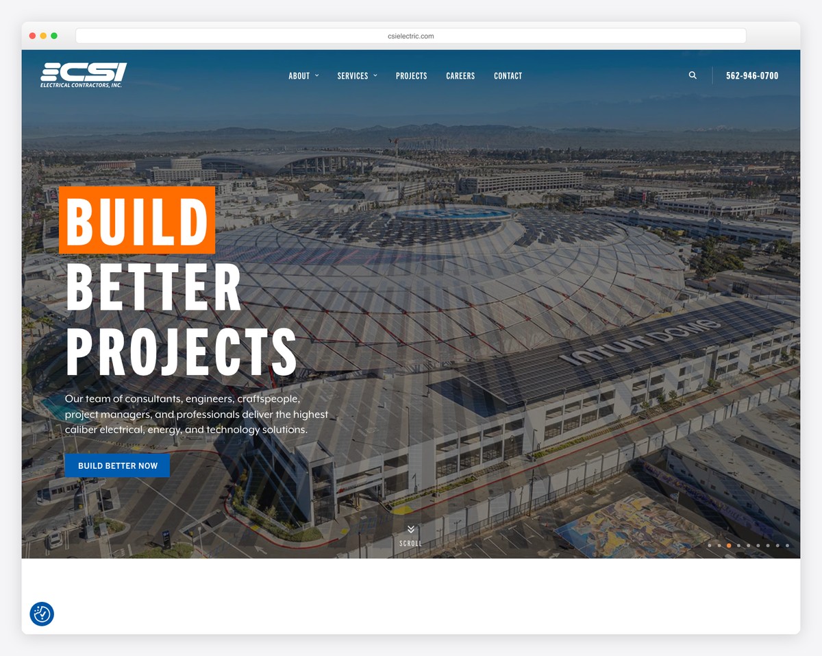
This is what an electrician’s site looks like when the customer is a general contractor rather than a homeowner. There is no quote form anywhere on the homepage and no licence badge. Instead the hero is an aerial photograph of a stadium build and the headline is three words: Build Better Projects. The phone number sits in the header and repeats seven times down the page, because on commercial work the next step is a conversation rather than a form. Careers sits in the top-level menu beside Projects, which tells you recruiting is as much this site’s job as selling.
What stands out: No quote form at all, deliberately. Commercial buyers do not fill in web forms, so the space goes to project photography instead.
3. Kollmann Electric
Built with: WordPress
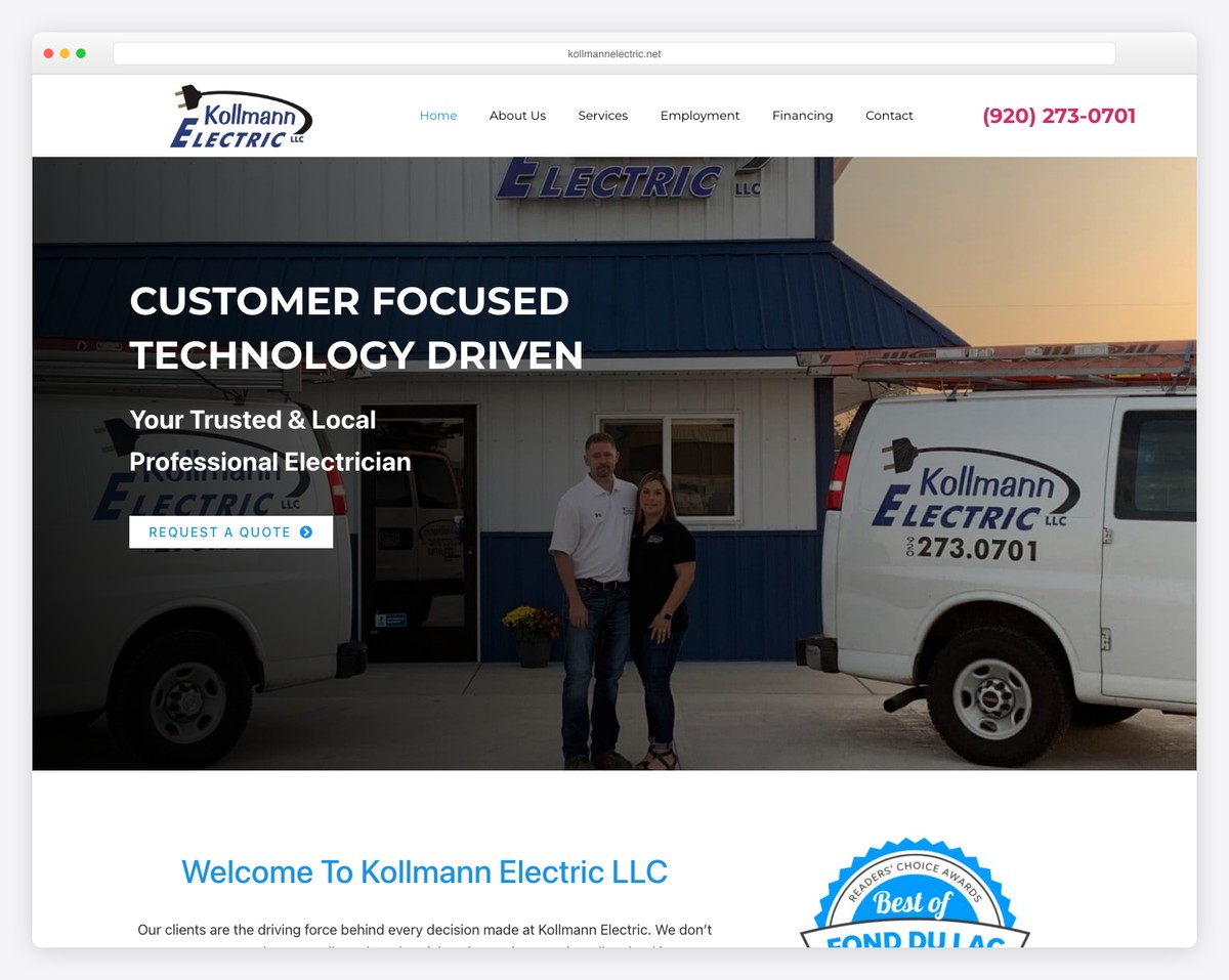
Kollmann’s quote form asks five things and one of them is “Best Time To Call” — a field that exists because this business rings you back rather than emailing. The licence line reads “fully licensed and insured for your protection” and the service area is named down to two towns, Fond du Lac and Oshkosh, rather than left as a county. The hero is a photograph of the owners standing in front of their own van outside their own building, which does more for a local trade business than any stock image can. Financing has its own top-level menu item.
What stands out: “Best Time To Call” as a form field. It assumes the follow-up is a phone call and asks the one question that makes the callback land.
4. Kleinberg Electric
Built with: WordPress
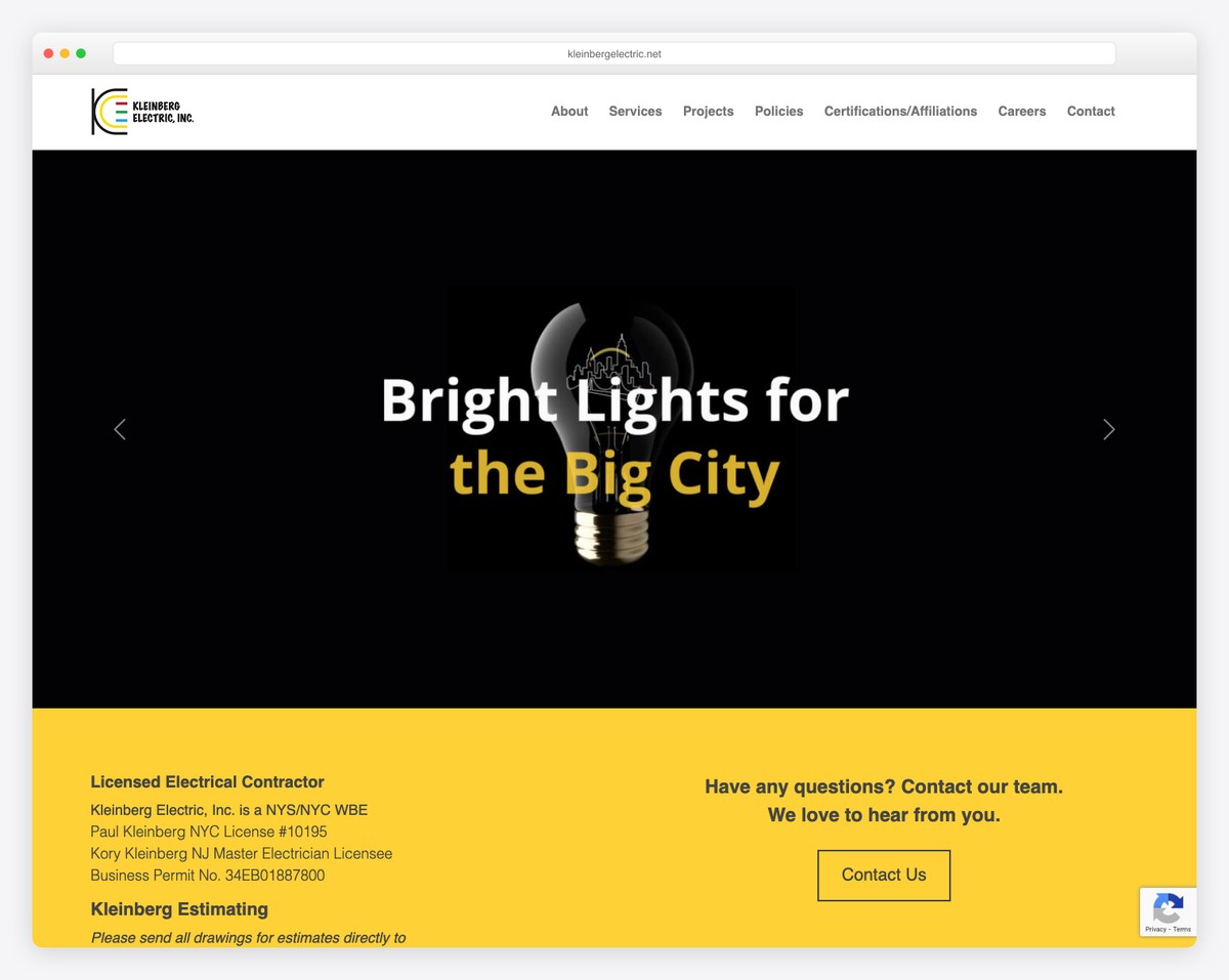
Kleinberg publishes its licence numbers in full — a New York City licence, a New Jersey master electrician licensee and a business permit number — in a yellow band directly beneath the hero. Almost nobody else here does that; the rest say “licensed and insured” and stop. The trade-off is the opposite failure: there is no clickable phone number anywhere on the page, so a visitor on a phone has to select the digits by hand. The black hero with a single yellow accent is the most confident piece of visual design on this list.
What stands out: Licence numbers printed in full rather than summarised as “licensed and insured”. It is the strongest trust signal here and it costs nothing to add.
5. O’Connell Electric Company
Built with: WordPress
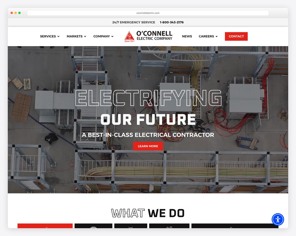
The menu splits into Services and Markets, and the Markets list — food and beverage, transportation, higher education, government — is how large commercial buyers actually think about contractors. A hospital facilities manager wants to know you have done hospitals. Above all of it runs a thin bar carrying “24/7 emergency service” and a toll-free number, which is the cleanest separation of urgent from planned work on this list: the emergency goes to the bar, everything else goes to the video hero. The number in that bar is not a link, which is the one thing worth fixing.
What stands out: A persistent emergency bar above the header. It keeps the 2am call and the planned project apart without either crowding the other.
6. New Electric
Built with: WordPress
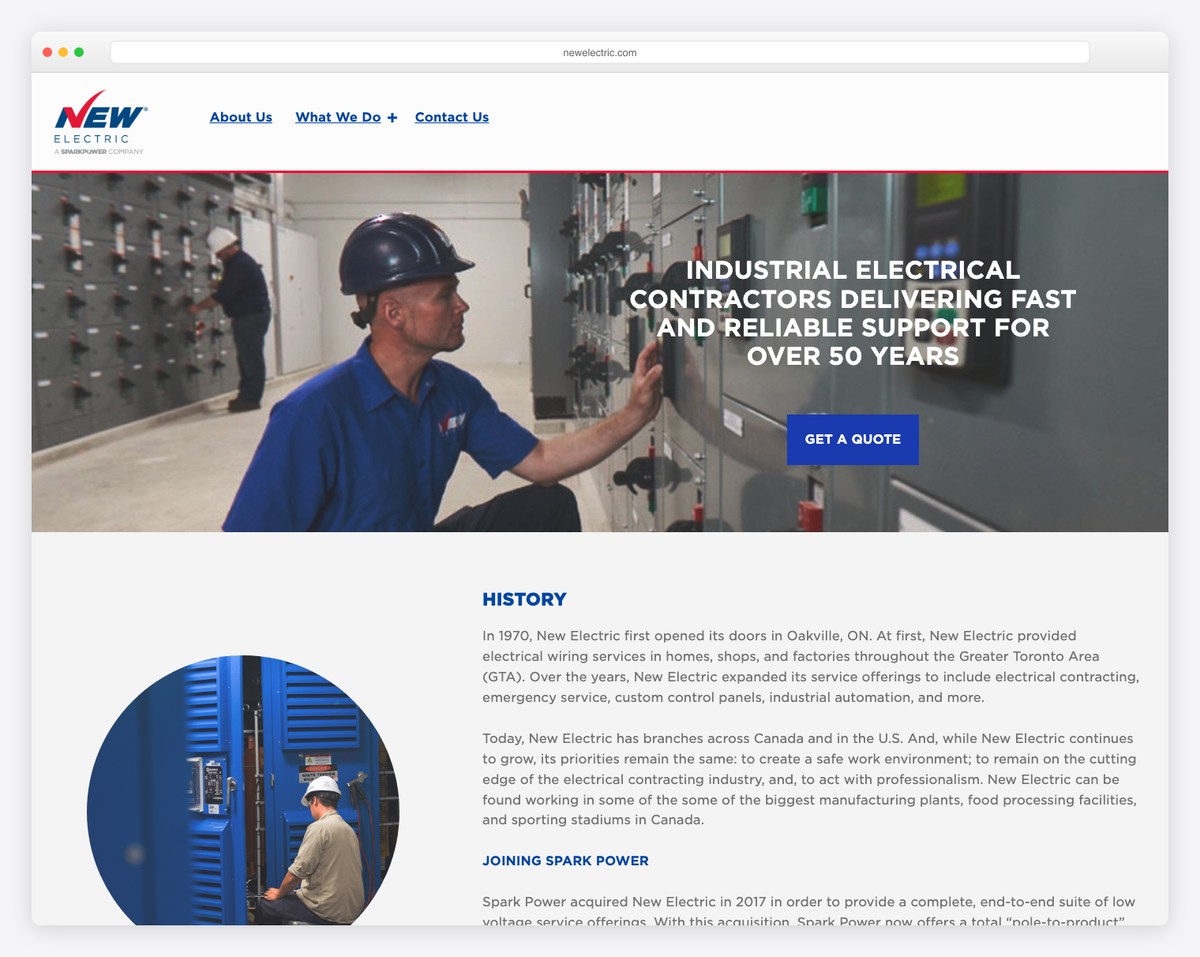
Three items in the navigation: About Us, What We Do, Contact Us. That is the entire menu for a fifty-year-old industrial contractor with branches across Canada and the United States. The headline states the market, the speed promise and the years in a single line, and the only call to action in the hero is Get a Quote. Below it the page goes straight into company history rather than a services grid, which suits a buyer doing due diligence rather than a homeowner comparing prices. There is no clickable phone number, and the 24/7 response promise appears only in body copy well below the fold.
What stands out: A three-item menu. Restraint reads as confidence when the work is industrial and the buyer already knows what they need.
7. Gator Electric
Built with: WordPress
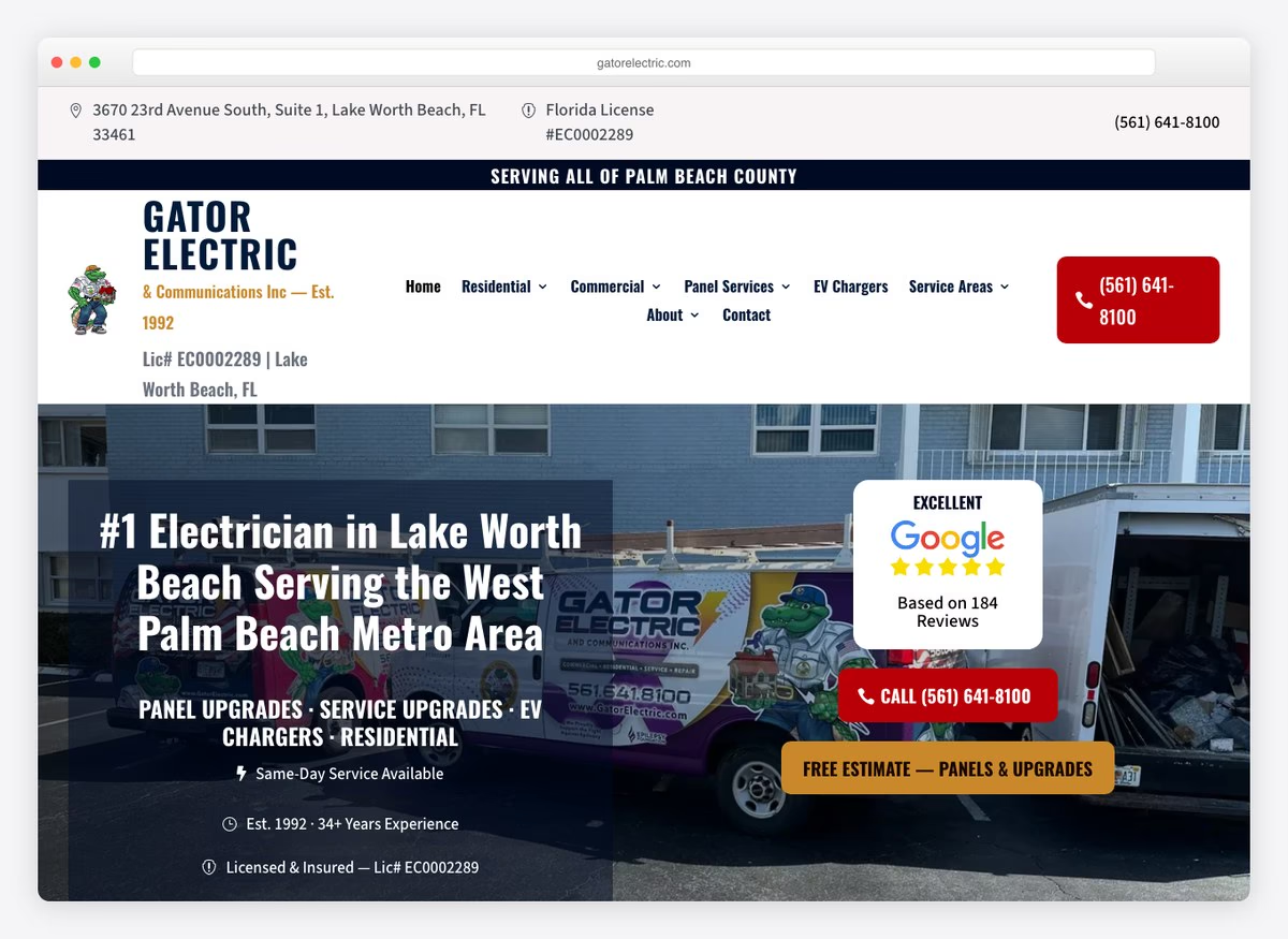
Gator puts both kinds of urgency in the hero and keeps them visually apart: a red Call button for the fault that just happened, and a gold Free Estimate button for the panel upgrade someone is only planning. That is the emergency-versus-scheduled split most electrician sites promise and few actually build. Everything a homeowner checks is in the first screen — the Florida licence number appears three times, the street address sits in the top bar, and a Google rating card sits beside the headline. The quote form asks four things and requires two, the shortest ask on this list.
What stands out: Two buttons, two colours, two urgencies. Nobody has to read to tell the emergency path from the planned-work path.
8. JTM Electrical
Built with: WordPress
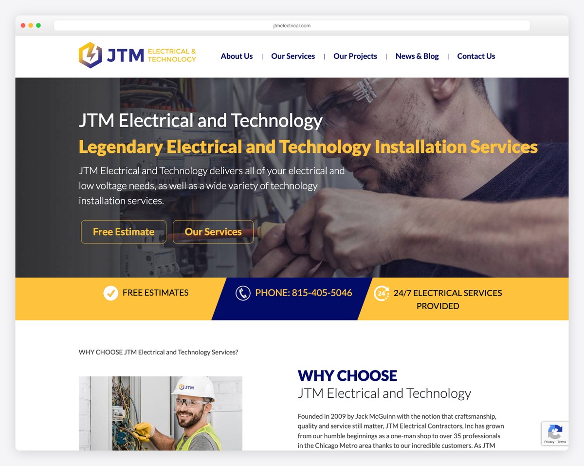
JTM runs a gold band directly under the hero carrying three promises — free estimates, the phone number, and 24/7 electrical services — which is the whole trust argument compressed into one strip. The hero itself offers two buttons, Free Estimate and Our Services, separating visitors who are ready from visitors who are still looking. The photography is close-up work on real installations rather than someone holding a clipboard. As on several sites here, the number in that band is not a tel: link, so it does not dial when tapped.
What stands out: One band under the hero carrying free estimates, the phone number and round-the-clock cover. Three objections answered in a single strip.
9. Bitz Electrical
Built with: Squarespace
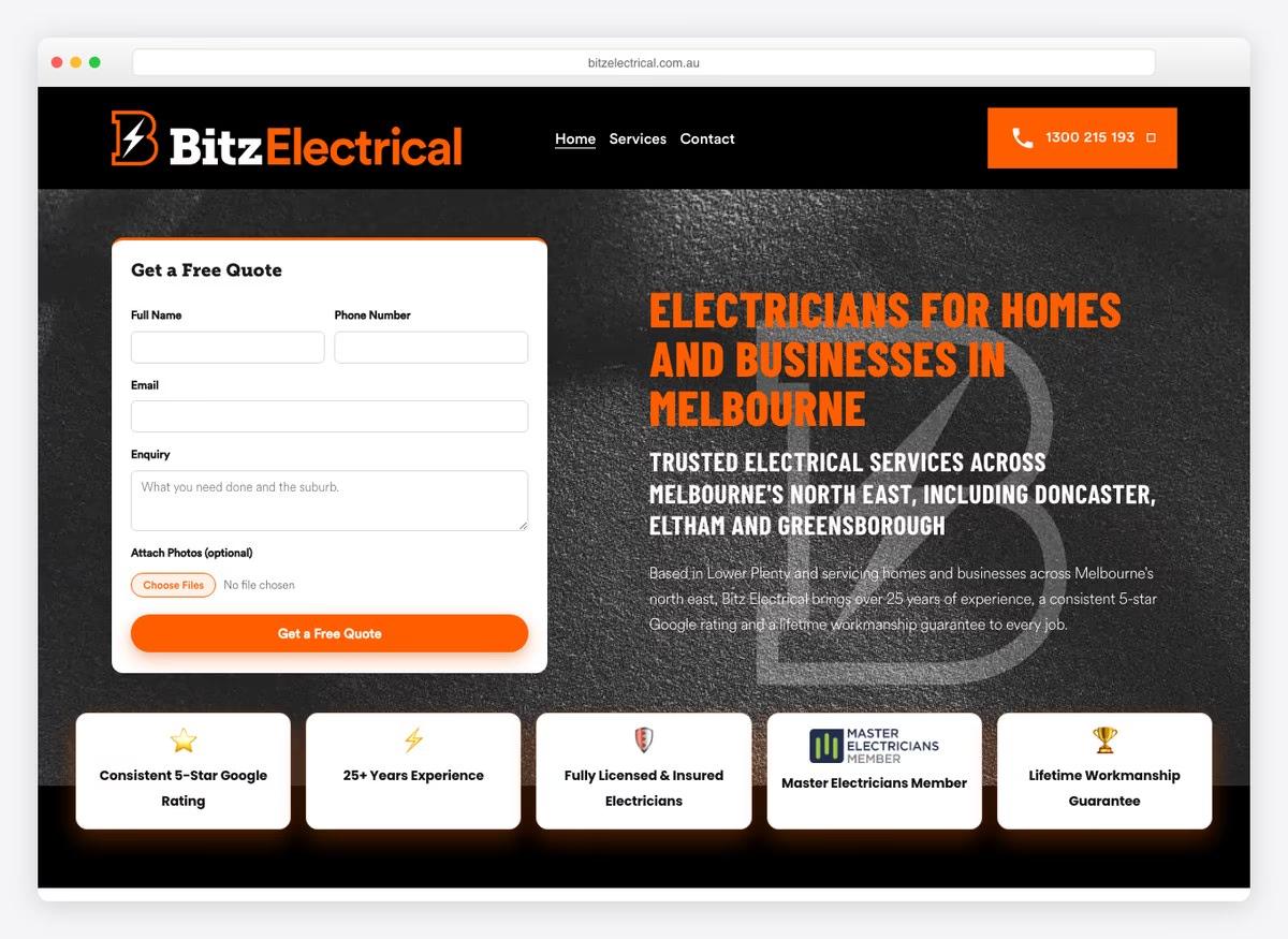
Most electricians bury the quote form at the bottom of the page. Bitz puts it in the hero beside the headline, and it is the only site of the nineteen that does. It asks for four details and marks the photo upload optional, short enough to finish on a phone. Everything else in the opening screen is trust work: a phone number in the header, a service area named down to the suburb instead of a vague “Melbourne”, and five badges covering the Google rating, years in the trade, licence and insurance, trade-body membership and a workmanship guarantee.
What stands out: The quote form sits inside the hero rather than at the end of the page. One site in nineteen does this, and it is the single biggest structural difference on the list.
10. Randy’s Electric
Built with: WordPress
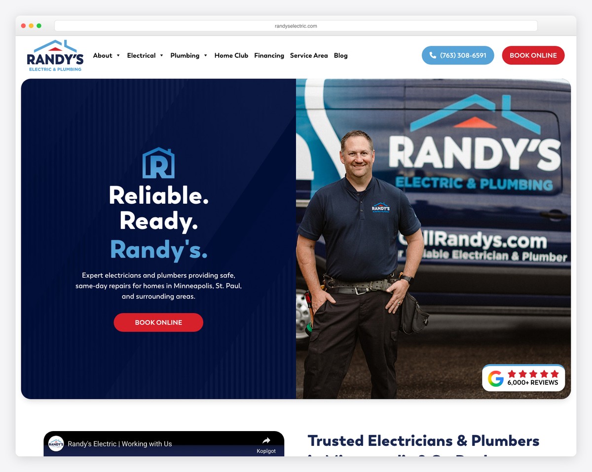
There is a menu item called Local Proof. Not Testimonials, not Reviews — Local Proof, which is the better framing, because what a nervous homeowner wants is evidence you have worked on their street. Beside it sit Service Area, Financing and a Home Club membership. The copy leans on specifics that survive scrutiny: licensed technicians arriving in stocked trucks, options explained before work starts. The weak point is the quote form, which is the longest here at eight fields with five required — a lot of friction for a business whose header button says Book Online.
What stands out: Naming the testimonials section “Local Proof”. It answers the question the visitor is actually asking.
11. Contract Electrical
Built with: WordPress
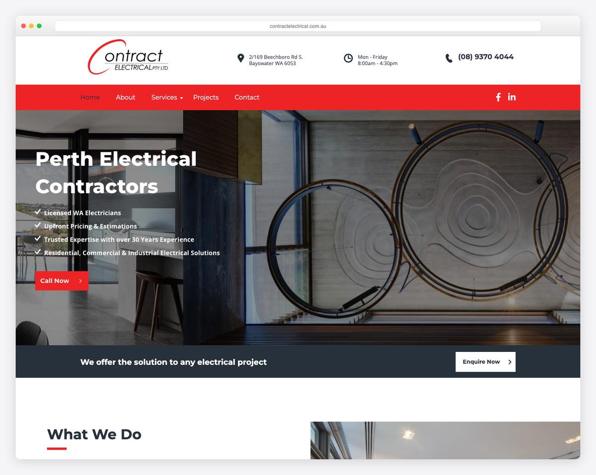
The phone number is the first item in the navigation, ahead of Home. Contract Electrical states its licence class as “Licensed WA Electricians” — the state matters in Australia, where licensing is issued per state — and names its base as Bayswater near the Perth CBD rather than claiming the whole of Western Australia. The hero headline is “Perth Electrical Contractors”, which is exactly the phrase somebody would type. Services split into maintenance, residential and commercial as separate menu items rather than one page.
What stands out: Putting the phone number before Home in the menu. It is first in the tab order and first under the thumb.
12. Beel Electrical
Built with: Squarespace
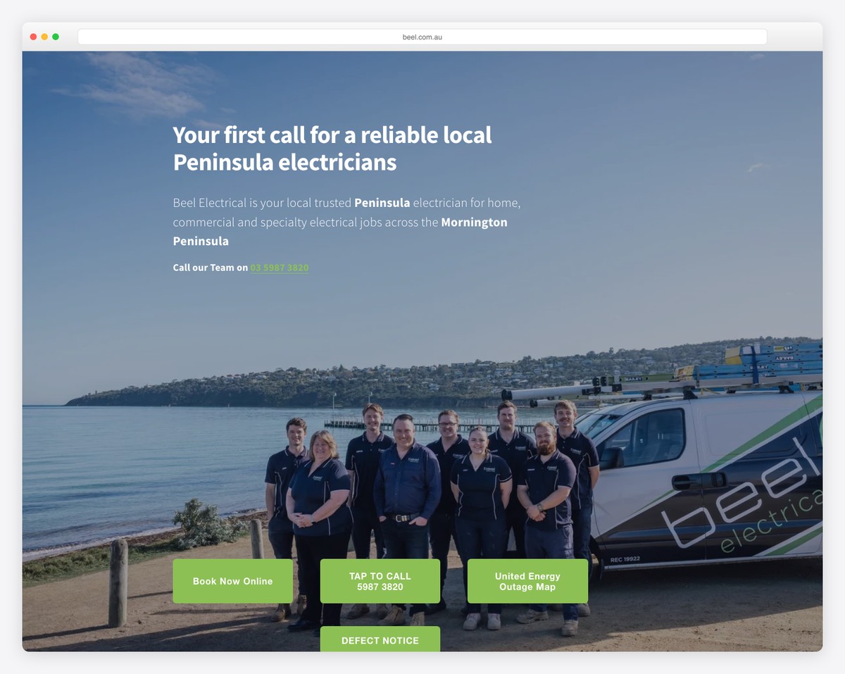
Two menu items here exist nowhere else on this list: Defect Notice and Thermal Imaging. In Victoria a defect notice is a formal document the electricity distributor sends a property owner with a deadline attached, so a page addressing it catches people at the exact moment they have to hire somebody. The hero carries three buttons — Book Now Online, Tap To Call, and a link to the distributor’s outage map — and the last of those is genuinely useful while costing Beel nothing. The phone number is written into the headline rather than left to the header.
What stands out: Linking to the distributor’s outage map. It answers “is it just me?” before the visitor calls, which earns more trust than a testimonial.
13. Hall Electrical
Built with: WordPress
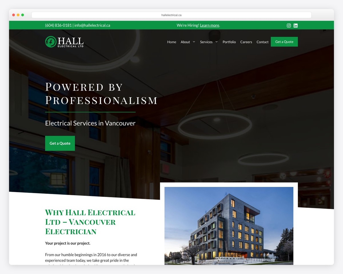
Hall runs a thin green strip above the header carrying the phone number, the email address and a We’re Hiring link — three audiences served in one line. The licence appears as a provincial registration number a Vancouver homeowner can look up, rather than a generic claim. The quote form asks four fields with three required, and Get a Quote is the only coloured element in an otherwise restrained header. Services are split by building type — multi-family, commercial, residential — instead of by task, which suits a contractor whose work is buildings rather than call-outs.
What stands out: Splitting services by building type rather than by task. A strata manager and a homeowner take different paths out of the same menu.
14. Atkins Electric
Built with: WordPress
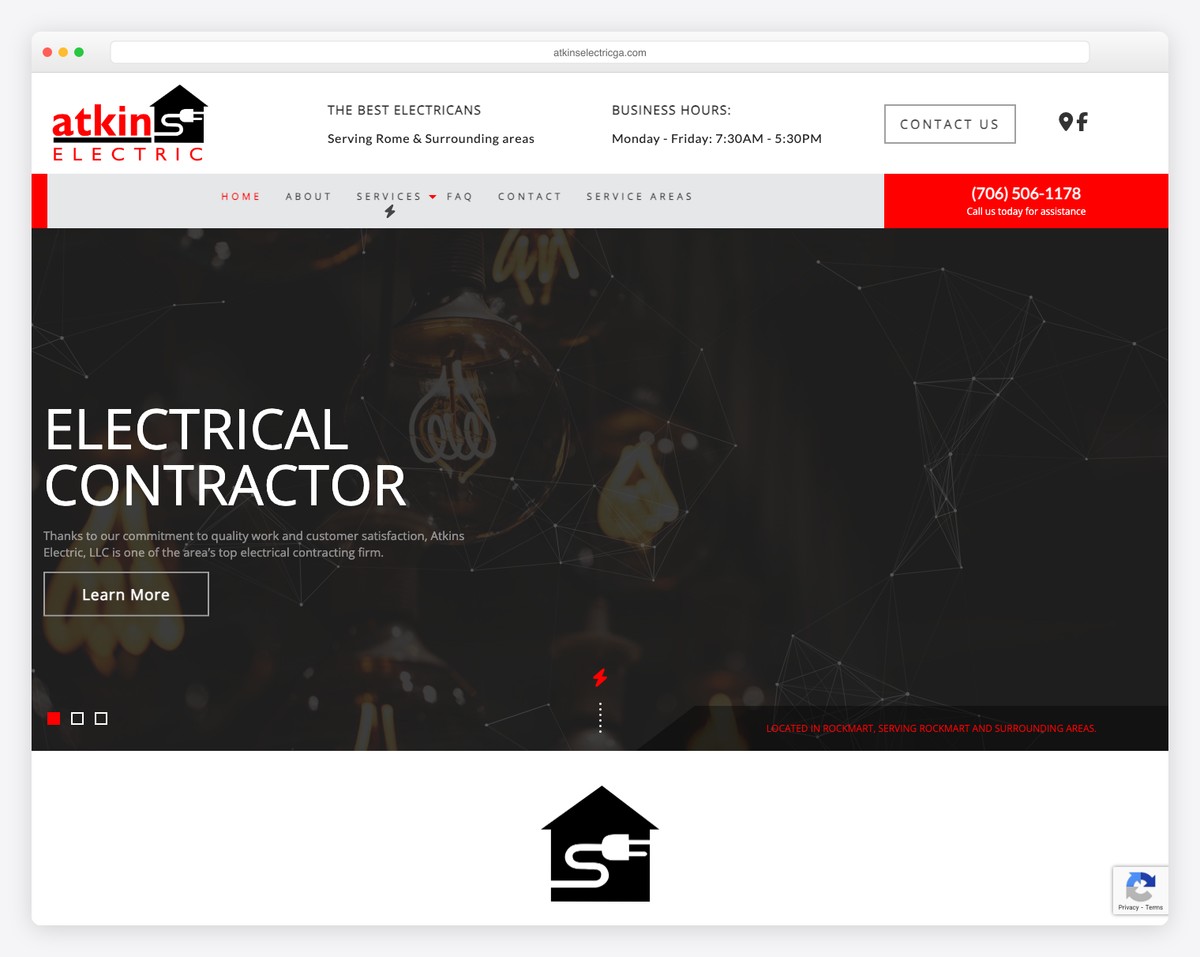
Atkins puts its opening hours in the header beside the service area, which quietly tells somebody visiting at 9pm that nobody is answering. That is more honest than an unstaffed 24/7 badge and it sets expectations before the call is made. The hero is dark with a red accent, and the quote form asks five fields with none of them required — the lowest-friction form on this list. One detail to copy carefully rather than exactly: the header names Rome as the service area while the footer names Rockmart, two Georgia towns about twenty miles apart. If you serve both, say both in both places.
What stands out: Opening hours in the header. One line, and it prevents the call that rings out.
15. Industrial Electric Services
Built with: Squarespace
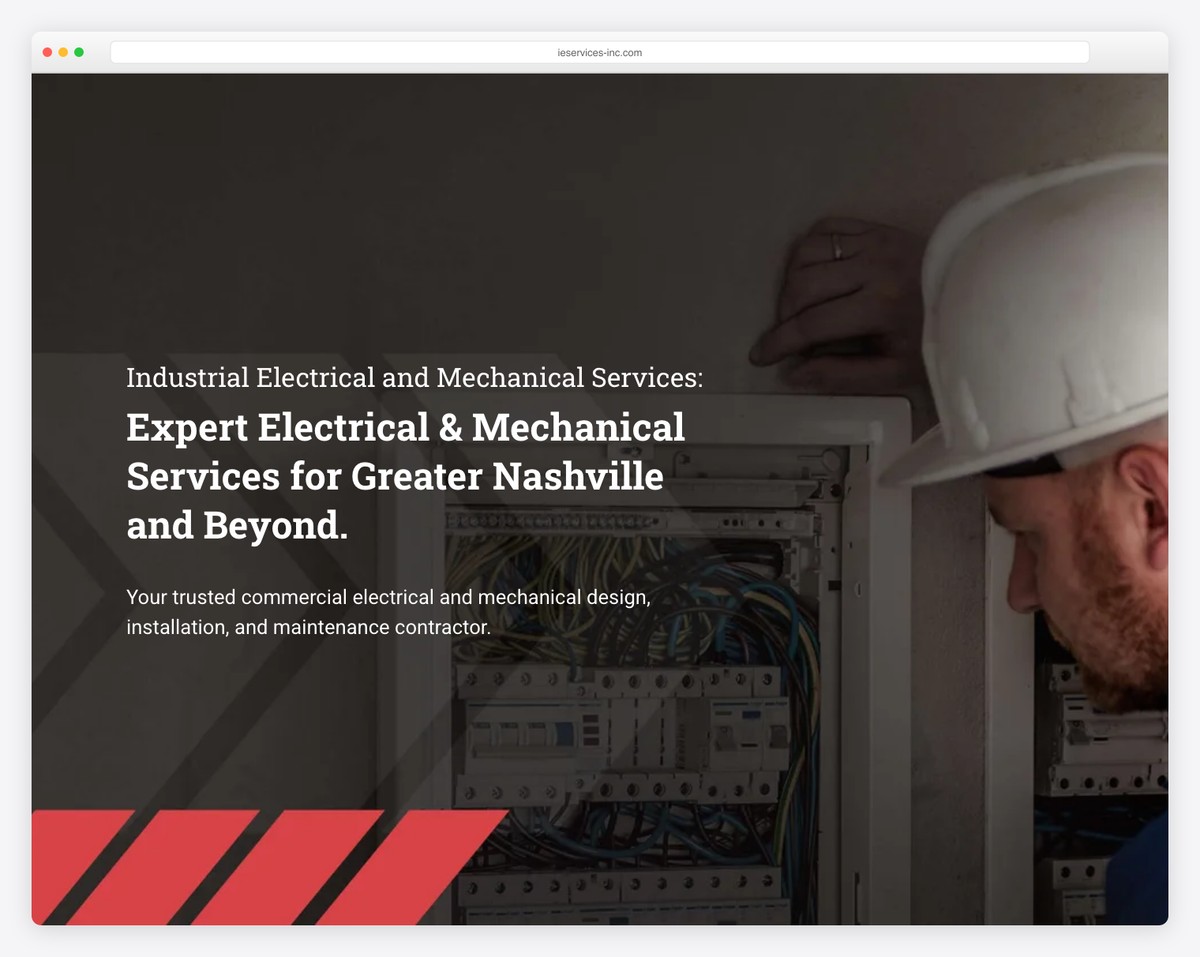
Four things in the navigation and two of them — Careers and an employee portal — are aimed at staff rather than customers. For an industrial contractor in a tight labour market that is a defensible allocation, because the recruiting problem is larger than the lead problem. There is no quote form at all. The headline names the market and the geography in one sentence, and the red-and-black hazard striping under the hero is the only decorative element anywhere on the page.
What stands out: Half the navigation aimed at hiring rather than selling. When the constraint is crews and not customers, that is the right call.
16. JMCorp & Son
Built with: Webflow
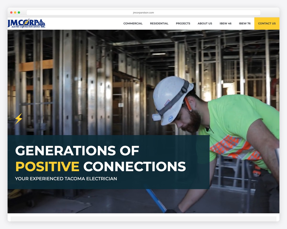
Two of the seven navigation items are IBEW union locals. On commercial and public projects that is not decoration, it is a qualification, and putting it in the top-level menu settles the labour question for a general contractor within a second of landing. A women’s business enterprise certification badge sits in the hero for the same reason, since it can be a scoring requirement on public bids. The headline, “Generations of Positive Connections”, is the only piece of wordplay on this list that earns its place.
What stands out: Union locals in the main navigation. On public and commercial work that is a bid qualification, not a badge.
17. Gibbs Electric Company
Built with: Squarespace
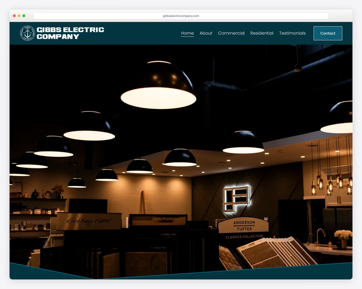
Gibbs is the only site here that photographs finished lighting rather than electricians, vans or panels. The hero is a warm interior full of pendant fittings, which is what somebody buying luxury lighting design wants to see, and the dark teal palette separates it completely from the blue-and-white trade look everything else defaults to. The cost is reach: there is no phone link, no quote form, and no service area named beyond Southern California. It works beautifully for a referred client and much less well for somebody searching in a hurry.
What stands out: Photographing the finished lighting instead of the electrician. Right when you sell design, wrong when you sell call-outs.
18. Withrow Electric
Built with: Duda
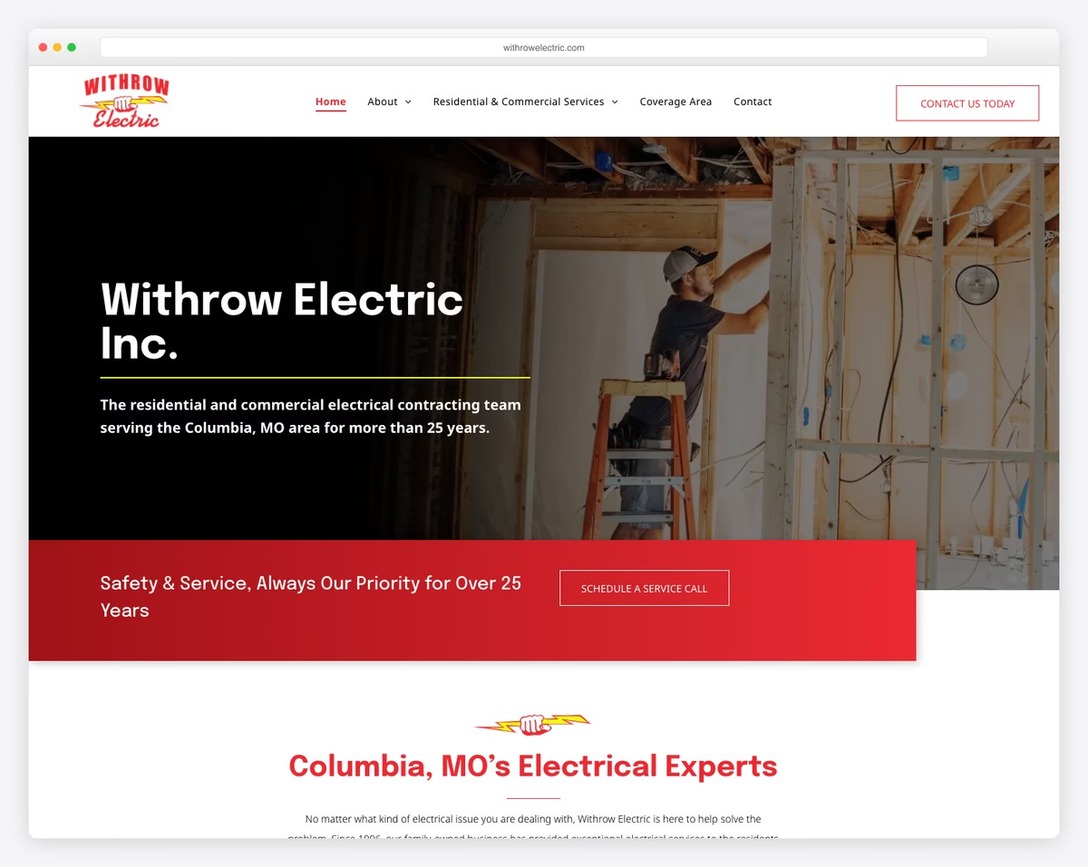
The menu lists jobs rather than a Services page: Inspections, Rewiring, New Construction, Electrical Panel Upgrade, each its own item, plus Coverage Area. Somebody searching for a panel upgrade can land straight on the panel upgrade page. The subheading names the town and the years in one sentence, and a red band under the hero carries the safety promise. The phone number is on the page but not in the first screen, which is the main thing to fix on an otherwise well-organised site.
What stands out: One menu item per job. It is the difference between one page competing for everything and five pages each competing for one thing.
19. High Class Electric
Built with: GoDaddy
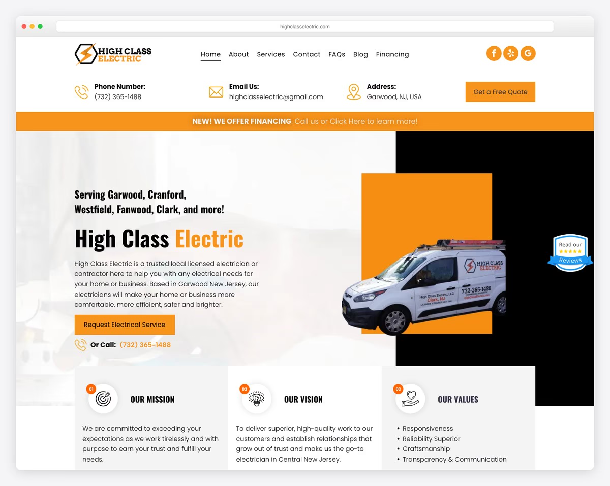
The quote form asks for “Your Town” — a field that exists because in New Jersey the answer decides whether the job is worth taking. The headline carries the search phrase and the credential together, naming the licence, the borough and the county in one line, and the licence number is published in full. The phone number appears three times in the first screen, once inside the menu bar itself. Financing and a FAQ both sit at top level. The weakness is that the orange and black hero has a great deal going on, and the trust signals compete rather than rank themselves.
What stands out: Asking for the visitor’s town inside the quote form. It qualifies the job before anybody picks up the phone.
What the nineteen palettes have in common
Read together the palettes are far more uniform than the nineteen designs are. Every swatch below is sampled from that site’s own screenshot, so this is what the trade actually looks like rather than what a colour theory article would recommend.
The ground — what the page sits on
The accent — what the buttons are painted
Thirteen of the nineteen carry a warm accent and seven of those are red, which is the single most common decision on this list. Blue and navy turn up almost as often but usually as a panel or body colour rather than the thing the buttons are painted. Thirteen sites use exactly one accent, four use two, one uses three and one uses none at all. The pattern is a black-and-white page with one loud colour on the phone number and the quote button, and almost nobody deviates from it.
Building an electrician website yourself
The useful finding from these nineteen is how little separates the effective sites from the rest. It is not budget, animation or photography. It is whether the six things above are present in the first screen, and most of them are a single line of text or a link.
What these sites are actually built on. Platform was detected from each site’s own markup and asset hosts rather than assumed. Eighteen of the nineteen gave a clear answer: eleven run WordPress, four are on Squarespace, and one each on Webflow, Duda and GoDaddy’s builder. More useful than the headline number: seven of the eleven WordPress sites are built with a page builder — two on Elementor, two on WPBakery, and one each on Divi, Beaver Builder and GeneratePress — while four run a theme with no builder at all. The sites that convert best are not the ones on the most capable platform.
Build the first screen first. In order, and none of it needs a designer: a tappable phone number in the header, the licence number written out in full, the towns you cover named individually rather than as a county, and one button for emergencies sitting beside a different-coloured button for planned work. Then a quote form of four fields, in the hero rather than at the foot of the page — one site in nineteen does that, and it is the clearest structural advantage on the list.
Then give each job its own page. The sites here that are easiest to find are the ones whose menus list jobs rather than a single Services page: panel upgrades, rewiring, EV chargers, inspections, each with its own URL. One page competing for everything loses to five pages each competing for one thing. If you want a running start on the design, our roundup of electrician website templates covers themes that already have this structure.
How we chose these
Opened every site
Each one loaded in a real browser at 1280×860 and judged from the live page, not from an old screenshot sitting in our media library.
19 checked · 1 found dead and replaced
Measured the first screen
Phone links, licence wording, service area, and every form with its field count read straight out of the page above the fold.
6 criteria · counted, not rated
Sampled the palette
Colours taken from each screenshot with the browser frame cropped off, then checked by eye so a hi-vis shirt could not pass as a brand colour.
4 photographic colours rejected
Detected the platform
Read from each site’s own markup and the asset hosts it loads from. Where nothing could be established we left it blank rather than guess.
18 of 19 confirmed
Two things are judgement rather than measurement, and worth stating plainly. Every site here belongs to an electrical contractor that is actually trading — no template demos, no agency mock-ups, no concept work lifted from design galleries. And the list is ordered for variety of approach rather than by rank: a one-page site for a sole trader and a multi-branch contractor site are solving different problems, and neither is the better design in the abstract.
Frequently Asked Questions
What platform are most electrician websites built on?
We checked what each site in this list actually runs by inspecting its markup, rather than guessing. Of the 19 sites here we could confirm 18: 11 run WordPress, 4 are on Squarespace, and one each is on Webflow, Duda and GoDaddy’s builder. The remainder gave no reliable signal. WordPress dominating is not an accident — most of these sites were built by a local agency, and WordPress is what local agencies build on.
What should an electrician website actually include?
A phone number that is visible without scrolling, your licence number, the areas you cover, photographs of your own finished work, and a quote form short enough to complete on a phone. Everything else is optional. The sites in this list that convert best are not the most elaborate ones — they are the ones that answer “are you legitimate, do you cover me, how do I reach you” immediately.
Does an electrician need a website if the work comes from referrals?
A referral still checks you online before calling. The website is not competing with word of mouth, it is confirming it — a referred customer who finds nothing, or finds a dead Facebook page, hesitates. That is the job a small site does even when it generates no search traffic of its own.
Should an electrician website list prices?
Most of these do not, and that is defensible — job scope varies too much for a fixed figure to be honest. What the better examples do instead is publish call-out rates, minimum charges or an hourly band, which sets expectations without pretending a rewire has a fixed cost. Silence on price is fine; a vague promise of “competitive rates” is not.
How many past jobs should the site show?
Enough to prove range, not so many that the page stalls. Six to twelve projects covering different work types — domestic rewire, consumer unit upgrade, commercial fit-out, EV charger install — does more than fifty near-identical photographs of consumer units.
Browse the other Home services & trades website examples (18 more collections), or see website examples for every industry.

Related Posts


Comments (0)