19 Best Chiropractic Websites For Design Inspiration 2026
No matter your profession, a great website can effectively promote your brand and help build a strong web presence. These chiropractic websites are impressive and useful if you’re a chiropractor who needs the inspiration to develop a strong online presence.
Chiropractic treatment is known to be safe and effective. Accordingly, it is proven to alleviate pain, depression and anxiety. In like manner, it also relieves muscle tightness, enhances blood flow, and even improves mobility. With the benefits of chiropractic treatment to the body, I see why this type of healthcare professional is in demand worldwide. Statistics reveal that chiropractors treat more than 35 million Americans (adults and children) annually in the United States alone. So, if you’re in this profession, building a website that will help you boost your career is lucrative. Having a website that will reveal your expertise as a trained and registered chiropractor and, at the same time, exhibit your amazing, practical chiropractic services is beyond measure.
We’ve handpicked these chiropractic websites to motivate experts in this treatment field. Here, you can find simple, comprehensive, creative, outstanding designs, a clean layout, better typography, and excellent web design features. Scroll through the list and grab the best concept you’d like to apply for your next chiropractic website projects.
Best Chiropractic Website Designs
1. The Joint Chiropractic
Made with ASP.NET, PHP and Bootstrap Frontend Framework
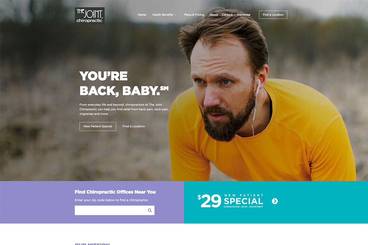
Chiropractic treatment is one of the best remedies for back pain, migraines, chronic pain, sciatica and other related diseases. It typically brings healing without surgery or medication. Hence, many people now consider for their health. Here’s The Joint Chiropractic, ready to make its brand prominent worldwide with its amazing chiropractic website. It can kindle the interest of fellow chiropractors to build their websites with professionalism and classiness. The hero header welcomes visitors with a nice tagline, full-width image background, and clear CTAs.
Meanwhile, the special offers section is pretty attractive and has vibrant colors. Furthermore, it also comes with cool features such as video integration for the brand’s introduction. Check out how awesome and inspiring this website is.
What stands out: A vibrant color palette creates energy and personality that sticks in visitors’ minds.
2. International Chiropractic Association
Made with Divi WordPress theme and Hosted with Godaddy
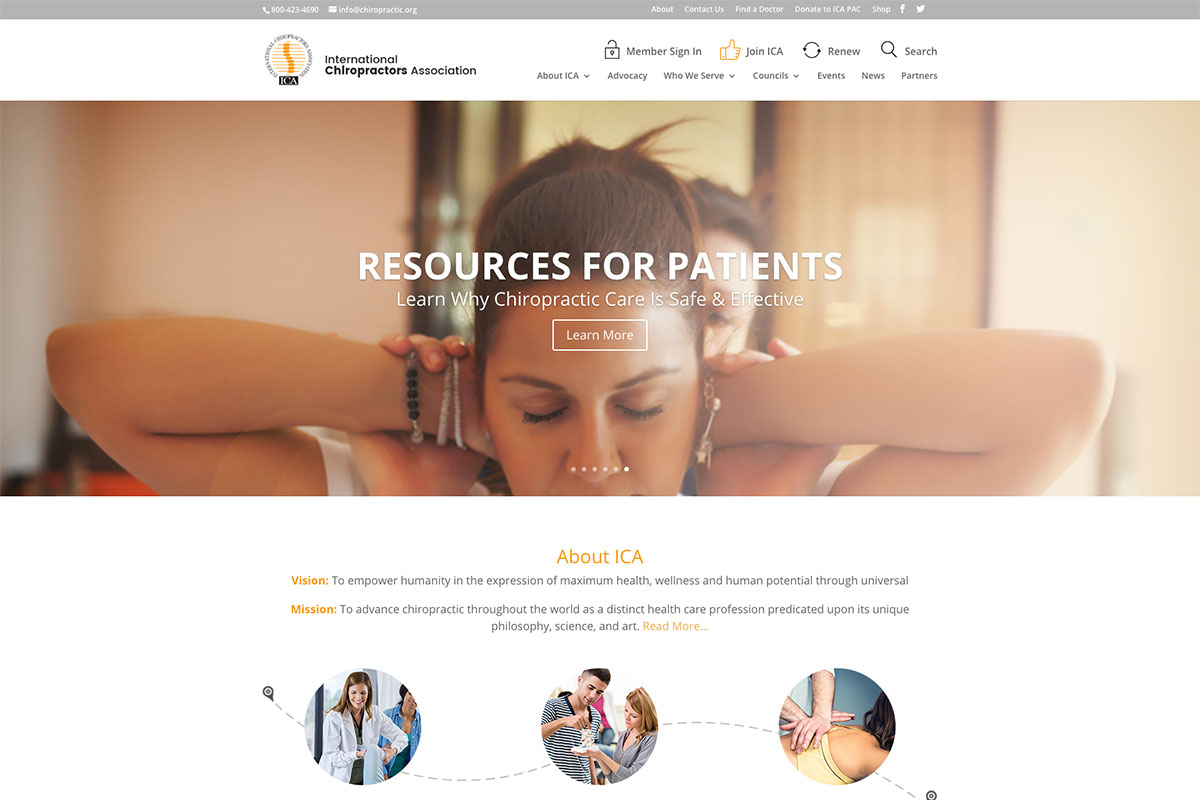
Chiropractors need a superb website to advertise their practical services online. It is easier for patients to know more about their business. Check out these chiropractic websites to stimulate and build a strong web presence. International Chiropractic Association has a nice and minimalist website design. Specifically, it highlights various images on the hero scene via a slider. While the elements are well organized, integrating the white space simply implies sophistication. In particular, the testimonials section also looks stylish with another smooth slider. For navigation, this website utilizes a sticky header and a drop-down menu, making it easier for visitors to access other content.
What stands out: A hero slider showcases multiple offerings at a glance, giving visitors quick access to key content.
3. Australian Chiropractors Association
Made with the default WordPress theme and hosted with Kinsta
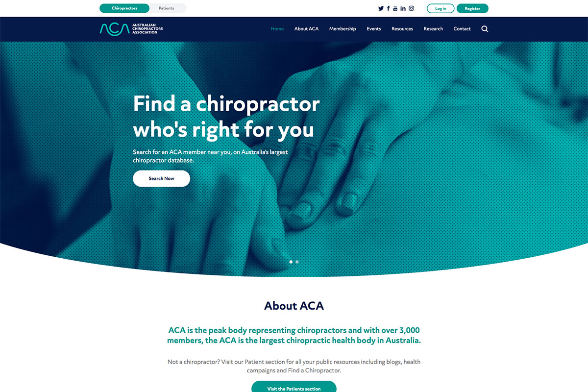
A website is an important digital marketing strategy that allows one to grow one’s business or profession. Here’s a list of chiropractic websites to help you build a nice, creative concept for your online presence. Australian Chiropractors Association is a magnificent manifestation of the brand’s expertise in chiropractic. The hero header has essential elements to boost conversions like the primary CTA, filtered images, and headlines. Meanwhile, the website utilizes consistent web elements such as rounded buttons, good typography, and color schemes. Those features truly improve the website’s appeal, and the white space, even more, makes it look seamless.
What stands out: A prominent search function helps visitors find exactly what they need without scrolling through pages.
4. MVP Chiro
Made with WordPress, Elementor and hosted with Godaddy
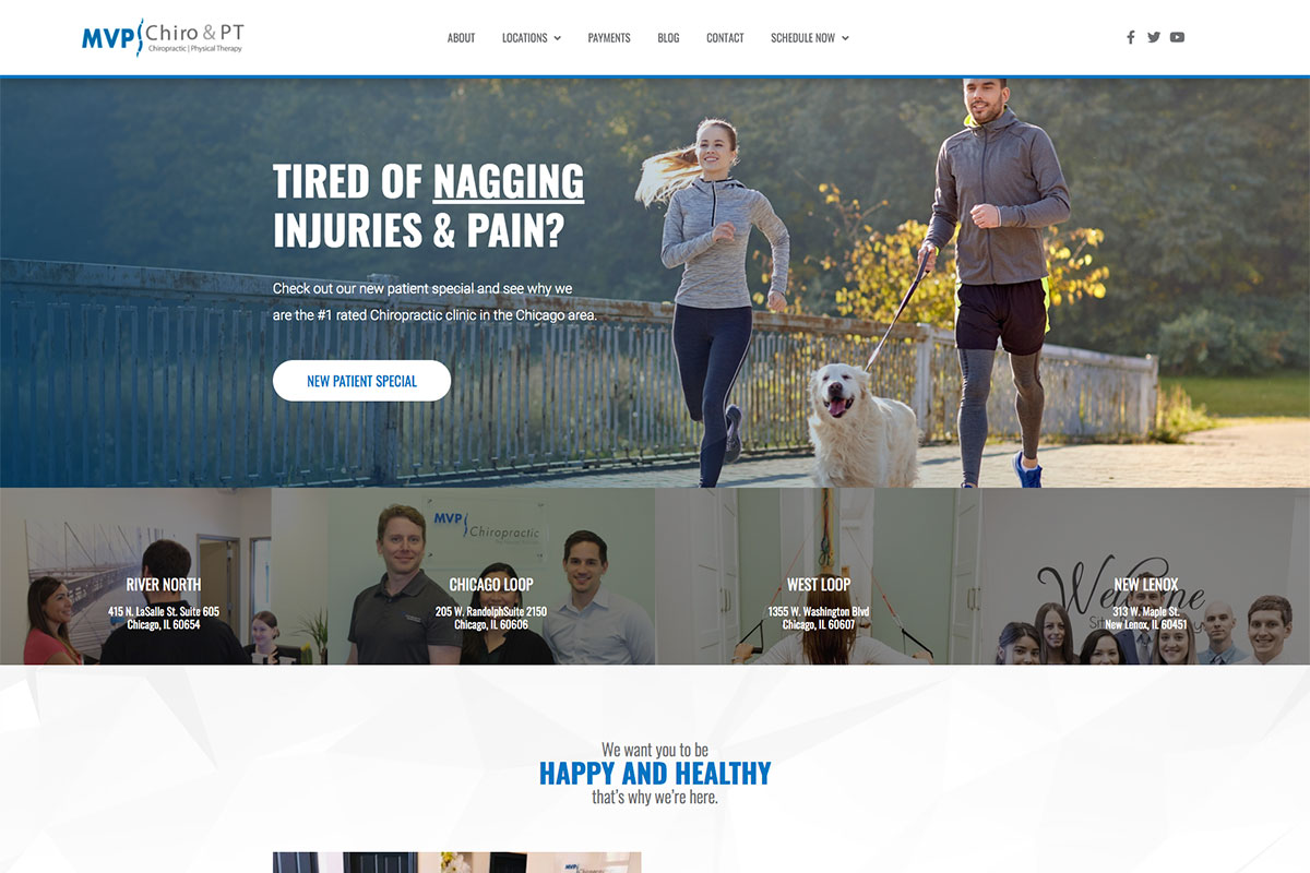
Chiropractic has been practiced in different places. And as a chiropractor, a good website should promote its awesome services worldwide. Here’s MVP Chiro, one of the clean and resourceful chiropractic websites to check upon finishing your chiro web design project. Its website welcomes visitors with a captivating headline and primary CTA on the hero header. Of course, the content would always look better if the website utilizes clear and quality images. That feature is well observed in the hero header, presentation of the different branches, testimonials, and others with this website. Furthermore, it also embraces the sticky header where the logo plays its vital role, menu, and social media icons.
What stands out: The background video creates an immersive first impression that immediately sets the mood.
5. Chiropractor’s Association of Saskatchewan
Custom-built PHP website hosted on Google Cloud
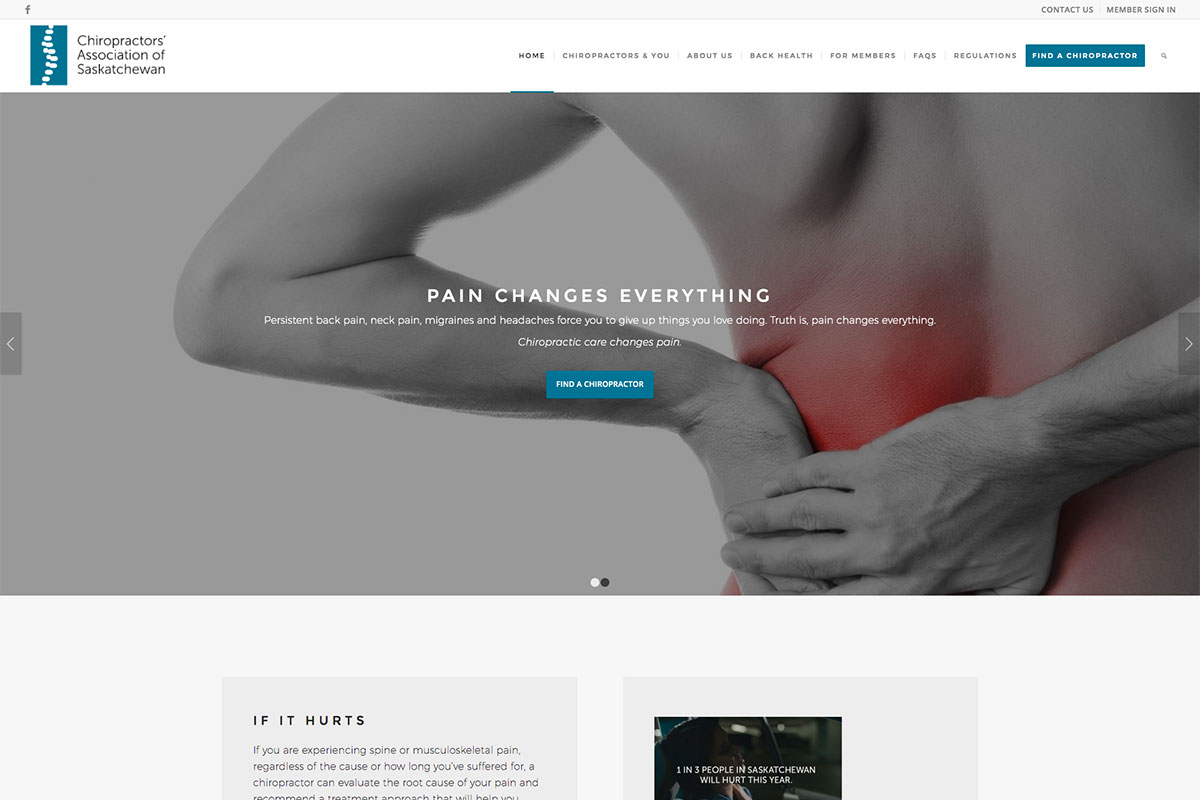
Back pains are a burden and needs to be cured. Thanks to chiropractic treatment that can help relieve such pains and other diseases. These chiropractic websites will provide ideas and design inspiration if you’re in this profession. This website elevates its brand as it utilizes a clean and minimalist layout. A better showcase of the images, taglines and CTAs is made possible with the slider in the hero scene.
What stands out: Parallax scrolling adds visual depth and encourages visitors to keep exploring.
6. Atlant Health
Website made with WordPress and Elementor Pro
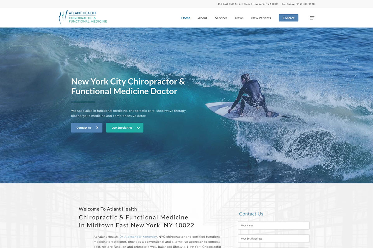
Specializing in functional medicine, Atlant Health is ready to provide its patients with the best chiropractic services and functional medicine. Its impressive website, elements, and features make the overall design visually appealing. The hero header is ready to impress the visitors from the captivating image, clear call-to-action buttons, and headlines. A clean and minimalist design is also used for the firm’s introduction, including an adequately labeled contact form. As services look more interesting and appealing with thumbnails added, Atlant Health never fails to add such attractive images. Other services also look clean and neat with ample white space and grids.
What stands out: Layered parallax effects create a sense of movement that makes scrolling feel dynamic.
7. Thrive
Website made with OceanWP theme and hosted with Godaddy
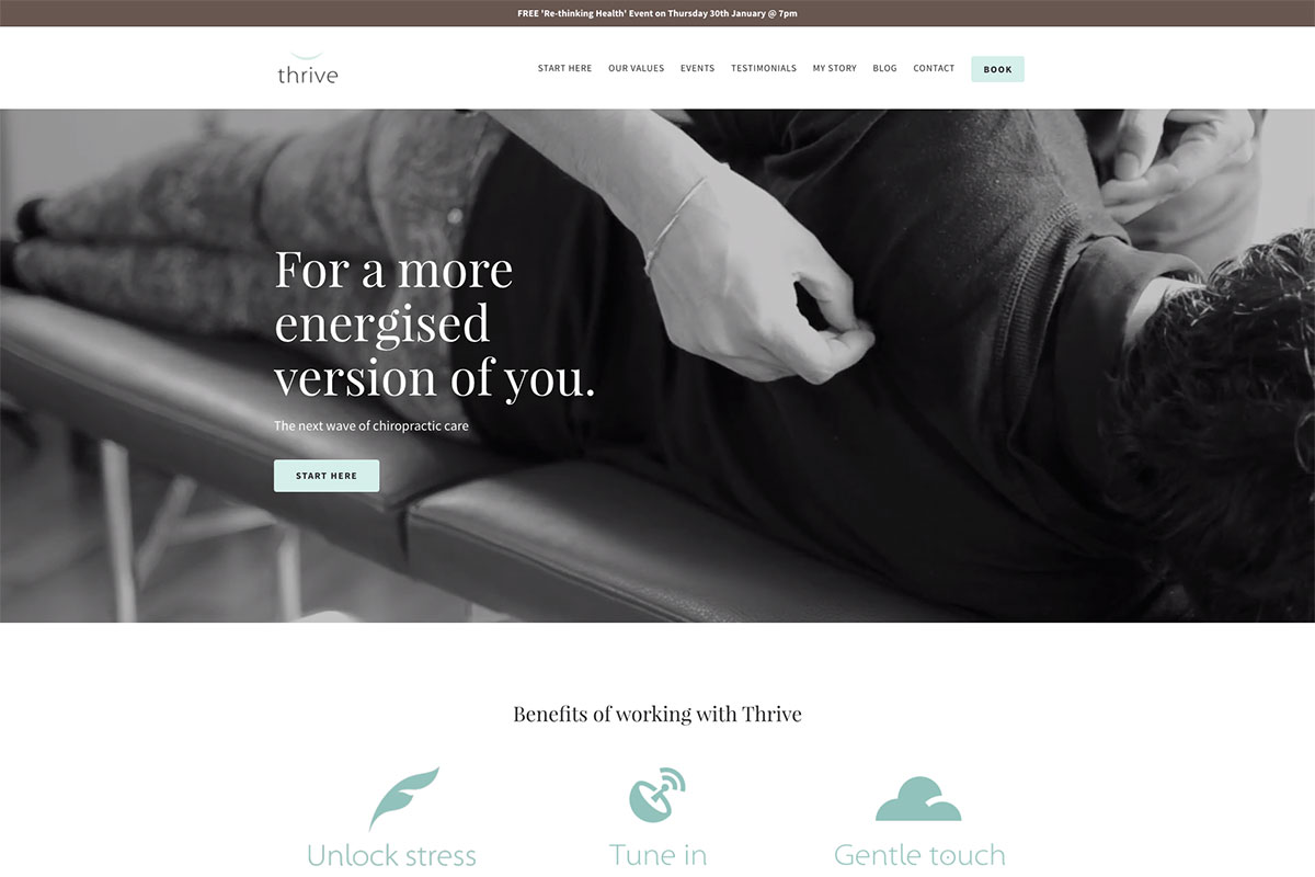
Videos are one of the most powerful and effective tools of visual communication. Likewise, video backgrounds are an effective strategy to capture visitors’ attention when used properly. Thrive, being a part of these chiropractic websites inspiration, has an impressive, monochrome video background on the hero scene. Your website must convey the message you wish to deliver to your audience. Thrive indicates its awesome benefits with a clean and neat layout. Using flat and simple icons and little descriptions makes such benefits look clear and appealing. Adding more videos makes content even more compelling, and this website exhibits such useful videos abundantly. To make the testimonials section stand out, this website uses large, black fonts to showcase it with simplicity.
What stands out: The image carousel keeps the above-the-fold area dynamic without requiring visitors to scroll.
8. ABC Chiropractic
Website made with Wix website builder
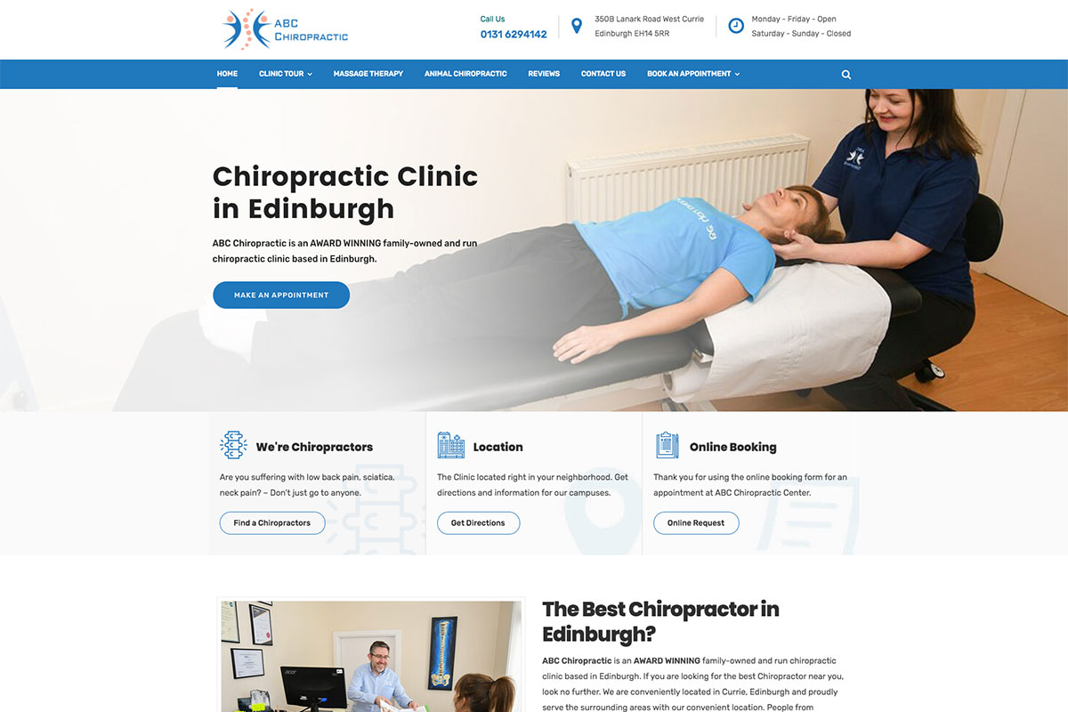
Websites may vary depending on the business or profession a brand tries to promote. But regardless of the product or service the brand offers, it must be well-designed and functional. For chiropractors, these websites are truly amazing to look at. ABC Chiropractic introduces its wonderful services with a professional and comprehensive website. Blue is the site’s primary color, and white space makes the design perfect.
What stands out: Built-in booking functionality turns the website into a 24/7 appointment scheduler.
9. Peace Haven Chiropractic
Made with Vaidy WordPress theme for chiropractors
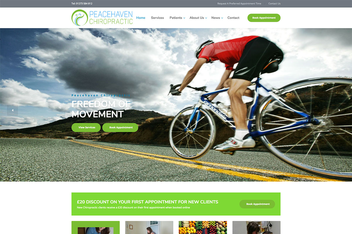
Do you offer timeless chiropractic services to those who need it most? If you do then you ought to spread your expertise worldwide. If you lack the stimulation, perhaps these chiropractic websites we’ve handpicked will never fail to impress you. Here’s Peace Haven Chiropractic website that stylishly presents its brand. Specifically, the hero header looks cool and refreshing, with a smooth slider highlighting the beautiful images, taglines, and corresponding call-to-action buttons. As special offers interest the audience, this website presents a vibrant section of that feature where a call-to-action is added.
Moreover, the services section has a neat and clean visual hierarchy. What’s more? The latest news is also seamless, with an amazing card design.
What stands out: Integrated appointment booking removes friction between browsing and converting.
10. Healing Hands Chiropractic
Made with Divi WordPress theme and Hosted with WP Engine
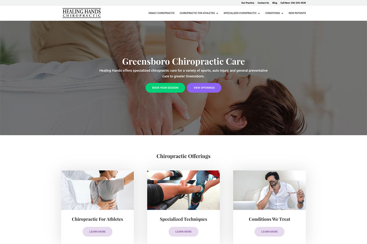
Chiropractic, when employed skillfully, is safe and effective. It can bring relief from chronic diseases and improve wellness. Hence, this profession needs a good website to improve career opportunities. Check out these chiropractic websites that we’ve collected to help you finalize your designs. Healing Hands Chiropractic has a clean and resourceful website that promotes its services with sophistication. Specifically, the hero header is a magnificent display of a quality image, eye-catching CTAs, and captivating headlines. Moreover, the presentation of the services section also looks awesome as it uses card design. This website includes more practical CTAs in different sections to drive more patients into this treatment.
What stands out: An embedded map makes it easy for visitors to find the physical location at a glance.
11. Ozark Clinic
Made with Physio WordPress theme. Hosted with Google Cloud
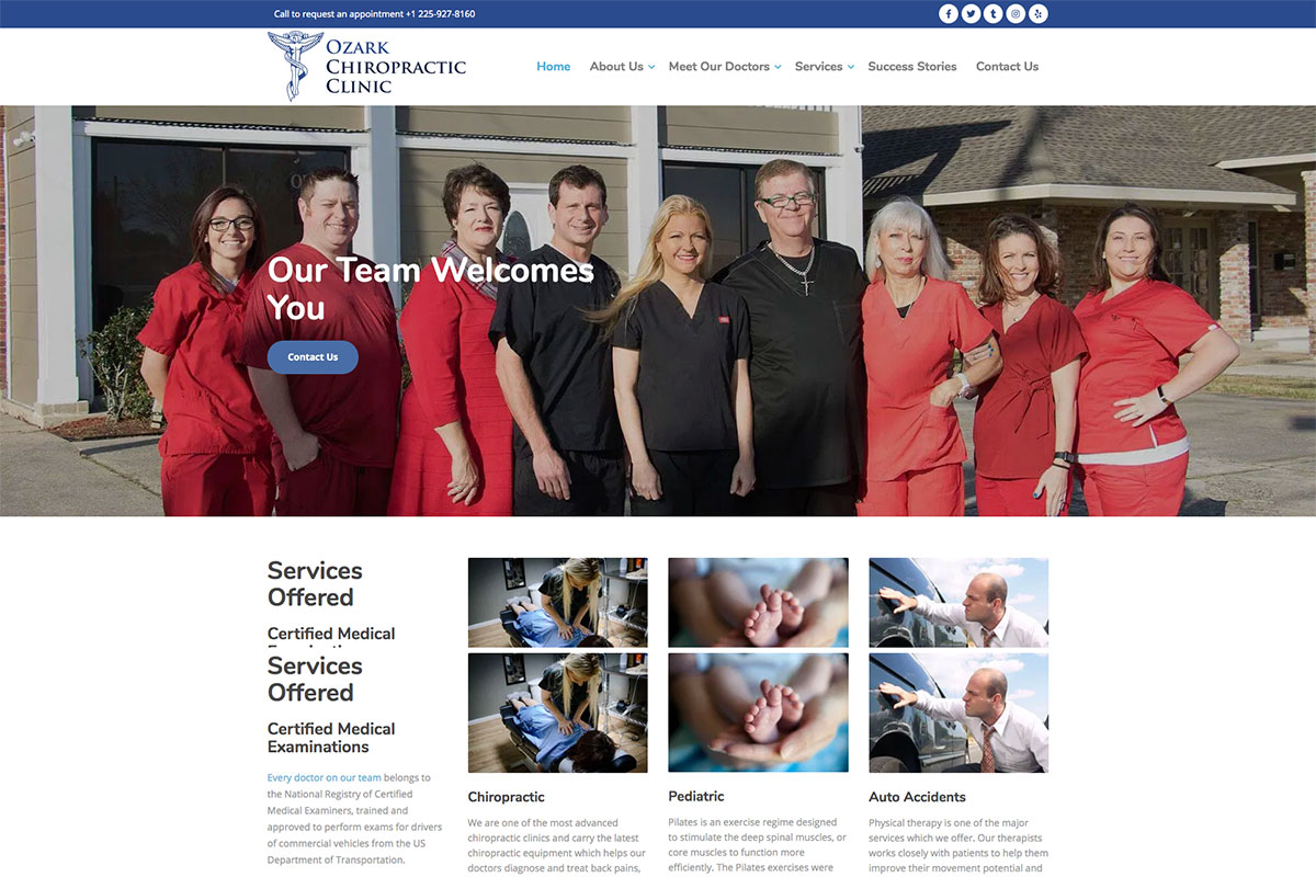
Modern and functional websites can boost the brand’s credibility online. Ozark Clinic comes with a superb chiropractic website. It has a nice and simple hero header with the necessary elements to introduce its brand across the web. Notably, the homepage has useful website elements combined to drive more patients effortlessly. The hero header looks welcoming, with the team’s photograph as a background image with a CTA. The services section is neat and organized, and the card design layout is great. The clean and properly labeled contact form makes this website more professional. That’s not all. The team section adds elegance and sophistication to the design with another set of card design elements. Other notable features include a parallax effect for another CTA, a slider for the testimonials, google map, social media icons, and accessibility.
What stands out: A masonry grid layout organizes content attractively while maximizing screen real estate.
12. Greystone Chiropractic
Website made with Squarespace website builder

The website color scheme is one of the most effective tools that brands must not ignore, as it can create a good audience impression. Therefore, picking the right color scheme is a must for all brands. Greystone Chiropractic uses blue as the site’s primary color, often denoting stability. Of course, the white space complements to that color scheme and helps deliver a clear and direct message to the audience. Trying to exhibit the best of their services, this website utilizes boxes representing each chiropractic service that overlaps the hero image. It also has super neat icons for the major insurances they accept in grayscale. Other useful features are the slider for testimonials, parallax effect, video integration, and practical CTAs.
What stands out: Full-screen video on the homepage draws visitors in before they even start scrolling.
13. General Chiropractic Council
Website made with ExpressionEngine and hosted with Cloudflare

When building your chiropractic website, the design and functionality must be seamless. This way, the brand can be represented well across the market. General Chiropractic Council has a straightforward but comprehensive design. In the hero header, the smooth slider complements the split-screen layout. With quality images and engaging headlines highlighted in that section, coupled with CTAs, this website can convert visitors into patients.
Furthermore, the website also has a nice and well-labeled form to help users find registered chiropractors. What’s more? The quality images with corresponding call-to-action buttons are perfectly arrayed in alternate positions. For the latest news, the articles also look interesting with a car design layout.
What stands out: Scroll-triggered animations guide the eye through each section without overwhelming the visitor.
14. Chirotouch
Website made with WordPress and hosted with Bluehost
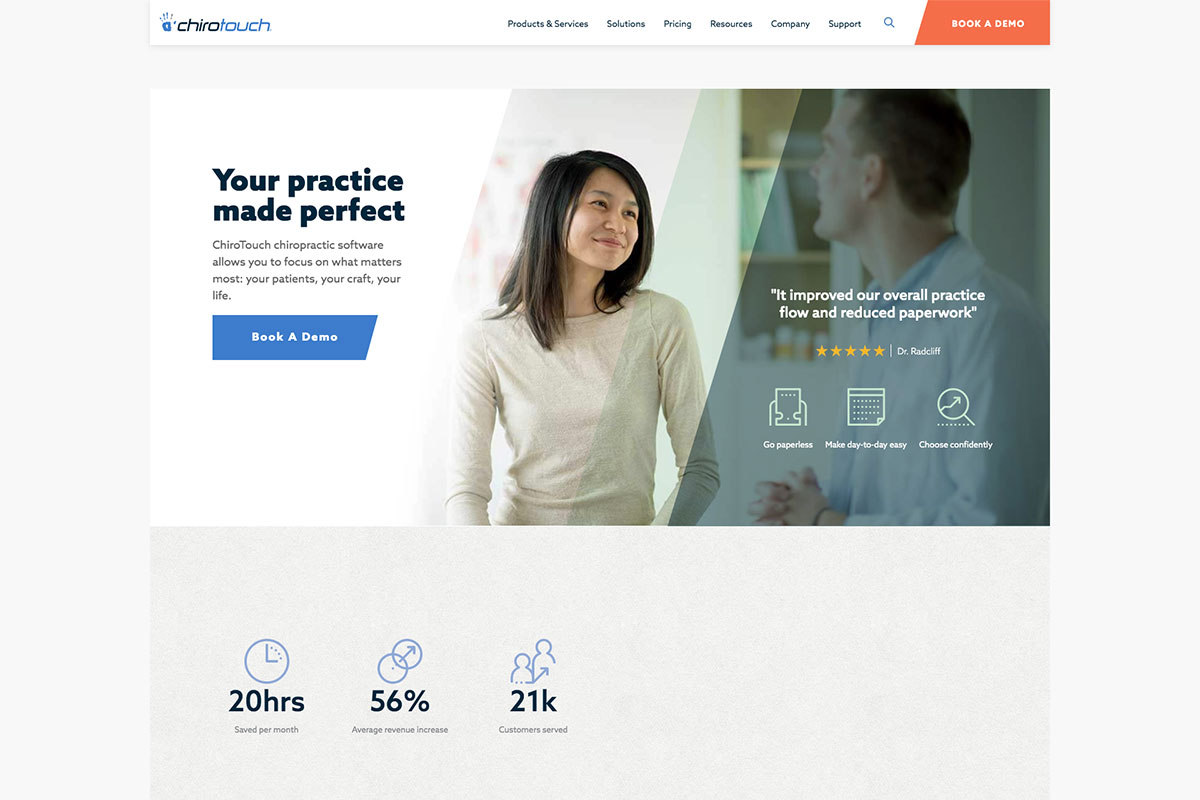
“Serve the profession, enable better outcomes”. With such a guiding principle, Chirotouch is committed to providing excellent software to the chiropractic profession. Its homepage is jampacked with modern and useful elements that make the message clear and professional-looking. The call-to-action buttons are necessary for audience conversion, and this website comes with ample CTAs in prominent spots. This chiropractic software displays the features with style and amazing hover effect and makes a good impression. It also includes testimonials that will effectively improve the brand’s reputation online. Moreover, the animation upon scrolling also adds elegance to the overall design.
What stands out: Client testimonials placed prominently on the homepage build trust before visitors even explore the services.
15. Calchiro
Made with Divi WordPress theme and hosted with InMotion hosting
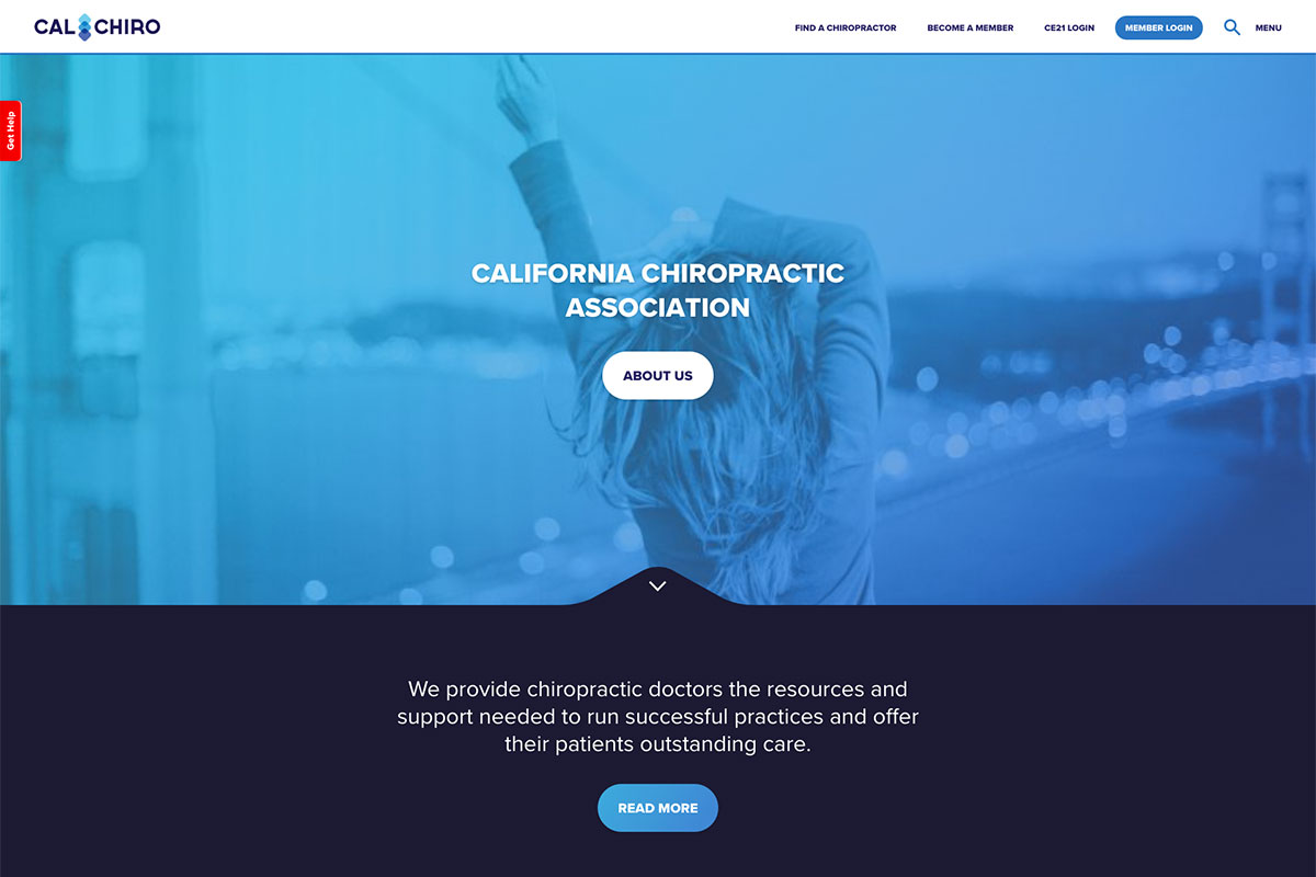
A good website is needed to stay competitive, especially in this modern era. With these chiropractic websites, skilled chiropractors will have ideas for improving their website design and generating more leads. Calchiro is a minimalist and elegant website dedicated to chiropractic treatment. It makes use of the sticky header to provide ease of navigation. The logo, menu, and search function are visible on the hero header. It also comes with minimal content on the homepage organized in various website sections. Furthermore, this website also uses the card design to showcase upcoming events professionally.
What stands out: The minimalist design keeps the focus on what matters most — the content itself.
16. The Chiro Guy
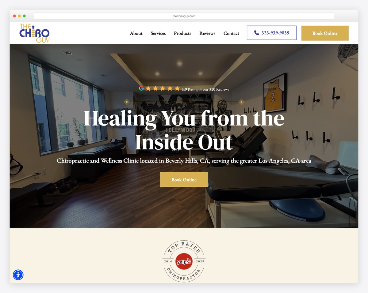
The Chiro Guy uses a sophisticated navy blue and gold color scheme with DM Serif Display headings. Based in Beverly Hills, the design conveys luxury wellness with carousel testimonials highlighting 11 consecutive years of top ratings.
Service pages detail treatment specialties with patient education content, while the premium aesthetic matches the high-end Beverly Hills clientele.
What stands out: The navy and gold palette with serif headings positions chiropractic care as a luxury wellness service rather than a clinical medical visit.
17. Bergen Chiropractic
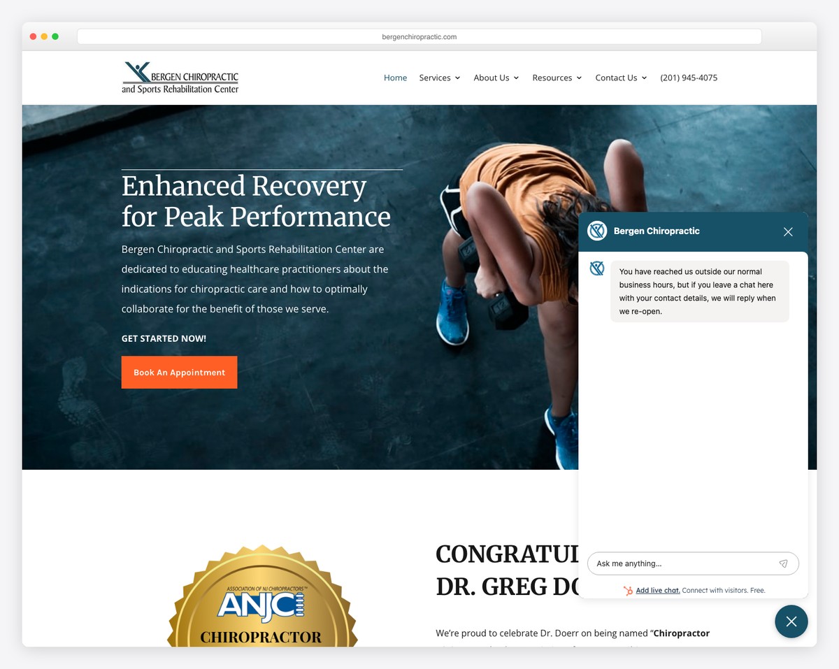
Bergen Chiropractic presents a professional healthcare layout with blue accent palette and structured FAQ sections. Built with Divi, the site includes local business schema markup for strong local SEO presence in Cliffside Park, NJ.
The comprehensive FAQ sections address common patient questions upfront, reducing appointment anxiety and building trust before the first visit.
What stands out: Structured FAQ sections that address patient concerns proactively show how content-rich design can serve both SEO and patient education simultaneously.
18. Chiro London
Built with: Squarespace
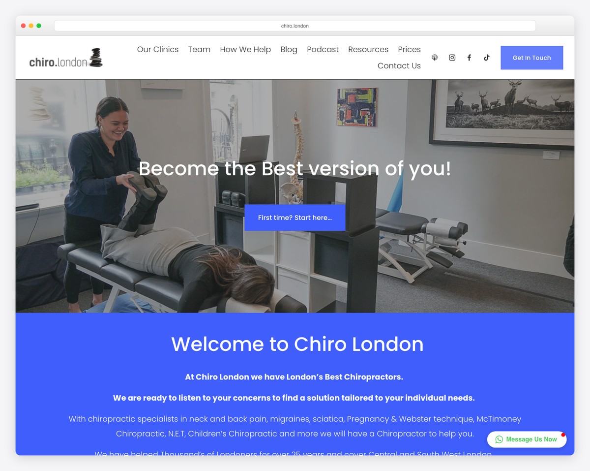
Chiro London is a multi-location chiropractic group with a modern, content-rich layout. The site integrates blog posts, social media feeds from Instagram, TikTok, and Apple Podcasts to build community engagement.
Prominent “Book your first visit” CTAs appear throughout the content-heavy pages, ensuring conversion opportunities are never more than a scroll away.
What stands out: Integrating social media content (Instagram, TikTok, podcasts) directly into the site creates a content ecosystem that builds trust through multiple touchpoints.
19. SF Chiro
Built with: Squarespace
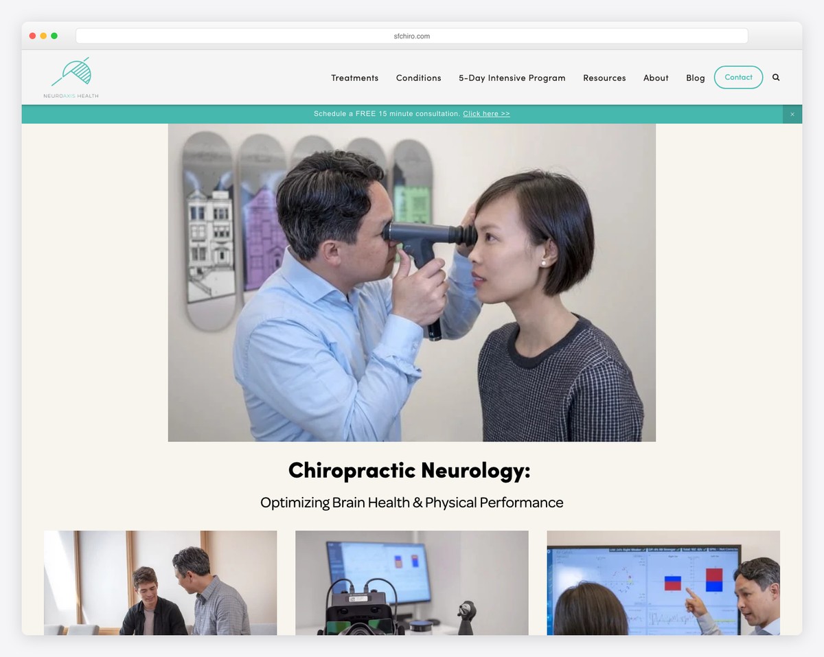
SF Chiro (NeuroAxis Health) specializes in chiropractic neurology, with feature cards highlighting specialized treatments for concussions, spine decompression, and vertigo. Free consultation CTAs and integrated Yelp reviews build credibility.
The specialty-focused approach helps patients with specific conditions find relevant treatment information quickly, differentiating from general chiropractic practices.
What stands out: Specializing in chiropractic neurology and featuring condition-specific treatment cards helps this practice stand out from general chiropractic clinics.
Related Posts

Comments (0)