
27 Best General Contractor Website Examples 2026
Twenty-one of the twenty-seven general contractor websites below link to a portfolio. Eight have a phone number in the first screen.
That inversion is the story. Across four other trades we have measured the same way — plumbing, electrical, HVAC and landscaping — the phone number is the first thing on the page. General contractors are the exception: they lead with the buildings and make you look for the number. It is a defensible choice for referral-led work and an expensive one for anybody hoping to be found.
What we looked for
Nobody hires a general contractor in a panic. A build is chosen over weeks, usually from a shortlist that arrived by referral or through an architect, so the checks below are weighted toward what a considered buyer needs — the work, the money, the licence — rather than what an emergency caller needs.
The eight things we checked, and how contractors compare with four other trades
Measured in a browser at 1280×860. Counts, not opinions.
| What we checked | Sites | What the number tells you |
|---|---|---|
| Links a portfolio of built work | 21/27 | The highest of any trade measured, and correctly so — the buildings are the argument. |
| Pricing or budget mentioned | 12/27 | Better than landscaping, worse than HVAC. The best of them admit there is no average price rather than dodging. |
| Tappable phone anywhere | 14/27 | Thirteen sites have no clickable number at all. |
| Service area named | 9/27 | Eighteen never say where they build. |
| Phone above the fold | 8/27 | The lowest of any trade. Plumbers manage sixteen of eighteen. |
| Enquiry form on the homepage | 7/27 | Between 2 and 6 fields where one exists, which is admirably short. |
| Licence or insurance stated | 5/27 | The lowest of any trade, on the largest purchase any of them sell. |
| Enquiry form above the fold | 0/27 | None. |
Five trades, the same measurement. Contractors are last on contact and first on portfolio:
| Criterion | Plumbers | Electricians | HVAC | Landscapers | Contractors |
|---|---|---|---|---|---|
| Phone above the fold | 16/18 | 10/19 | 25/30 | 9/19 | 8/27 |
| Licence stated | 13/18 | 12/19 | 20/30 | 5/19 | 5/27 |
| Service area named | 13/18 | 10/19 | 24/30 | 4/19 | 9/27 |
| Links a portfolio | — | — | — | 13/19 | 21/27 |
The pattern across all five is consistent: the more urgent the trade, the more prominent the phone number. A burst pipe is dialled, a heating failure is dialled, an extension is researched. What is harder to defend is the licence: five of twenty-seven state one, on the most expensive thing any of these trades sell.
Best General Contractor Website Examples
Table of contents — all 27 contractor websites
- Blue Divide
- NOVO Construction
- Allstate General Contractors
- Domus Custom Builders
- Beasley Construction & Associates
- Never Stop Building
- C2 Construction
- A & K General Contractor
- Tri-State General Contractors
- Keen Building Company
- KC Remodel & Repair
- Letter Four
- Evans Construction
- Honest Renovators
- Southtide Construction
- MIR Homes
- Siena Construction
- West Village GC
- Pryor Construction
- Grunley Construction
- Schimenti Construction
- Tuckman-Barbee Construction
- DC Builders
- Castle Homes
- Scott Simpson Design + Build
- PCL Construction
- Vitruvius Built
1. Blue Divide
Built with: Squarespace
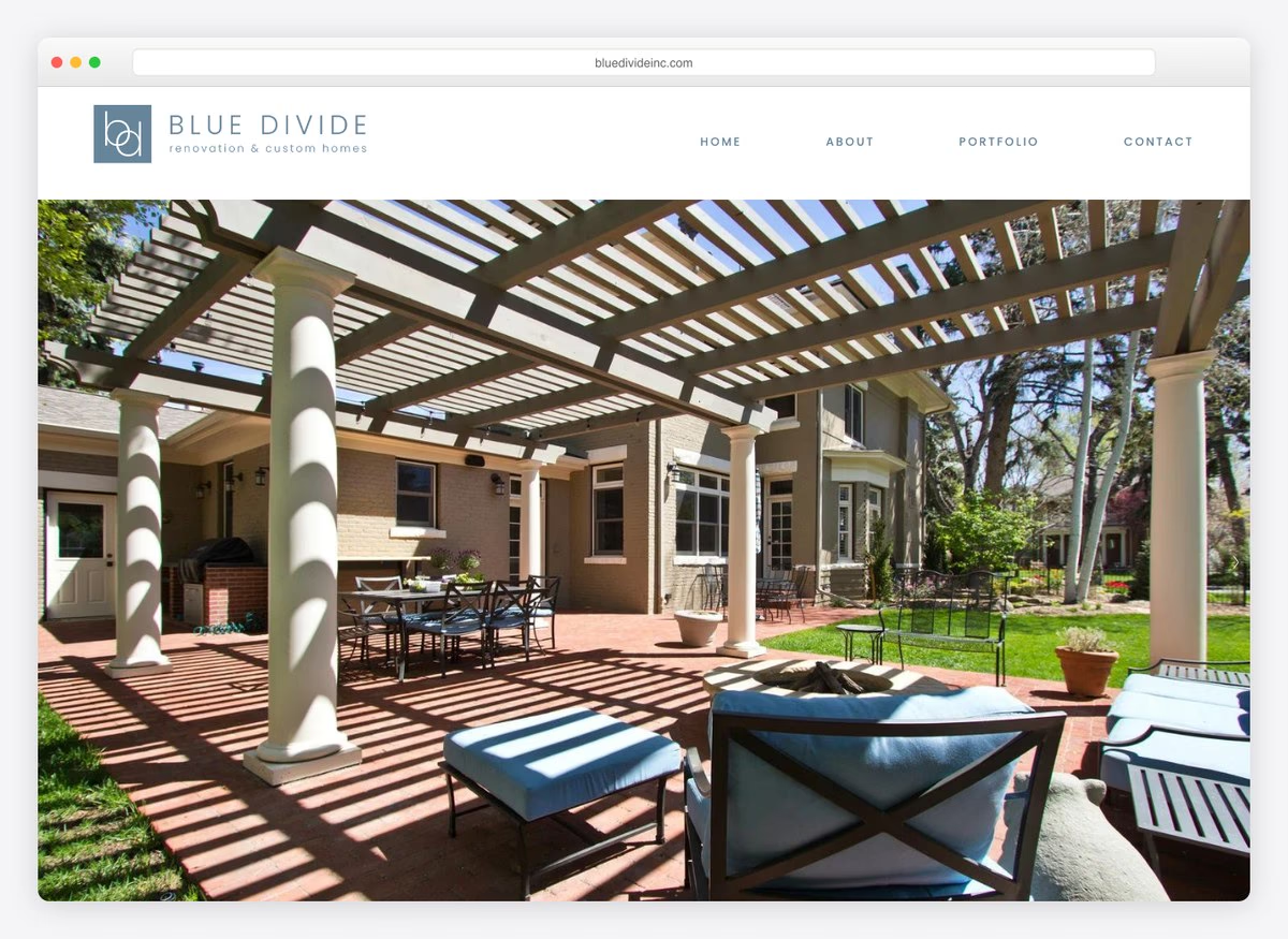
Four words in the navigation and a portfolio doing all the work. This is a firm that vets and assembles subcontractors rather than swinging hammers itself, and the copy says so. There is no phone number in the opening screen and no enquiry form — the assumption is that anyone serious will reach the contact page, which for referral-led construction is often true and is still a risk.
What stands out: A four-item menu with the portfolio second. When the work is the argument, everything else is a distraction.
2. NOVO Construction
Built with: Squarespace
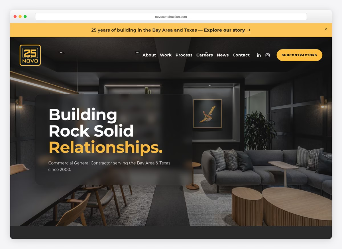
The contractor licence number is published in full, which five of these twenty-seven do, and the positioning line names both the sector and the two states served. The menu is organised by client type rather than by service — corporate interiors, professional services, a named region — which is how a commercial developer picks a shortlist. Leadership and Community both get pages, because on projects this size the buyer is choosing a firm, not a trade.
What stands out: A menu organised by client type. Commercial buyers shortlist on sector experience, not on capability lists.
3. Allstate General Contractors
Built with: Squarespace
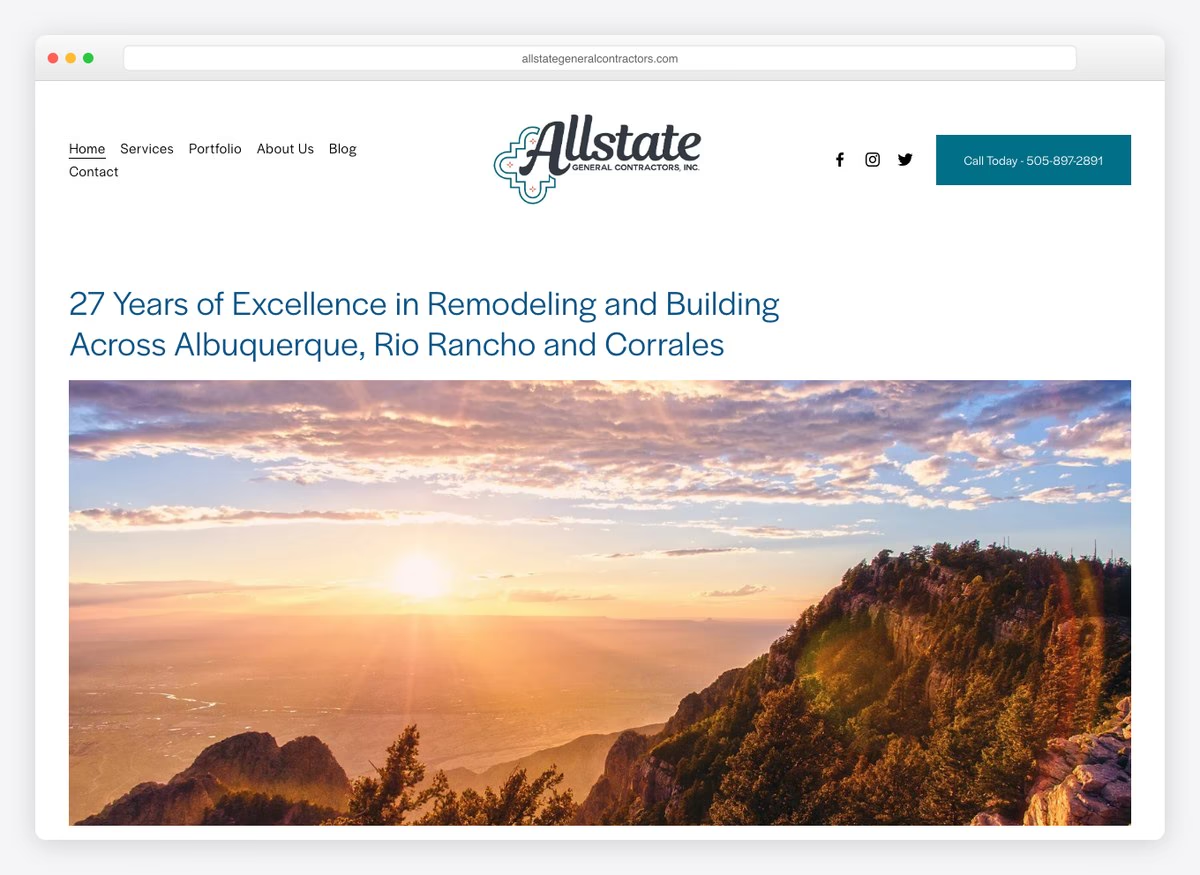
The headline carries the years and three named towns, which is more specific than any other site here and exactly what a homeowner searching locally needs. Below it the menu splits by job rather than by trade: kitchen remodels, bathroom remodels, flooring, new construction, each its own page and each its own search. A phone number sits above the fold, which only eight of these twenty-seven manage.
What stands out: Three towns in the headline. Most contractors claim a region; naming the actual places is what a local search rewards.
4. Domus Custom Builders
Built with: Squarespace
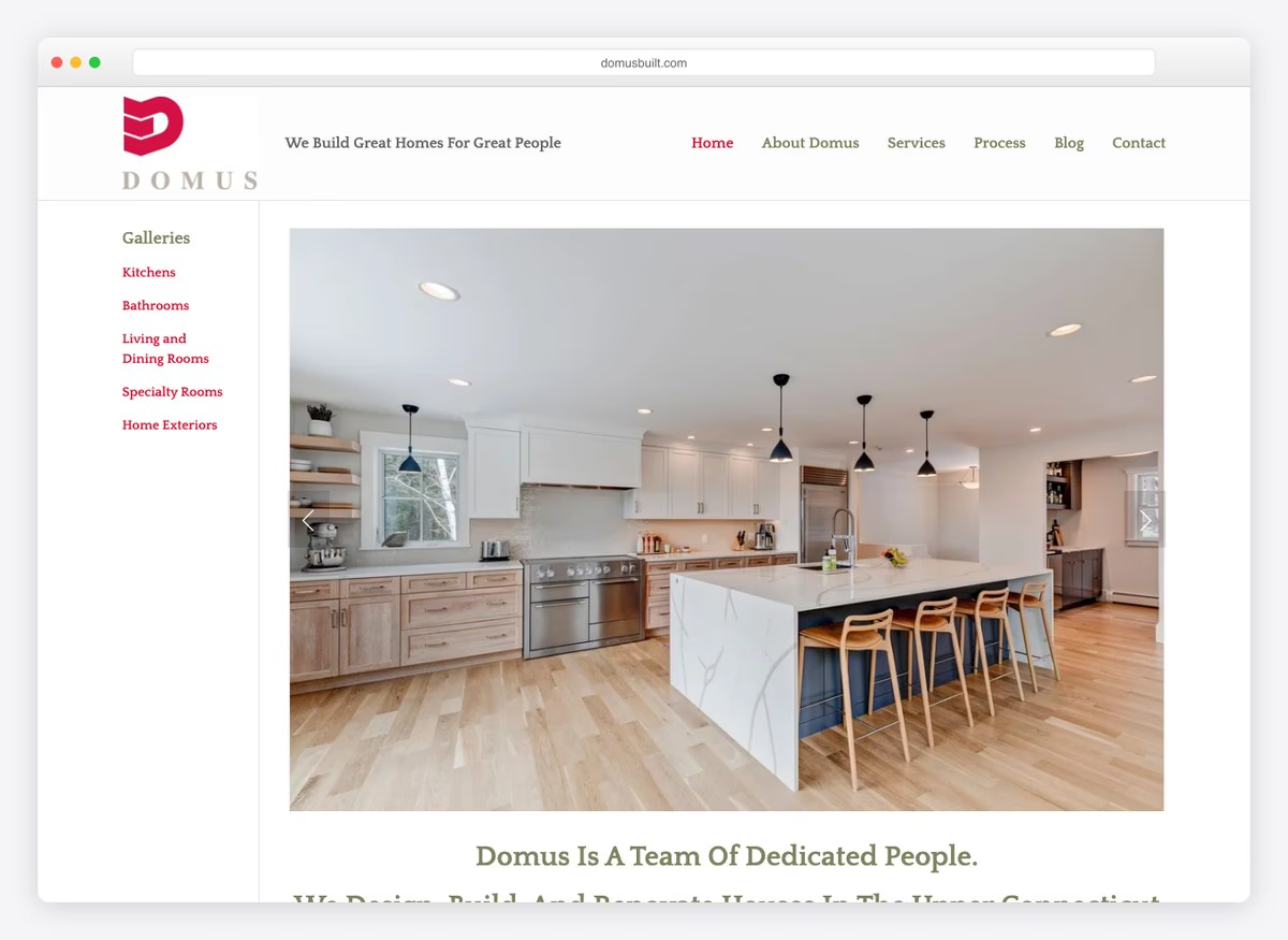
The most honest sentence on this list is in the copy here: on a custom home or an addition, there is really no such thing as an average price. Saying that plainly does more for trust than a fake range would, and it pre-empts the question every visitor arrives with. The site leans on the team rather than the buildings — the headline is about people — and there is no portfolio link in the opening screen, which is the one thing missing.
What stands out: Admitting there is no average price. It answers the unaskable question honestly instead of dodging it.
5. Beasley Construction & Associates
Built with: Squarespace
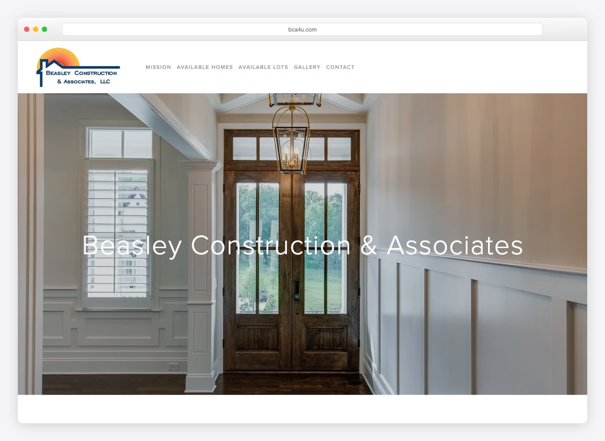
Two menu items reveal a different business from everyone else here: Available Homes and Available Lots. This builder is selling inventory as well as services, which changes the visitor from someone commissioning a build to someone shopping for one. The rest is conventional — mission, gallery, contact — and the inventory pages are the reason to visit.
What stands out: Selling available homes and lots alongside the service. It converts a browser into a buyer without a consultation.
6. Never Stop Building
Built with: Squarespace
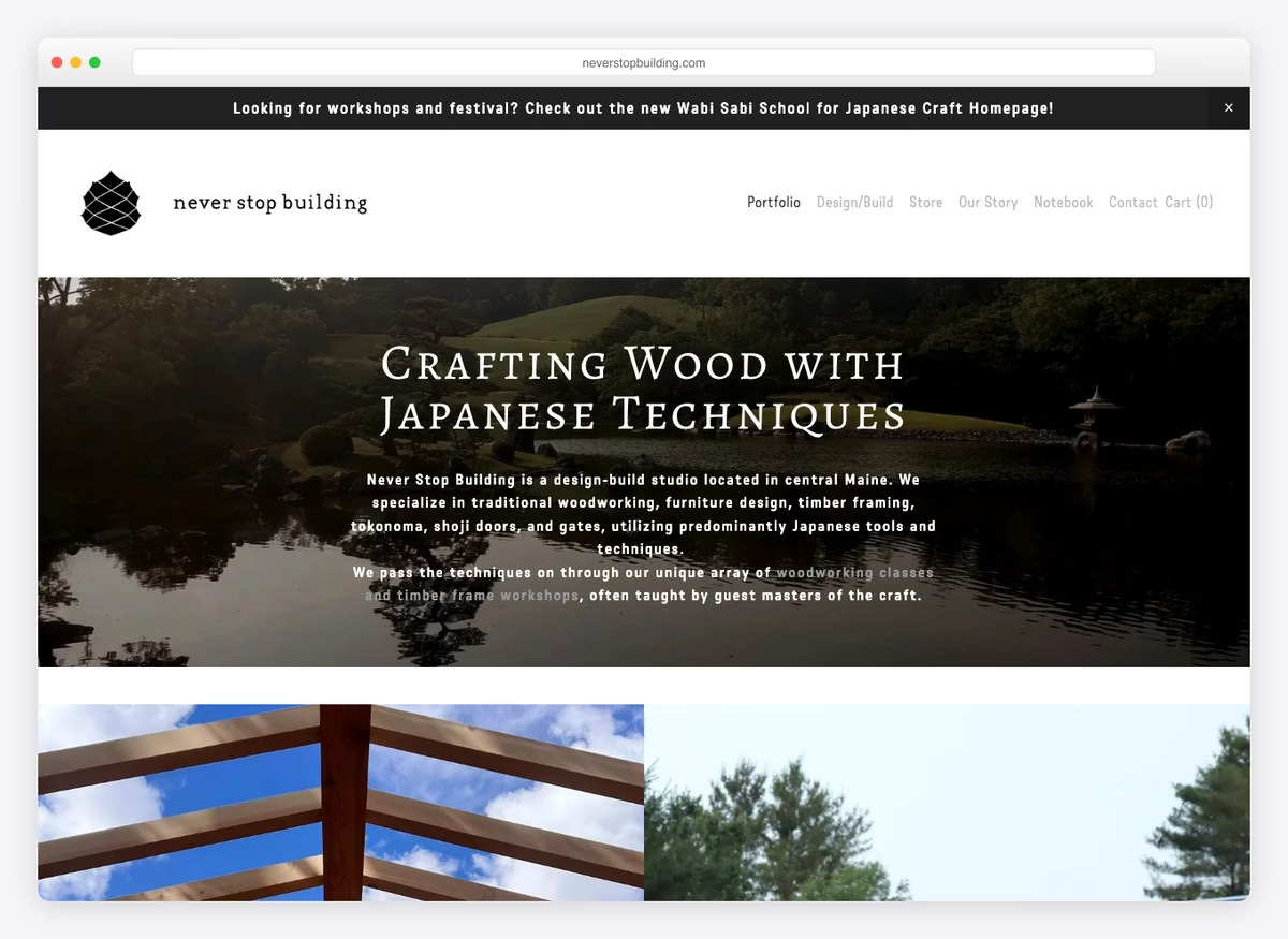
“Crafting wood with Japanese techniques” is the most specific positioning on this list by a distance, and it does the filtering that a generic design-build headline cannot. The menu carries Our Process, a Store and a Notebook, which together describe a studio with a point of view rather than a contractor with capacity. It is a small business making itself impossible to compare on price.
What stands out: A headline nobody else could write. Specific craft positioning removes the firm from the price comparison entirely.
7. C2 Construction
Built with: Squarespace
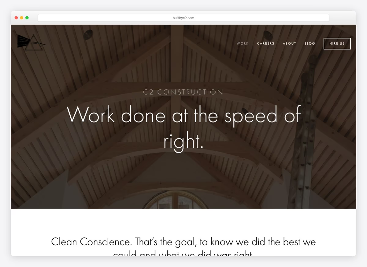
The call to action is Hire Us, not Contact, and the headline is a paragraph about doing right by the client rather than a claim about quality. Careers sits second in a six-item menu, ahead of About — in commercial construction the constraint is people, and the site allocates space accordingly. There is no portfolio link in the opening screen, which for a firm whose menu starts with Work is an odd omission.
What stands out: “Hire Us” instead of Contact. It names the transaction rather than the mechanism.
8. A & K General Contractor
Built with: Wix
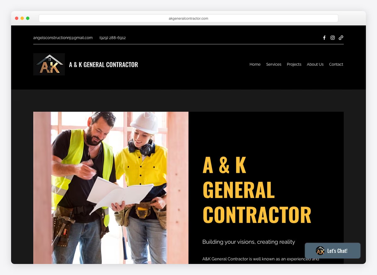
A plain five-item site: home, services, projects, about, contact. The copy claims competitive pricing and management tailored to the project, which is what most contractors say. Nothing here is wrong and nothing is memorable, which makes it a useful control — it is what the category looks like when a firm treats the website as an obligation rather than a tool.
What stands out: A reminder of the baseline. Competent and forgettable is the default this category has to beat.
9. Tri-State General Contractors
Built with: Wix
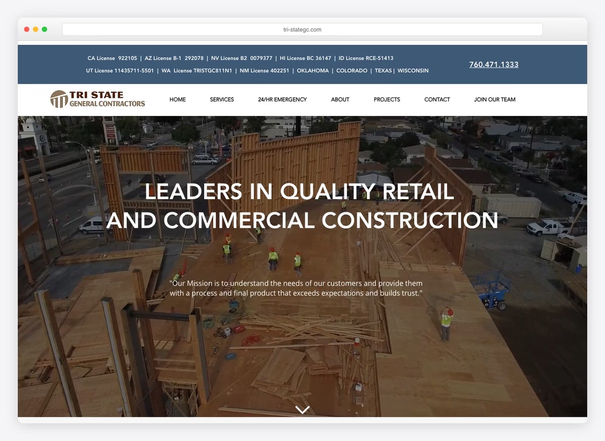
The headline is five state licence numbers — California, Arizona, Nevada, Hawaii and Idaho — followed by the phone number. Nothing else. For a contractor doing corporate rollouts across state lines that is precisely the qualifying information, and putting it where the slogan usually goes is the boldest decision on this list. The menu backs it with construction management, pre-construction and design-build as separate services.
What stands out: Licence numbers as the headline. For multi-state rollout work it is the only fact that decides whether the call happens.
10. Keen Building Company
Built with: Wix
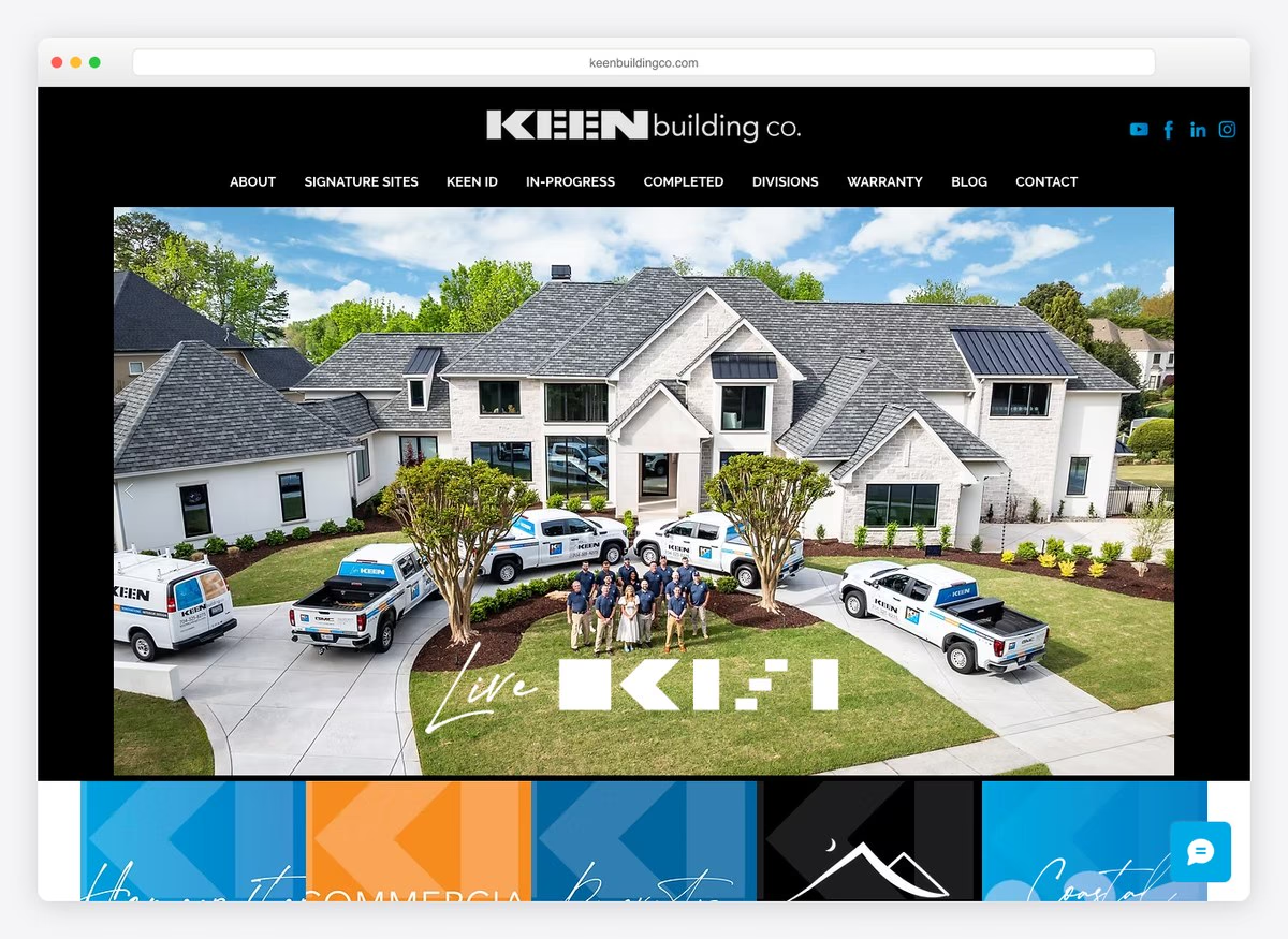
A custom builder selling its estimating technology: the copy claims tools that predict pricing and materials to a level of detail most firms cannot, and the menu carries Our Process, an FAQ and two named proprietary systems. That is a builder trying to make an opaque purchase legible, which is the right instinct. The enquiry form asks five fields and requires all five, which pulls in the other direction.
What stands out: Selling the estimating process as the product. On a custom build, predictability is worth more than craftsmanship claims.
11. KC Remodel & Repair
Built with: Squarespace
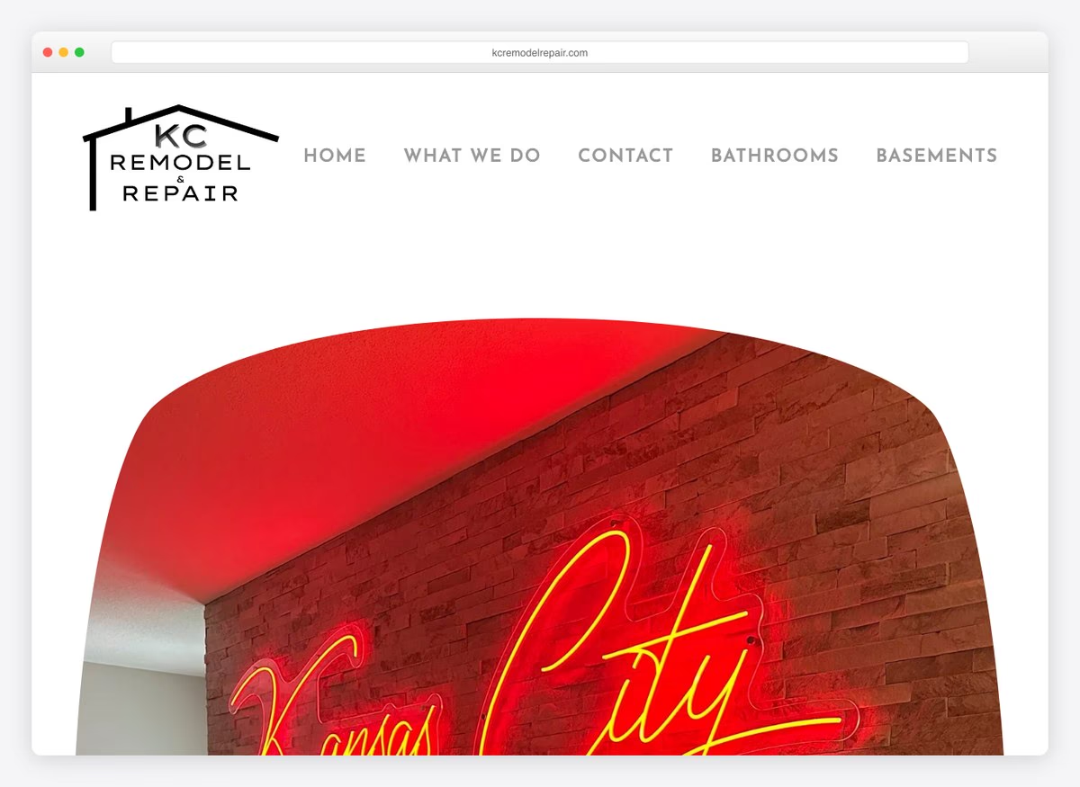
Three items in the menu and two service pages behind them, bathrooms and basements. This is a small remodelling business that has resisted the urge to claim everything, and the narrowness reads as competence rather than limitation. There is no phone number above the fold, no portfolio link and no form — the site is a business card, and for a firm running on word of mouth that may be enough.
What stands out: Claiming two rooms rather than every trade. Narrowness reads as specialism when the alternative is a list nobody believes.
12. Letter Four
Built with: Webflow
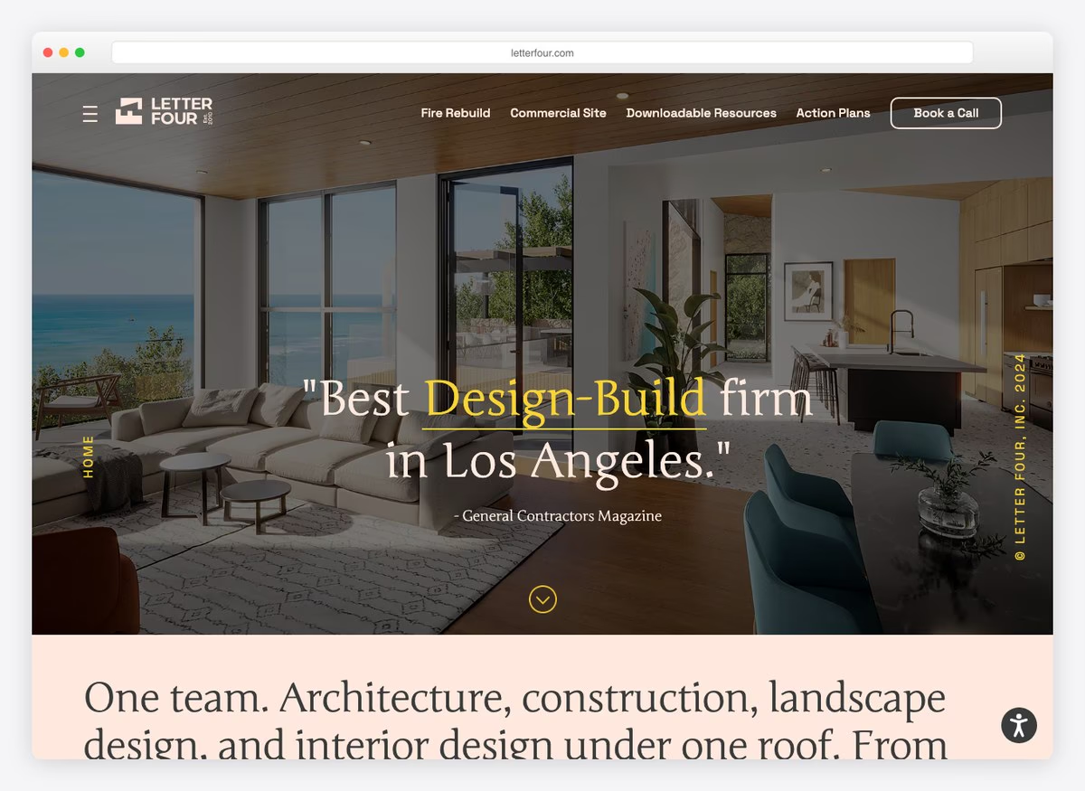
The founders are a licensed architect and a licensed general contractor, stated plainly, which is the whole pitch for a design-build firm and settles the question of who is responsible when drawings meet a site. The copy goes directly at pricing anxiety, asking whether previous contractors gave straight answers on what plans would actually cost. The enquiry form asks two fields.
What stands out: Naming both licences held by the founders. Design-build lives or dies on who carries the risk, and this answers it in one line.
13. Evans Construction
Built with: Webflow
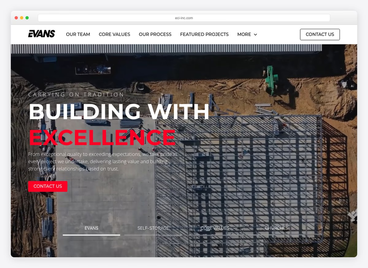
A general contractor with a declared speciality — self-storage — given equal billing with the general headline. Picking a building type is how a mid-sized commercial firm escapes bidding against everyone, and the menu supports it with a process page and featured projects. The form asks six fields and requires all six, which is heavy for a first contact on a commercial enquiry.
What stands out: Naming a building type as a speciality. Self-storage developers search for self-storage builders, not for general contractors.
14. Honest Renovators
Built with: Webflow
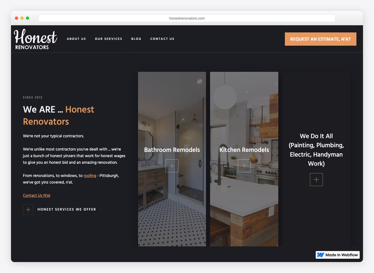
The company name is the promise and the headline repeats it, which is the entire positioning: renovation is a category where the fear is being taken advantage of, and leading with honesty targets that directly. The enquiry form asks two fields. The site is small and the argument is single-minded, which suits a residential remodeller competing against contractors people already distrust.
What stands out: Making the trust objection the brand. In remodelling the fear is not quality, it is being taken advantage of.
15. Southtide Construction
Built with: Webflow
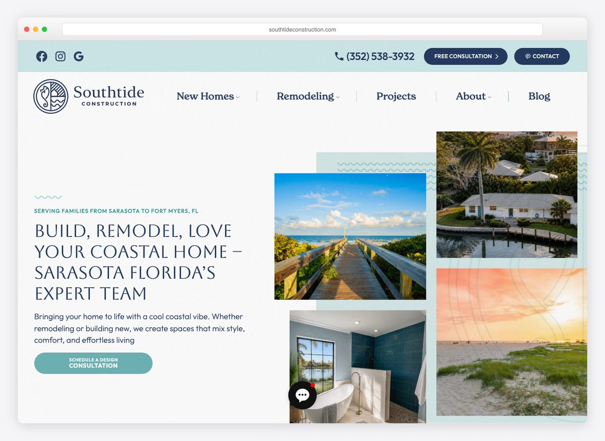
The menu lists named house plans — five of them, each after a local island or key — which turns a custom build into something browsable. Alongside them sit remodelling services split by room. The headline names the region and the promise together, and the service area is stated as a route between two cities rather than a vague coastal claim. A phone number sits above the fold.
What stands out: Named house plans in the menu. It gives a custom builder something to show before a consultation, which is otherwise impossible.
16. MIR Homes
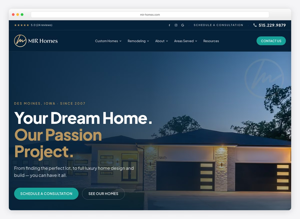
Areas Served has its own menu item, the phone number appears twice above the fold, and the site offers a designer-selected finish upgrade for booking a consultation — an actual incentive attached to the conversion step, which nobody else here does. The headline is warmer than the category norm and the menu splits custom homes from remodelling cleanly.
What stands out: An incentive attached to the consultation. A finish upgrade costs the builder little and converts a browser into a booked meeting.
17. Siena Construction
Built with: WordPress
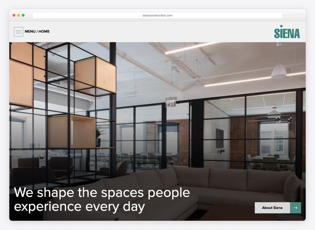
“We shape the spaces people experience every day” is a line written for institutional clients rather than homeowners, and the site is arranged for a procurement reader: no phone number in the opening screen, no form, no portfolio link. That is a defensible choice at this end of the market, where the enquiry arrives through an architect, and a poor one if any of the traffic is people searching.
What stands out: A hero written for a procurement audience. It works when the enquiry is relationship-led and fails when it is search-led.
18. West Village GC
Built with: WordPress
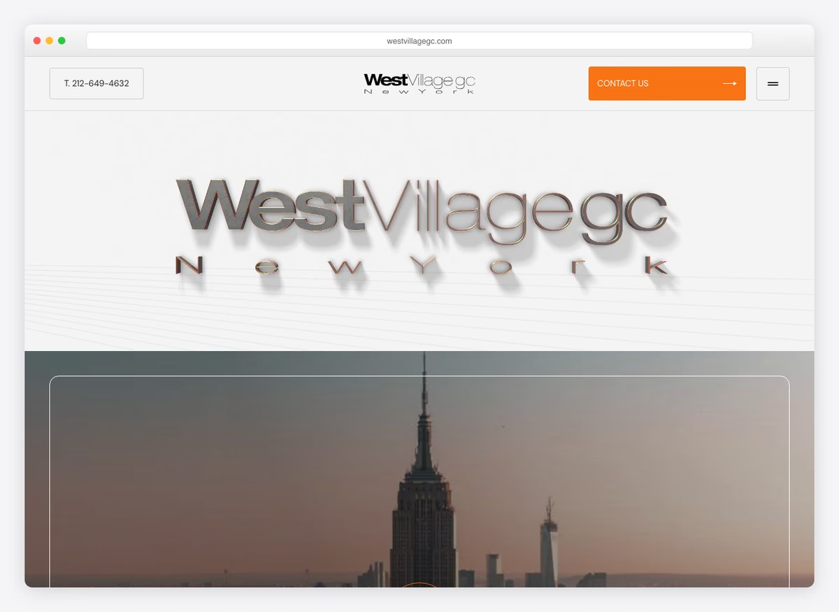
The phone number is in the navigation and the blog is unusually useful: pieces on construction price increases and insurance claims in a single city, which is exactly what a property owner in that market searches when something has gone wrong. Publishing on local cost movements is a better lead source for a city contractor than another gallery.
What stands out: Blogging on local construction costs and insurance claims. It catches the owner at the moment they need a contractor, not before.
19. Pryor Construction
Built with: WordPress
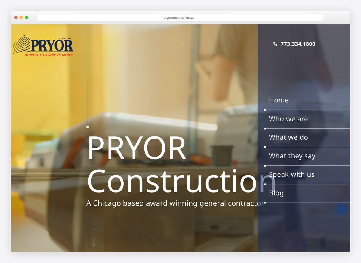
A name and a phone number, and very little else. There is no portfolio link, no service list and no form in the opening screen. For a firm that works entirely on repeat commercial business the website is a formality, and this one is honest about being one — but it forfeits every search a competitor is winning.
What stands out: The minimum viable contractor site. It costs nothing to run and earns nothing either.
20. Grunley Construction
Built with: WordPress
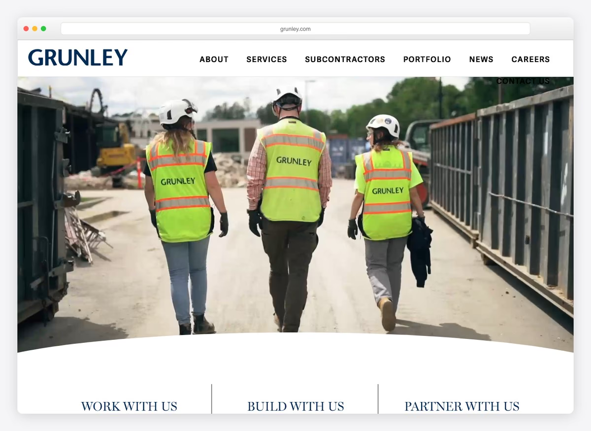
Subcontractors has its own top-level menu item, which is the tell for a large commercial builder: the site serves the supply chain as much as the client, and a trade looking for bid opportunities can find them without emailing. Careers sits alongside it. The headline pairs work with us and build with us, addressing both audiences in one line.
What stands out: A subcontractor portal in the main menu. At this scale the site is a procurement tool as much as a shop window.
21. Schimenti Construction
Built with: WordPress
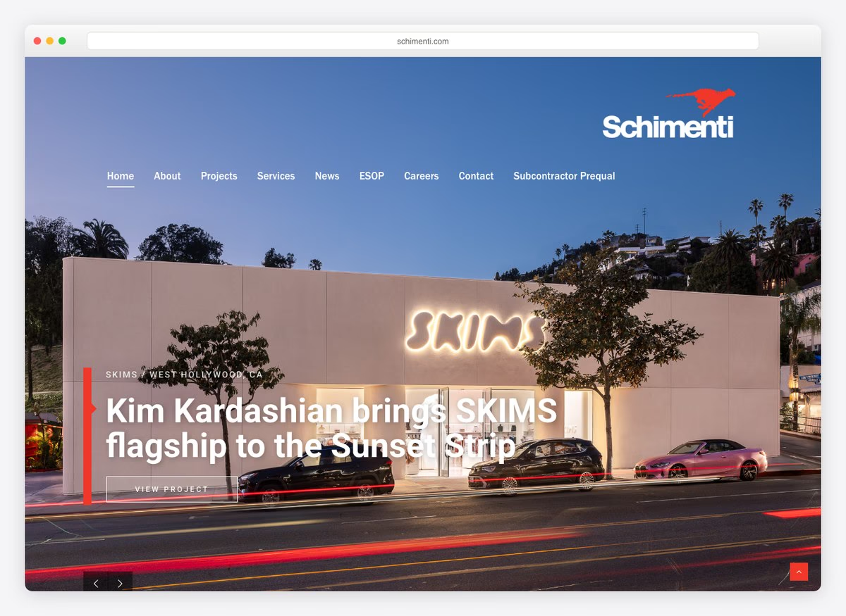
An employee-ownership plan gets its own menu item, which is a recruitment and a trust signal at once — it tells a client the people on site have a stake, and a prospective hire that there is one to have. The rest is a conventional commercial structure: projects, services, news, careers. Retail construction at national scale, presented without ornament.
What stands out: Employee ownership in the navigation. It recruits and reassures with the same three letters.
22. Tuckman-Barbee Construction
Built with: WordPress
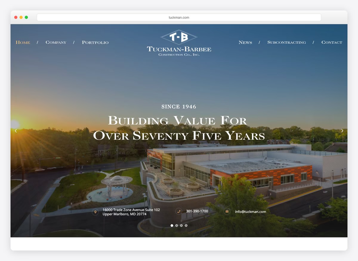
The copy describes repeatedly serving the same agencies, which in federal and institutional construction is the entire credential — past performance is a scoring criterion, not a boast. A phone number appears above the fold. The site is spare and makes no attempt at a consumer audience, correctly.
What stands out: Leading with repeat institutional clients. In public-sector work, past performance is literally scored.
23. DC Builders
Built with: WordPress
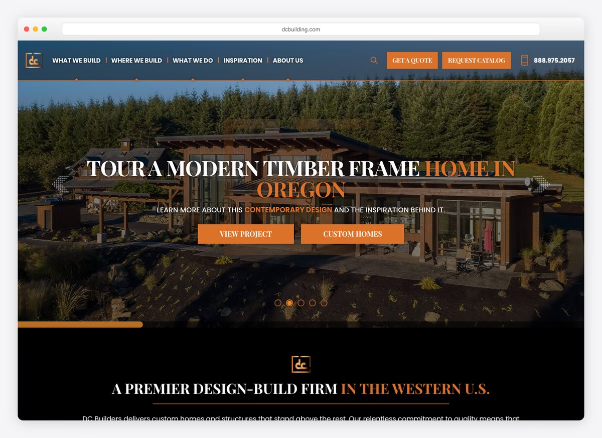
The menu is organised by what gets built: luxury custom homes, timber frame homes, wedding and event venues, wineries and tasting rooms. Those are four different buyers with four different budgets, and giving each a page means each can rank on its own terms. The region is named in the copy and a phone number sits above the fold. It is the best-organised residential site here.
What stands out: A menu by building type rather than by service. A winery owner and a couple building a house are not the same search.
24. Castle Homes
Built with: WordPress
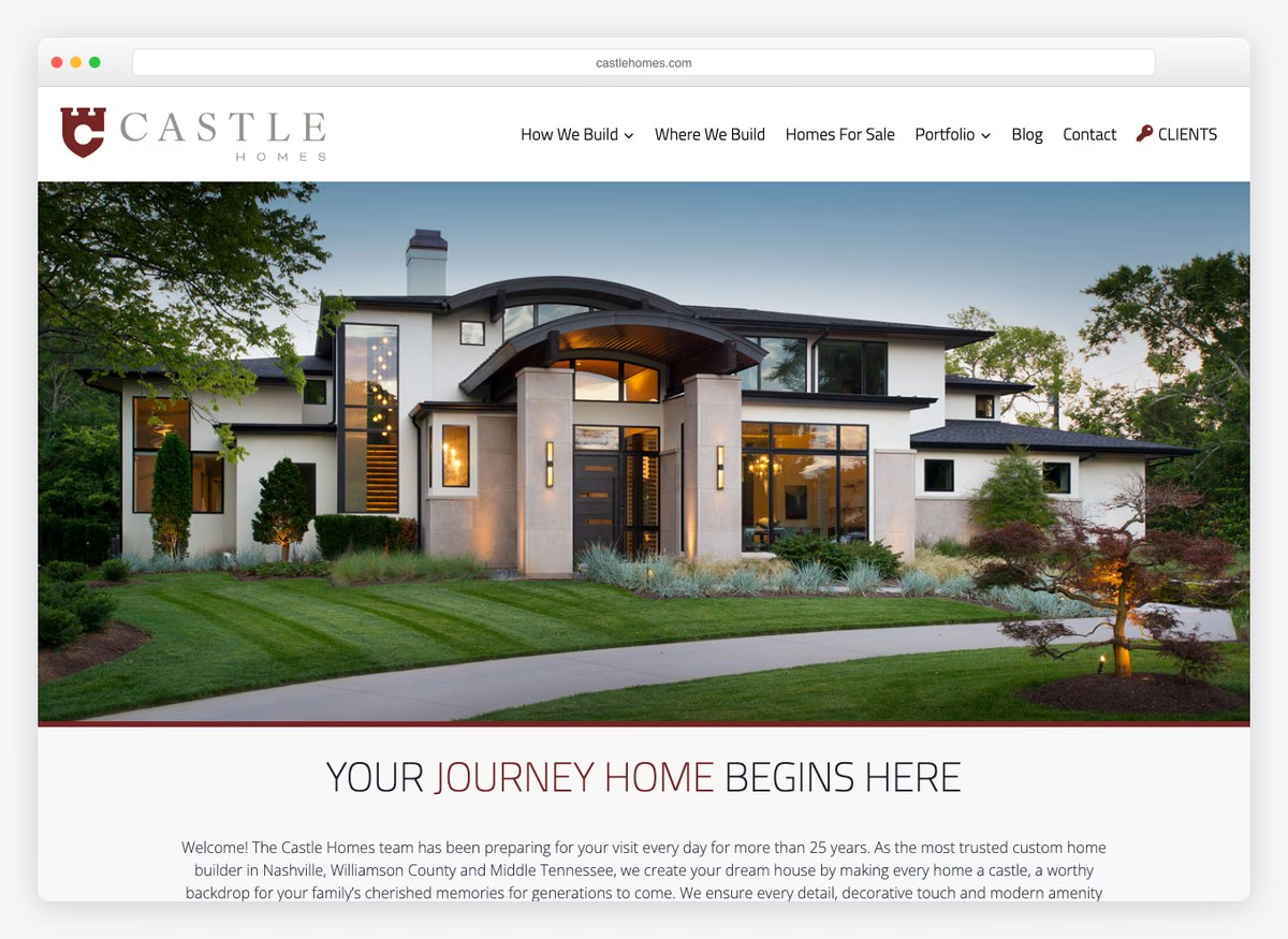
How We Build, Where We Build, Homes For Sale — three menu items that answer process, geography and inventory in the order a buyer asks them. Guaranteed pricing is stated in the copy, which in custom home building is a genuine commitment rather than a slogan, and it is the strongest single claim on this list.
What stands out: Guaranteed pricing on a custom build. It is the one promise that removes the buyer’s largest fear.
25. Scott Simpson Design + Build
Built with: WordPress
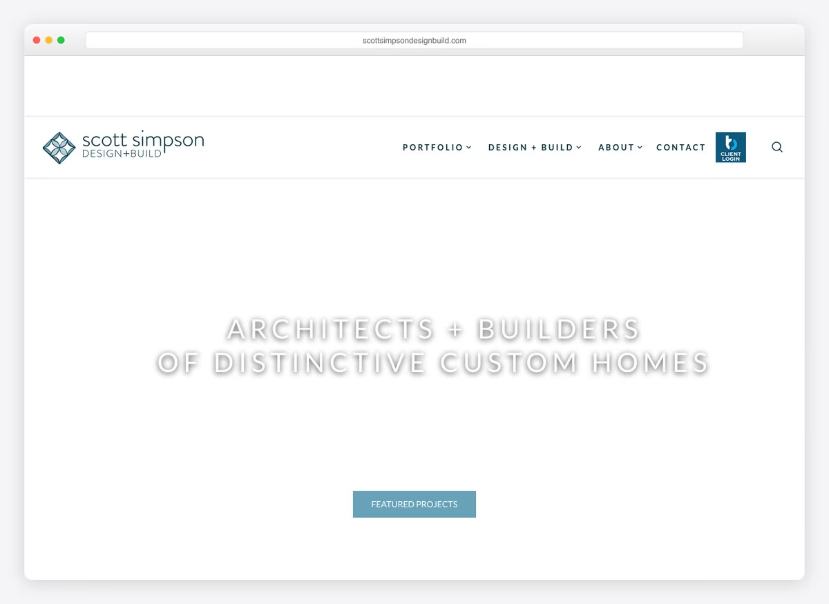
“Architects + builders” as the headline, and a menu split by architectural style — modern, farmhouse, contemporary, urban, green — rather than by service. Somebody who knows they want a farmhouse can go straight to farmhouses. The copy claims pricing transparency as a differentiator and the form asks three fields. This is a portfolio structured the way clients actually browse.
What stands out: A portfolio split by architectural style. Clients arrive knowing the look they want, not the service they need.
26. PCL Construction
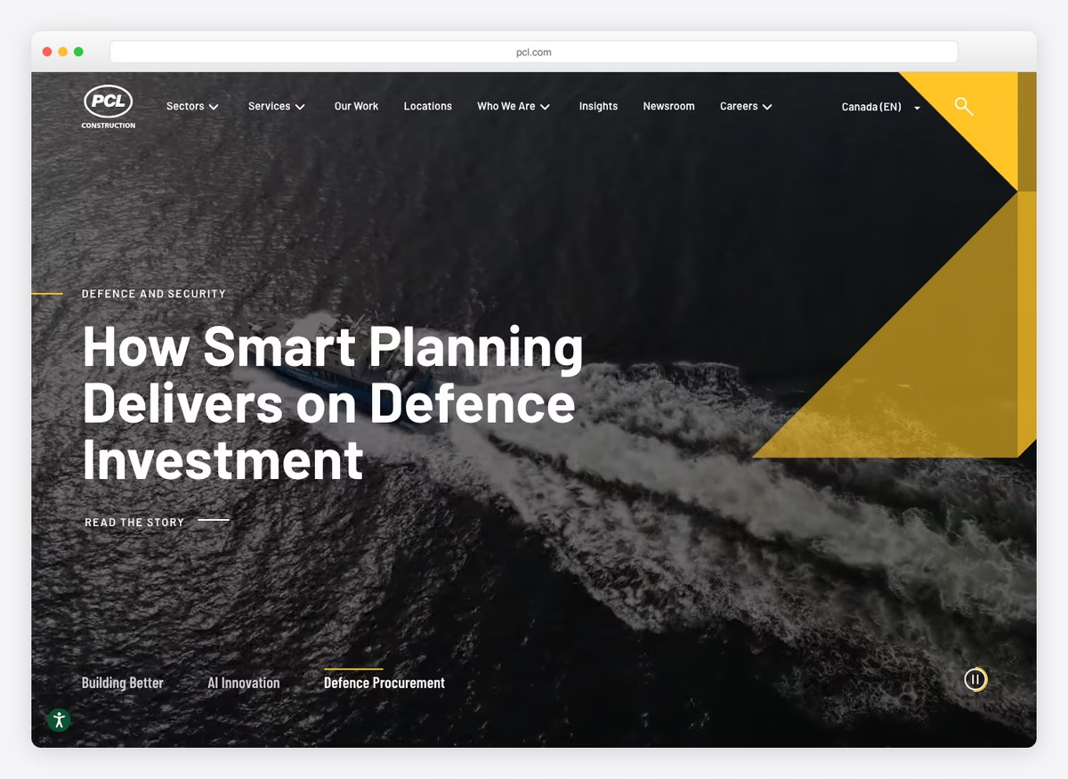
A national contractor at a scale where the website is a newsroom: Our Work, Locations, Insights and a press section, with no phone number, no service list and no enquiry form in the opening screen. At this size the buyer relationship predates the website entirely and the site exists to be credible to journalists, recruits and investors as much as to clients.
What stands out: A newsroom rather than a shop window. Above a certain size the website stops being a sales tool.
27. Vitruvius Built
Built with: Wix
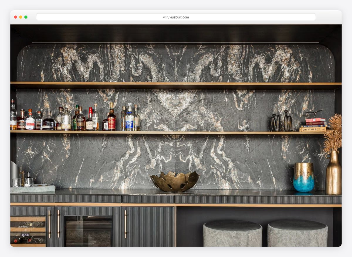
A luxury residential firm with a Latin name and almost no interface: no phone number above the fold, no form, no service menu in the opening screen. The copy names the city and the segment and stops. This is the referral-led end of the market where the site confirms a decision somebody has already half made, and it is built for exactly that and nothing else.
What stands out: A site built to confirm rather than persuade. It only works when every enquiry already arrives with your name attached.
What the twenty-seven palettes have in common
Every swatch below is sampled from that site’s own screenshot.
The ground — what the page sits on
The accent — where any colour appears at all
Construction is the least coloured trade we have measured. Seven of the twenty-seven carry no chromatic accent at all, and the ones that do lean blue or a single warm note rather than a brand colour. The material palette is doing the work — concrete, timber and sky arrive in the photography, and adding a corporate hue on top would fight it. Set against the others: a plumber’s page is white with a blue button, an electrician’s white with red, a landscaper’s white with green, an HVAC page with both blue and red. A contractor’s is usually white, black and a photograph.
Building a contractor website yourself
A caveat on the platforms, because it would be easy to misread. 9 of these run WordPress, 8 Squarespace, 4 Wix and 4 Webflow — but the entries are grouped by platform in the order they appear, which means this list was assembled by working through platform showcases rather than by finding the best contractor sites and then checking what they ran on. Treat the split as a description of how the list was sourced, not of the industry.
Fix the two things this trade gets wrong. Put a phone number in the first screen: nineteen of these do not, and thirteen have no clickable number anywhere on the page, on a purchase worth six figures. And state your licence — five of twenty-seven do. The firm that leads with five state licence numbers where the slogan usually goes is doing something the other twenty-six could copy in an afternoon.
Then organise the portfolio the way clients browse. The strongest sites here split by what gets built or by architectural style — timber frame, wineries, farmhouse, contemporary — rather than by service. Somebody planning a barn conversion and somebody planning a winery are not the same search, and one page cannot win both. For a starting point, our construction company website examples cover the commercial end of the same trade.
How we chose these
Opened every site
Each one loaded in a real browser at 1280×860 and judged from the live page, not from an old screenshot in our media library.
27 checked · 27 re-captured
Measured the first screen
Portfolio access, phone links, licence wording, service area, pricing language and every form with its field count.
8 criteria · counted, not rated
Compared against four other trades
The same measurement has now been run on plumbing, electrical, HVAC and landscaping, which is what makes the contractor result legible.
5 trades · 121 sites
Detected the platform, and said what it means
Read from markup and asset hosts — then reported honestly that the list is ordered by platform, so the split describes sourcing rather than the trade.
25 of 27 confirmed
The list is ordered for variety of approach rather than by rank. A two-person remodeller and a national contractor with a newsroom are not competing with each other, and both are here because the useful lessons are not all at one scale.
Browse the other Home services & trades website examples (18 more collections), or see website examples for every industry.

Related Posts


Comments (0)