Appy
Template Details
Author: Colorlib
Updated: October 2026 · v3.0.0
Credits: Images from Unsplash
Description
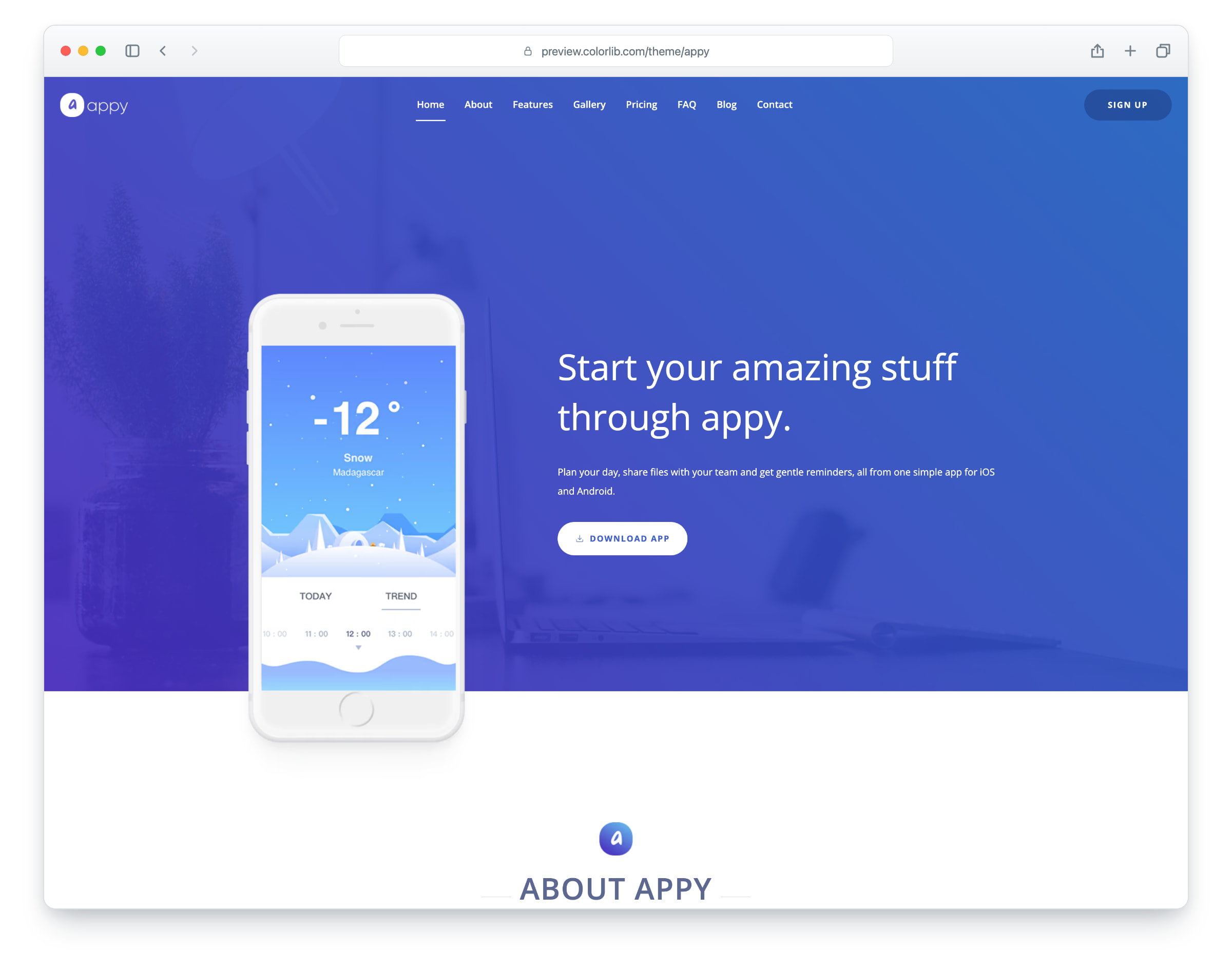
Appy is a landing page template for a mobile app, built on Bootstrap 5, with a clean, modern design. It helps you present your application and spread the word, and the layout is responsive and mobile-ready. There are three pages: the one-page home page, whose menu links scroll to each section, a blog and a single blog post.
The home page has a hero with a phone mockup, an about section, a progress section, a video tour, features, testimonials, a screenshot slider in a phone frame, a download section with app store buttons, pricing plans, an FAQ, a newsletter form and a contact form. Call-to-action buttons sit throughout the page to lead visitors to the download. The blog page lists articles with a featured post and pagination, and the blog post has comments and a comment form, for behind-the-scenes news and content marketing.
What’s new in 3.0
- Still Bootstrap 5.3.8 and plain JavaScript with no jQuery, as in 2.x; Bootstrap’s files now ship unchanged in their own vendor folder. Swiper 14 replaces Swiper 11 on the testimonial and screenshot sliders, an in-page video dialog replaces GLightbox, and a small built-in reveal module replaces AOS. Lucide SVG icons replace the Linearicons icon font. npm run build (esbuild) compiles one minified stylesheet and one script, writes the icon sprites and stamps the version.
- Lighter pages: the home page went from 2.1 MB and 40 requests to 925 KB and 34 requests. Every photo has an AVIF version with the original JPEG or PNG as the fallback, real dimensions, lazy loading below the first screen and high priority for each page’s lead image, the full-screen preloader is gone, and the unused WebP copies and images are removed. The download is now 2.3 MB (it was 2.4 MB).
- No third-party requests: Open Sans is self-hosted, the icons are local SVGs, the video loads from YouTube’s privacy-enhanced player only after a visitor clicks play, and a Google Analytics 4 snippet stays commented out until you add your own ID. Before, every page loaded its fonts from Google Fonts.
- Working forms: the contact form sends through php/send-email.php, the newsletter form through php/subscribe.php and the blog comment form through php/comment.php, each with validation, a spam trap and an in-page message. Before, the newsletter form sent nothing and the comment form posted nowhere.
- Accessibility: one h1 per page and headings in order (they skipped from h2 to h4 and h6 in the testimonials and comments), labelled controls, names on the pagination arrows, a menu, sliders and video dialog that work from the keyboard, visible focus outlines, reduced-motion support and WCAG AA text contrast, with all text at 5:1 or better: the brand gradient ends in a darker blue instead of a light cyan, the hero overlay is denser, the feature section is a deeper blue, and grey and lilac text uses darker shades.
- Fixed: on phones the screenshot slider showed an empty phone and widened the page to 907 px; it now shows the screenshots and the page no longer scrolls sideways. The feature, comment and form headings, which lost their sizes in 2.0 and overflowed the page on tablets, are back to their intended sizes. The testimonial arrows covered the text of the first and last cards and now sit beside the slider, the skip link no longer shows in the top-left corner, and placeholder links that pointed to “#” (menu, buttons, store badges, tags, pagination and comment links) now go somewhere.
- Demo content: app copy in place of placeholder text, three distinct testimonials, new blog titles, an article and comments, fictional names, an address, a phone number and an email, and a stock clip as the demo video. Photos that showed brand names and two portraits are replaced with Unsplash photos, a real street address in a screenshot mockup is removed, and the touch icon now shows the Appy mark.
Pricing Appy
Single
$19
- Premium support
- Template updates
- For 1 year
- Access all templates
Membership
$129
- Premium support
- Template updates
- For 1 year
- For 1 year
Lifetime
$349
- Premium support
- Template updates
- For life
- For life
Featured in: 61 Best Free Bootstrap Landing Page Templates 2026
Similar App Landing Page Templates View all 37 app landing page templates →