16 Best Dropshipping Website Example Designs 2026
Are you searching for the best dropshipping website examples to gain inspiration when building your online business?
We’ve researched 75 dropshipping stores to find out that the best ones don’t really differ from traditional eCommerce websites (much).
When you decide to dive into the dropshipping business, ensure you create a high-quality website.
Use quality images, excellent copyright and product descriptions and don’t forget about branding.
Here are the perfect examples of various industries that you can learn from.
One of the best platforms for dropshipping is Shopify, but you can also use a WooCommerce theme for dropshipping business if you prefer WordPress.
Best Dropshipping Website Example Designs
1. Warmly
Built with: Shopify
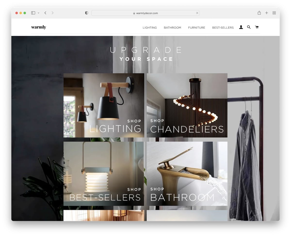
Warmly has an awesome hero section with a background image and a grid overlay linking to popular categories.
Like the rest of the web design, the header and footer are minimalist. They also display “fake” sale notifications, which can greatly increase sales.
What stands out: Keep your web design clean and minimal, emphasizing products with gorgeous imagery.
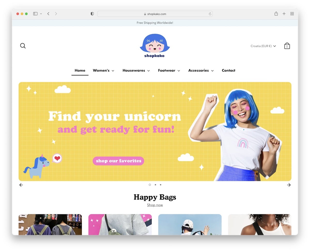
2. Mooshe
Built with: Shopify
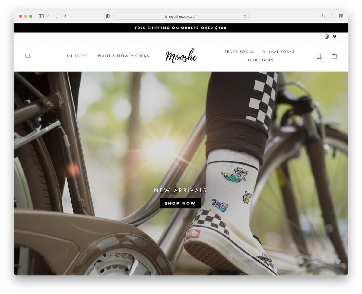
Mooshe’s responsive web design ensures an excellent mobile and desktop shopping experience, a must for any dropshipping business.
They spice up the simplistic look with a black top bar notification, a floating header, a big hero image, and a parallax background.
What stands out: Floating header lets online shoppers jump from page to page without scrolling back to the top.
3. Balls
Built with: Shopify
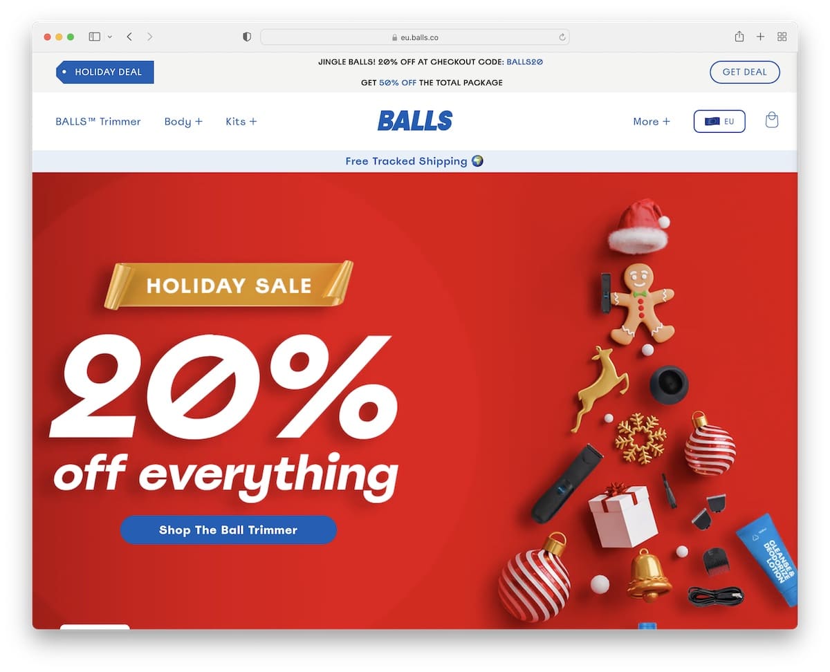
Balls is a cool and catchy dropshipping website example that uses branded elements that keep you remaining of the brand.
The floating header features a drop-down menu that keeps it nice, tidy and practical.
Just below the hero area is a dedicated section with press mentions and an average star rating, which indicates that Balls is a serious business.
What stands out: Collect authority mentions and throw them on your site for social proof.
4. Notebook Therapy
Built with: Shopify
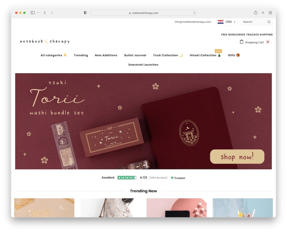
Notebook Therapy has an opt-in popup for a giveaway that helps it build its email list for all marketing campaigns.
The website is very simple, with many product in-hand images that give their items a more “realistic” feel.
Two other cool features are the client image slider and the handy top bar with a currency switcher and a search bar.
What stands out: Use popups to build your email list.
5. Fashion By Teresa
Built with: Shopify
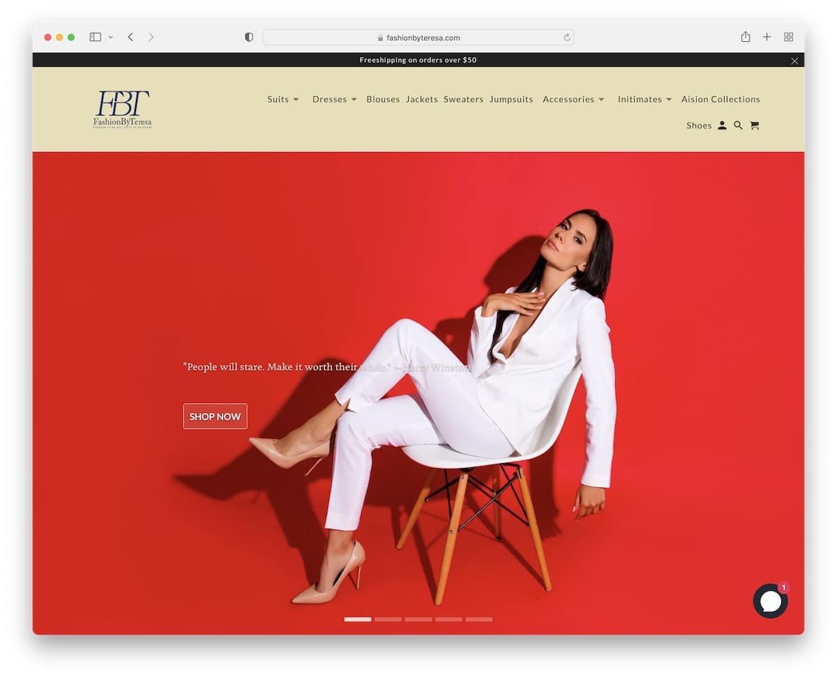
Fashion By Teresa is ready to inspire and impress with its full-width slider with text and a CTA on each slide.
This dropshipping website example has a sticky header with a drop-down and a top bar (you can close the latter).
They also use the home page to promote two of their items with an option of direct purchase.
What stands out: Grab every visitors’ attention with a slider and give them a reason to click the CTAs.
6. Meowhiskers
Built with: Shopify
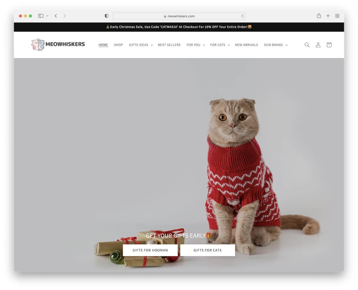
Meowhiskers’s big banner with CTA buttons creates a strong first impression. The home page features various sections for featured collections, best sellers and new arrivals, to name a few.
They also use reviews to build trust and a subscription form to build an email list. Because of many items, Meowhiskers includes a multi-level drop-down menu that simplifies finding items.
What stands out: A multi-level drop-down navigation is great for adding many categories.
7. Little Crystals
Built with: Shopify
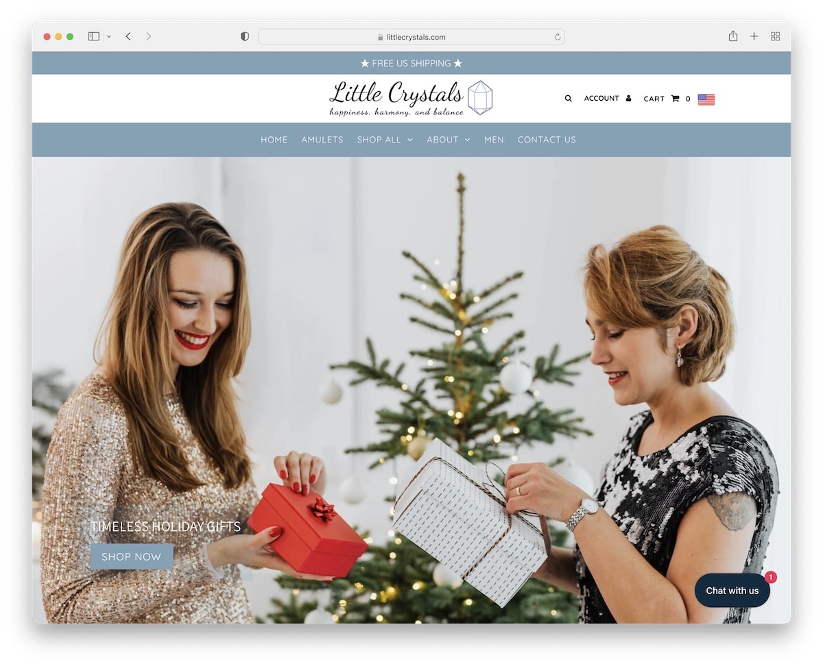
Little Crystals starts with a massive slider, a creative header, and a top bar notification. The menu floats on top of the screen so users can search for other pages on the spot.
What’s also smart is running a blog section that they strategically use for content marketing. Finally, the live chat widget can always contact their support team.
What stands out: Using a live chat can increase your sales.
8. Motherly
Built with: Elementor
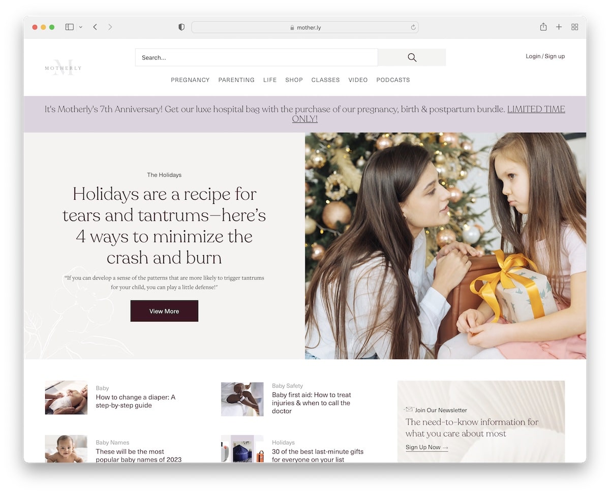
Motherly isn’t your traditional dropshipping website because it is a content-rich, brand-like business website with a lot of news, tips, videos, and more.
While the home page has a lot of material, the light design, enough white space, images and sections with different background colors make it a pleasant experience.
The sticky header features a large search bar because many users need it to find the desired content faster.
What stands out: Create valuable and practical content without being too salesy.
9. The Korean Fashion
Built with: Shopify
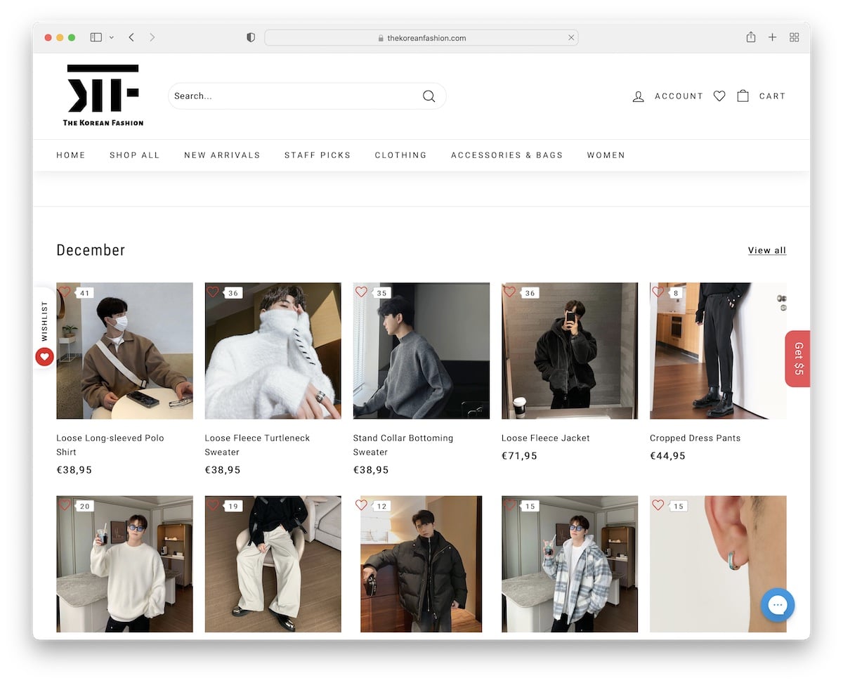
The Korean Fashion website is a large grid of items, followed by categories with circular thumbnails and client reviews with images.
The floating header accompanies the user with navigation, a search bar and account, a wishlist, and cart icons/links.
What’s also cool is the sticky sidebar notification button that opens a popup with an opt-in form for a gift.
What stands out: Get more subscribers by offering them a gift (promoting it with a floating sidebar button).
10. Sage & Sill
Built with: Shopify
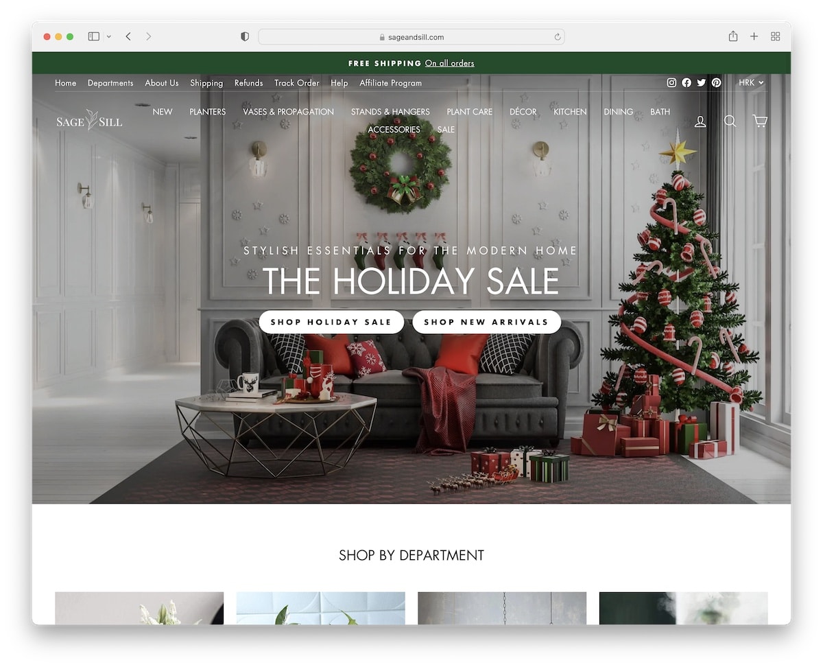
Sage & Sill starts with a popup promoting a discount on the first order in exchange for an email. But a sticky button/reminder will appear in the bottom left corner if you don’t opt-in.
This dropshipping website example has a simple grid design, promoting various categories, items, and more.
The hero banner features two CTAs, and the top bar has a sliding notification. The header is transparent for a cleaner look.
What stands out: If you want to promote multiple items on your home page, use a grid layout with a light design.
11. Jacqueline Maddison
Built with: Shopify
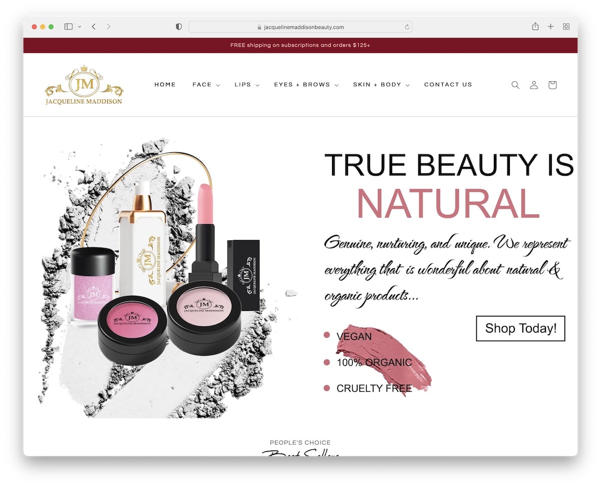
Jacqueline Maddison’s minimalist design puts all the shine on their products. The drop-down navigation disappears on the scroll but reappears on the back scroll for a more distraction-free experience.
Moreover, the footer includes additional links, social media icons and payments they accept.
Some of the thumbnails react on hover, showcasing a secondary image (but also enhancing engagement).
What stands out: Enable the hover effect for thumbnails, showcasing a different image to grab more attention.
12. Brookstone
Built with: Shopify
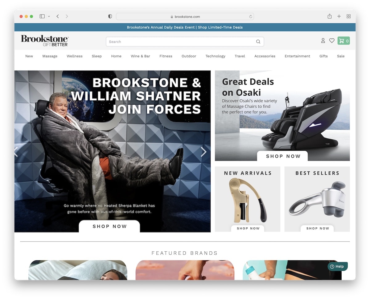
Brookstone is a modern eCommerce/dropshipping website with a large search bar and a mega menu. The header (except the top bar) sticks to the top, so the user can jump from page to page much more easily and quickly.
The hero section features a slider and additional static images that promote a product, new arrivals and best sellers.
What stands out: Instead of using just the hero slider, split the layout in half and use the other side for static images to promote other products/categories.
13. Articture
Built with: Shopify
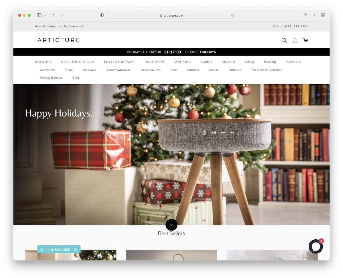
While Brookstone’s home page is very crowded, Articture keeps things simple and more appealing to the eye.
The hero image only features text (no CTA) and a scroll-down button to jump straight to best sellers.
But Articture’s header is pretty stuffed with two notification bars, one with contact detail and the other promoting a sale with a countdown timer for urgency.
What stands out: Do you want to increase sales? Use a countdown timer for sales and special offers.
14. Makeup Mirror
Built with: Shopify
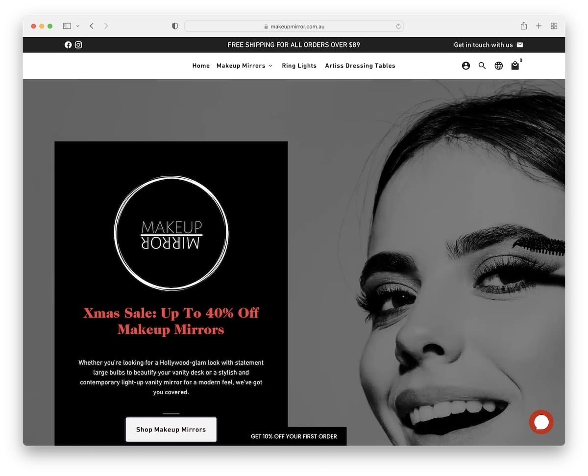
Instead of forcing a popup for a discount, Makeup Mirror uses a floating button on the bottom screen that opens it on click.
The page uses “fake” sale notifications, customer reviews with links to products they purchased and FAQ accordions to answer the most common questions.
The footer features quick links, social icons, a quick about us widget and a newsletter subscription form.
What stands out: Don’t be too pushy with popups; let the user control them (like in Makeup Mirror’s case).
15. Venetto Design
Built with: Shopify
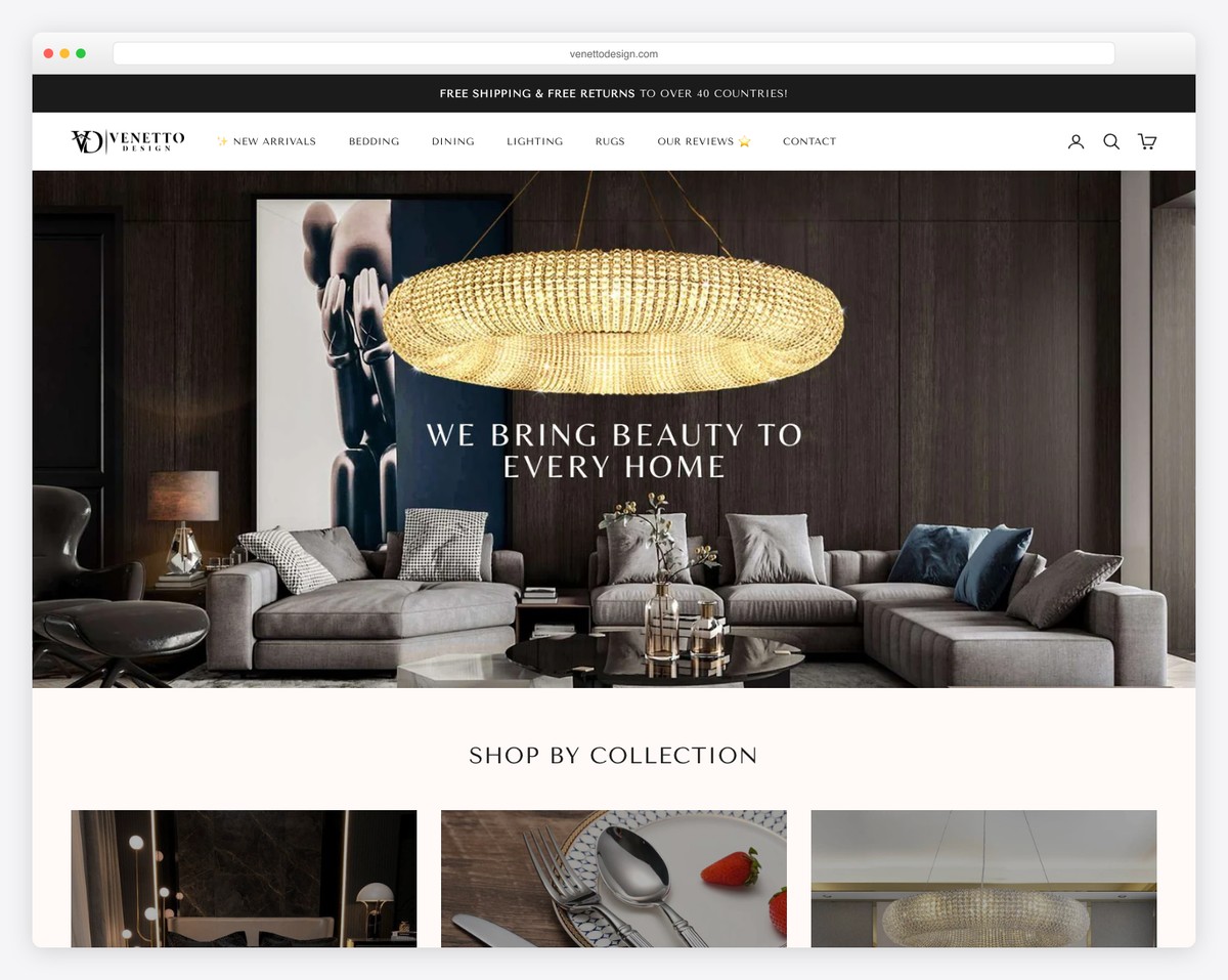
Venetto Design sells premium home goods including bedding, dining accessories, lighting, and decor through a sophisticated Shopify storefront. The luxury positioning with a neutral color palette of whites and beiges immediately distinguishes it from typical dropshipping stores.
Custom typography with elegant headings and multi-language support targeting the European market give the store a high-end boutique feel. The curated product selection and lifestyle photography demonstrate that dropshipping can look premium when the branding is done right.
What stands out: Luxury positioning through neutral colors, elegant typography, and curated collections proves that dropshipping stores don’t have to look generic — investing in branding transforms perceived value.
16. Pillow Slides
Built with: Shopify
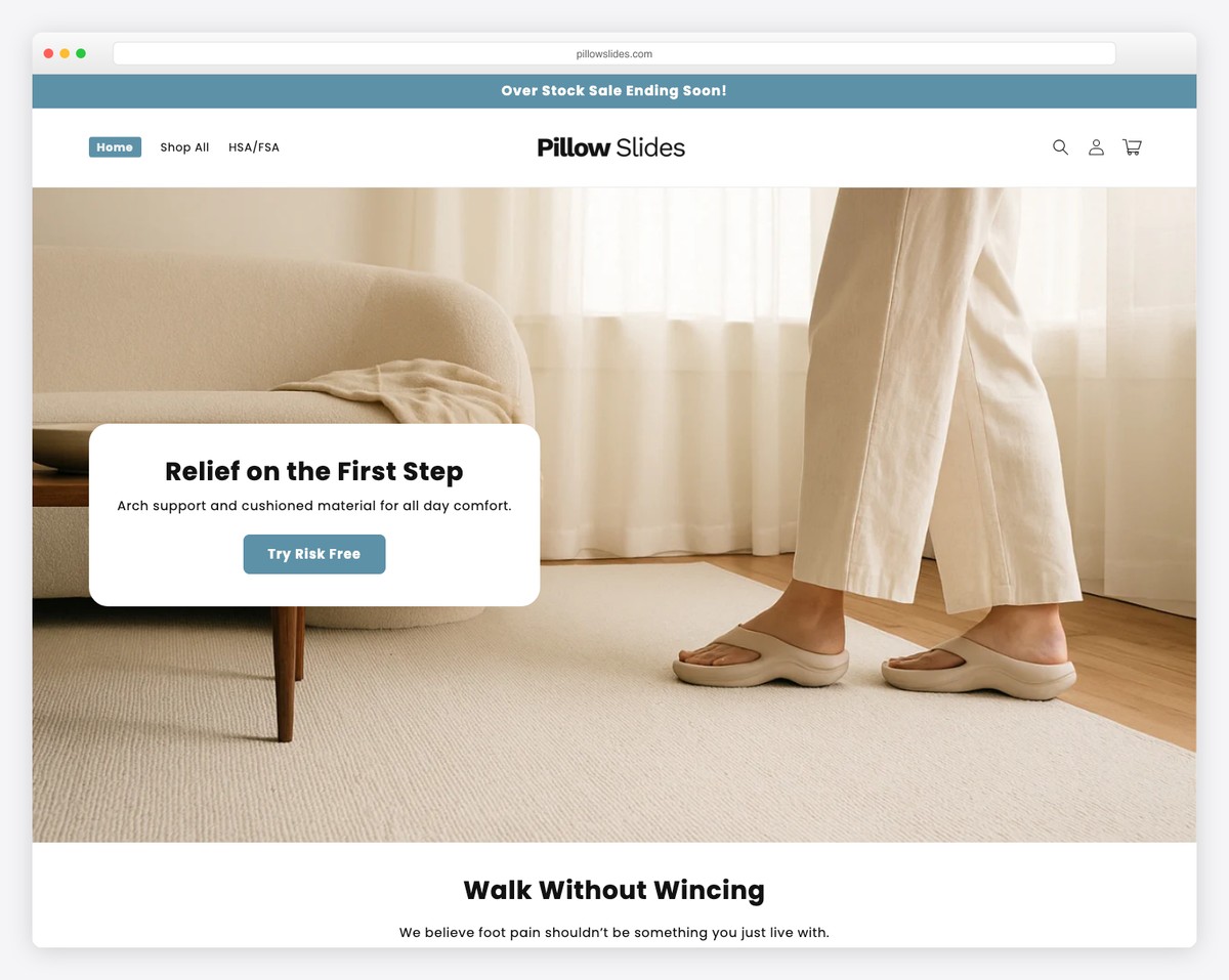
Pillow Slides is a niche health-focused footwear brand selling orthopedic slides designed for plantar fasciitis and arthritis relief. The clean Shopify store uses a minimal color palette with strategic red accents that draw attention to key product benefits and CTAs.
A customer testimonial carousel highlighting pain relief results and statistics sections build trust through social proof. The strong product photography with lifestyle images shows the slides in everyday settings, making the health benefits feel accessible rather than clinical.
What stands out: Positioning a product around pain relief rather than just fashion creates an emotional buying trigger — customers aren’t buying slides, they’re buying comfort and relief from daily discomfort.
Related Posts

Comments (0)