28 Best CrossFit Gym Website Examples 2026
Looking for CrossFit gym website inspiration?
Whether you’re opening a new box, rebranding an existing affiliate, or building a multi-location CrossFit community, your website is often the first impression potential members get. A strong site communicates your coaching philosophy, showcases your community, and makes it easy to sign up for a free trial or intro session.
We curated 28 of the best CrossFit gym websites from around the world — from legacy affiliates in New York City and Los Angeles to competitive training facilities in Australia, Singapore, and Europe. You’ll find dark-themed powerhouses, minimalist designs, and community-driven sites that all convert visitors into members.
Each entry includes the platform it’s built on, so you can find the right website builder for your own project.
Best CrossFit Gym Website Examples
1. CrossFit Hollywood
Built with: Squarespace
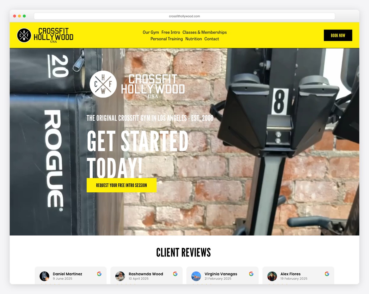
CrossFit Hollywood is one of the original CrossFit affiliates in Los Angeles, operating since 2008. The website takes a minimalist approach with clean layouts and community-focused photography that lets the athletes and the box speak for themselves.
Rather than overwhelming visitors with flashy animations or aggressive sales copy, the site relies on authentic imagery of real members working out. The simplicity signals confidence — this gym has been around long enough that its reputation does the selling.
What stands out: The minimalist design backed by authentic community photography creates instant credibility — a legacy gym that doesn’t need to shout to fill its classes.
2. CrossFit Union Square
Built with: Squarespace
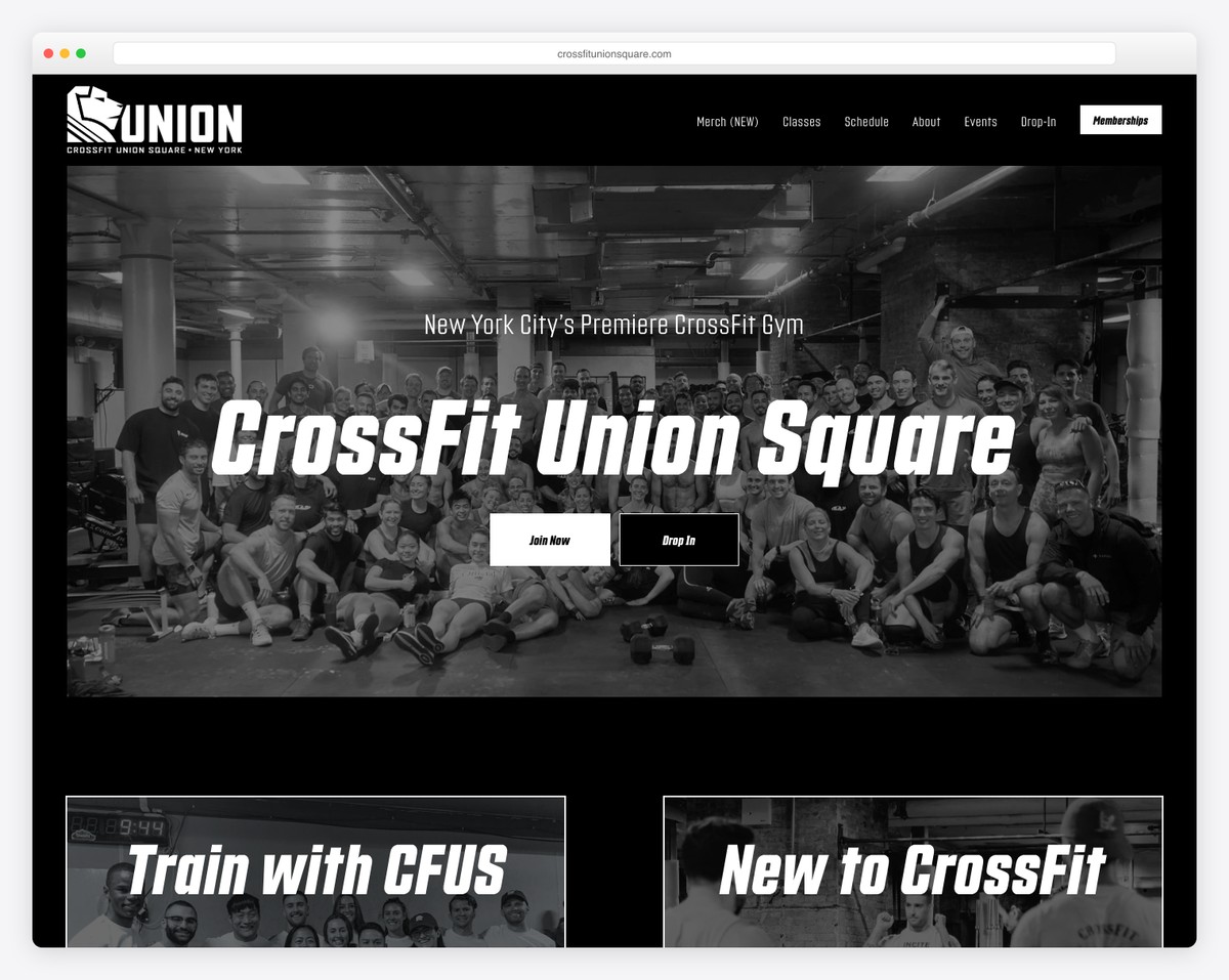
CrossFit Union Square in NYC delivers a polished, grid-based design with striking black-and-white athletic imagery. The layout feels deliberate and professional — every section earns its place on the page.
The monochrome photography creates a cohesive visual identity that feels more like a high-end fitness brand than a neighborhood gym. Program details and class descriptions are organized cleanly, making it easy for prospective members to find exactly what they need.
What stands out: The black-and-white photography gives the site a premium editorial quality that elevates CrossFit from workout to lifestyle brand.
3. CrossFit Echo Park
Built with: Squarespace
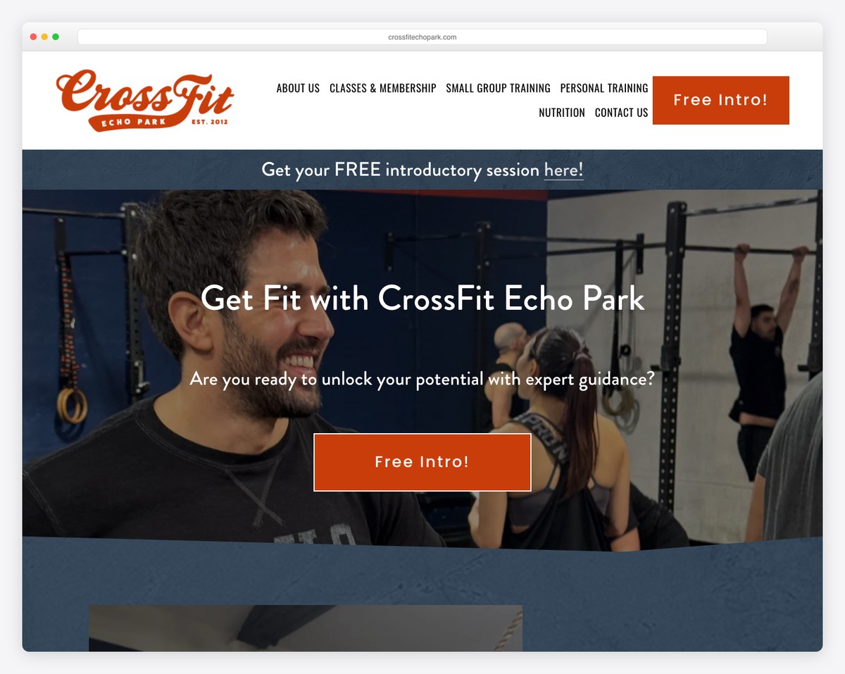
CrossFit Echo Park in Los Angeles combines minimalist design with full-width imagery and strong free trial CTAs. The site wastes no time getting visitors to take action — the path from landing to sign-up is short and direct.
The full-width hero images give the site an immersive feel, pulling visitors into the energy of the gym before they’ve even scrolled. The free trial offer is positioned prominently, removing the biggest barrier for newcomers who are curious but hesitant.
What stands out: The prominent free trial CTAs combined with immersive full-width photography create a conversion-focused design that doesn’t sacrifice visual appeal.
4. CrossFit City Limits
Built with: Squarespace
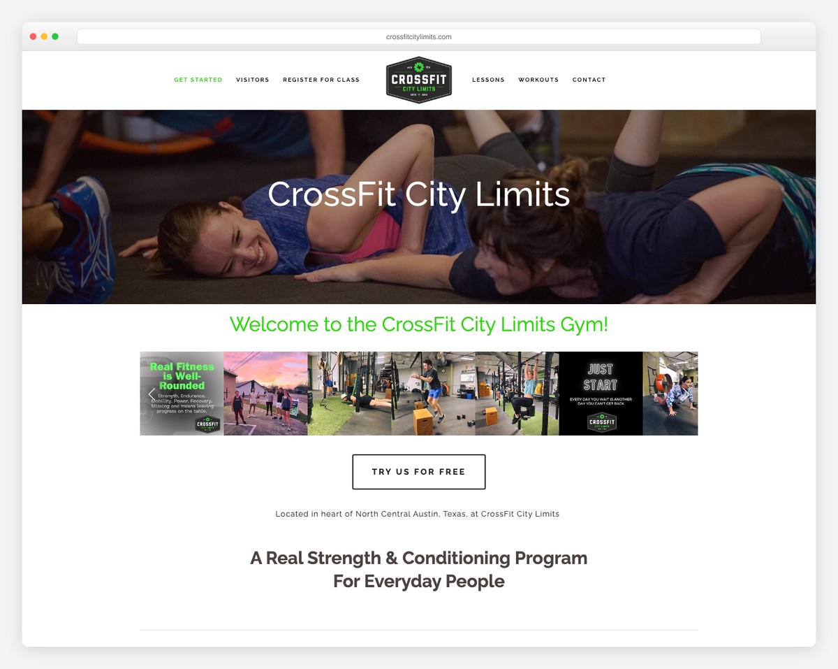
CrossFit City Limits in Austin, TX uses a distinctive black-and-green color scheme that sets it apart from the typical dark-and-red CrossFit aesthetic. The site puts coaching philosophy front and center, emphasizing the quality of instruction over equipment or facility size.
The coaching-first messaging is smart — in a city packed with CrossFit boxes, the differentiator isn’t barbells and pull-up rigs (every gym has those), but the coaches who guide the programming and build the culture.
What stands out: The emphasis on coaching philosophy over facility features demonstrates that great CrossFit gyms are built on people, not equipment.
5. SMASHBOX Performance
Built with: Squarespace
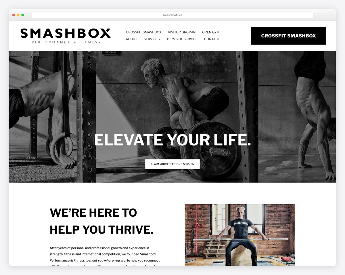
SMASHBOX Performance in Toronto takes a modern minimalist approach with clearly segmented service sections. The site breaks down their training offerings into distinct categories, making it easy for visitors to find the program that matches their goals.
The segmented layout works particularly well for a gym that offers multiple training modalities beyond traditional CrossFit. Each section gets its own visual treatment, creating a browsable experience that respects the visitor’s time.
What stands out: The segmented service sections make it instantly clear what SMASHBOX offers, helping visitors self-select the right program without having to dig through pages of content.
6. Tri-Force MMA & BJJ
Built with: Squarespace
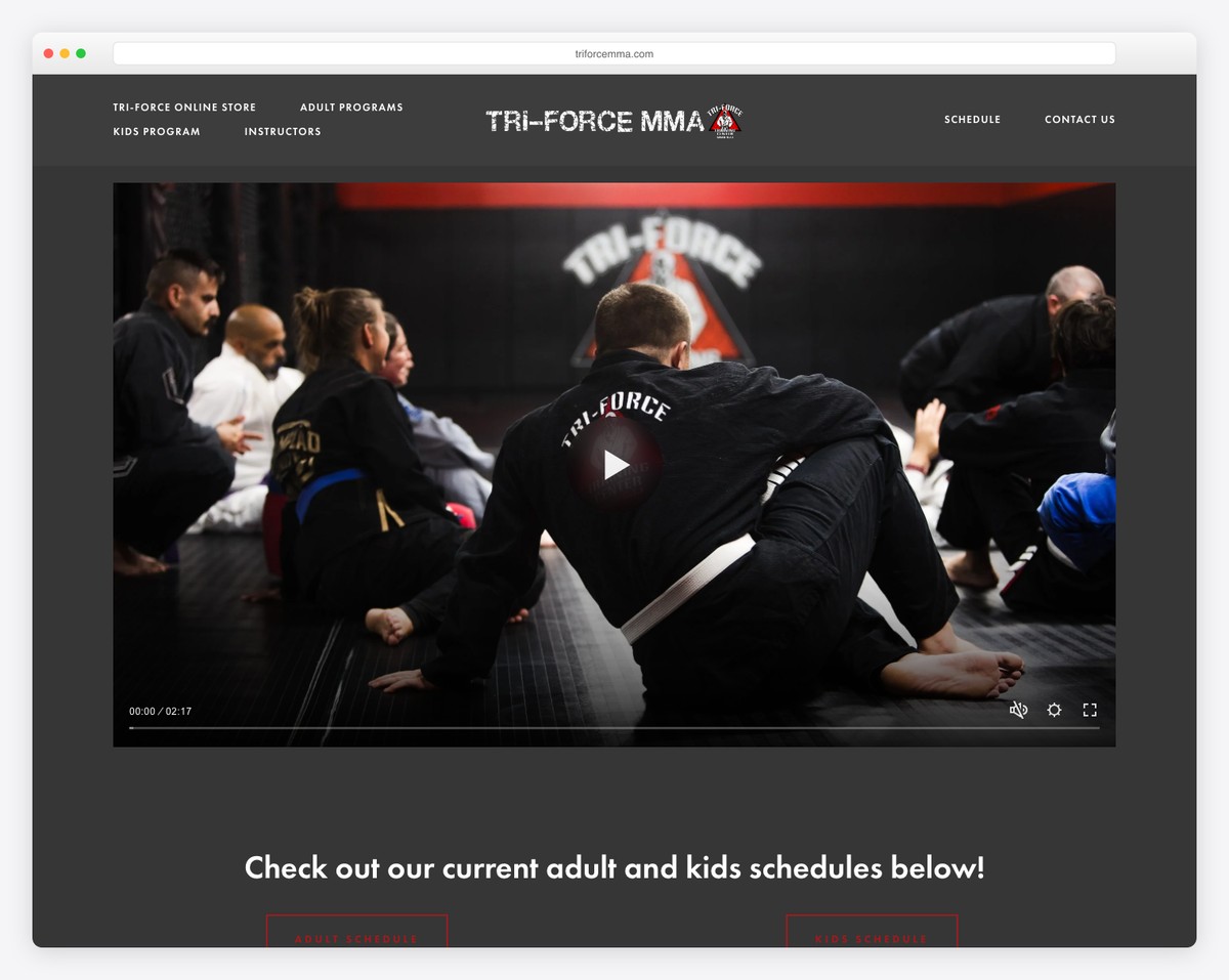
Tri-Force MMA & BJJ in Pawtucket, RI goes heavy on gallery photography, showcasing real training sessions and competition moments. The trial sign-up CTAs are strategically placed throughout the page to capture interest at every scroll depth.
The gallery-first approach is a smart move for a combat sports gym — prospective members want to see the training environment, the coaching style, and the caliber of athletes before they walk through the door. Nothing sells a gym like seeing real people training hard.
What stands out: The gallery-heavy design lets real training photography do the selling, backed by well-placed trial CTAs that convert curiosity into action.
Building a website for your own CrossFit box? Browse our fitness website templates or check out our gym website examples for more design inspiration.
Looking for more fitness and wellness inspiration? Check out our roundups of best spa websites, best small business websites, and best service website examples.
7. CrossFit Urban Edge
Built with: Wix
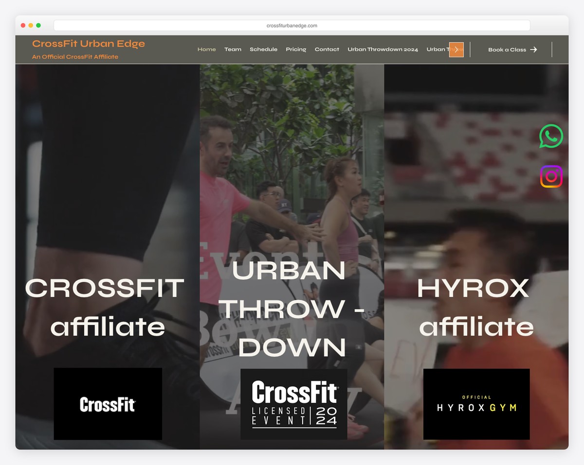
CrossFit Urban Edge in Singapore brings dynamic energy to its web presence with a grid mesh layout, embedded video, and smooth transitions. The site feels alive — every section has movement and purpose.
The dynamic transitions and video integration create an experience that mirrors the intensity of a CrossFit workout. For a Singapore-based box competing in a crowded fitness market, this level of polish signals professionalism and commitment to quality.
What stands out: The grid mesh layout with dynamic transitions creates an energetic browsing experience that captures the intensity of CrossFit training itself.
8. Invictus Boston
Built with: Wix
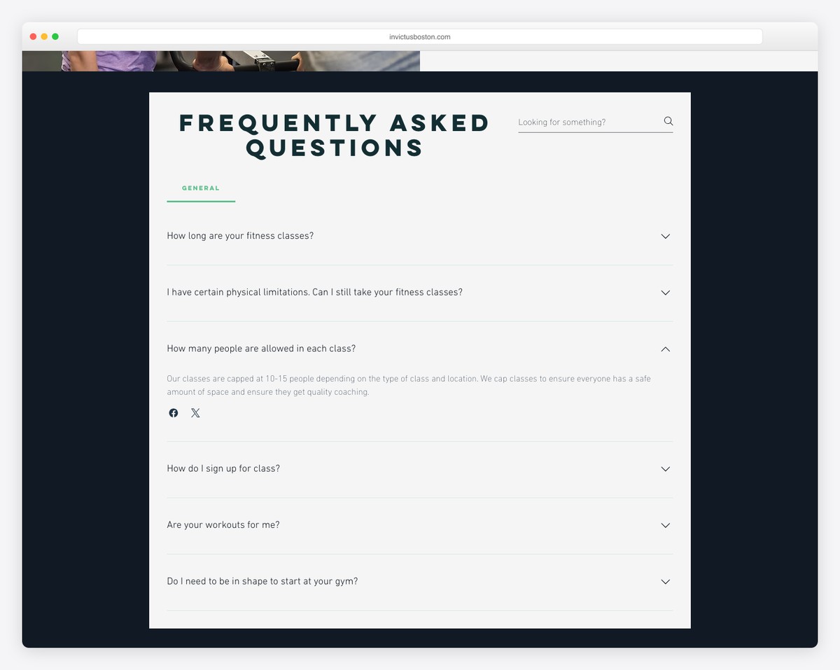
Invictus Boston uses a grid-based layout with view-transition animations that add subtle sophistication to the browsing experience. The design feels modern and technical without being overwhelming.
The animations are purposeful — they guide the eye through the content rather than distracting from it. This is a site built for people who appreciate attention to detail, which aligns perfectly with the CrossFit community’s respect for precision in movement and programming.
What stands out: The view-transition animations add a layer of sophistication that most gym websites lack, creating a polished experience that reflects the precision of their programming.
9. CrossFit Amsterdam
Built with: Shopify
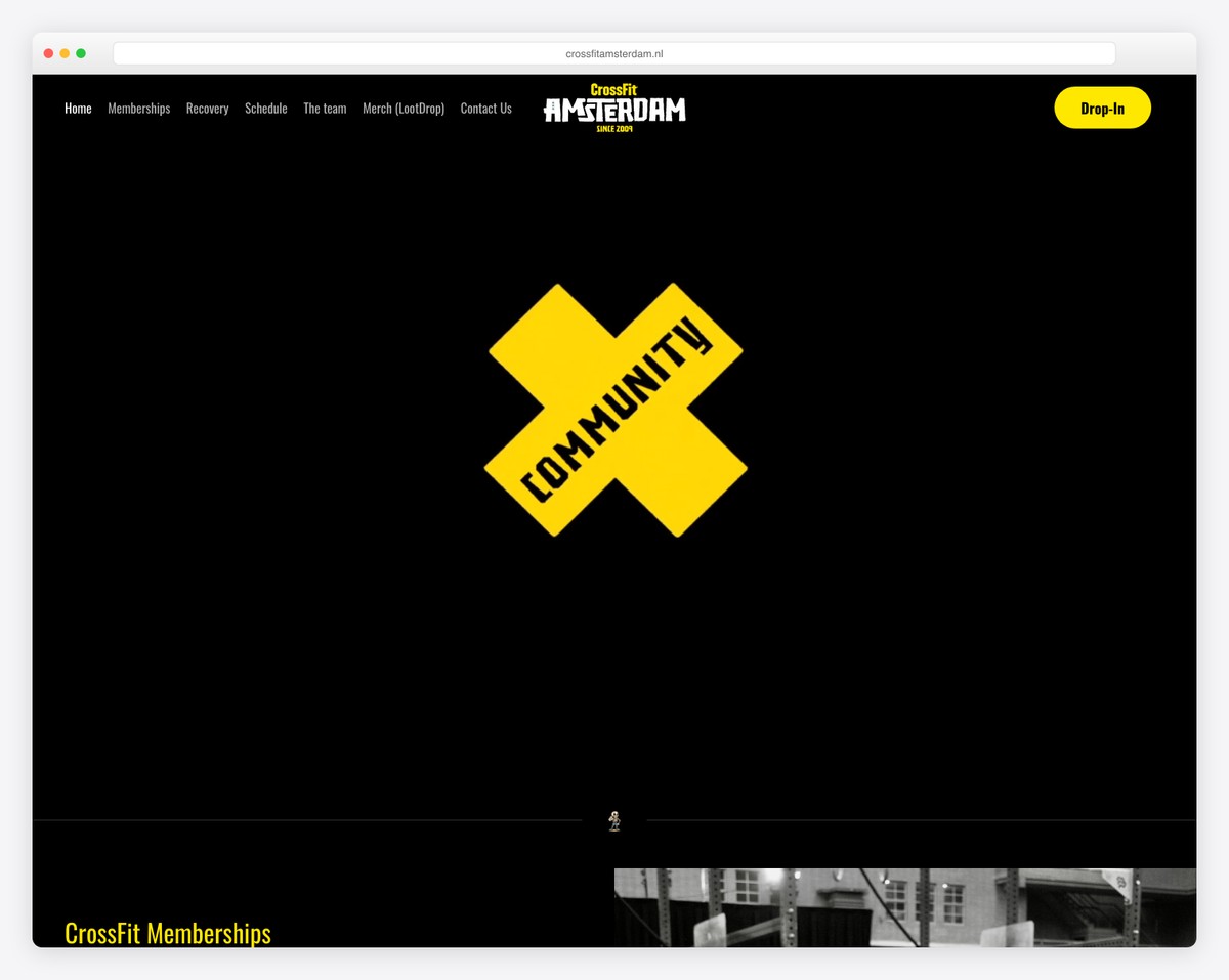
CrossFit Amsterdam pairs a dark theme with yellow and teal accents for a design that’s both bold and functional. The split-screen layout divides content into clear visual zones, making navigation intuitive even for first-time visitors.
Built on Shopify, the site seamlessly integrates membership sales with class information. The e-commerce backbone allows for smooth online sign-ups and merchandise sales — a practical dual-revenue approach that many CrossFit affiliates could learn from.
What stands out: The split-screen layout with yellow and teal accents creates a visually striking dark theme that makes key information impossible to miss.
10. Mayhem Nation
Built with: Shopify
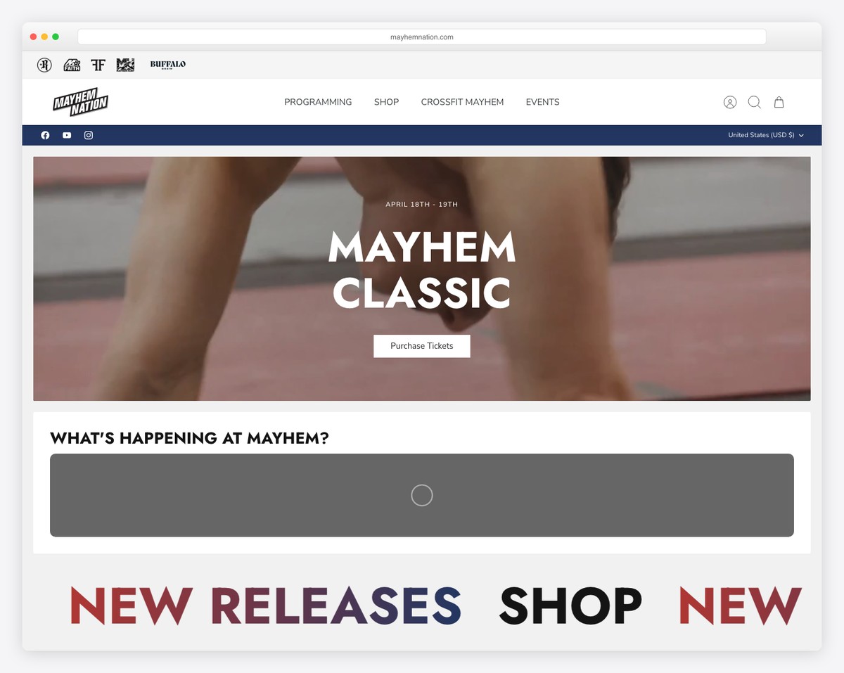
Mayhem Nation is Rich Froning’s training facility in Cookeville, TN — and the website matches the scale of ambition. Built on Shopify, the site drives a serious e-commerce operation selling competition programming, apparel, and training plans alongside gym memberships.
The Shopify platform is an ideal choice here, handling the complexity of digital programming subscriptions, physical merchandise, and gym information all in one storefront. The brand recognition of Froning’s name powers the whole operation, but the site execution is what converts visitors into paying customers.
What stands out: The Shopify-powered e-commerce engine turns a CrossFit gym into a full-fledged fitness brand, selling programming and merchandise to athletes worldwide.
11. Sharp Edge CrossFit
Built with: Webflow
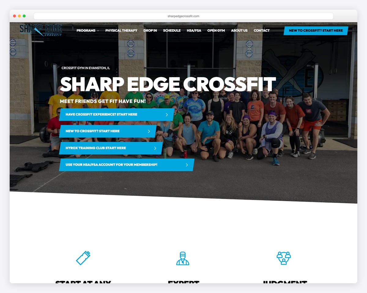
Sharp Edge CrossFit in Evanston, IL leads with a bold teal color scheme and a dark theme anchored by a background video hero section. The video immediately immerses visitors in the gym’s atmosphere — you can feel the energy before reading a single word.
The teal accents against the dark background create strong visual contrast that guides the eye to CTAs and key information. It’s a design that commands attention while keeping the content hierarchy clear and navigable.
What stands out: The background video hero section pulls visitors into the gym’s energy instantly, making the bold teal-on-dark design feel alive and dynamic.
12. LAX CrossFit
Built with: Webflow
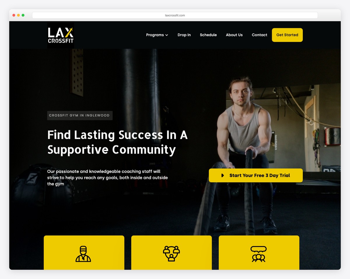
LAX CrossFit in Inglewood, CA takes a community-focused approach with three clearly defined program tiers. The tiered structure helps visitors self-select the right entry point, whether they’re complete beginners or seasoned competitors.
Presenting programs as tiers rather than a single catch-all class is a smart conversion strategy. It reduces the intimidation factor for newcomers while signaling to advanced athletes that there’s room to grow. Each tier is described with enough detail to set clear expectations.
What stands out: The three-tier program structure removes the guesswork for new visitors and makes CrossFit feel accessible regardless of fitness level.
13. West LA Athletics
Built with: Webflow
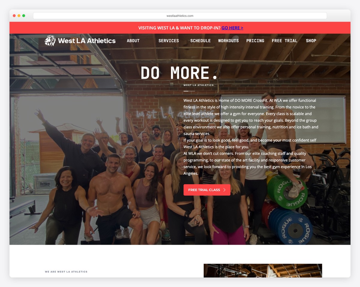
West LA Athletics uses a dark color scheme paired with community testimonials that let members tell the story. The social proof is woven throughout the site, reinforcing the message that this gym transforms lives, not just physiques.
The testimonial-driven approach is particularly effective for CrossFit, where community is the primary differentiator. Prospective members aren’t just buying access to barbells — they’re joining a tribe. The real member stories make that tribe tangible and inviting.
What stands out: The community testimonials woven throughout the dark design create powerful social proof that sells the CrossFit experience, not just the facility.
14. Renegade Athletics
Built with: Webflow
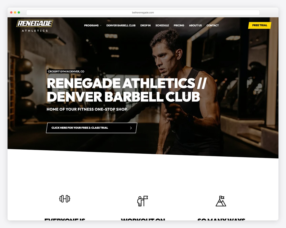
Renegade Athletics in Denver, CO embraces a black-and-gold color scheme with a minimalist layout that lets the brand speak with authority. The gold accents add a premium feel without veering into luxury territory — it’s aspirational but grounded.
The minimalist approach means every element on the page carries weight. There’s no filler content or decorative fluff — just clear messaging about programs, coaches, and how to get started. The name “Renegade” is backed up by a design that feels bold and unconventional.
What stands out: The black-and-gold palette creates a premium brand identity that’s aspirational without being intimidating — a difficult balance that Renegade nails.
15. VC Fitness
Built with: Webflow
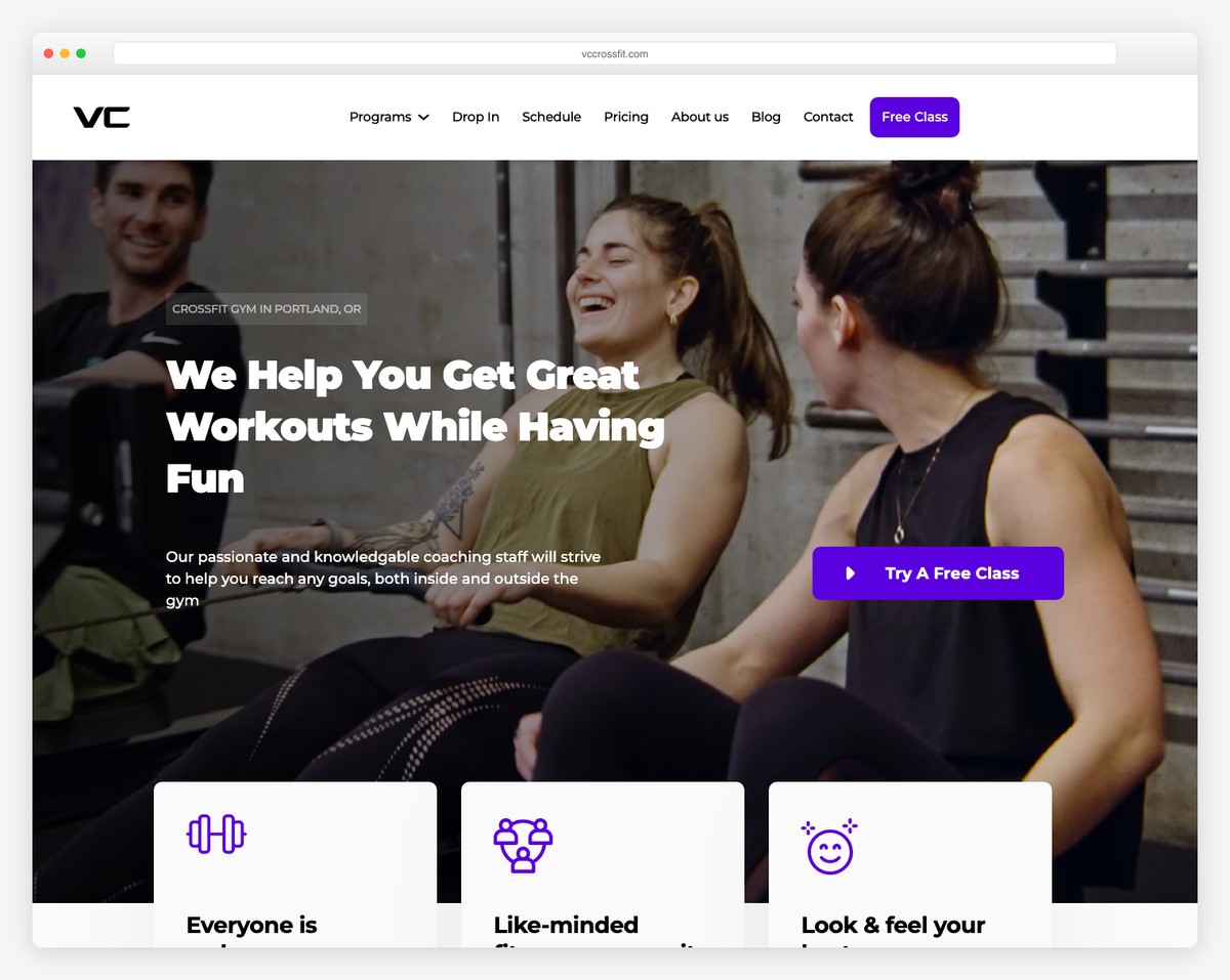
VC Fitness in Portland, OR stands out with a gradient purple color scheme and a forward-looking approach that extends beyond traditional CrossFit. The site promotes HYROX training and nutrition programs alongside WODs, positioning the gym as a comprehensive fitness destination.
The expanded programming beyond CrossFit reflects a broader industry trend — the best boxes are diversifying their offerings to attract athletes with different goals. The purple gradient gives the site a unique visual identity that’s instantly recognizable.
What stands out: The HYROX and nutrition programming alongside traditional CrossFit shows a gym that’s evolving with the industry, not just sticking to the WOD board.
16. Flat White CrossFit
Built with: Webflow
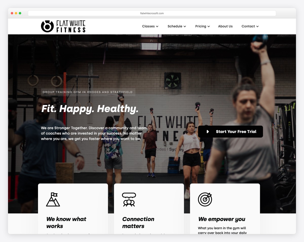
Flat White CrossFit operates two locations in Rhodes and Strathfield, NSW, Australia with a clean design and strong free trial CTAs. The site is refreshingly straightforward — no dark moody themes, just clear information and a direct path to getting started.
The dual-location setup is handled well, with location-specific details that help visitors find their closest box without confusion. The free trial offer is presented confidently and repeatedly, making it the obvious next step for anyone browsing.
What stands out: The clean, approachable design breaks from the dark-and-intense CrossFit aesthetic, making the gym feel welcoming to beginners and seasoned athletes alike.
17. CrossFit Muse
Built with: Webflow
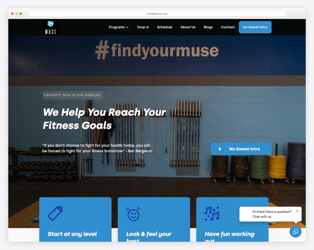
CrossFit Muse in Downtown LA features a clean hero section with integrated consultation booking. The site prioritizes the booking flow — every design decision funnels visitors toward scheduling a conversation with a coach.
The consultation-first approach is smart for a gym in a competitive market like DTLA. Rather than pushing visitors straight into a class, the site invites them to have a conversation first, which builds trust and dramatically improves conversion for committed long-term members.
What stands out: The consultation booking model prioritizes relationship-building over hard selling, creating a pipeline of committed members rather than one-time drop-ins.
18. CrossFit NYC (The Black Box)
Built with: WordPress
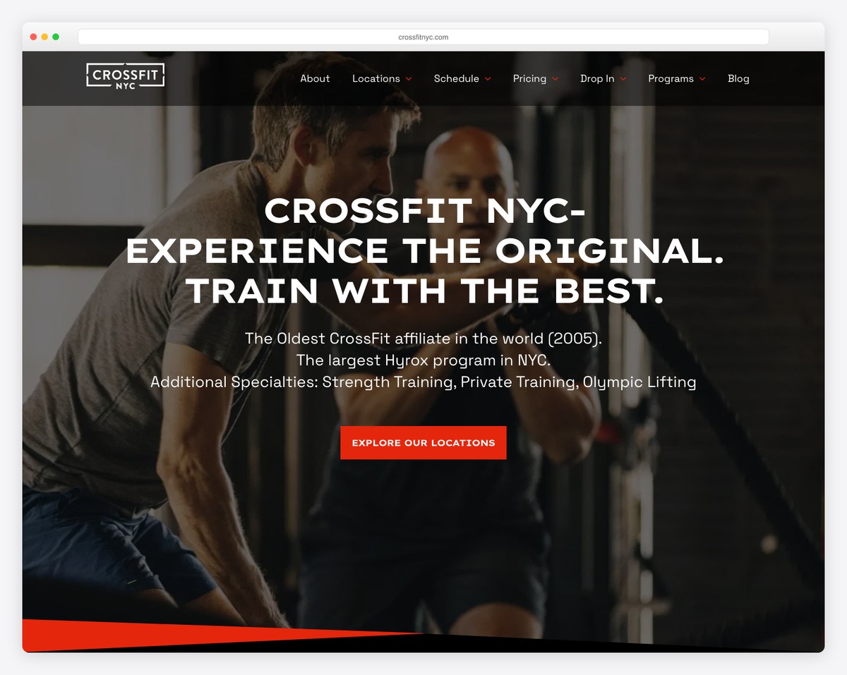
CrossFit NYC, known as The Black Box, holds the distinction of being the oldest CrossFit affiliate in the world, founded in 2005. Operating in Flatiron and the Upper West Side, the site uses dark accents and a no-frills layout that reflects the gym’s OG status.
The design doesn’t try to be flashy — it doesn’t need to be. As the first CrossFit affiliate in New York, the brand carries historical weight. The site focuses on essential information: locations, schedule, and how to start, letting the legacy speak for itself.
What stands out: As the oldest CrossFit affiliate in the world, the straightforward design lets the gym’s legendary status and two-decade track record do the convincing.
19. CrossFit Queens
Built with: WordPress
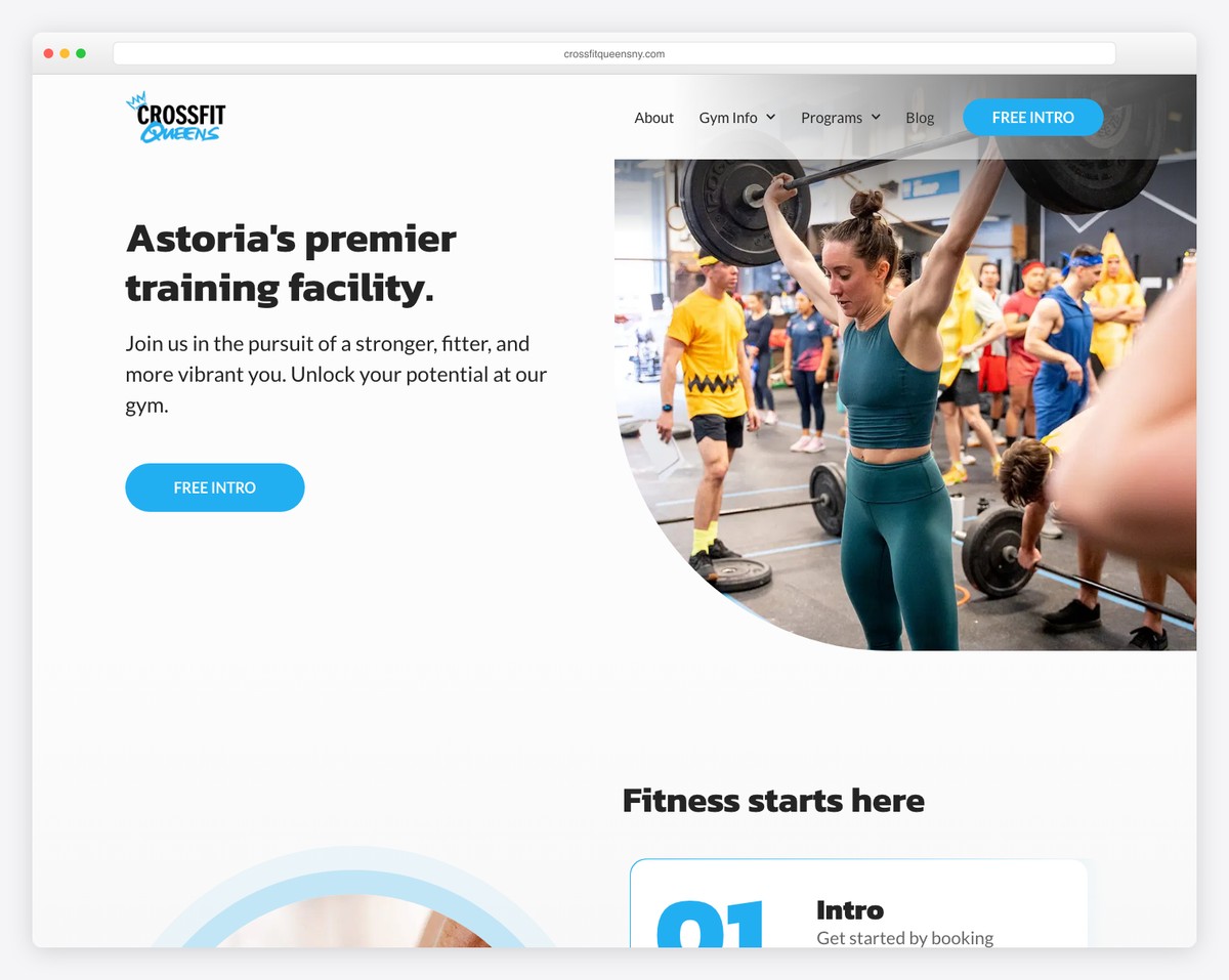
CrossFit Queens in Astoria, Queens, NY uses a dark gradient background with cyan and blue accents that give the site a modern, tech-forward feel. The color scheme is distinctive — cool tones that set it apart from the usual warm reds and oranges of CrossFit branding.
The cool blue palette works well for a borough that prides itself on being different from Manhattan. The site is well-organized with clear program descriptions and an emphasis on community that reflects Astoria’s tight-knit neighborhood culture.
What stands out: The cyan and blue accent palette breaks from typical CrossFit color conventions, giving the site a fresh, modern identity that matches Astoria’s creative energy.
20. CrossFit Hell’s Kitchen
Built with: WordPress
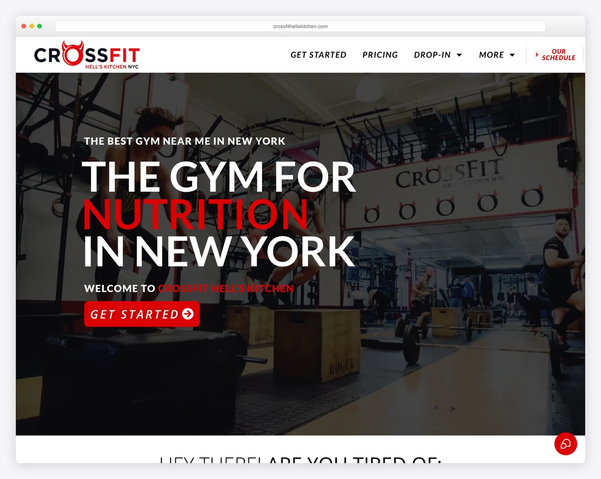
CrossFit Hell’s Kitchen in Manhattan uses bold red accents and a full-width hero that captures the gritty energy of its namesake neighborhood. The design leans into the Hell’s Kitchen brand with an intensity that feels authentic and unapologetic.
The red accent color is a natural fit for a gym named after one of NYC’s most iconic neighborhoods. The full-width hero imagery shows real members mid-workout, creating an immediate sense of the gym’s culture and intensity level.
What stands out: The bold red accents and neighborhood branding create a site that feels inseparable from Hell’s Kitchen itself — the location IS the brand.
21. ESTLR Athletics
Built with: WordPress
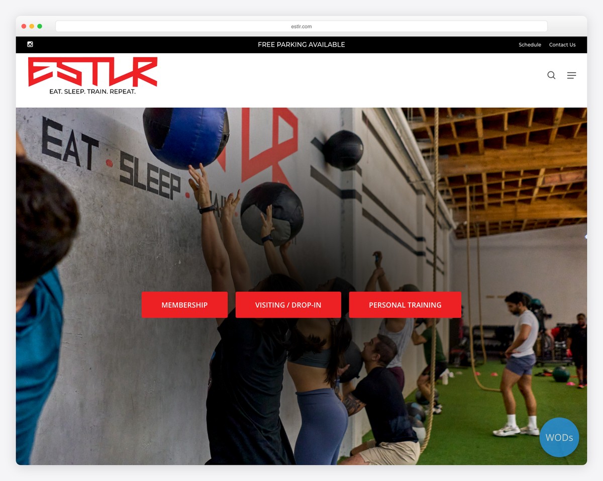
ESTLR Athletics in the DTLA Arts District features a minimalist dark navigation with vibrant accent colors that pop against the dark background. The design mirrors the Arts District’s creative energy — industrial, artistic, and contemporary.
The vibrant accents add personality without cluttering the layout, and the minimalist navigation keeps the focus on content and CTAs. For a gym in one of LA’s most creative neighborhoods, the design feels perfectly at home.
What stands out: The vibrant accents against a dark minimalist canvas reflect the DTLA Arts District’s creative character, making the gym feel like a natural extension of its neighborhood.
22. CrossFit Aldgate
Built with: WordPress
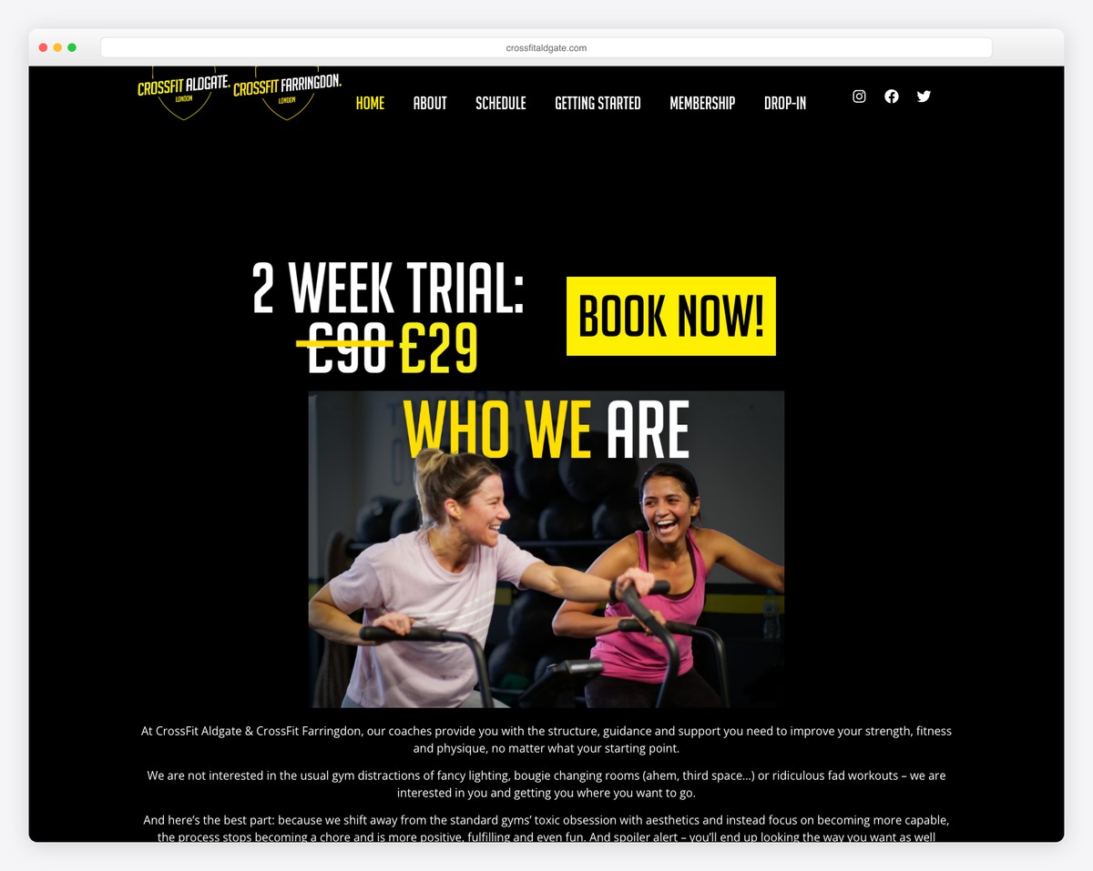
CrossFit Aldgate operates two locations in London with a professional design that emphasizes clear “BOOK NOW” calls-to-action. The site is business-focused — every element is designed to convert visitors into booked trial sessions.
The dual-location setup is handled cleanly, with separate information for each gym that helps Londoners find the most convenient option. The professional polish signals that this is a well-run operation, which matters in a city where competition for fitness members is fierce.
What stands out: The prominent “BOOK NOW” buttons throughout the site create a conversion-optimized experience that wastes no time getting visitors to take the next step.
For more web design inspiration, explore our website builder comparisons or browse personal trainer website examples for additional ideas.
23. CrossFit DB
Built with: WordPress
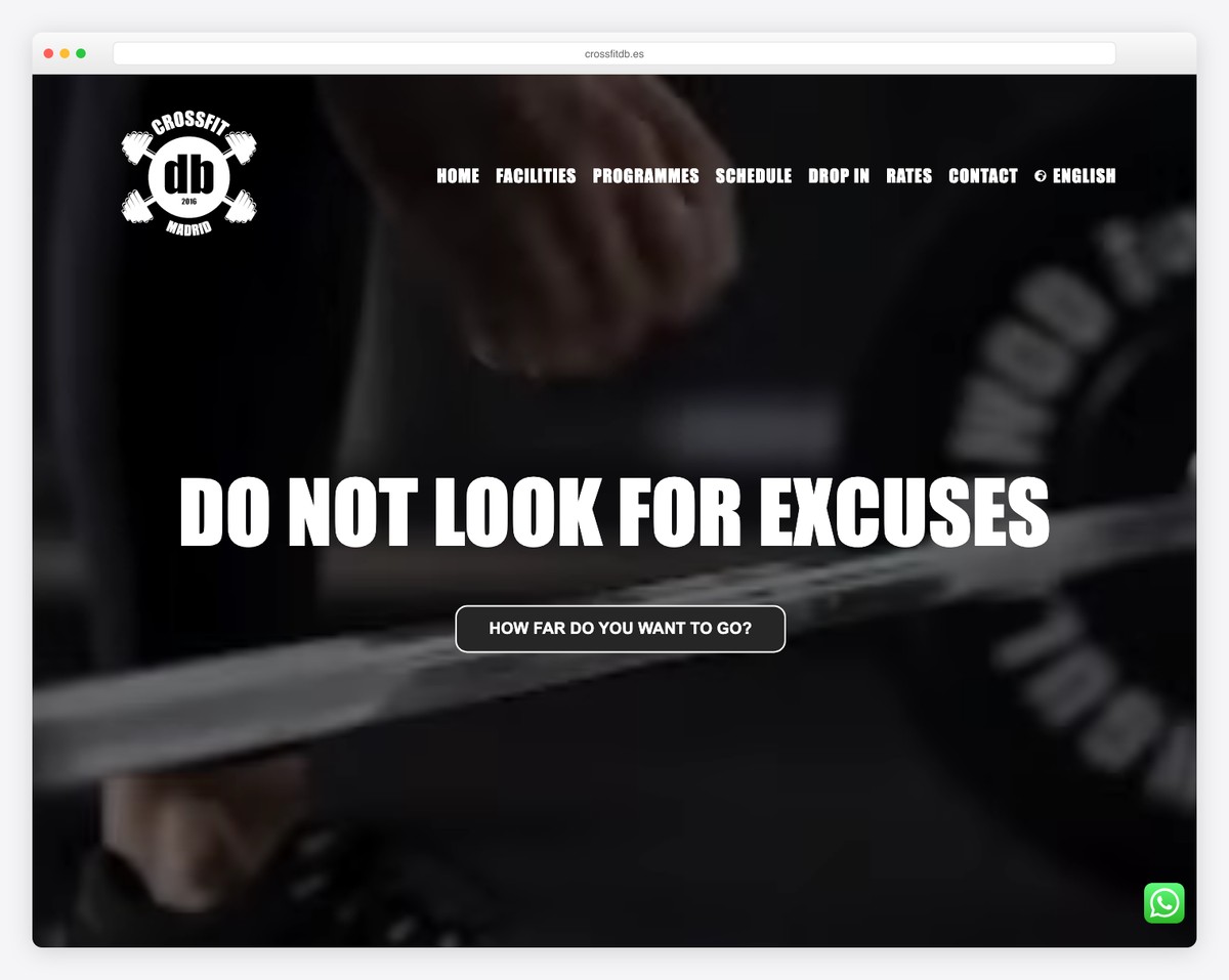
CrossFit DB in Madrid, Spain uses red accents with a clean Montserrat and Open Sans typography pairing that gives the site a sharp, readable feel. The bilingual support (Spanish and English) opens the gym to Madrid’s large international community.
The typography choices are noteworthy — Montserrat for headings brings boldness and impact, while Open Sans for body text ensures readability. It’s a combination that many fitness websites could benefit from adopting.
What stands out: The clean typography pairing and bilingual support demonstrate thoughtful design choices that serve both local and international audiences in Madrid.
24. CrossFit Unit
Built with: WordPress
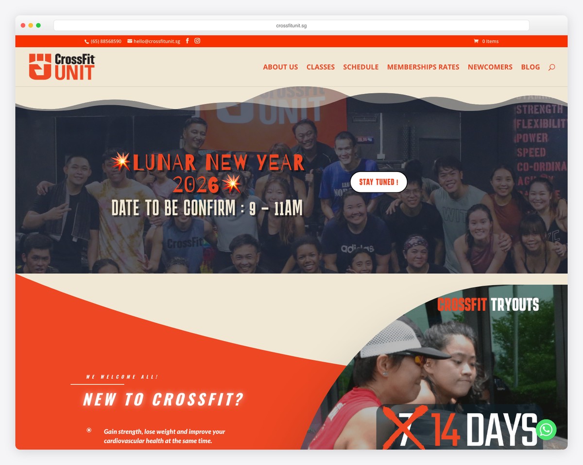
CrossFit Unit in Singapore’s Sports Hub uses a balanced dark-and-light design with seamless Instagram integration. The social feed adds a layer of real-time content that keeps the site feeling fresh without requiring constant manual updates.
The Instagram integration is more than decorative — it showcases daily community life, recent WODs, and member achievements. For prospective members scrolling through, it’s live proof that this is an active, thriving community.
What stands out: The Instagram integration turns social media content into a dynamic trust signal, showing real-time community activity that static testimonials can’t match.
25. CrossFit Bondi
Built with: WordPress
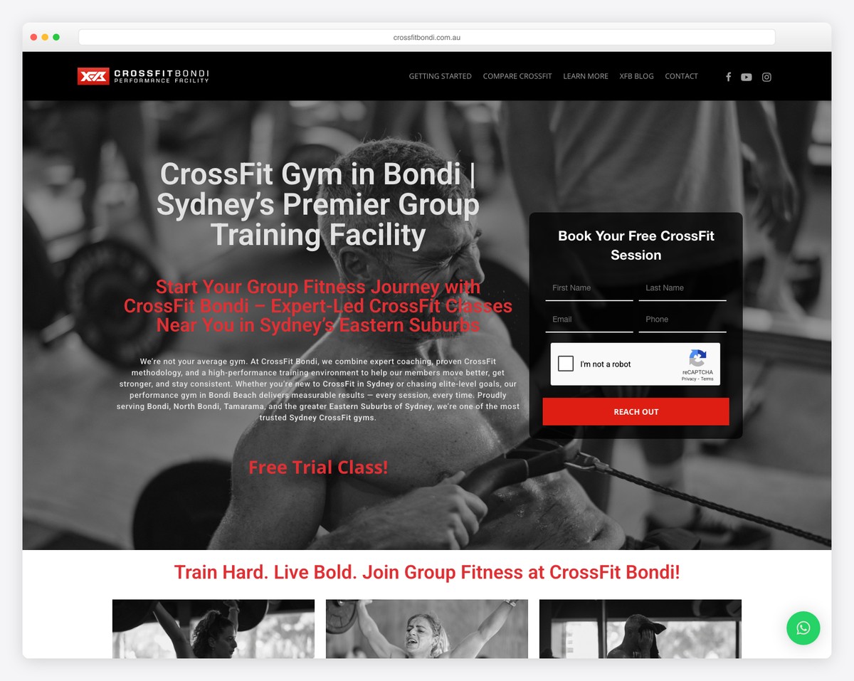
CrossFit Bondi in Bondi Junction, Sydney focuses on performance with a dedicated beginners program that lowers the barrier to entry. The site clearly differentiates between its competition track and its foundations program, making both audiences feel welcome.
The beginners program is presented as a genuine pathway, not an afterthought. Prospective members can see exactly what the on-ramp process looks like, which removes the anxiety that often stops people from walking into a CrossFit box for the first time.
What stands out: The dedicated beginners program with clear on-ramp details addresses the biggest objection potential members have — the fear of being unprepared for CrossFit.
26. CrossFit Colosseum
Built with: WordPress
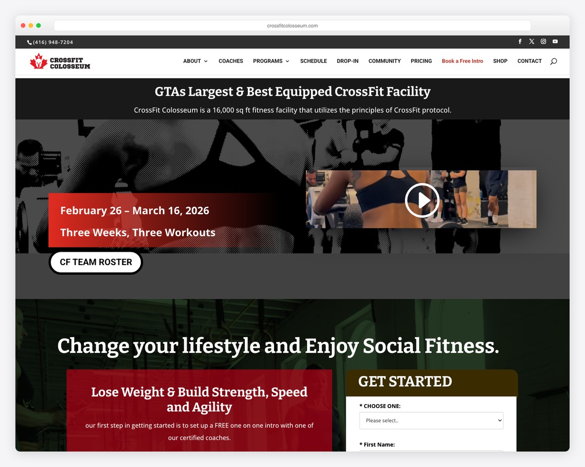
CrossFit Colosseum in Toronto boasts a massive 16,000-square-foot facility and a dark-and-red design built on the Divi theme. The site’s scale matches the gym’s physical footprint — bold, expansive, and commanding.
The dark-and-red palette is classic CrossFit, and the Divi theme provides enough flexibility to create a custom-feeling design without the cost of a fully bespoke build. For gym owners looking at WordPress, this is a strong example of what’s possible with a premium theme.
What stands out: The 16,000-sqft facility is the hero of the brand, and the dark-and-red design amplifies the imposing scale of one of Toronto’s largest CrossFit boxes.
27. Invictus Fitness
Built with: Custom
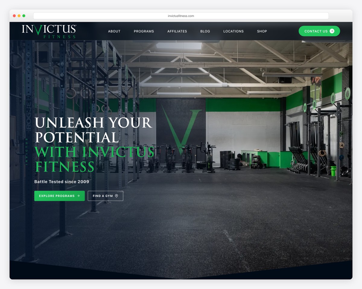
Invictus Fitness operates from San Diego with a multi-location presence and a custom-built Next.js website. The minimalist design with gradient overlays creates a polished, app-like experience that feels more tech startup than traditional gym.
The Next.js architecture delivers blazing-fast page loads and smooth transitions that most gym websites can’t match. For a brand that sells online programming to a global audience, the technical investment pays off in user experience and conversion rates.
What stands out: The custom Next.js build delivers a performance level and user experience that template-based sites simply can’t replicate — a fitting choice for a gym that competes at the highest level.
28. CrossFit Hawthorn East
Built with: Custom
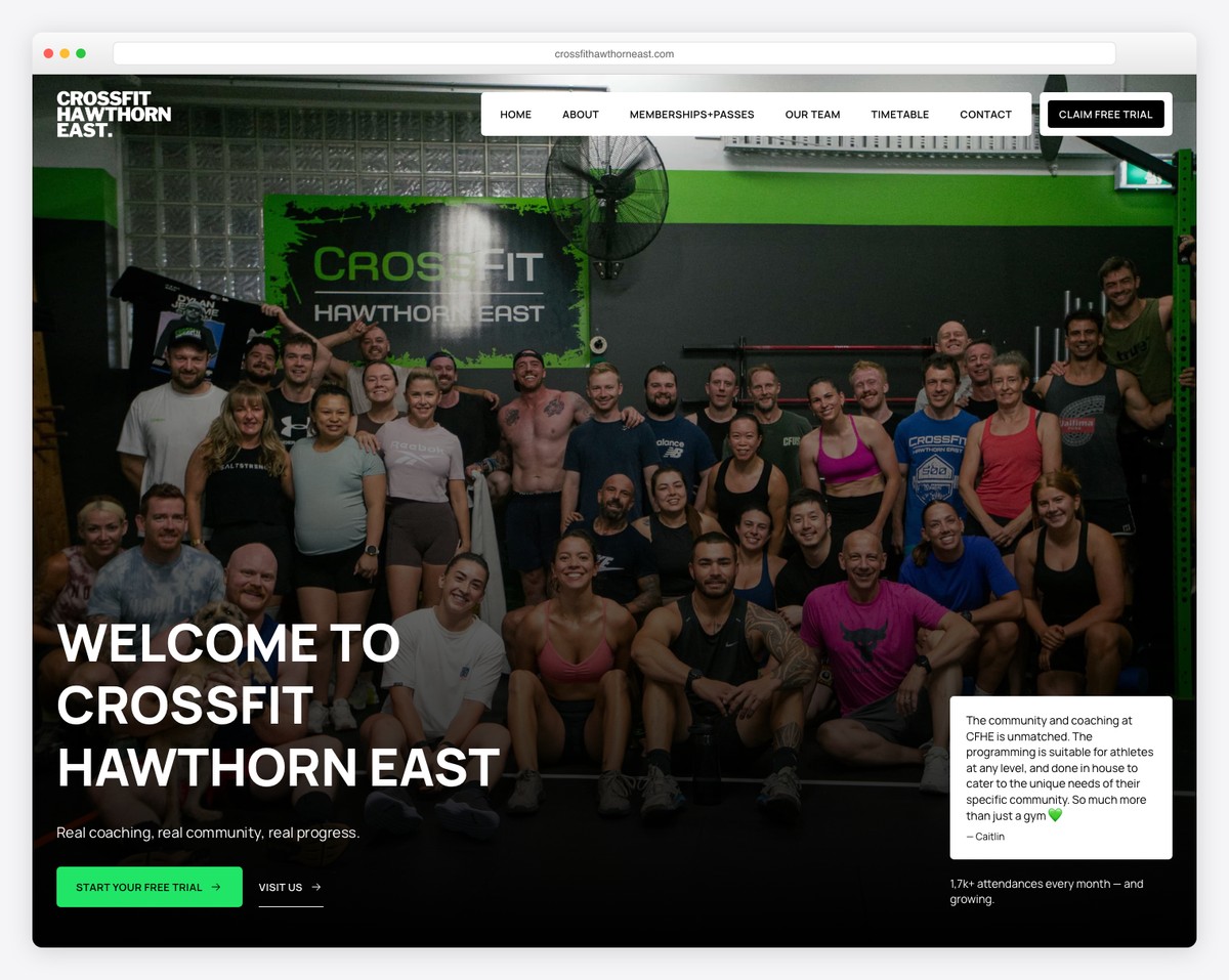
CrossFit Hawthorn East in Melbourne, Australia uses a Framer-built site with dark theming and animated components that bring the design to life. The animations are purposeful — they highlight key content sections and guide the visitor’s journey through the page.
The Framer platform enables the kind of micro-interactions and component animations that would be difficult to achieve with traditional website builders. The dark theme keeps the focus on the animated elements, creating a modern experience that stands out in the CrossFit space.
What stands out: The Framer-powered animations add a layer of interactivity that makes this one of the most technically impressive CrossFit gym websites we’ve seen.
What Makes a Great CrossFit Gym Website?
After reviewing 28 CrossFit gym websites across four continents, here are the elements that consistently appear in the best designs:
- Authentic training photography — Real photos of members mid-WOD build more credibility than any stock image of a clean barbell.
- Clear beginner pathway — The best sites address the intimidation factor head-on with dedicated on-ramp or foundations programs.
- Prominent trial offers — Free trials and intro sessions placed above the fold convert curious visitors into first-time members.
- Coach profiles — CrossFit members choose boxes based on coaches. Feature your coaching team prominently with credentials and personalities.
- Community social proof — Testimonials, Instagram feeds, and member spotlights prove the community is real and thriving.
- Mobile-first design — Members check WODs and schedules on their phones daily. Your site must work flawlessly on mobile.
Squarespace is the most popular platform among CrossFit gyms thanks to its clean templates and scheduling integrations. Wix offers more creative flexibility with animations and video backgrounds, while Shopify is the best choice if you plan to sell programming, merchandise, or supplements alongside memberships.
Related Posts


Comments (0)