Portfolio 2
Template Details
Author: Colorlib
Updated: October 2026 · v3.0.0
Credits: Images from Unsplash
Description
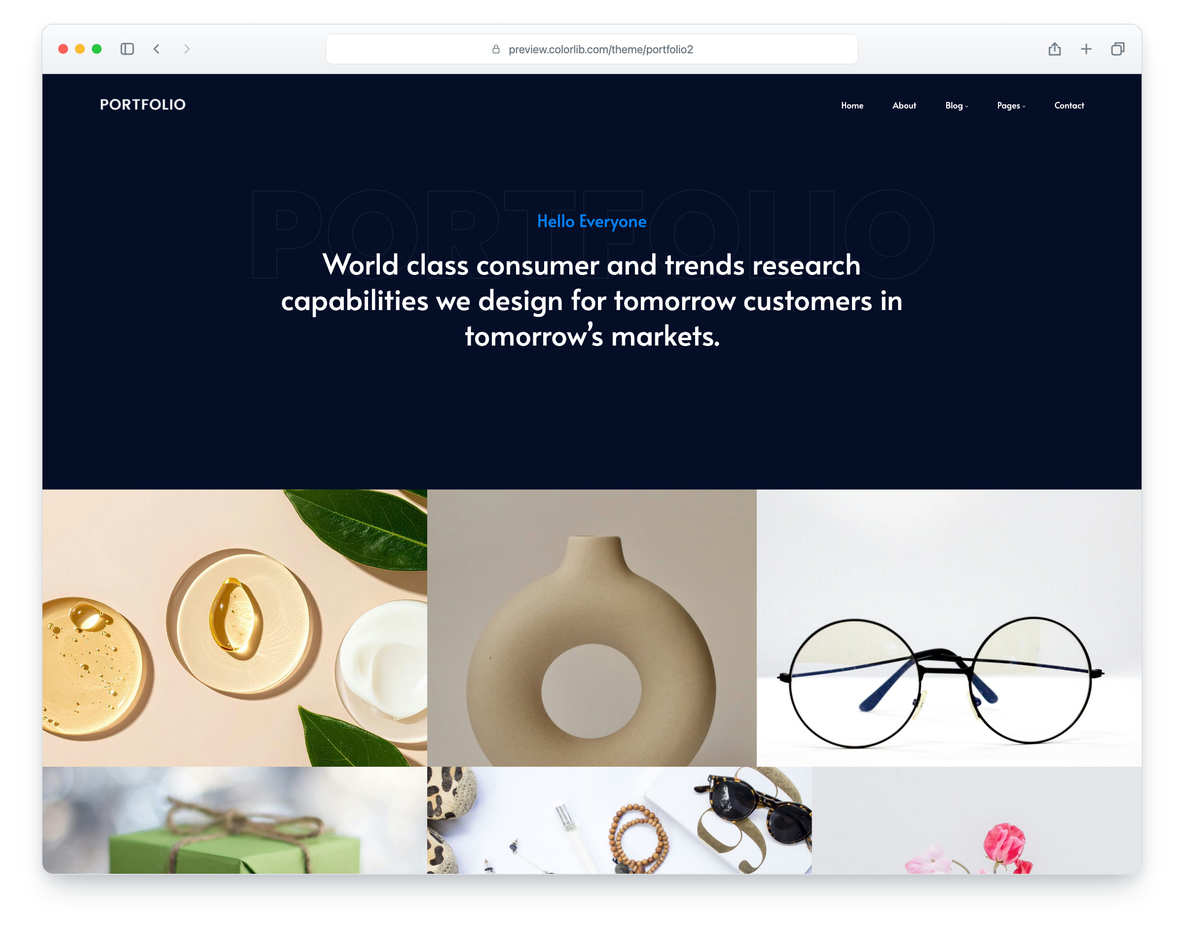
Portfolio 2 is a website template for creative design studios, agencies and freelance designers, built on Bootstrap 5 with a dark navy and bright blue design. The layout is responsive and mobile-ready and works in all popular web browsers. It comes with nine pages: home, about, services, works, work details, blog, single blog post, contact and elements.
The home page opens with a large statement hero and a full-width work grid with hover captions, followed by services, an article slider, a testimonial slider and a call to action. The inner pages add a team section, a project case study with client details and share links, a blog with sidebar and comments, and a contact page with a click-to-load map and a working contact form.
What’s new in 3.0
- Bootstrap 5.3.8 (the earlier release used Bootstrap 4.0 and jQuery), compiled from Sass together with the theme and the original Bootstrap 4 proportions, and plain JavaScript with no jQuery. Swiper 14 replaces Owl Carousel on the testimonial and article sliders, PhotoSwipe replaces Magnific Popup in the Elements gallery, and a keyboard-operable menu panel replaces SlickNav. npm run build (Dart Sass and esbuild) compiles one minified stylesheet and one script.
- Lighter pages: all ten pages together went from 28.0 MB and 503 requests to 6.8 MB and 205 requests. Every photo has an AVIF version with the JPEG or PNG as the fallback, real dimensions and lazy loading below the fold, and unused plugins such as Isotope, Counter-Up, WOW.js, Slick, Nice Select and a date picker are gone.
- No third-party requests: Alata, Roboto and Poppins are self-hosted, the Font Awesome, Themify and Flaticon icon fonts are replaced by Lucide SVG icons and a small social-logo subset (the Twitter bird is now the X logo), the contact map loads only after a click, and a Google Analytics 4 snippet stays commented out until you add your own ID.
- Working forms: the contact, comment, newsletter and Elements forms send through php/send-email.php, with validation, a spam trap and an in-page message, and the blog search sends its term to the blog page.
- Accessibility: a skip link and a main landmark on every page, one h1 per page, a real menu button, a mobile menu that keeps keyboard focus inside and closes with Esc, sliders that pause on focus, names on icon-only links, descriptive alt text, visible labels on every form, focus rings, reduced-motion support and WCAG AA text contrast.
- Fixed and refreshed: the work grid photos are cropped to their tiles instead of stretched and are sharp on large screens, each testimonial slide has its own client, the footer and button links lead to real pages, and the demo content uses new still-life and studio photos from Unsplash and fictional client, project, team and blog names.
Pricing Portfolio 2
Single
$19
- Premium support
- Template updates
- For 1 year
- Access all templates
Membership
$129
- Premium support
- Template updates
- For 1 year
- For 1 year
Lifetime
$349
- Premium support
- Template updates
- For life
- For life
Similar Portfolio Templates View all 91 portfolio templates →