Magazine
Template Details
Author: Colorlib
Updated: October 2026 · v3.0.0
Credits: Images from Unsplash
Description
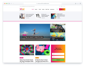
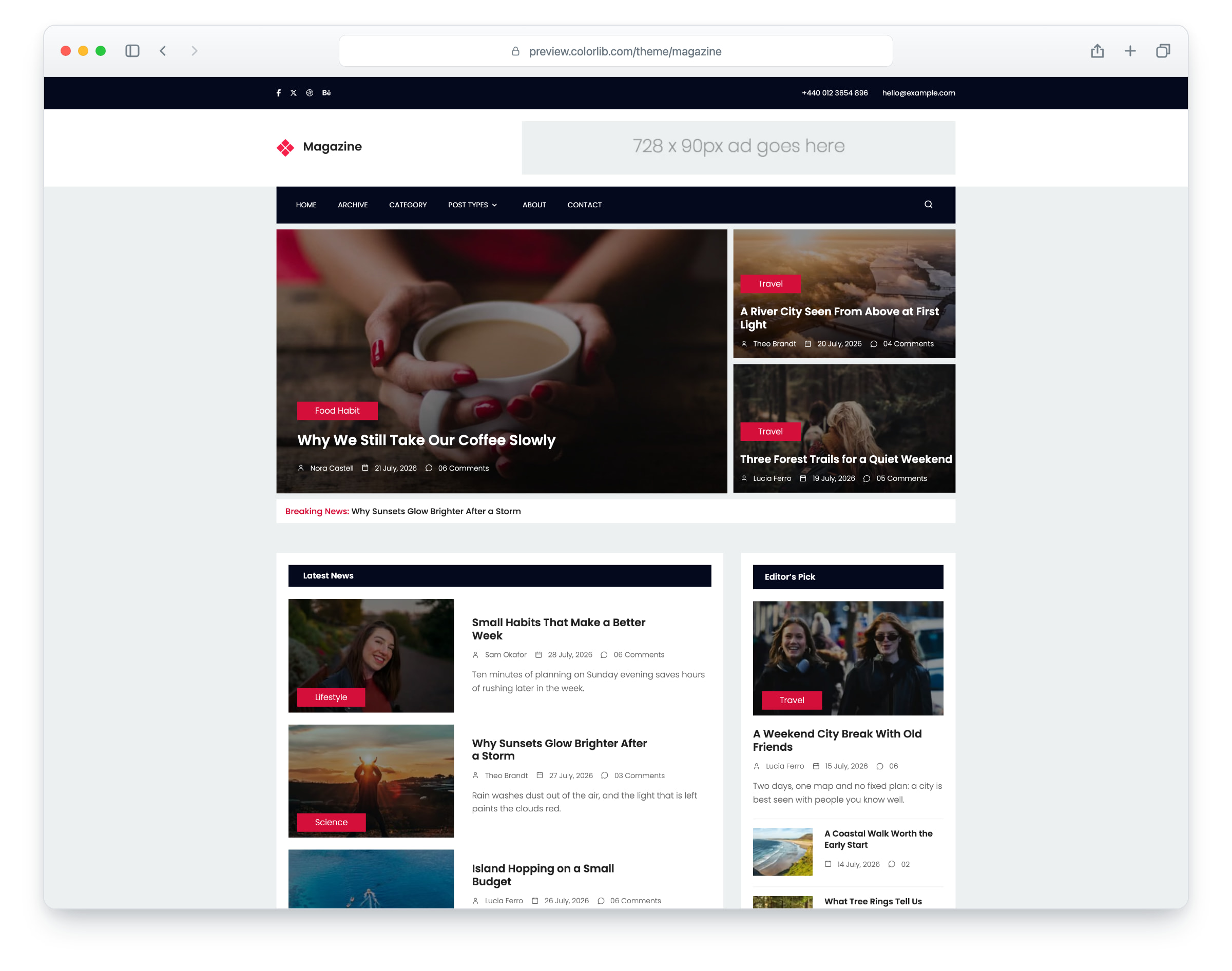
Magazine is a news and lifestyle magazine template, built on Bootstrap 5, for stories about travel, food, fashion and everyday life. The layout is responsive and mobile-ready. There are ten pages: home, archive, category, standard post, image post, gallery post, video post, audio post, about and contact.
The home page has top stories with large photos, a breaking news line, Latest News, Popular Posts and Relevant Stories, ad slots in the header and sidebar, and a sidebar with Editor’s Pick, a newsletter form, Most Popular and social links. The 25 demo stories each open their own article with a byline, comments, a comment form and links to the previous and next story; the archive lists every story with a Load More button, the category page shows one section or the results of the search box in the menu bar, and an RSS feed lists the stories. The five post types show a single photo, a photo slider, a video that plays in a dialog and an audio player. The about page has features, a who-we-are section, an accordion with a video, reader quotes and partner badges, and the contact page has the contact details, a map that loads on click and a contact form. Magazine gives you a ready-made site for an online magazine, a news site or a lifestyle blog.
What’s new in 3.0
- Bootstrap 5.3.8 (the earlier release used a Bootstrap 4.0 beta and jQuery 2.2.4), compiled from Sass with the design’s original proportions, and plain JavaScript with no jQuery. Swiper 14 replaces Owl Carousel on the gallery post, the reader quotes and the partner badges, a video dialog replaces Magnific Popup and the old video player script, CSS submenus replace Superfish, a keyboard-operable slide-in panel replaces the cloned phone menu, and unused plugins such as Nice Select, jQuery UI, ajaxChimp and animate.css are gone. Lucide SVG icons replace Linearicons and Font Awesome 4.7, with a small Font Awesome 7 Brands subset for the social logos (the Twitter bird is now the X logo). npm run build (Dart Sass and esbuild) compiles one minified stylesheet and one script.
- Lighter pages: the home page went from 1.86 MB and 68 requests to 0.64 MB and 43 requests, and the video post from 2.77 MB and 77 requests to 0.55 MB and 32 requests. Every photo has an AVIF version with the JPEG or PNG as the fallback, real dimensions and lazy loading below the first screen, and the logo is an SVG. The download went from 2.73 MB to 1.85 MB and includes the Sass sources, the build scripts and the PHP mailers.
- No third-party requests: Poppins is self-hosted, the icons are local SVG, the contact map is an OpenStreetMap map (no API key needed) that loads only when a visitor clicks “Show map”, the videos load from YouTube’s privacy-enhanced player only after a click, and an analytics snippet stays commented out until you add your own ID. Before, every page loaded web fonts, scripts and a map script from outside servers, and the video post loaded its player as soon as the page opened.
- Real demo content: 25 fictional stories with their own headlines, sections, writers, dates and excerpts, and every teaser opens its own article. The archive has Load More, the category page filters by section, the search box in the menu bar works, and an RSS feed lists the stories. Before, every teaser repeated one placeholder headline and linked to the same post. Writers, commenters and readers are fictional, the partner badges are original artwork for fictional partners, the about page copy is about the magazine, the video posts play stock clips, and the audio post plays a placeholder track (it pointed at two missing files).
- Working forms: the contact form, the comment forms on the post pages and the sidebar newsletter send through php/send-email.php and php/subscribe.php, with validation, a spam trap and an in-page message, and no visitor input in the mail headers. Before, the comment forms had no action, the newsletter was a plain link, and the contact mailer put the visitor’s address in the From header.
- Accessibility: a skip link, a main landmark, one h1 per page and the page language set, names on icon-only links and buttons, labelled fields, alt text for every photo, a keyboard-operable accordion, a phone menu that keeps keyboard focus inside and closes with Esc, submenus that open on keyboard focus and on the first tap on touch screens, visible focus rings, 44 px tap areas for the small header controls and the gallery arrows, and WCAG AA text contrast: dark text on the bright pink page band, a deeper pink for pink text and for the tags and buttons with white labels, darker body, footer, date and field greys, and a soft shade under the white captions on the lead photos.
- Fixed: on phones the search form lay over the menu button, so the menu could not be opened; the page jumped when the menu bar stuck to the top; every page requested a favicon that did not exist; the reader quote arrows pointed up and down on a sideways slider; every link goes somewhere now (about 70 per page went nowhere), apart from the social profile links, which are placeholders for your own; and typos are corrected throughout.
Pricing Magazine
Single
$19
- Premium support
- Template updates
- For 1 year
- Access all templates
Membership
$129
- Premium support
- Template updates
- For 1 year
- For 1 year
Lifetime
$349
- Premium support
- Template updates
- For life
- For life
Similar Templates