Boto
Template Details
Author: Colorlib
Updated: October 2026 · v3.0.0
Credits: Images from Unsplash
Description
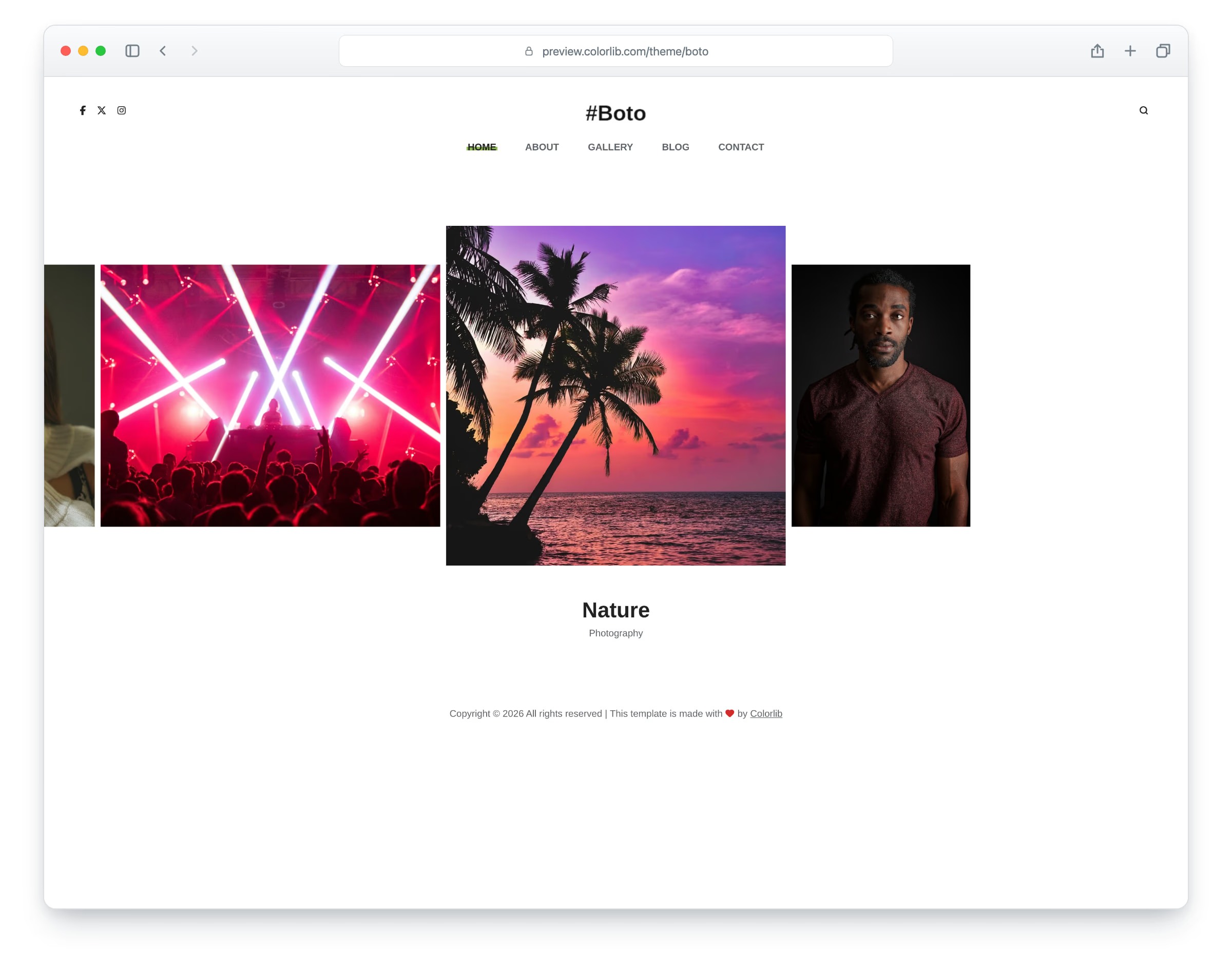
Boto is a photography portfolio template, built on Bootstrap 5, for photographers and creative studios. It has a light, photo-first layout: a centred header with the logo, social links, a full-screen search and the menu, and plenty of white space around the photos. The layout is responsive and mobile-ready, with a slide-in menu on phones. There are six pages: home, about, gallery, blog, a single blog post and contact.
The home page is a photo slider that shows each photo at its own width, with the active one centred at full height and its title below; every photo opens in a lightbox. The about page has a portrait, a signature, an experience column and skill bars. The gallery is a twelve-photo grid with a lightbox, and the blog a mixed grid of post cards. The blog post has a photo strip, a quote, a banner photo, tags and share links, a comment form and related posts, and the contact page has your details, social links and a working contact form.
What’s new in 3.0
- Bootstrap 5.3.8 (the earlier release used Bootstrap 4.4.1 and jQuery), compiled from Sass together with the theme and the Bootstrap 4 proportions the design was drawn with, and plain JavaScript with no jQuery. Swiper 14 replaces Slick on the home slider and the blog photo strip, PhotoSwipe 5 replaces the old lightbox, and a slide-in mobile menu replaces SlickNav. npm run build (Dart Sass and esbuild) compiles one minified stylesheet and one script.
- Lighter pages: all seven pages together went from 7.0 MB and 120 requests to 3.4 MB and 87 requests; the home page from 1.5 MB to 0.96 MB and the contact page from 0.46 MB to 0.15 MB. Every photo has an AVIF version with the JPEG as the fallback, real dimensions and lazy loading below the first screen, and the full-page preloader is gone.
- No third-party requests: Arimo is self-hosted, and Font Awesome 4.7 is replaced by Lucide SVG icons and a small social-logo subset (Twitter is now X).
- Sharper photos: the home slider, blog cards, blog photo strip and banner use photos at twice the old resolution or more.
- Accessibility: a skip link, landmarks and one main heading per page, labelled icon buttons, a search panel and menu that work with the keyboard, visible focus rings, darker text and button colours that meet WCAG contrast, and reduced-motion support.
- Working forms: the contact and comment forms have visible labels, validate in the browser and send through the included PHP mail script with a spam trap; the header search goes to the blog.
Pricing Boto
Single
$19
- Premium support
- Template updates
- For 1 year
- Access all templates
Membership
$129
- Premium support
- Template updates
- For 1 year
- For 1 year
Lifetime
$349
- Premium support
- Template updates
- For life
- For life
Similar Photography Templates View all 48 photography templates →