
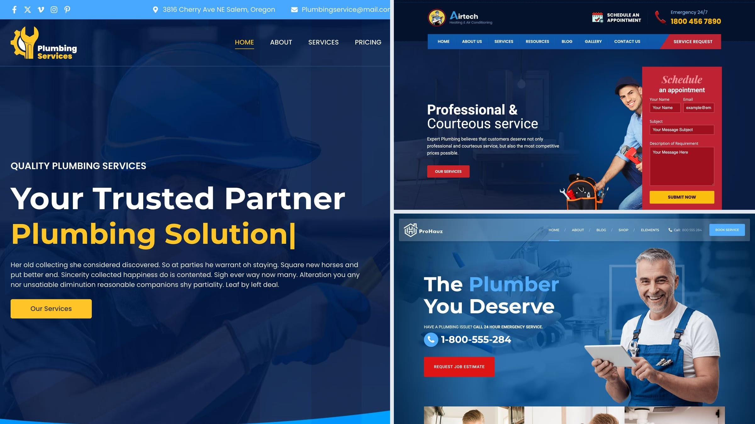
17 Best Plumber WordPress Themes 2027
The best plumber WordPress themes are Astra, whose free Plumber starter puts a quote form beside the headline, ProHauz, the best-selling plumber-specific theme, and Airtech, the only demo here with a request form, tap-to-call and an emergency line in the first screen. This list covers 17 themes, 9 free and 8 paid, each opened, screenshotted, checked against what a plumbing site needs and, for the free ones, speed-tested.
That checklist matters more than the design. We opened 18 real plumbing company websites: 16 put a tappable phone number above the fold, but only one put a quote form there. Among the demos below, 4 do. The themes that close that gap are marked, so you can see which ones ask for the job.
Want a plumbing site without WordPress? See our plumber website templates, including a free one, or browse plumbing website design examples for ideas.
Quick picks
- Best free: Astra — free Plumber starter with a quote form beside the headline
- Fastest (lab-tested): Royal Elementor Kit — 217 KB, the lightest theme we measured
- Best for quote requests: Airtech — request form, tap-to-call and emergency line in the first screen
- Most popular plumber theme: ProHauz — best-selling plumber-specific theme, on the most competitor lists
- Best for multi-trade firms: BlueCollar — handyman design rated highly by a large number of buyers
- Best for a supply shop: The Plumbing Store — a WooCommerce store for plumbing parts and fixtures
Top picks at a glance
Table of contents — all 17 themes
Quick comparison: our picks
| Theme | Price | Best for | Standout | Updated |
|---|---|---|---|---|
| Astra | Free | A plumbing company that wants quote requests | Quote form beside the headline | Sep 2026 |
| Royal Elementor Kit | Free | An Elementor site that must load fast | Lightest theme we tested | Sep 2026 |
| Airtech | $59 | Plumbing and heating firms | Form, tap-to-call and emergency line up top | Feb 2026 |
| ProHauz | $69 | Companies running coupons and call-outs | Best-selling plumber-specific theme | Jun 2026 |
| BlueCollar | $49 | Multi-trade firms | Top rating from a large sample | Sep 2026 |
| The Plumbing Store | $69 | Plumbing supply shops | WooCommerce store for parts | Jun 2026 |
Which demos have what a plumbing site needs
We checked every plumbing demo for the four things that decide whether a visit becomes a job. A tick means it is there as imported; a dash means you add it yourself. Only 4 of the 16 demos put a quote or booking form in the first screen.
| Theme | Quote or booking form in first screen | Tap-to-call in header | Emergency line in header or hero | Appointment form |
|---|---|---|---|---|
| Astra | ✓ | — | ✓ | — |
| Royal Elementor Kit | — | — | — | — |
| Zakra | — | — | — | — |
| Mighty Plumbers | — | — | — | — |
| Neve | — | — | — | — |
| HomeLancer | ✓ | — | — | — |
| Colibri WP | — | — | — | — |
| GeneratePress | — | — | — | — |
| OceanWP | — | — | — | — |
| ProHauz | — | ✓ | ✓ | ✓ |
| Airtech | ✓ | ✓ | ✓ | ✓ |
| Boldman | — | — | — | ✓ |
| Plumbing by ThemeREX | — | — | ✓ | — |
| BlueCollar | — | ✓ | ✓ | — |
| Divi | ✓ | — | — | ✓ |
| Bridge | — | — | ✓ | — |
We tested it: free plumber theme speed
How we tested: we installed each free theme on the same clean WordPress site with identical content and no extra plugins, then measured the homepage with Google Lighthouse on mobile in September 2026. The content is the same everywhere, so the difference is the theme itself. The dedicated plumbing themes came out heaviest, which is worth weighing in a trade where people search on a phone in a hurry.
| Theme | Page weight | Requests | Lighthouse | LCP |
|---|---|---|---|---|
| Royal Elementor Kit | 217 KB | 13 | 82/100 | 2.1s |
| GeneratePress | 277 KB | 14 | 99/100 | 1.8s |
| Neve | 299 KB | 15 | 99/100 | 2.1s |
| Astra | 425 KB | 14 | 92/100 | 3.2s |
| Zakra | 451 KB | 17 | 91/100 | 3.1s |
| OceanWP | 802 KB | 29 | 72/100 | 5.3s |
| Mighty Plumbers | 1019 KB | 34 | 72/100 | 5.5s |
| Colibri WP | 1191 KB | 21 | 59/100 | 6.5s |
| HomeLancer | 1625 KB | 36 | 65/100 | 9.3s |
Best free plumber WordPress themes
Every theme in this section is free on WordPress.org, and so is the plumbing or handyman design shown, which we confirmed by checking that each demo runs the free theme rather than a Pro edition. Where a better plumbing design sits behind a paywall, the entry says so.
1. Astra
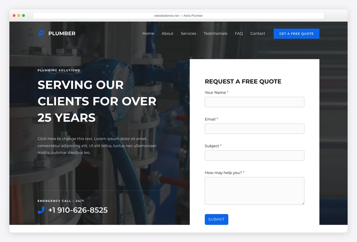
Why we like it: The only free plumber starter we found with a quote form beside the headline.
Astra’s free Plumber starter puts a short quote request next to the headline and an emergency number underneath, the combination that turns a visit into a job. The same design imports for the block editor, Elementor or Beaver Builder, so it fits the builder you already know, and it stayed light in our speed test.
✅ Pros: quote form in the first screen, emergency call-out line, one design for three page builders ⚠️ Cons: the phone number is plain text rather than a tap-to-call link, and much of the wider starter library needs Astra Pro
2. Royal Elementor Kit
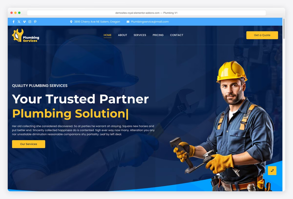
Why we like it: The lightest theme we tested, carrying a complete plumbing kit with its own pricing page.
Royal Elementor Kit imports a full plumbing site through Elementor, including a pricing page most plumbing designs leave out. It was the lightest theme in our speed test by a clear margin, which counts when people search for a plumber on a phone in a hurry. A second free plumbing kit adds reviews and a 24/7 message.
✅ Pros: lightest theme we tested, pricing page included, two free plumbing kits to choose from ⚠️ Cons: needs Elementor and the Royal Elementor Addons plugin, and the hero paragraph is filler text to replace
3. Zakra
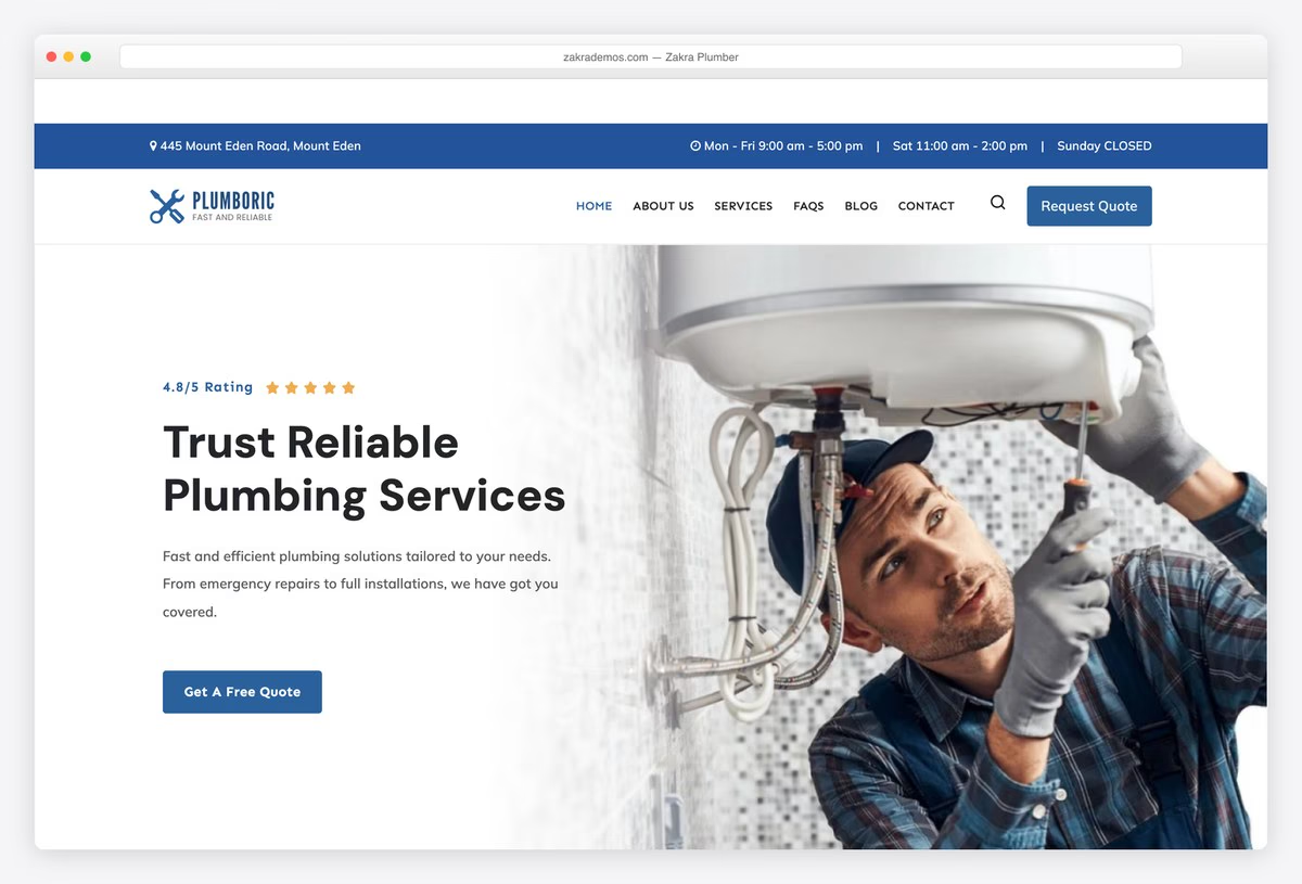
Why we like it: Real plumbing copy out of the box: leak detection and water heater pages, not lorem ipsum.
Zakra’s free Plumber starter ships with written service content for leak detection, water heaters and drains, so you are editing a plumbing site rather than filling an empty one. It stayed light in our test and the free theme includes header and footer builders. Its two Plumbing Services demos are Pro, so check the label before importing.
✅ Pros: genuine plumbing copy, light in our test, free header and footer builders ⚠️ Cons: no quote form or tap-to-call on the homepage, and the better-looking plumbing demos are Pro
4. Mighty Plumbers
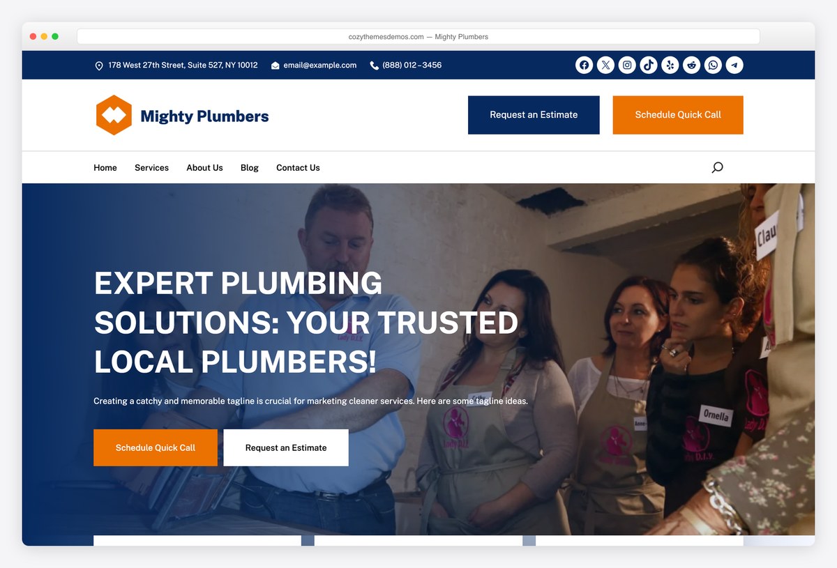
Why we like it: The only actively maintained free theme on WordPress.org built purely for plumbers.
Mighty Plumbers is the one free theme we found made only for plumbers, with drain cleaning, leak detection, sewer and 24/7 emergency sections in its demo. It sits below our usual install threshold, which is why it is flagged. Wire up the two header buttons before launch: in the demo, Request an Estimate and Schedule Quick Call link nowhere.
✅ Pros: plumbing-only design, emergency section, actively maintained ⚠️ Cons: below our install threshold, dead header buttons in the demo, and heavier than the frameworks
5. Neve
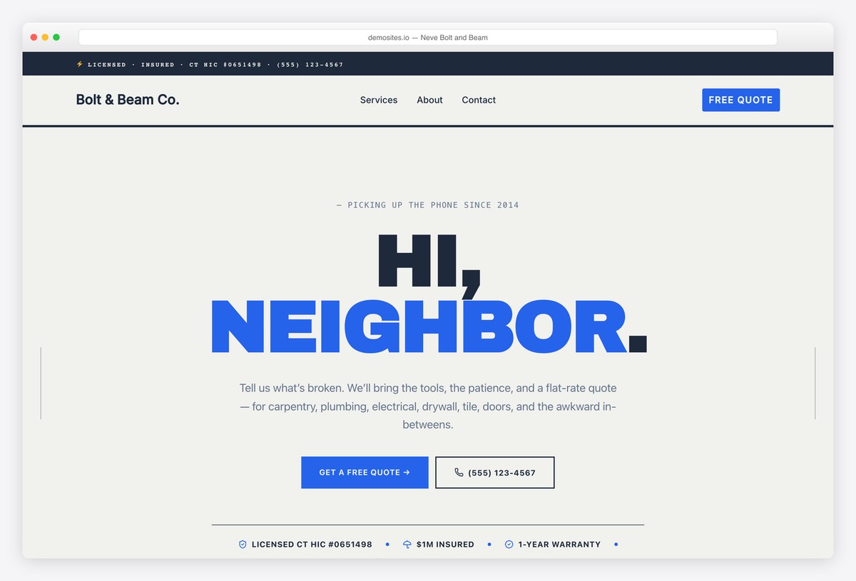
Why we like it: The warmest free design here, and one of the two fastest themes in our test.
Neve’s free Bolt and Beam starter is a handyman site with plumbing as one of six trades, written in a friendly local voice with prices and a licence line on the page. It tied for the best score in our speed test. The plumbing-only starter, IronWorks, needs Neve Pro on the Business plan, so the free design suits multi-trade firms.
✅ Pros: top speed score, prices and licence shown on the homepage, friendly local tone ⚠️ Cons: plumbing is one trade among six, and the plumbing-only starter is paid
6. HomeLancer
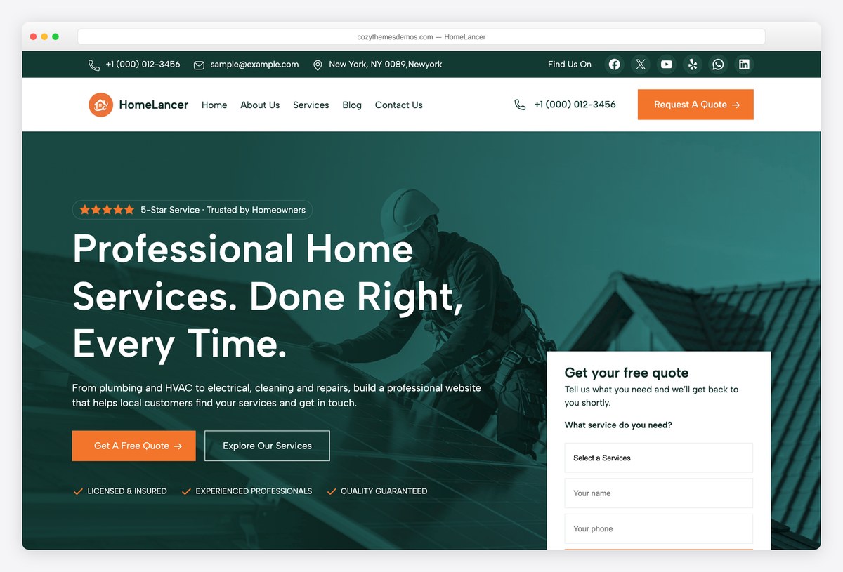
Why we like it: One of only two free demos here with a quote form in the first screen.
HomeLancer is built for a multi-trade home services company covering plumbing, HVAC, electrical, roofing and cleaning, and puts a three-field free quote form in the hero where visitors can use it at once. It was also the heaviest theme in our speed test, so compress images and drop sliders you do not need before launch.
✅ Pros: quote form in the first screen, built for several trades, actively maintained ⚠️ Cons: the heaviest free theme we measured, few ratings so far, and plumbing is one trade of several
7. Colibri WP
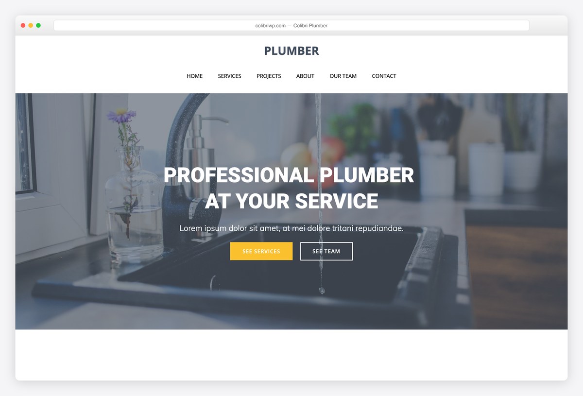
Why we like it: Its own visual drag-and-drop editor, so you do not need Elementor to rearrange a page.
Colibri WP brings its own drag-and-drop editor and a free Plumber starter with services, a projects grid and a contact form. The structure is sound, but most of the demo copy is placeholder text and the starter has not been refreshed in years, so plan to write every page yourself. It was also among the heavier themes we tested.
✅ Pros: its own visual editor, a free plumber layout, contact form included ⚠️ Cons: mostly placeholder copy, a dated starter, and heavier than the other frameworks
Not set on WordPress? Our plumber website templates are static sites with nothing to update, and Mainline is free, with a quote form in the first screen.
Free themes whose plumbing design is paid
These two themes are free and very widely used, but the plumbing design in the screenshot is part of a paid add-on. They are strong choices if you will pay for the starter, and listing them here means nobody is surprised at import.
8. GeneratePress
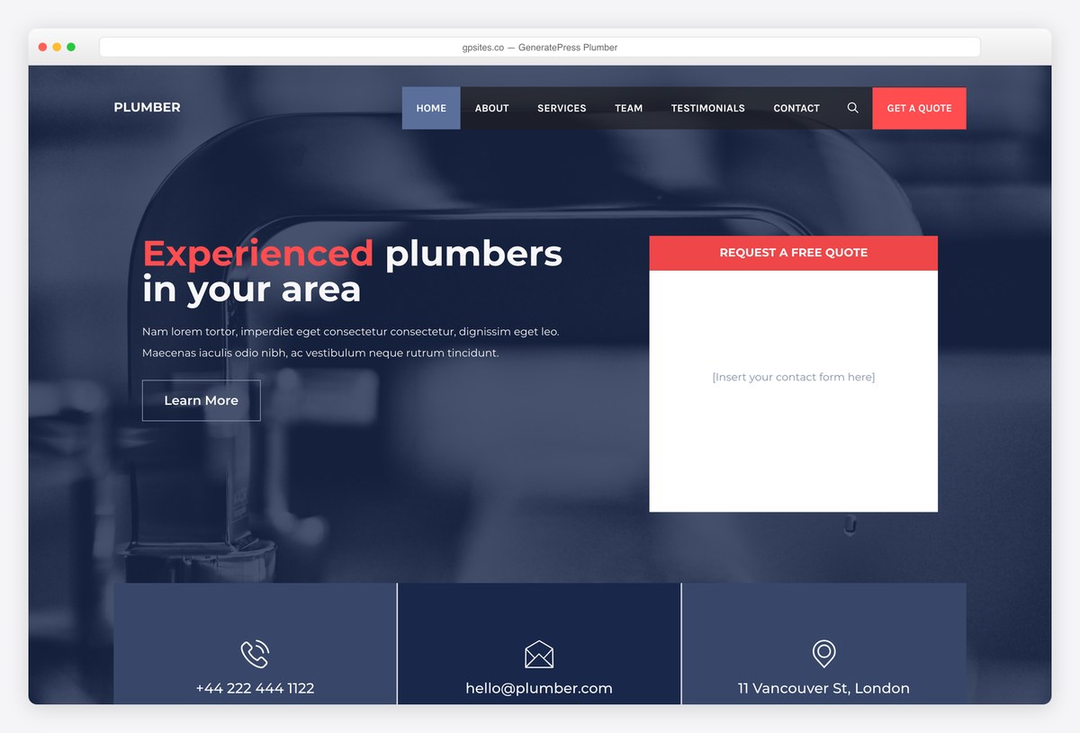
Why we like it: One of the lightest themes we have measured, with a plumber design that leaves room for your own quote form.
GeneratePress is one of the lightest themes we have measured, and its Plumber site from the premium library pairs a dark, service-led hero with a request-a-quote panel and phone, email and address underneath. The panel is a slot for your own form plugin. The theme is free, but importing this design requires GP Premium.
✅ Pros: top-tier speed, clean trade layout, a quote panel in the hero ⚠️ Cons: the plumber design is paid, and the quote panel needs a form plugin of your own
9. OceanWP
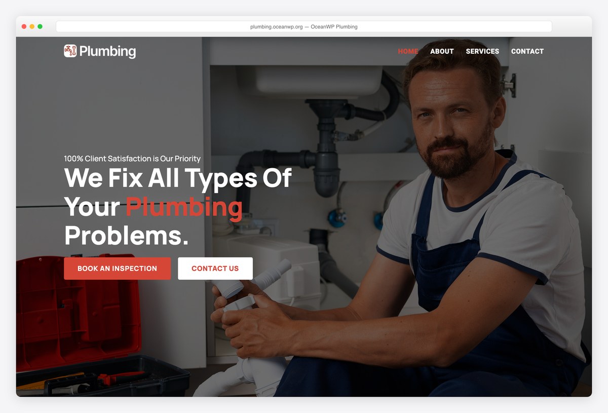
Why we like it: A confident photographic plumbing demo with one clear ask: book an inspection.
OceanWP’s Plumbing demo leads with a bold photographic hero and a single call to action, book an inspection, which suits plumbers who sell surveys and repiping rather than emergency call-outs. The theme is free and very widely used, but this demo needs OceanWP’s paid extensions bundle, and it was heavier than the other frameworks we tested.
✅ Pros: strong photographic design, a very large user base, Elementor-based ⚠️ Cons: the plumbing demo is paid, no quote form or tap-to-call in the demo, and heavier than most frameworks
Paid plumber WordPress themes
Paid themes still lead this category. Every figure below was read from the live ThemeForest item page or the vendor’s own pricing, and each theme is shown running its plumbing demo rather than the vendor’s sales page.
10. ProHauz
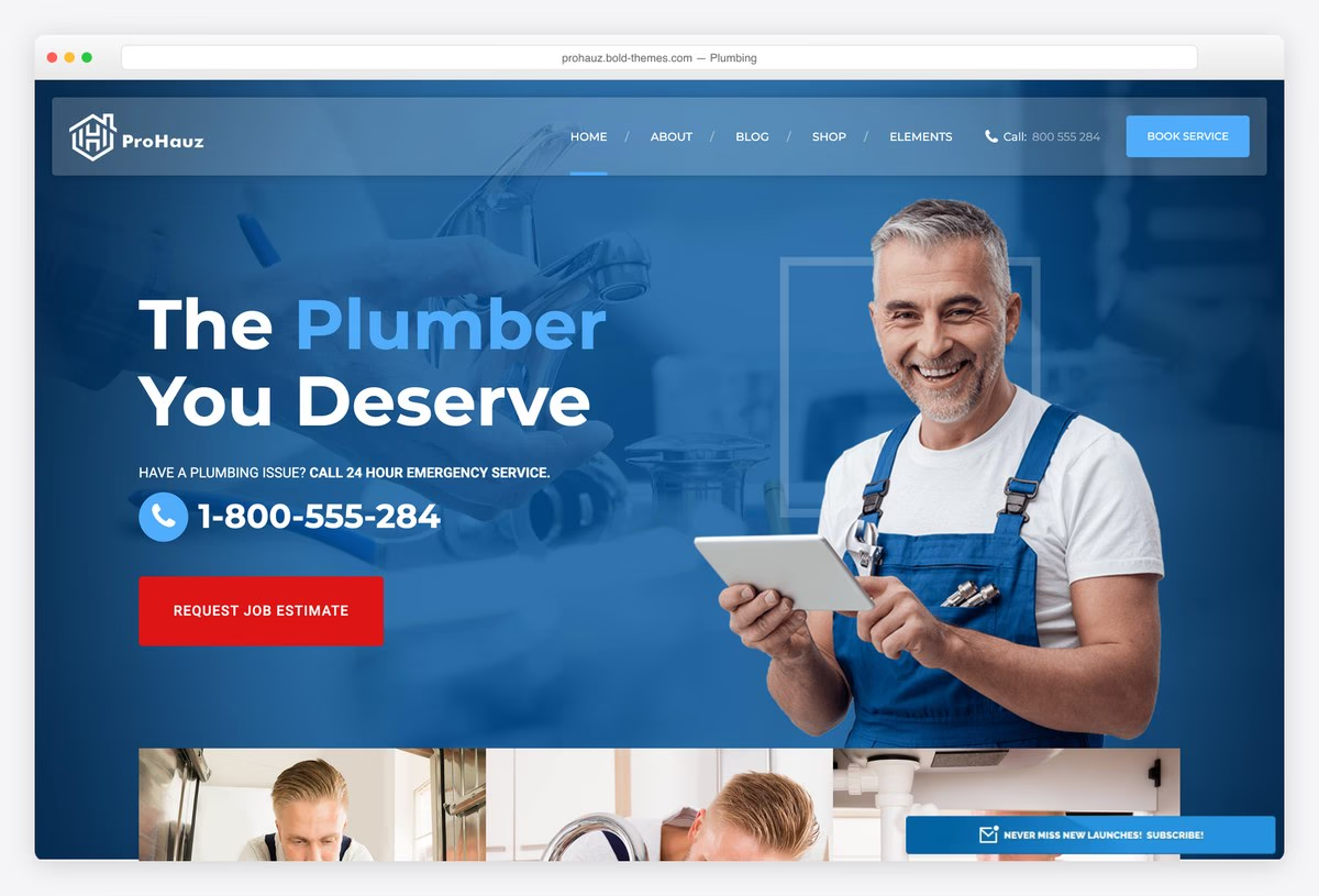
Why we like it: The best-selling plumber-specific theme we found, and on more competitor lists than any other.
ProHauz puts a tap-to-call number in the hero, an emergency line and a job estimate request, then backs them with coupons and an appointment form, the working parts of a real plumbing site. It was built for HVAC and home services, and its dedicated plumbing demo is among the most complete trade layouts in this list.
✅ Pros: tap-to-call, emergency and coupon patterns built in, appointment request form, strong sales ⚠️ Cons: the demo root is a sales page, so start from the plumbing demo, and the design is busy
11. Airtech
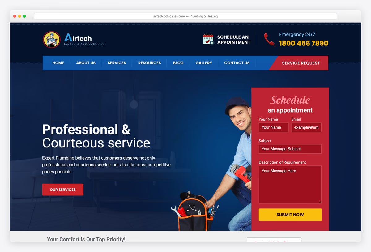
Why we like it: The only demo here with a request form, tap-to-call and an emergency line all in the first screen.
Airtech’s plumbing and heating demo does what our research says converts: an appointment request form beside the headline, a tap-to-call emergency number in the header and service cards straight after. For a firm that takes both repairs and heating installs, it is the most conversion-ready starting point in this list.
✅ Pros: request form in the first screen, tap-to-call emergency number, plumbing and heating in one design ⚠️ Cons: fewer sales than the category leaders, and the header is crowded on smaller screens
12. Boldman
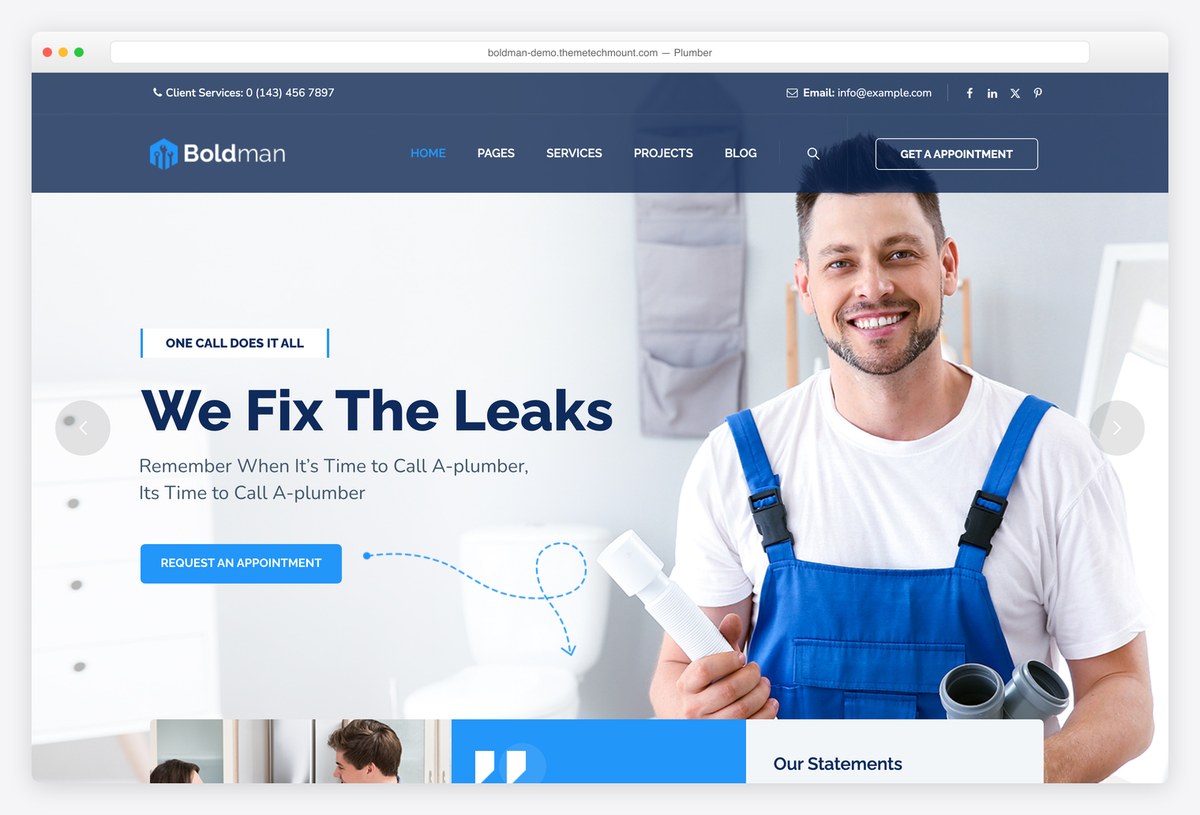
Why we like it: A dedicated plumber demo inside a large, frequently updated handyman theme.
Boldman is a handyman and renovation theme with its own plumber demo, opening on a clear leak-repair headline and an appointment button. It is updated often and has a large, well-rated customer base, which lowers the risk of buying a niche theme. Appointment booking is included; a quote form in the first screen is not.
✅ Pros: dedicated plumber demo, frequent updates, appointment booking ⚠️ Cons: no quote form or emergency line in the first screen, and it ships many demos you will not use
13. Plumbing by ThemeREX
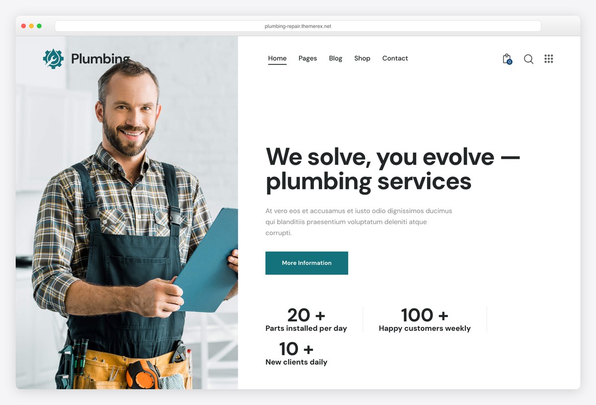
Why we like it: The calmest design in the paid section, with plumbing as the whole product rather than one demo.
ThemeREX’s Plumbing theme is built for plumbing and repair companies from the ground up, with a split hero, service counters, an emergency section and a shop if you sell parts. It is the most restrained design here, which suits a firm that wants to look established rather than loud. The demo paragraphs are placeholder text.
✅ Pros: plumbing-only product, clean modern design, optional shop for parts ⚠️ Cons: no quote form or tap-to-call in the first screen, and placeholder demo copy
14. BlueCollar
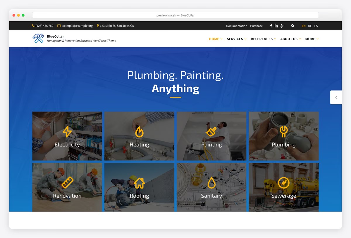
Why we like it: The best-rated theme in this list across a large number of buyers, and on five competitor roundups.
BlueCollar opens with Plumbing. Painting. Anything and a grid of trades, so it suits a firm that does plumbing alongside other work. It has a tap-to-call number and an emergency line in the header, one of the best ratings from a large number of buyers, and a lower price than most of the paid section.
✅ Pros: tap-to-call and emergency line, excellent rating from a large sample, lower price ⚠️ Cons: a handyman design first and plumbing second, and no quote form on the homepage
15. Divi
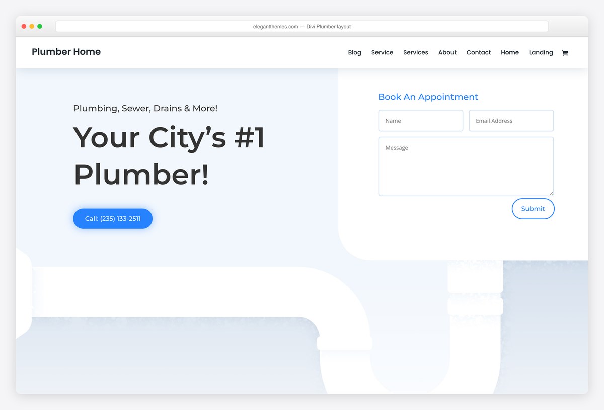
Why we like it: Its plumber layout pack comes with the theme and puts an appointment form in the first screen.
Divi’s Plumber layout pack, included with the theme, opens with a big local headline beside an appointment form, and every section can be rebuilt visually without code. It suits a plumber who wants full control of the design. The licence covers unlimited sites, which matters if you build for more than one trade or client.
✅ Pros: appointment form in the first screen, full visual control, unlimited sites ⚠️ Cons: a yearly fee unless you buy lifetime, and the phone number in the layout is not a tap-to-call link
16. Bridge
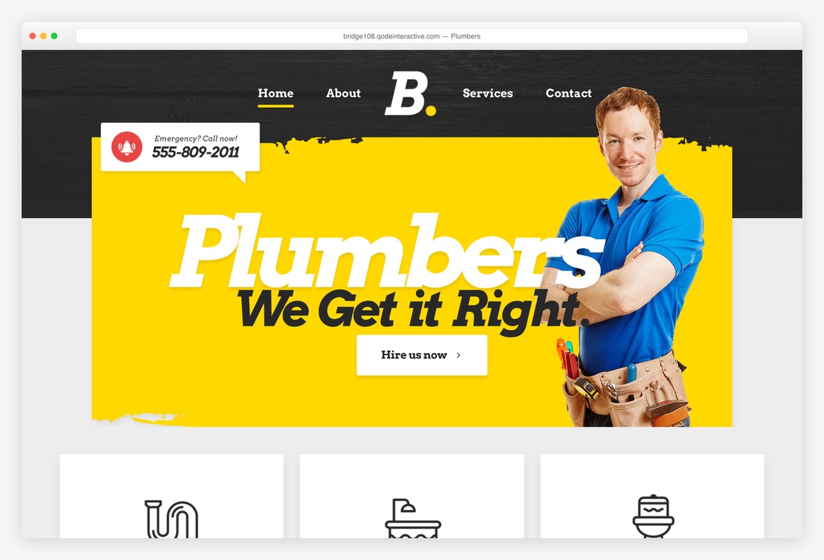
Why we like it: The best-selling theme in this list, with a loud plumbers demo nobody will forget.
Bridge is a large multipurpose theme with a dedicated plumbers demo in bold yellow and an Emergency? Call now! badge above the headline. You buy a huge, well-supported product, which is reassuring, and a great many options you will never touch, which is not. It suits a plumber whose brand is built to stand out.
✅ Pros: huge, well-supported product, emergency call badge, distinctive design ⚠️ Cons: the plumbers demo is thin, and you pay for hundreds of demos you will not use
17. The Plumbing Store
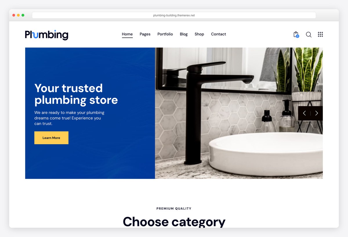
Why we like it: The only credible theme we found for a plumbing supply shop rather than a plumber’s service site.
The Plumbing Store is a WooCommerce theme for selling basins, taps, fixtures and parts, with category browsing and product pages ready to fill. It is not a service business site, so it belongs on your list only if you run a supply shop or showroom. For that job, it is the best-rated option we found.
✅ Pros: WooCommerce shop ready to stock, excellent rating, plumbing categories built in ⚠️ Cons: not built for a plumbing service business, and it depends on product photography you will need
Plumber website templates (no WordPress needed)
If you would rather not run WordPress at all, we also publish plumbing website templates built with Astro and Tailwind CSS. They are static sites: nothing to update, no plugins to patch, and free hosting on services such as Netlify or Cloudflare Pages. Each one is built around a different kind of plumbing business, and Mainline is free.
Colorlib plumbing website templates
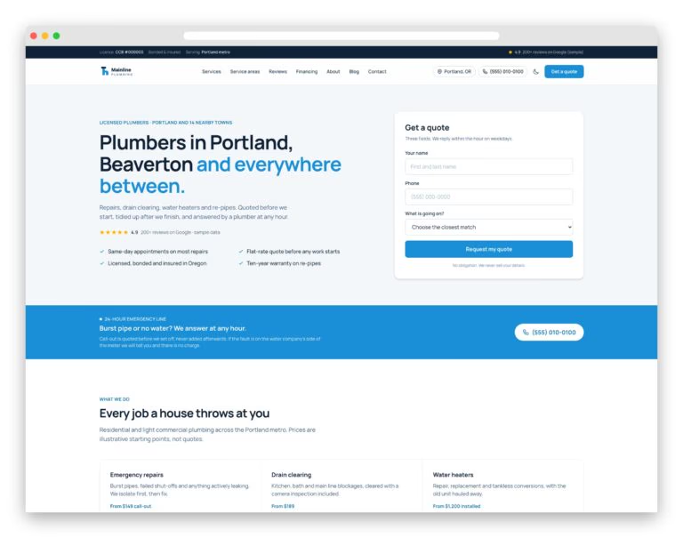 MainlineFree. A three-field quote form beside the headline and your towns in plain text.
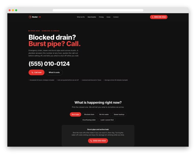 Rooter24For 24/7 drain work: phone as big as the headline and call-out fees by time of day.
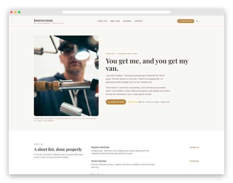 JourneymanFor a one-van plumber: sells the owner, with a named owner page and a plain price list.
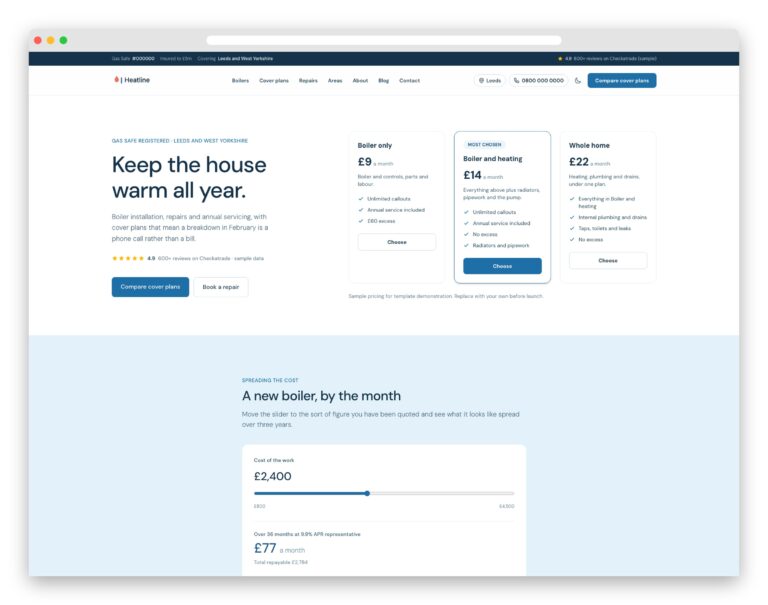 HeatlinePlumbing and heating: cover plans as the hero and a finance slider for installs.
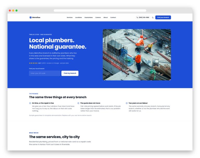 MetroflowSeveral branches: a ZIP finder that routes to each branch’s own page and phone.
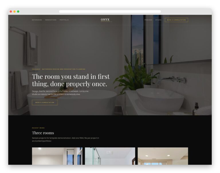 OnyxHigh-end bathrooms and remodels: a quiet, dark design with a before-and-after slider.
See all plumbing website templates, or the wider home services collection if you cover more than one trade.
What to look for in a plumber WordPress theme
- A quote form in the first screen. We opened 18 real plumbing company websites: 16 put a tappable phone number above the fold, and only one put a quote form there. Not every job is an emergency, and someone planning a bathroom or a water heater would rather type than call. Only 4 of the demos in this list do it.
- A phone number people can tap. It is the one thing real plumbing sites nearly all get right, yet several theme demos still show the number as plain text. On a phone, check that the header number opens the dialler before you commit.
- An emergency line you can switch off. 16 of those 18 sites advertise 24/7 cover. If you offer it, you want a line that stays visible; if you do not, make sure the theme’s emergency block can be removed rather than promising a service you will not answer.
- Room for your licence, insurance and service area. 13 of the 18 state a licence or insurance, and 13 name the towns they serve. Look for a top bar or header slot for the licence line, and a page layout you can duplicate for each town you want calls from.
- Speed on a phone. Plumbing searches are urgent and often made on a phone. In our test the heaviest free theme weighed 1,625 KB against 217 KB for the lightest, and the dedicated plumbing themes were at the heavy end, so a light framework with a plumbing starter often wins.
- The page builder you already know. Of the ten real plumbing sites we could identify as WordPress, eight run a page builder, mostly Elementor. Many paid plumber themes are built around one too, so check which before you buy and pick the one you will actually be able to edit.
Frequently Asked Questions
What is the best WordPress theme for a plumbing business?
For most plumbers, Astra with its free Plumber starter is the best place to start: it is free, light and puts a quote form beside the headline. If you will pay, Airtech has the most conversion-ready demo and ProHauz is the best-selling plumber-specific theme. A plumbing supply shop should look at The Plumbing Store instead.
Is there a free WordPress theme for plumbers?
Yes, but very few free themes are built only for plumbers. Mighty Plumbers is the one maintained plumbing-only theme we found, and it is still small. The stronger free options are general themes with free plumbing starters, such as Astra, Royal Elementor Kit and Zakra. GeneratePress and OceanWP keep their plumbing designs behind a paid add-on.
What should a plumbing website include?
A tap-to-call phone number, your licence and insurance, the areas you serve, reviews, and a quote or booking form near the top. In the 18 real plumbing sites we examined, almost all showed the phone number and emergency cover, but only one put a quote form where visitors see it first. Advertise 24/7 cover only if you answer it.
Can I add online booking to a plumbing WordPress site?
Yes. The simplest route is the booking widget from field service software you may already use, such as Jobber or Housecall Pro, which embeds on any WordPress page. A booking plugin works too if you want everything inside WordPress. Some themes here, including Airtech and ProHauz, include an appointment request form, which collects a preferred time rather than confirming one.
Should a plumber use WordPress, Wix or Squarespace?
WordPress suits plumbers who want many service and town pages, full control and no platform lock-in, and ten of the fifteen real plumbing sites we could identify run on it. Wix or Squarespace suit a small operator who wants no maintenance at all. A static template sits in between: nothing to update, but you edit the content in files.
How many service area pages does a plumbing website need?
One for each town or district you genuinely want calls from, and no more. Each page should say something specific to that place, such as response times, common jobs or work you have done there. Near-identical pages that only swap the town name are what Google calls doorway pages, and they can hold the whole site back.
Do I need a WordPress theme, or will a website template do?
A WordPress theme is right if you want to edit pages in a dashboard and add plugins for booking or reviews. A static HTML template is faster, needs no updates and can be hosted free, but you edit the content in files. Our plumbing website templates are the second kind, and one of them, Mainline, is free.
How much does a plumbing website cost?
With a free theme, your main costs are hosting and a domain. The paid plumber themes in this list cost from $49 to $79 once, and Divi is $89 a year or $249 for life. Budget separately for booking or review tools, and for photos of your own vans and jobs, which build more trust than any theme.
Which one should you use?
If you want a free plumbing site that asks for the job, start with Astra’s Plumber starter; if speed on a phone matters most, Royal Elementor Kit or GeneratePress. If you will pay for a finished trade design, Airtech is the most conversion-ready and ProHauz the most proven. Whatever you choose, put a quote form where visitors land, because almost nobody in this trade does. For more ideas, see our plumbing website design examples, handyman WordPress themes and the best free WordPress themes.

Related Posts




Comments (1)