30 Best Pilates Studio Website Examples 2026
Looking for Pilates studio website inspiration?
A beautiful, well-designed website helps Pilates studios attract new members, showcase their reformer classes, and communicate the studio experience before clients ever walk through the door.
We curated 30 of the best Pilates studio websites from around the world — from boutique reformer studios in NYC and Sydney to wellness-focused spaces in small towns and tropical settings.
Each entry includes the platform it’s built on, so you can find the right website builder for your own project.
Best Pilates Studio Website Examples
1. Pilates Republic
Built with: Squarespace
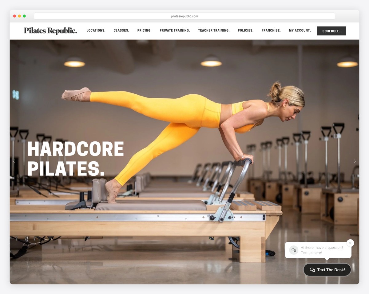
Pilates Republic operates five locations across San Diego with a modern, minimalist website that puts class booking front and center. Large hero sections with striking studio photography immediately communicate the premium experience.
The clean layout uses strategic whitespace and bold typography to guide visitors toward booking their first class. Multi-location navigation is handled elegantly without cluttering the interface.
What stands out: The multi-location booking flow is seamless — visitors can quickly find and book at any of the five San Diego studios without getting lost.
2. Prescription Dynamic Pilates
Built with: Squarespace
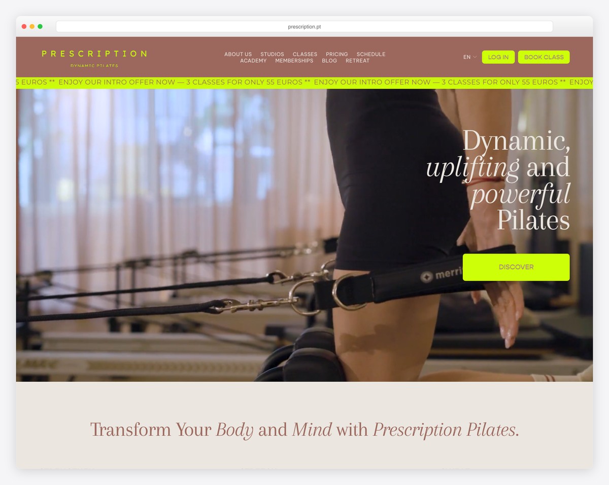
Prescription brings high-energy fitness culture to Pilates with six locations across Lisbon, Portugal. The bold lime green accent color breaks from the typical soft, muted palettes seen in most Pilates studio websites.
The energetic design language — vibrant colors, dynamic photography, bold type — positions their classes more like HIIT workouts than gentle stretching. It’s a deliberate choice that attracts a younger, fitness-focused audience.
What stands out: The bold lime green breaks every Pilates design convention, making the studio instantly memorable and clearly communicating their high-intensity approach.
3. Scout Studios
Built with: Squarespace
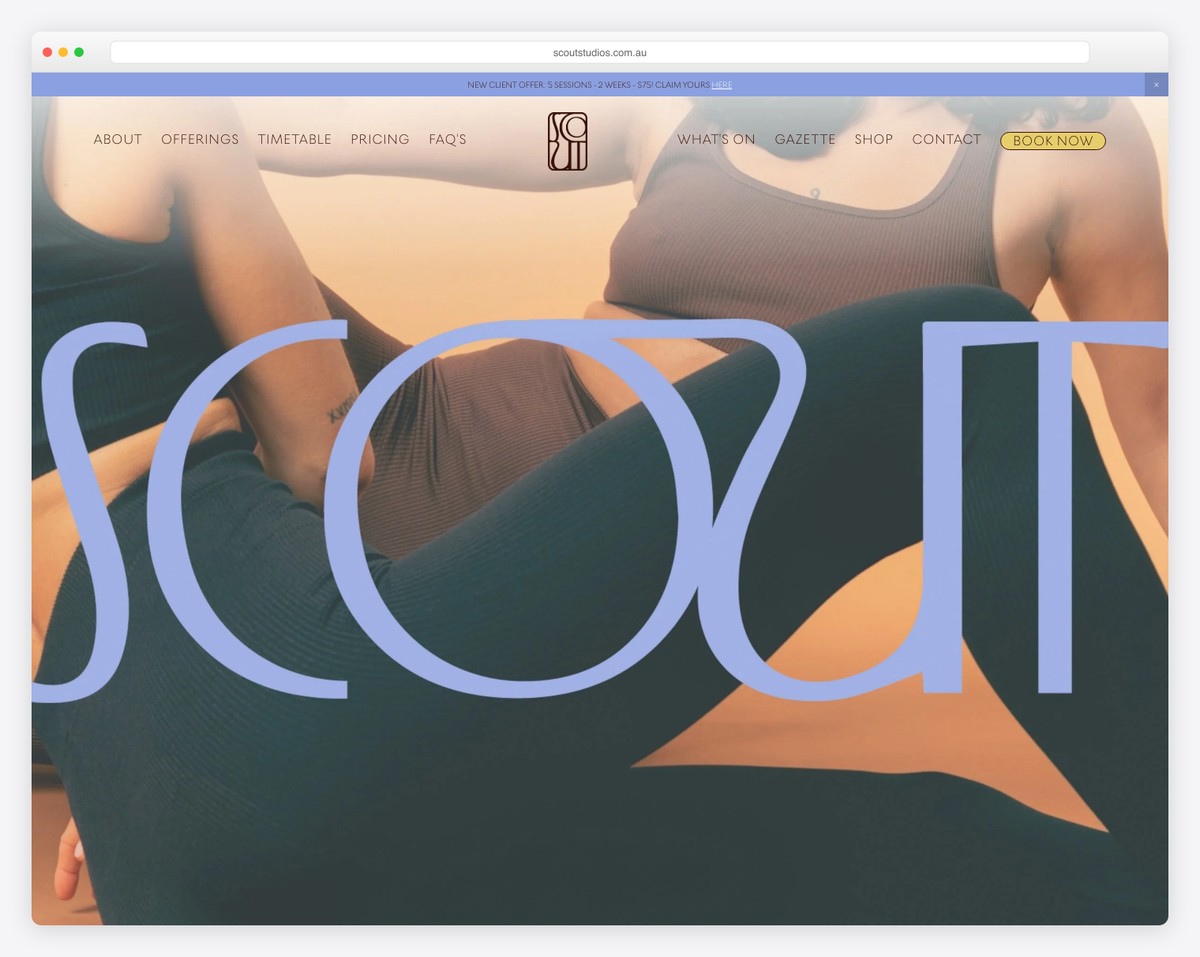
Scout Studios in Sydney operates three locations with a contemporary design that goes beyond just class bookings. They’ve integrated e-commerce for branded merchandise and a companion app, creating multiple touchpoints with their community.
The site feels modern and aspirational without being intimidating — a balance that many Pilates studios struggle to achieve. Clean grids, thoughtful photography, and subtle animations create a polished experience.
What stands out: The integrated merchandise shop and app promotion extend the brand beyond the studio, turning clients into brand ambassadors.
4. Gemini Pilates
Built with: Squarespace
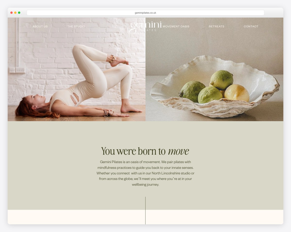
Gemini Pilates in North Lincolnshire, UK uses a minimalist approach with a scrolling marquee banner and overlapping image blocks that create visual depth. The design feels editorial and artistic — more like a lifestyle magazine than a gym website.
The overlapping imagery technique adds sophistication without complexity. It’s a great example of how Squarespace’s built-in layout tools can produce results that look custom-built.
What stands out: The overlapping image blocks create an editorial, magazine-like feel that elevates a small-town studio to a premium brand.
5. Get Low Pilates
Built with: Squarespace
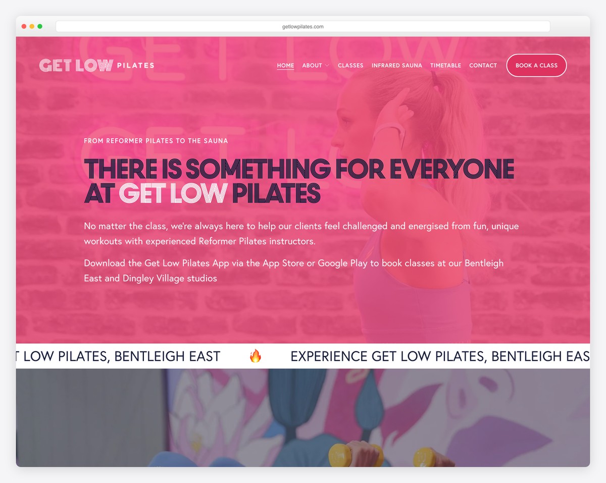
Get Low Pilates from Victoria, Australia goes bold with oversized typography and a dark/light contrast that creates dramatic visual impact. The animated marquee text adds energy and movement to the page.
The design choices are deliberate and confident — large type, high contrast, and strong imagery work together to create a brand that feels powerful and empowering rather than gentle and passive.
What stands out: The bold dark/light contrast and oversized type make a strong first impression that positions Pilates as a serious workout, not just gentle stretching.
6. Palm Pilates
Built with: Squarespace
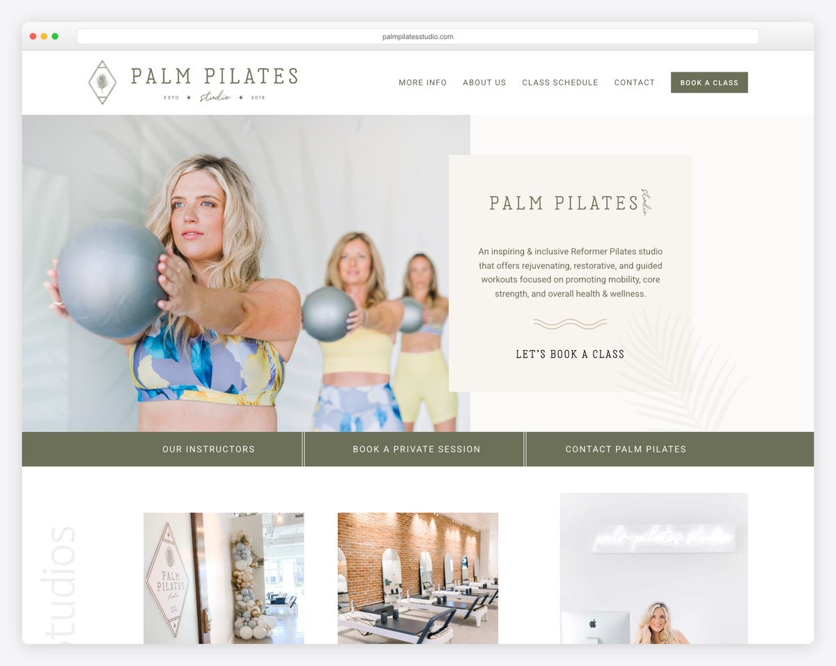
Palm Pilates in Panama City Beach, Florida leans into the beach-lifestyle aesthetic with green accents and wave graphics that tie the studio to its coastal location. The tropical vibe makes the practice feel like part of a wellness lifestyle.
The wave graphic elements are a subtle but effective design choice that connects the digital experience to the physical location. Visitors immediately understand the studio’s relaxed, beach-town personality.
What stands out: The wave graphics and green palette perfectly capture the coastal lifestyle, making the studio feel like a natural extension of Panama City Beach living.
FLAVOR BREAK: Building a website for your own Pilates studio? Check out our collection of fitness website templates or browse yoga studio website examples for more wellness design inspiration.
7. Tropic State Pilates
Built with: Squarespace
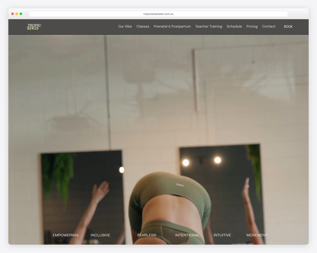
Tropic State in Queensland, Australia combines tropical wellness vibes with inclusive messaging that welcomes all body types and fitness levels. The Momence booking integration keeps scheduling seamless.
The inclusive language throughout the site — from the homepage to class descriptions — makes first-time visitors feel welcome regardless of their experience level. This approach widens their potential client base significantly.
What stands out: The genuinely inclusive messaging goes beyond trendy lip service, making people who might feel intimidated by Pilates feel genuinely welcome.
8. Pilates Lane
Built with: Squarespace
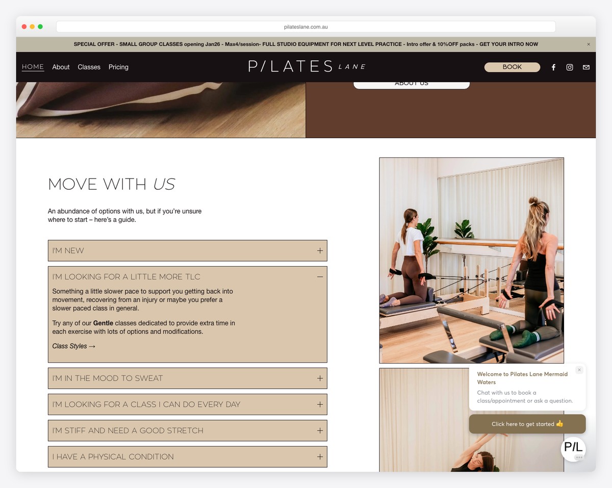
Pilates Lane on Australia’s Gold Coast uses warm earth tones and community-driven testimonials to create an inviting, down-to-earth brand. The palette feels grounded and natural, avoiding the cold minimalism of many studio sites.
Client testimonials are woven throughout the design rather than relegated to a single review page. This approach builds social proof at every scroll point, reinforcing the community feel.
What stands out: Testimonials integrated throughout the page — not just on a reviews section — make social proof a constant presence that builds trust as visitors browse.
9. Pilates on 10th
Built with: Squarespace
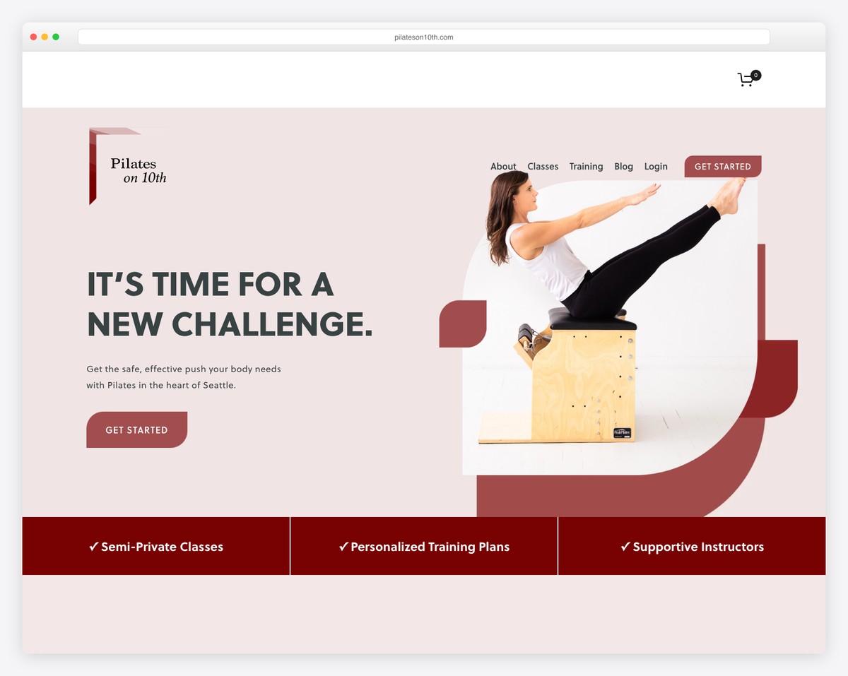
Pilates on 10th in Seattle’s Capitol Hill neighborhood uses a split-layout hero gallery and icon-driven benefits section to communicate key selling points quickly. The design is efficient — every element earns its place.
The icon-driven benefits (small group size, certified instructors, etc.) work like a visual checklist that visitors can scan in seconds. This format respects people’s time while hitting all the key decision factors.
What stands out: The icon-driven benefits section lets visitors quickly scan the studio’s key differentiators without reading paragraphs of text.
10. Brighton Pilates
Built with: Squarespace
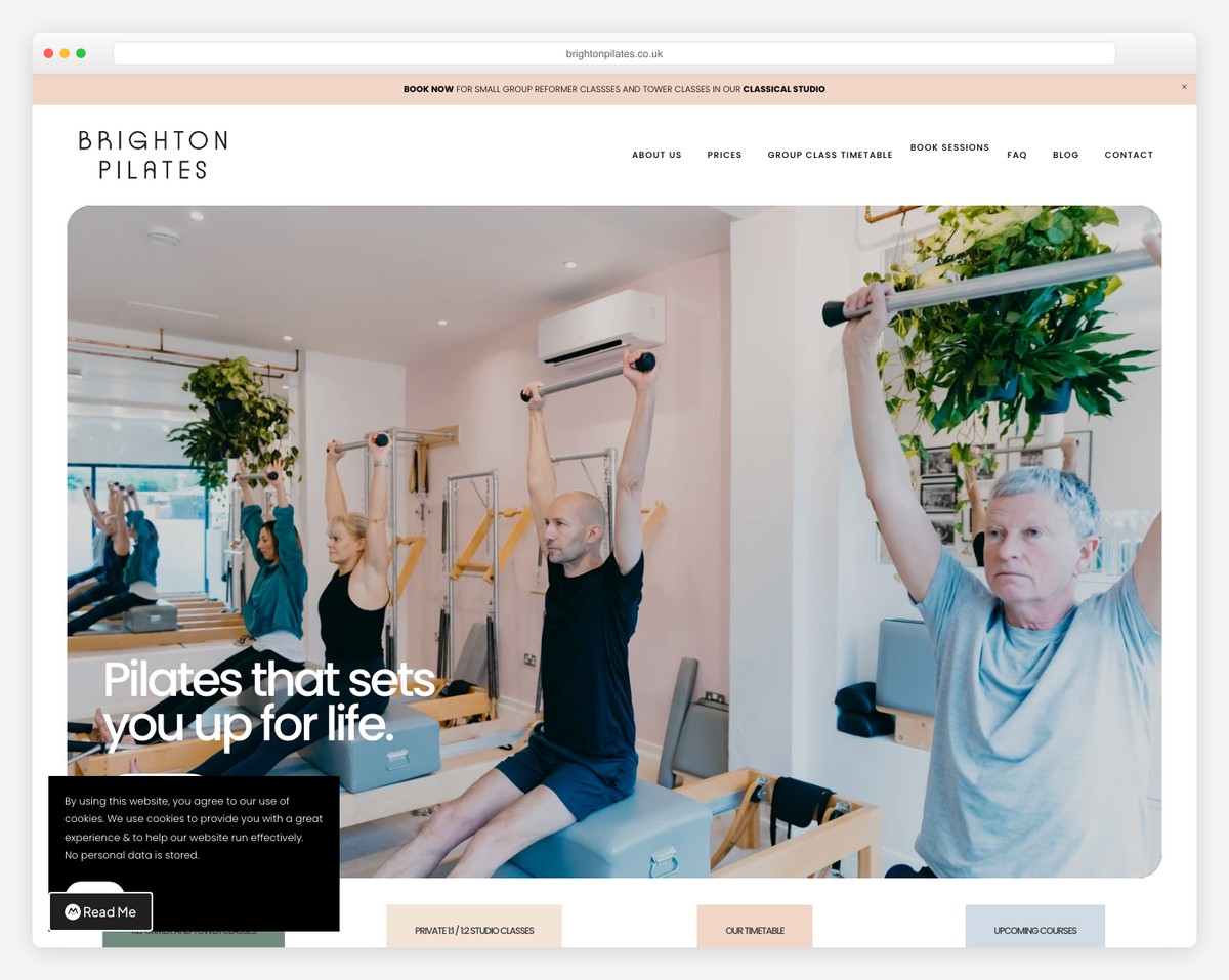
Brighton Pilates in Hove, UK leads with a full-width hero image and uses a fixed header with strategically placed booking CTAs. The clean layout makes it easy to navigate from class descriptions to booking in just a couple of clicks.
The fixed header ensures that the “Book a Class” button is always visible as visitors scroll, reducing friction in the conversion path. It’s a small UX detail that makes a big difference for a class-based business.
What stands out: The persistent booking CTA in the fixed header means visitors are never more than one click away from scheduling, no matter where they are on the page.
11. Uden Pilates
Built with: Squarespace
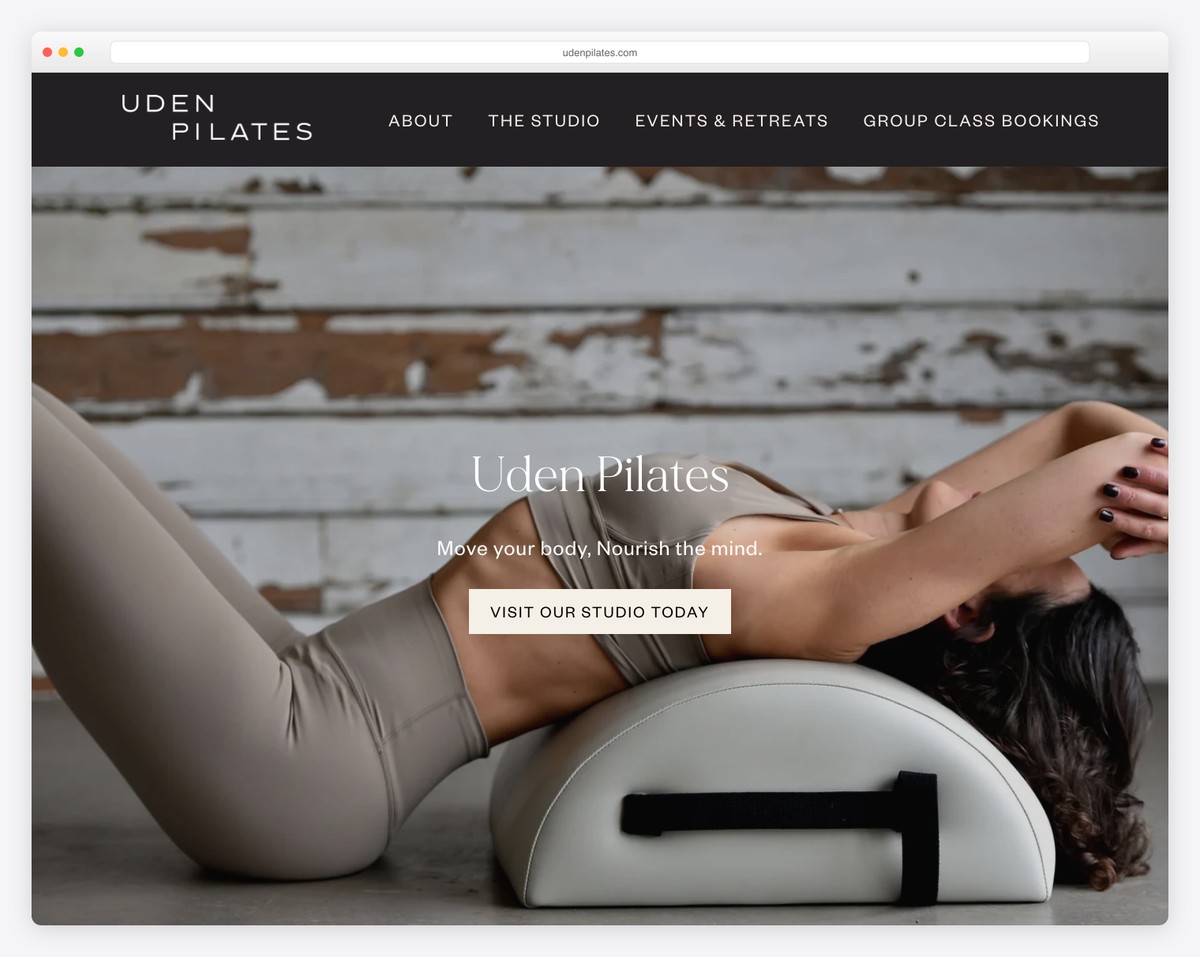
Uden Pilates in West Sussex, UK offers both in-person and virtual classes — a hybrid model that expanded their reach beyond their local area. The calming color palette creates a serene digital environment.
The virtual studio option is presented alongside physical classes as an equal offering, not an afterthought. This dual approach gives potential clients flexibility and widens the studio’s addressable market.
What stands out: The virtual studio is given equal prominence to in-person classes, showing that online doesn’t have to be second-class in the fitness world.
12. Kefi Studio
Built with: Squarespace
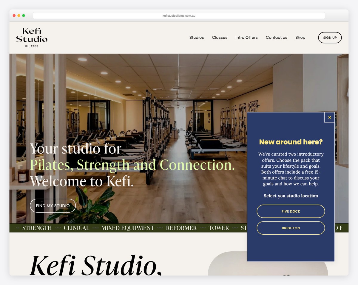
Kefi Studio in Australia (Five Dock, NSW and Brighton, SA) uses a marquee banner and the tagline “Pilates, Strength and Connection” to define their multi-modality approach. The site balances fitness imagery with community-focused messaging.
The two-location model is handled cleanly, and the emphasis on “connection” alongside physical training speaks to the community aspect that keeps members coming back to boutique studios.
What stands out: The “connection” element in their brand promise acknowledges that people join boutique studios for community, not just exercise.
13. Happi Studios
Built with: Squarespace
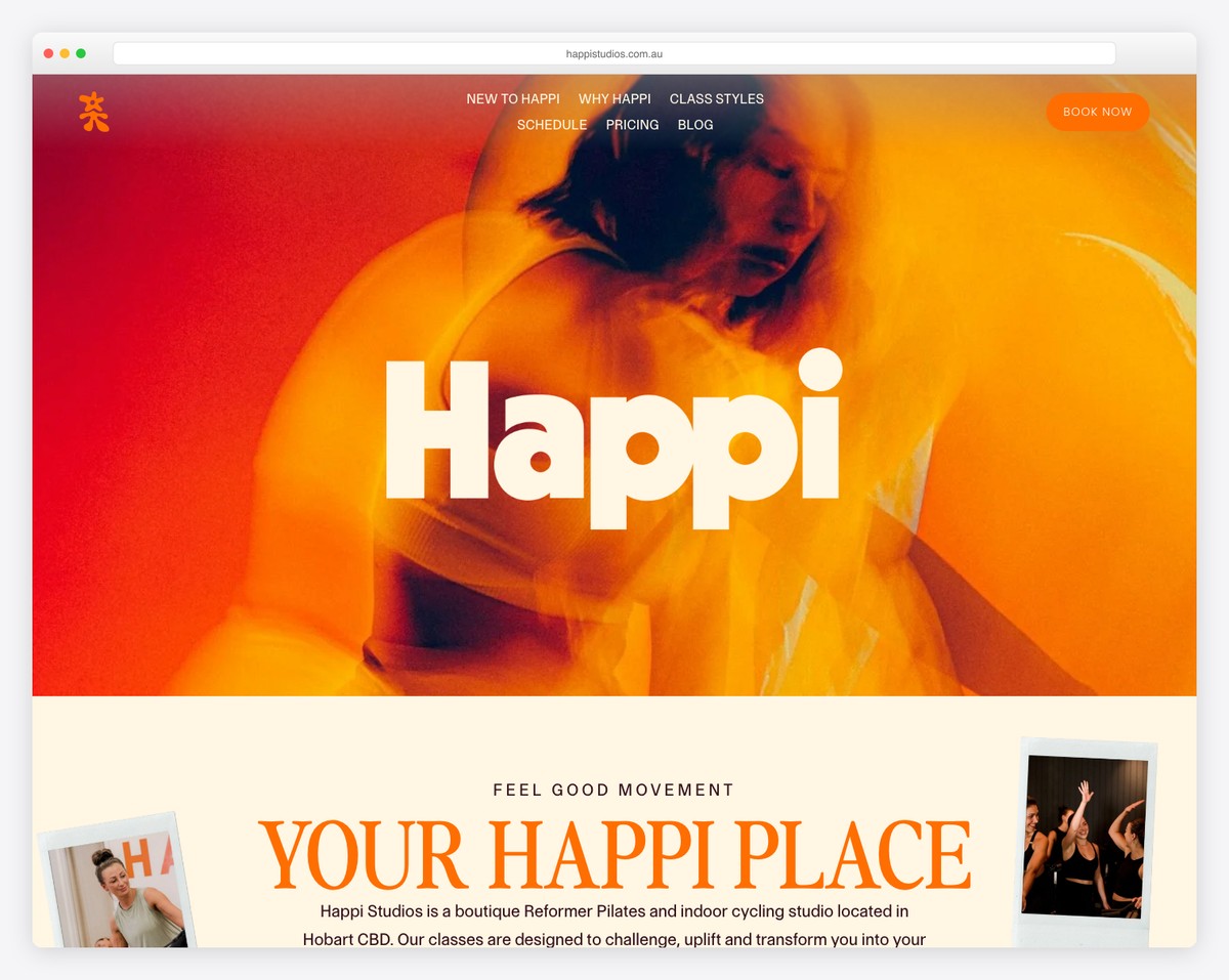
Happi Studios in Hobart, Tasmania uses a warm palette with orange accents and smooth scroll animations that create an inviting, joyful browsing experience. The name says it all — this is about happiness through movement.
The warm tones and smooth transitions give the site a feeling of ease that mirrors the studio experience. Visitors feel relaxed before they even step through the door.
What stands out: The warm orange palette and smooth animations create an emotional experience that perfectly matches the “happi” brand promise.
14. Essential MVMT
Built with: Squarespace
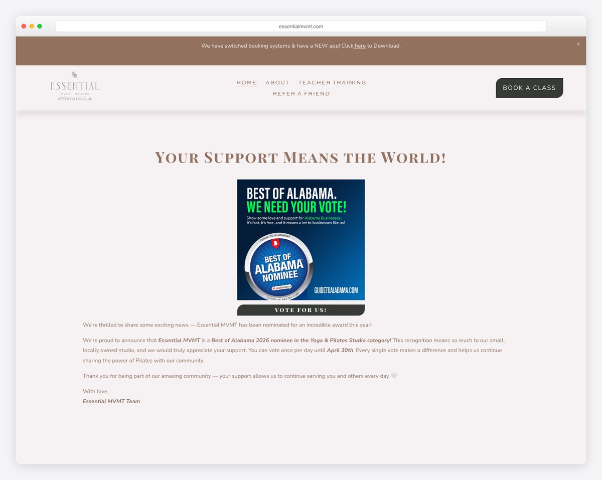
Essential MVMT in Vestavia Hills, Alabama draws from nature-inspired design with earthy tones and organic imagery. Community testimonials play a central role, and the inclusive messaging welcomes all body types and fitness levels.
For a studio in a smaller market, the website punches well above its weight class. The design quality and messaging sophistication rival studios in major metropolitan areas.
What stands out: The nature-inspired design and inclusive messaging create a welcoming environment that lowers the intimidation barrier for Pilates newcomers.
15. Seed Studios
Built with: Squarespace
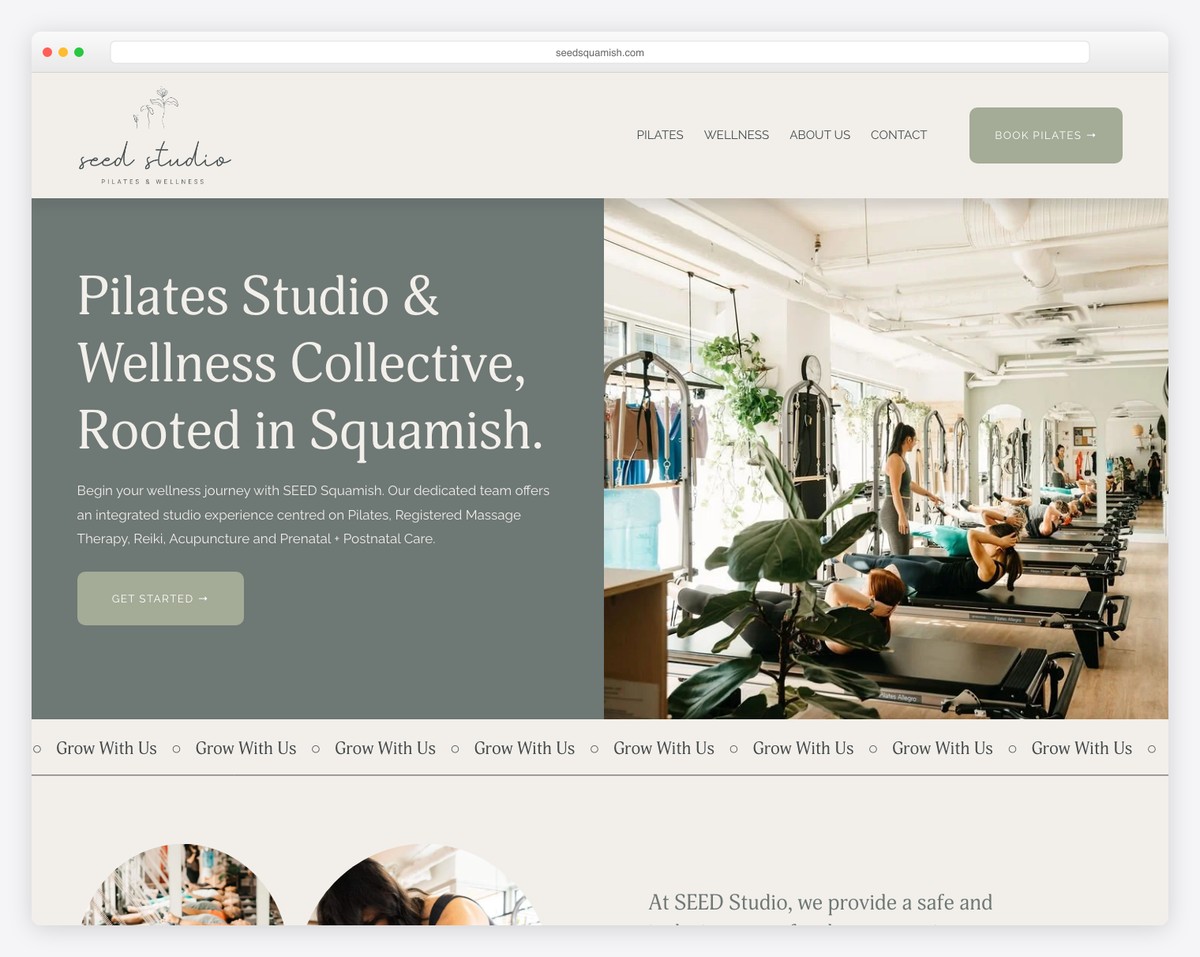
Seed Studios in Squamish, British Columbia blends Pilates with other wellness modalities under the tagline “Grow With Us.” The nature-inspired branding ties beautifully to the studio’s mountain town location.
The multi-modality approach (Pilates, yoga, barre, and more) is presented cohesively rather than as a confusing menu of unrelated classes. The “seed” metaphor of growth runs throughout the design and copy.
What stands out: The “Grow With Us” brand metaphor ties every element together — from the name to the nature imagery to the multi-modality class offerings.
16. LifeSpan Pilates
Built with: Squarespace
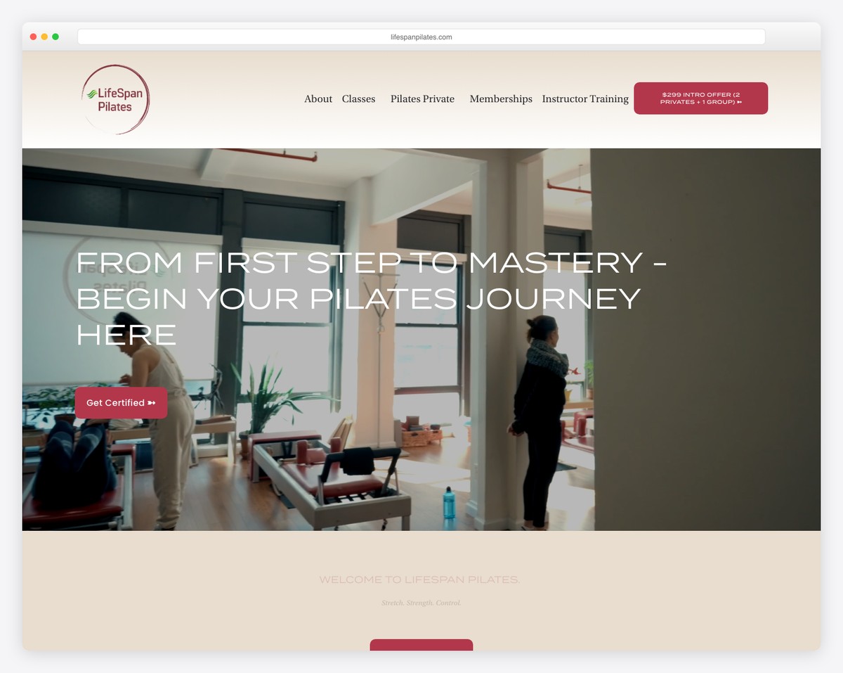
LifeSpan Pilates in Midtown Manhattan uses the tagline “Stretch. Strength. Control.” with centered content blocks that create a focused, intentional browsing experience. The design reflects the precision and control of Pilates itself.
Located in one of the most competitive fitness markets in the world, LifeSpan differentiates with clarity and purpose. Every design choice is deliberate, mirroring the mindful approach of their Pilates instruction.
What stands out: The centered, intentional layout mirrors the mindfulness of Pilates practice — the design philosophy and the fitness philosophy are perfectly aligned.
17. NEO Classical Pilates
Built with: Squarespace
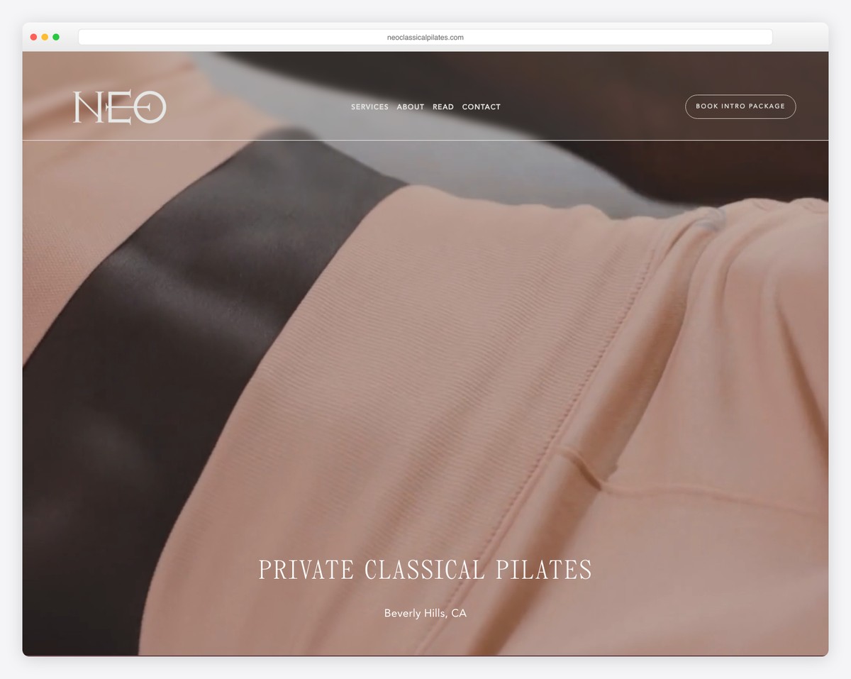
NEO Classical Pilates in Beverly Hills delivers the upscale wellness experience you’d expect from that zip code. The minimalist design uses sophisticated whitespace and restrained typography to communicate luxury without saying a word.
The site lets the photography and whitespace do the heavy lifting — there’s no visual clutter, no busy patterns, just clean elegance that signals exclusivity and quality.
What stands out: The generous whitespace and minimal design elements create an air of exclusivity that’s perfectly calibrated for a Beverly Hills audience.
18. Page One Pilates
Built with: Squarespace
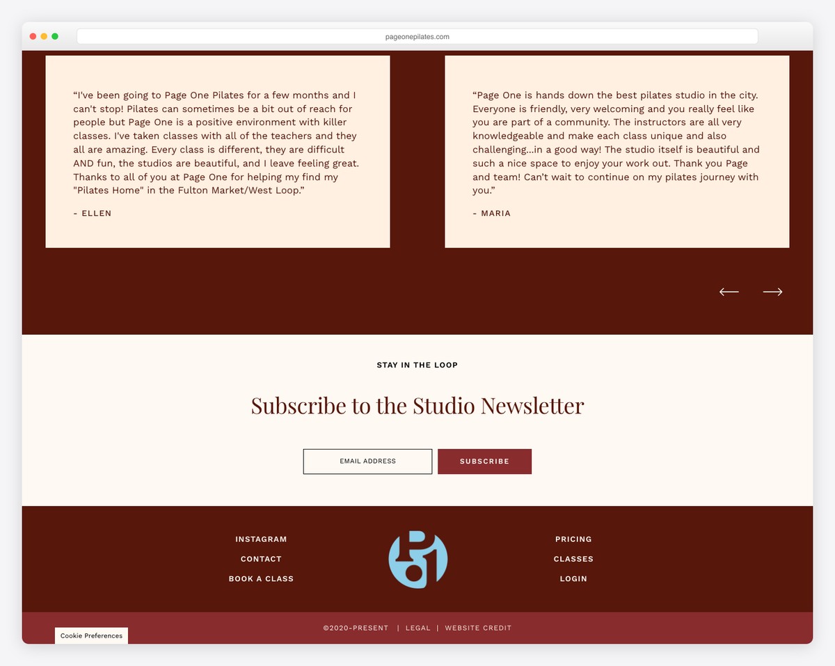
Page One Pilates in Chicago’s West Loop brings a boutique aesthetic with an animated marquee and a sophisticated color palette. The design feels like a fashion brand more than a fitness studio — intentionally so.
The boutique positioning is reinforced through every design choice: elegant typography, curated photography, and restrained use of color. It appeals to clients who see Pilates as a lifestyle choice, not just a workout.
What stands out: The fashion-forward aesthetic attracts clients who value design and lifestyle branding, positioning Pilates as an aspirational experience.
19. Native Pilates
Built with: Squarespace
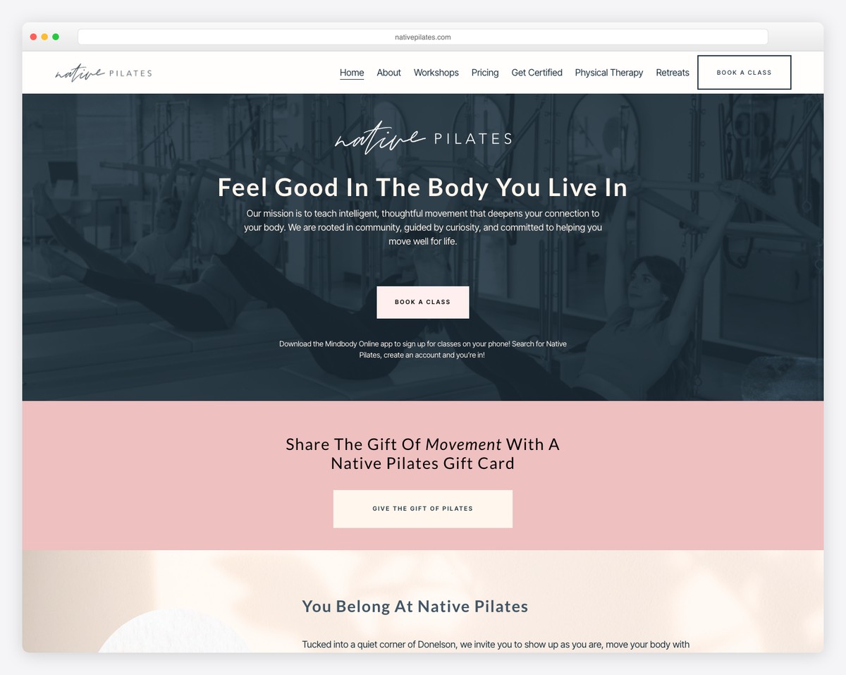
Native Pilates in Nashville uses a blue and pink palette with custom animations to create a vibrant, energetic brand. The multi-modality approach includes Pilates, barre, and strength training — all presented cohesively.
The animation work is particularly well-done — subtle enough to enhance rather than distract, but engaging enough to make the browsing experience feel premium and polished.
What stands out: The blue and pink palette is distinctive in the Pilates space, where muted earth tones dominate, making the brand instantly recognizable.
20. Carve Studio
Built with: Squarespace
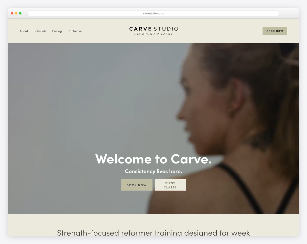
Carve Studio in Christchurch, New Zealand embraces bold typography and modern minimalism. The design is stripped back to essentials — big type, strong imagery, and clear calls to action.
The name “Carve” suggests sculpting and precision, and the design mirrors that philosophy with sharp, deliberate choices. No wasted space, no unnecessary elements — just what matters.
What stands out: The bold, stripped-back design lets the studio’s confidence speak for itself — proof that sometimes less really is more.
21. House of Sculpt
Built with: Shopify
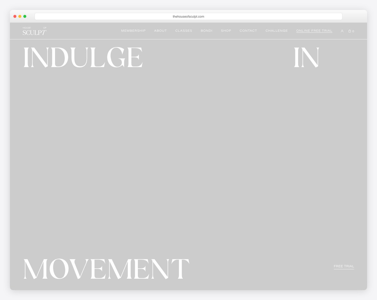
House of Sculpt in Bondi, Sydney combines luxury Pilates with a retail component powered by Shopify. The hero video immediately immerses visitors in the studio atmosphere, while the cream, black, and sage green palette feels premium.
Using Shopify allows them to seamlessly sell branded merchandise and wellness products alongside class bookings — a smart monetization strategy for boutique studios.
What stands out: The Shopify-powered retail integration creates an additional revenue stream while reinforcing the luxury lifestyle brand.
22. Kink Pilates
Built with: Showit
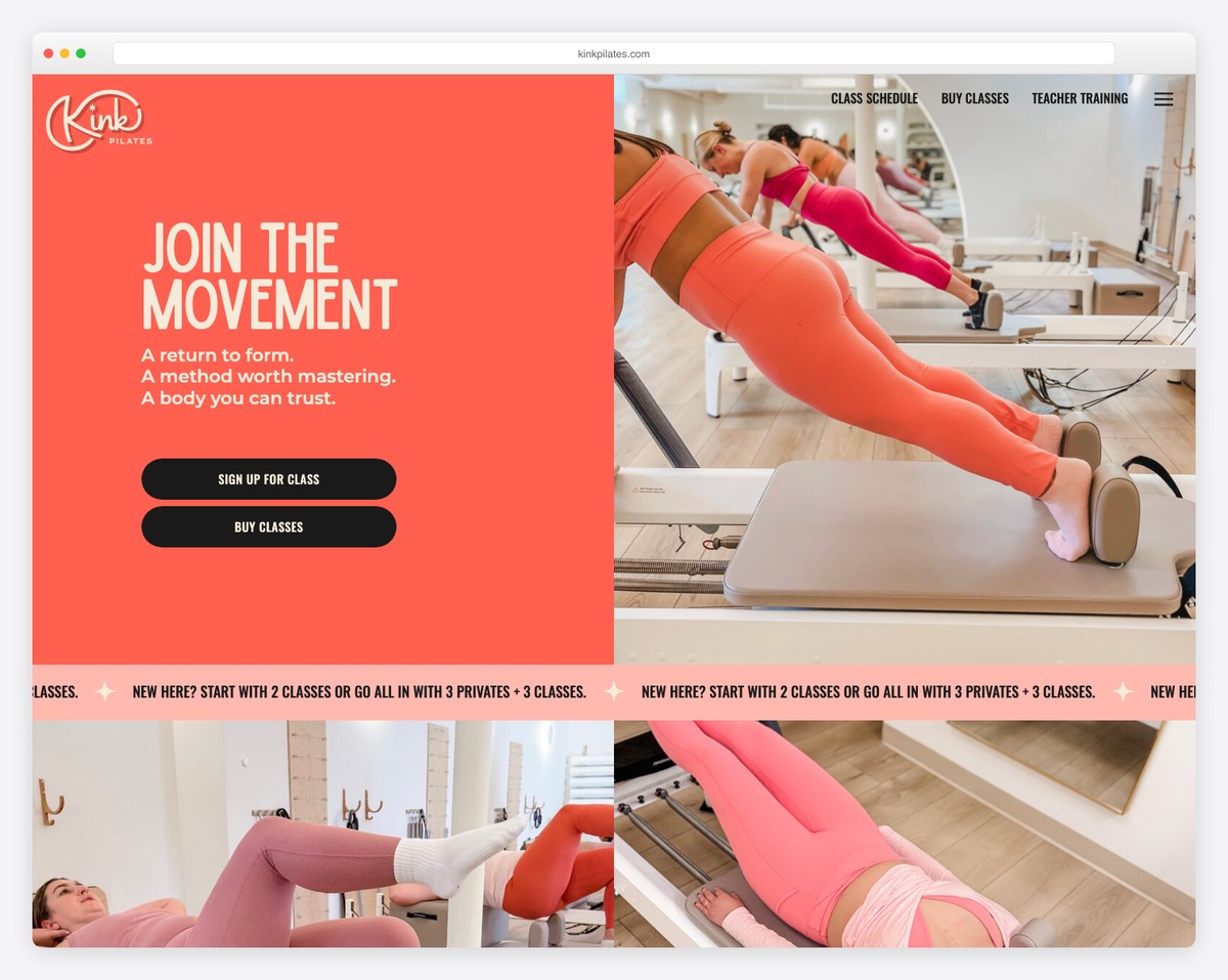
Kink Pilates near Boston breaks away from conventional Pilates design with a peachy-orange and cream palette accented by sparkle graphics. The aesthetic is uniquely feminine and playful — nothing like the typical muted studio look.
Built on Showit (a drag-and-drop platform popular with creative businesses), the site has a highly custom feel with unique layout arrangements that wouldn’t be possible in more rigid templates.
What stands out: The sparkle graphics and unconventional color palette make this one of the most visually distinctive Pilates websites we’ve seen.
Looking for more design ideas? Browse our curated list of website builders to find the right platform for your Pilates studio, or explore small business website examples for additional inspiration.
23. Be Kind Studios
Built with: WordPress
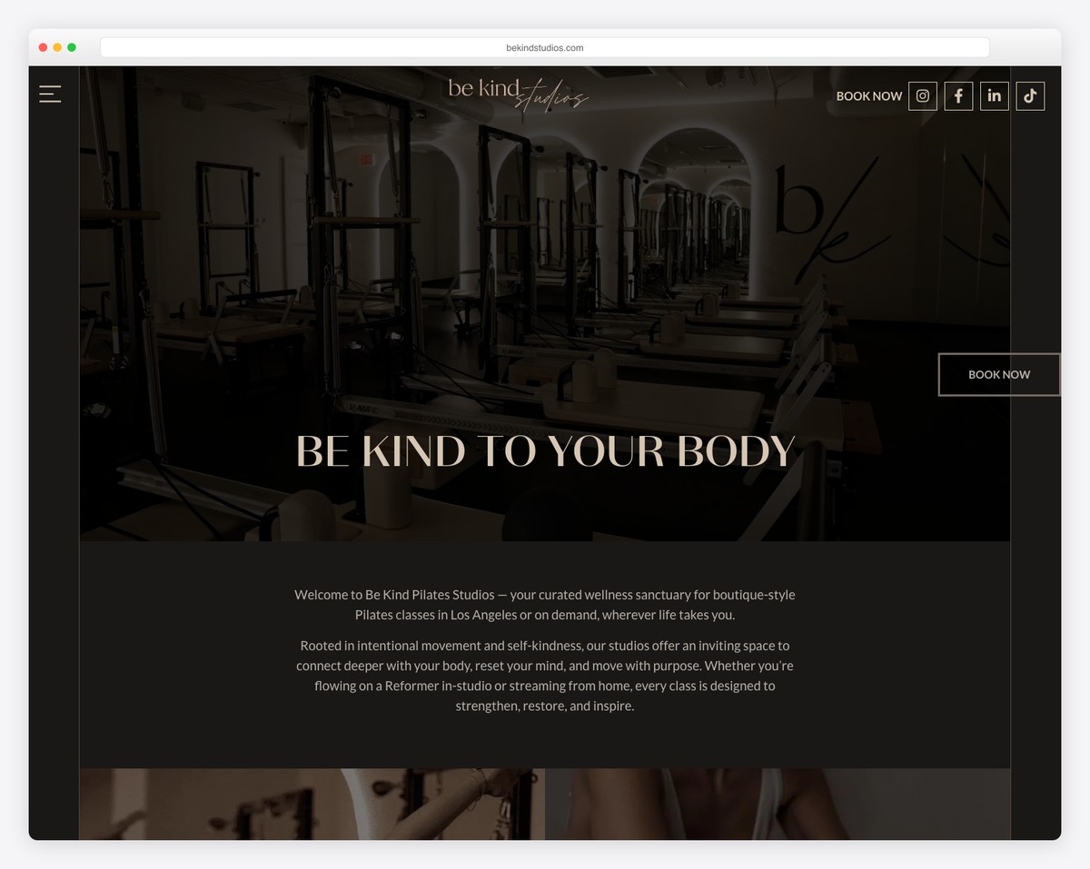
Be Kind Studios in Los Angeles uses Elementor with refined custom fonts to create an elegant, editorial feel. NitroPack optimization ensures the site loads quickly despite rich imagery and animations.
The “Be Kind” branding carries through every touchpoint — to yourself, to your body, to your practice. It’s a message that resonates with the wellness-minded LA audience they serve.
What stands out: The refined typography and editorial design approach makes this WordPress site indistinguishable from a custom build.
24. Exhale Pilates London
Built with: WordPress
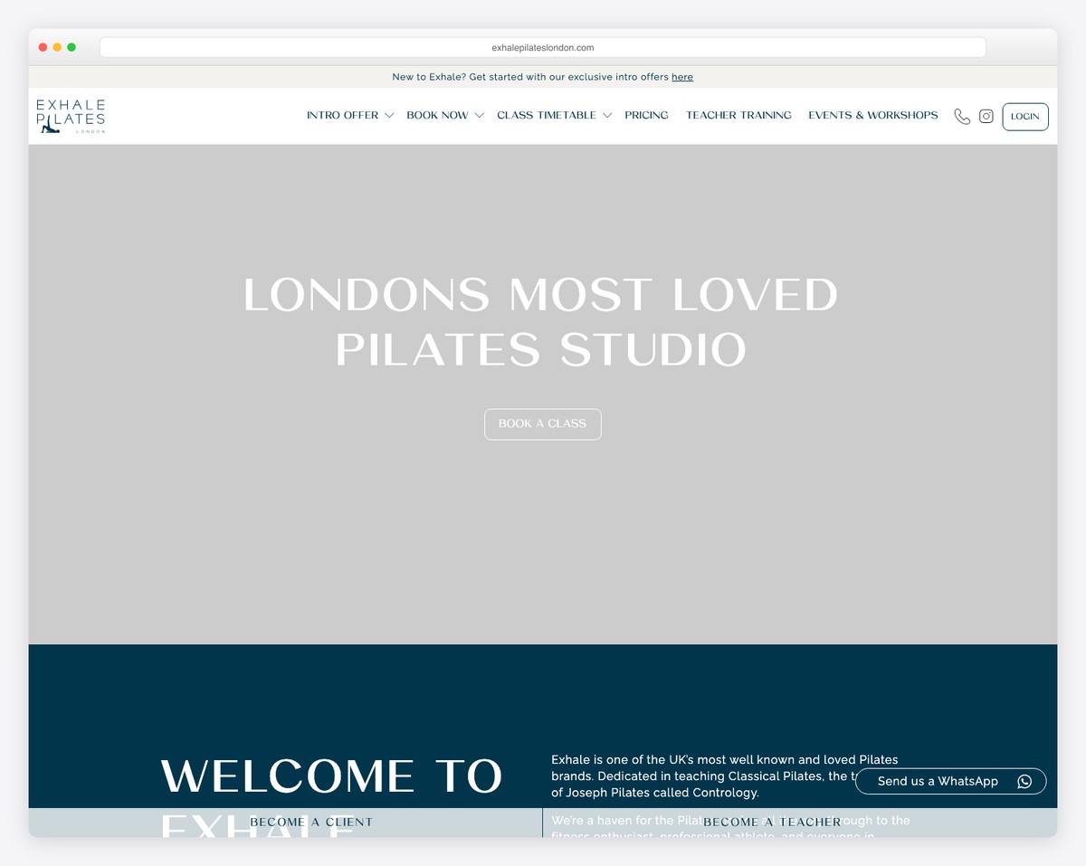
Exhale Pilates London uses a clean navy and white palette with WooCommerce integration for class packages and memberships. The classical Pilates focus is communicated through thoughtful copy and traditional imagery.
The WooCommerce setup allows flexible package purchasing — individual classes, class packs, and memberships — all managed through the familiar WordPress ecosystem.
What stands out: The WooCommerce integration handles complex pricing tiers smoothly, proving WordPress can compete with dedicated booking platforms.
25. Reformcore
Built with: WordPress
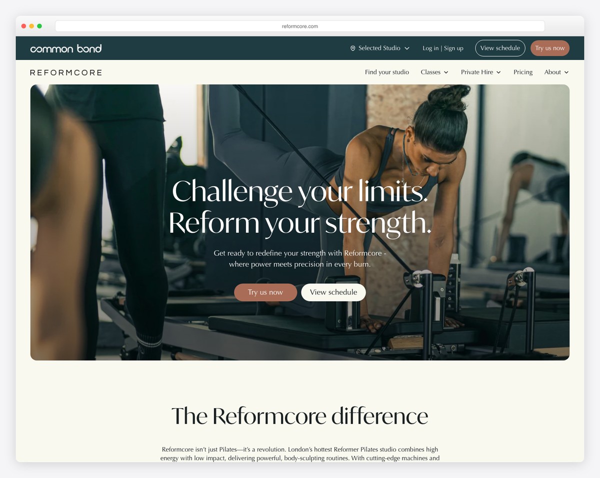
Reformcore in London’s Nine Elms area uses the Bricks builder with a dark luxury palette and custom CSS animations. The moody, dramatic design feels more like a nightclub than a Pilates studio — and that’s entirely the point.
The dark theme creates a sense of exclusivity and intensity that appeals to clients looking for a powerful, high-energy reformer experience rather than a gentle wellness session.
What stands out: The dark luxury palette is a bold departure from the bright, airy aesthetic of most Pilates websites, creating immediate differentiation.
26. New York Pilates
Built with: WordPress
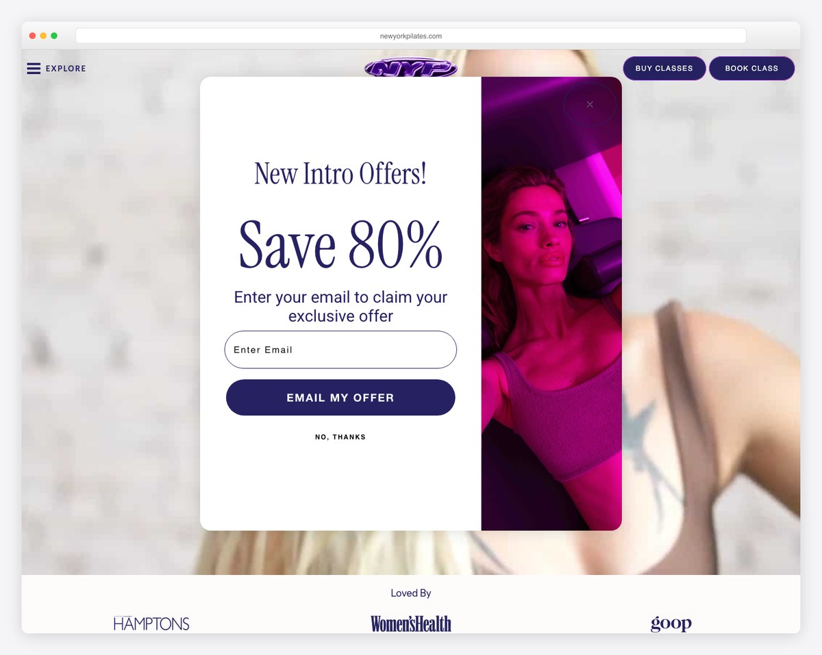
New York Pilates operates across NYC and the Hamptons with a sophisticated purple palette and smooth Elementor animations. The site balances elegance with energy, reflecting the NYC lifestyle their clients lead.
The multi-location setup handles the NYC-to-Hamptons seasonal dynamic well, allowing clients to easily switch between city and summer locations while maintaining their practice.
What stands out: The purple palette is unexpected and sophisticated, setting the brand apart in Manhattan’s crowded Pilates market.
27. Tribe Pilates
Built with: WordPress
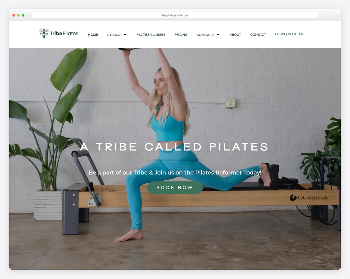
Tribe Pilates operates four locations across Los Angeles with an earth-tone green palette and strong community messaging. The “tribe” concept emphasizes belonging and shared experience over individual fitness goals.
The community-focused approach is backed by the four-location scale that gives members flexibility. The earthy design language feels grounded and authentic — appropriate for the LA wellness scene.
What stands out: The “tribe” community concept gives members an identity beyond just being gym-goers, fostering loyalty and retention.
28. Bodylove Pilates
Built with: WordPress
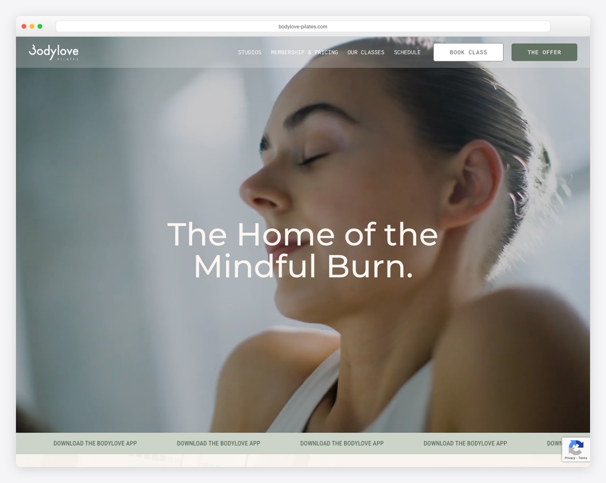
Bodylove Pilates operates five locations across Sydney plus a retreat location in Bali. The site features scrolling logo transitions and a design that scales well across their impressive multi-location footprint.
The Bali retreat offering is a smart brand extension that adds an aspirational element — clients can go from their local Sydney studio to a tropical Pilates retreat with the same trusted brand.
What stands out: The Bali retreat extension adds aspirational appeal and creates a unique upsell opportunity that most local studios can’t match.
29. Dynamic Pilates
Built with: WordPress
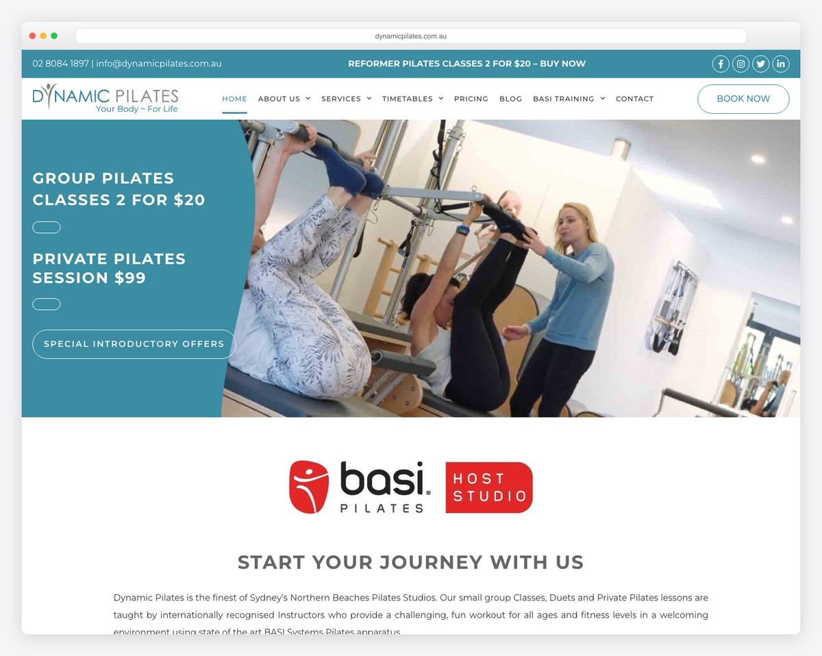
Dynamic Pilates in Manly, Sydney carries BASI host studio credentials — a significant mark of quality in the Pilates world. The Elementor-built site effectively communicates this professional distinction.
For Pilates professionals and discerning clients, the BASI credential signals a level of teaching quality that goes beyond typical certifications. The website uses this credibility throughout its messaging.
What stands out: The BASI host studio credentials serve as a powerful differentiator for knowledgeable clients who understand what that designation means.
30. Rebalance Studio
Built with: Custom (Gatsby/React)
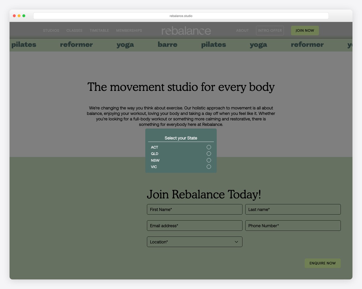
Rebalance Studio operates multiple locations across Australia with the most visually distinctive design on this list. The vibrant lime, apricot, and lilac color palette is unlike anything else in the Pilates space.
Built with Gatsby and React, the site delivers instant page transitions and a seamless browsing experience. The bold color choices make a powerful brand statement that attracts clients who want energy, not just serenity.
What stands out: The lime/apricot/lilac palette is the most distinctive color scheme in this entire collection — proof that Pilates branding doesn’t have to be neutral and muted.
What Makes a Great Pilates Studio Website?
After reviewing 30 Pilates studio websites, here are the patterns that separate the best from the rest:
- Seamless booking integration — The best studios put class booking one click away on every page.
- Strong visual identity — Whether it’s bold lime green or muted earth tones, the best sites commit fully to a cohesive color palette.
- Studio photography — Real photos of the space, equipment, and instructors build more trust than any stock image.
- Clear class descriptions — Explain what each class involves, who it’s for, and what level of experience is needed.
- Mobile optimization — Most people will find your studio on their phone, so the mobile experience must be flawless.
- Community messaging — The best studios sell belonging and community, not just workouts.
The overwhelming majority of Pilates studios on this list chose Squarespace — and for good reason. Its clean templates and built-in booking integrations make it an ideal choice for boutique fitness businesses. Shopify is another strong option if you plan to sell merchandise alongside classes.
Related Posts


Comments (0)