
Bonkers documentation
Everything you need to take Bonkers from install to a finished one-page site, in the order you will need it, with a screenshot or a short animation for every step. Bonkers is a free WordPress theme for studios, agencies and freelancers.
Written for Bonkers 1.1.1 on WordPress 7.1. Also on WordPress.org.
On this page
- The short version
- Install Bonkers
- Build the front page
- How the front page is put together
- Change text, images and buttons
- Reorder or hide sections
- Fill sections with widgets
- The work grid
- Phone and video sections
- Contact: form, details and map
- Newsletter sign-up
- Menus and links to sections
- Logo, colours and fonts
- The footer
- Blog, pages and page templates
- Block patterns and styles
- Coming from Bonkers Addons
- Updates, translations and customising
- If something is not where you expect
The short version
If you read one section, read this one. Each step links to the full explanation further down.
- Install and activate Bonkers. Install Bonkers
- Make a page called Home, give it the Front Page template, and make it your homepage. Build the front page
- Change the headline, photos and buttons in Appearance → Customize → Front Page Sections. Text, images and buttons
- Add widgets for your services, team, numbers, testimonials and client logos. Widgets
- Write a post for each project, with a featured image, to fill the Work grid. The work grid
- Pick a contact form and fill in your address, email and phone. Contact
- Build the menu, with links that scroll to each section. Menus
Nothing here needs code or a page builder, and Bonkers needs no companion plugin.
Install Bonkers
Bonkers is in the WordPress.org theme directory, so WordPress can install it for you:
- In your dashboard, go to Appearance → Themes and click Add New Theme.
- Search for Bonkers, then click Install on it.
- When it has installed, click Activate.
Downloaded the zip with the button at the top of this page instead? Do not unzip it. On the same screen click Upload Theme, choose bonkers.zip, click Install Now, then Activate.
Bonkers needs WordPress 6.1 or newer and PHP 7.4 or newer, and is tested up to WordPress 7.1. Tools → Site Health → Info shows both versions.
What activation does, and does not do
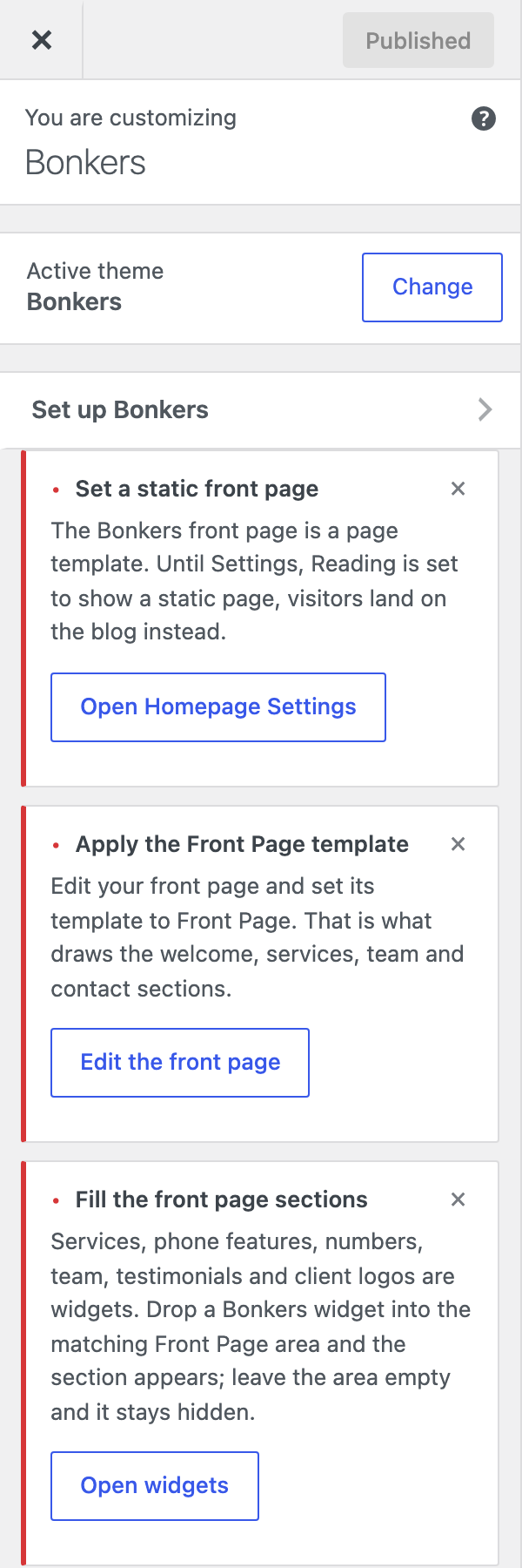
Bonkers does not create pages, posts or demo content, so it never touches a site you have already built. Instead it adds a Set up Bonkers checklist to the top of Appearance → Customize. Each step has a button that opens the right place, disappears once it is done, and can be hidden with its × if it does not apply to you.
Build the front page
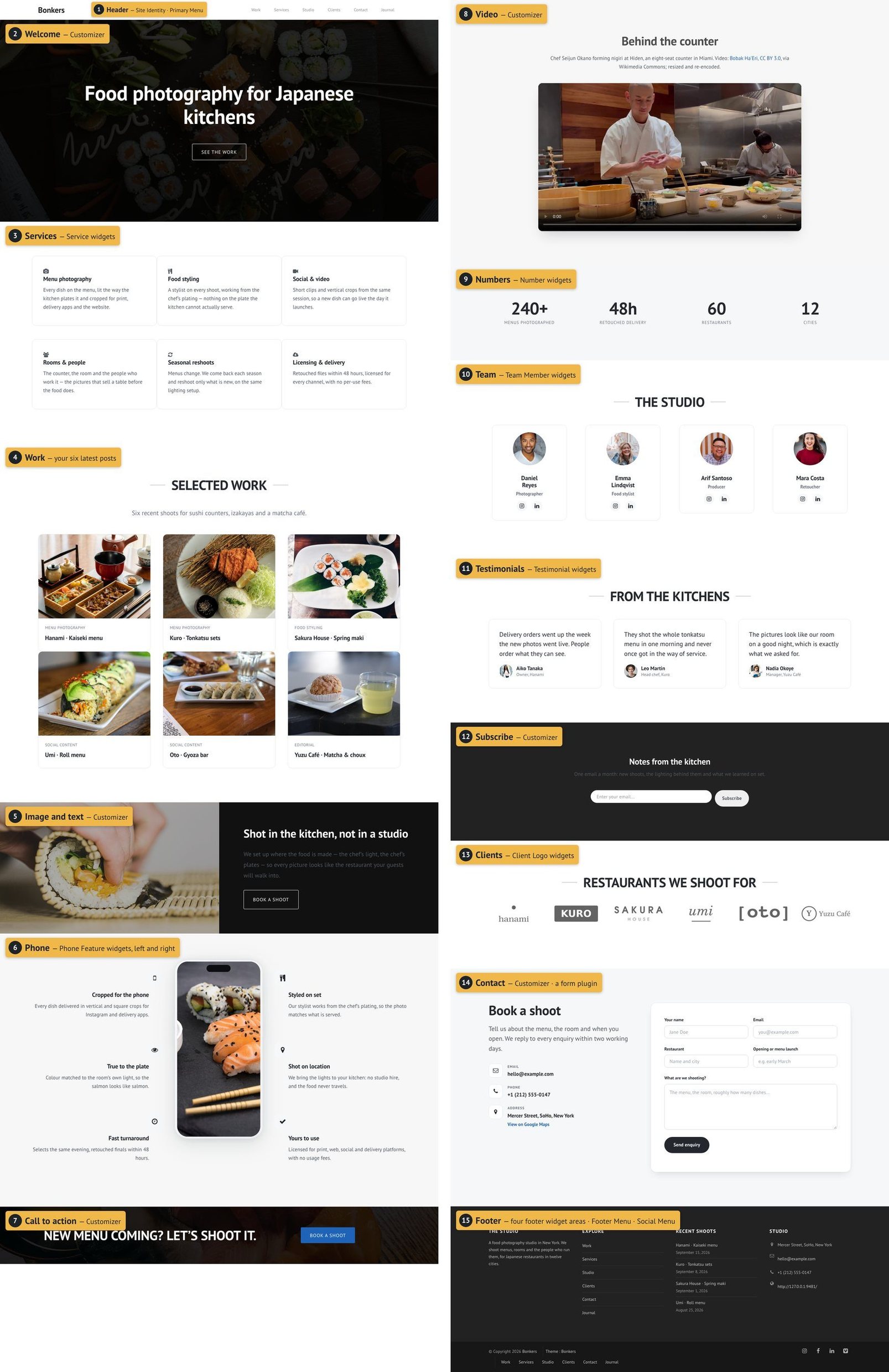
The Bonkers front page is a page template. It is made of up to thirteen sections, and it appears on whichever page uses the Front Page template.
1. Make the page
- Go to Pages → Add New Page and give it a title, such as Home.
- In the sidebar, open the Page tab, click the name next to Template, and choose Front Page.
- Click Publish.
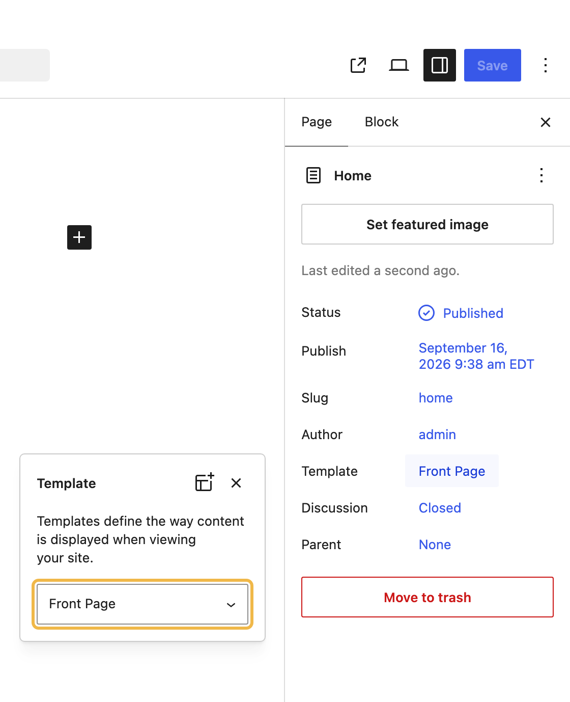
Leave the page itself empty: the template draws the sections, and anything typed into the page is not shown.
2. Make it your homepage
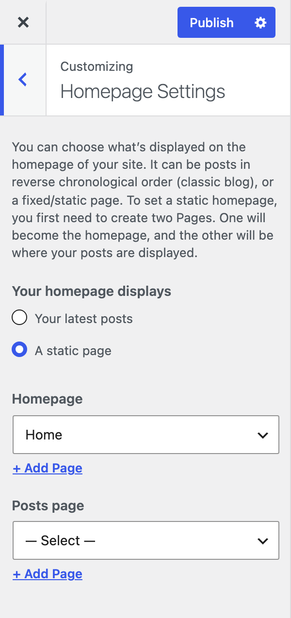
- Go to Appearance → Customize → Homepage Settings (or Settings → Reading).
- Choose A static page, then pick your page under Homepage.
- If you blog, make a second empty page, Journal say, and pick it under Posts page.
- Click Publish.
How the front page is put together
Some sections take their words and pictures from the Customizer, and some are filled with widgets. Once you know which is which, everything else is simple.
| Section | What fills it | Shows when |
|---|---|---|
| Welcome | Customizer: headline, background photo, button | Always |
| Services | Service widgets | It has at least one widget |
| Work | Your six latest posts; heading, intro, columns and link in the Customizer | You have posts |
| Image and text | Customizer: heading, text, photo, which side it sits, button | Always |
| Phone | Phone Feature widgets either side; the screen picture in the Customizer | Either side has a widget |
| Call to action | Customizer: heading, background photo, button | Always |
| Video | Customizer: heading, video address, poster, text below | A video address is set |
| Numbers | Number widgets | It has at least one widget |
| Team | Team Member widgets; heading in the Customizer | It has at least one widget |
| Testimonials | Testimonial widgets; heading in the Customizer | It has at least one widget |
| Subscribe | Customizer: heading, text, form address, button | A form address is set |
| Clients | Client Logo widgets; heading in the Customizer | It has at least one widget |
| Contact | Customizer: heading, intro, address, email, phone, form, map | Any of those is filled in |
Every section also has a Show this section switch, so you can hide one without emptying it.
Change text, images and buttons
Go to Appearance → Customize → Front Page Sections and click a section. Its settings open on the left and the preview on the right scrolls to it.
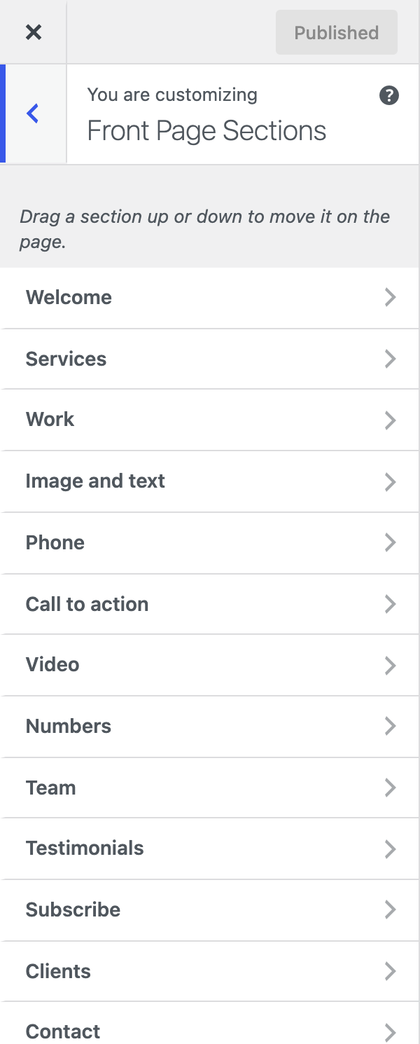
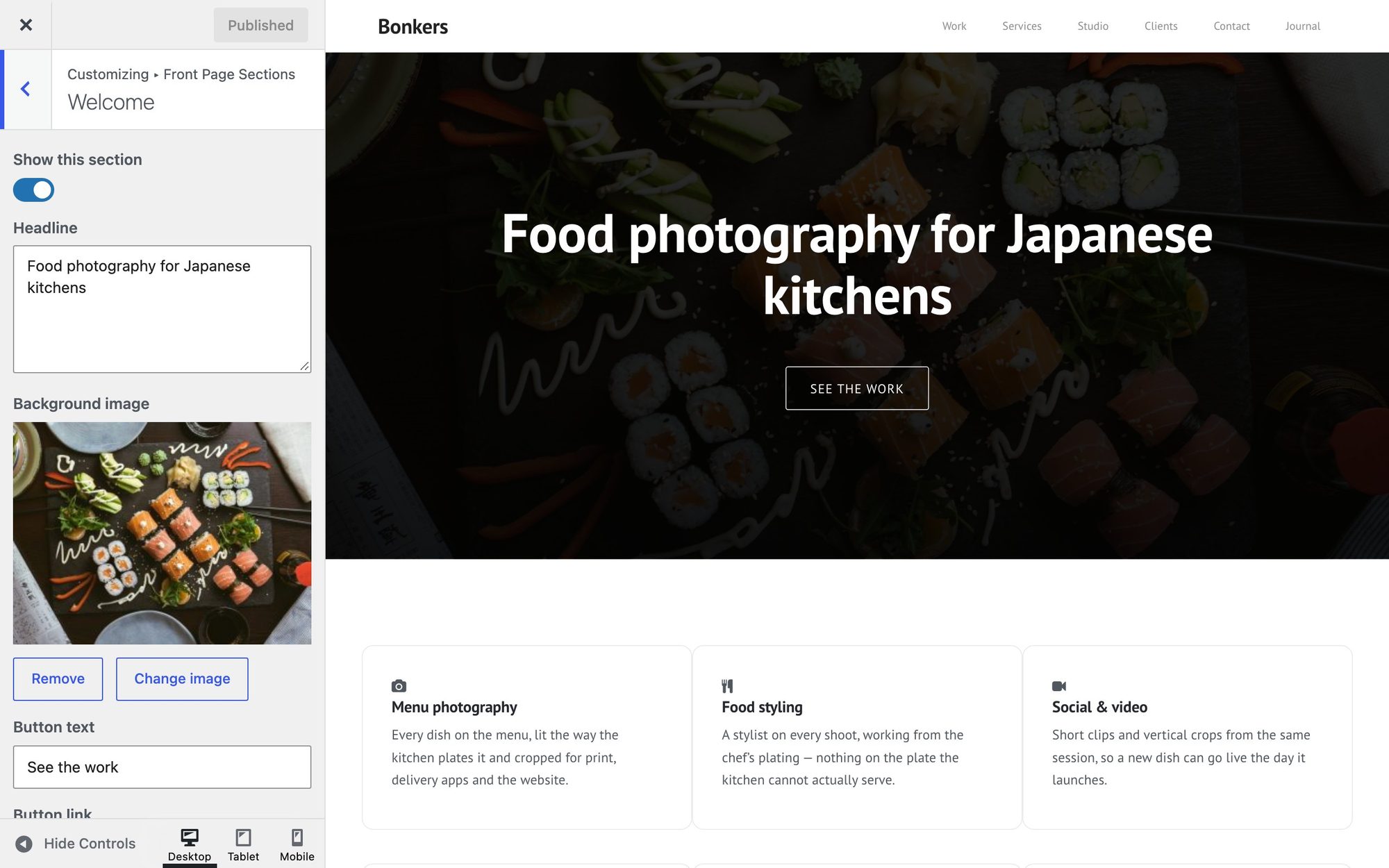
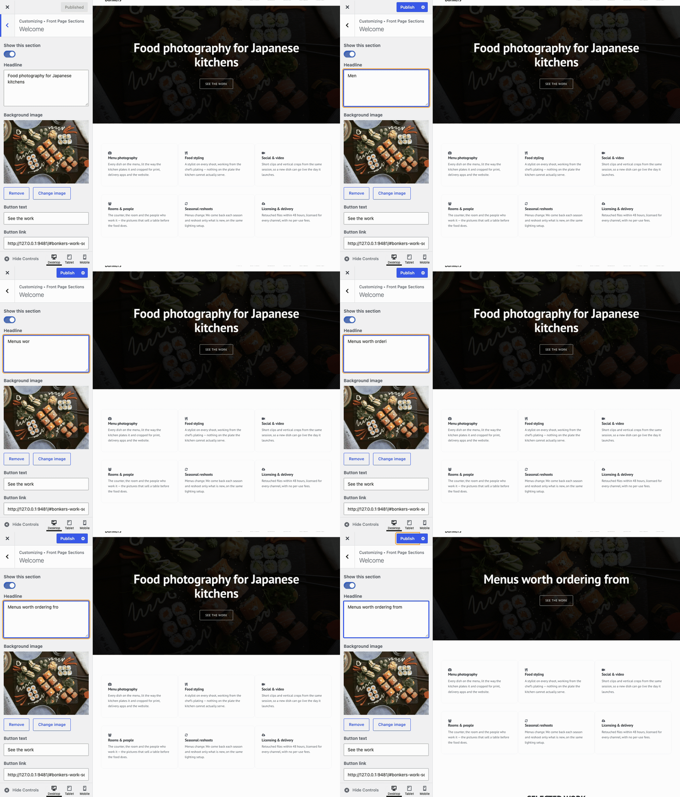
- Type into a field, or use Change image under a photo to pick one from the Media Library or upload a new one.
- Wait a moment: the preview reloads with your change.
- Click Publish at the top when you are happy. Until then, visitors see the old version.
- Headlines can break onto two lines. Type
<br>where the break should go, as inEvery Great Company<br>Starts With An Idea. - Empty a field to get the theme’s default back.
- A button can scroll to a section. Put the section’s anchor in Button link, such as
#bonkers-contact-section. All the anchors are listed under Menus. - Photos for a full-width background — Welcome and Call to action — should be at least 1920 pixels wide. Keep what matters near the middle: the edges are cropped on narrow screens.
Reorder or hide sections
The sections appear on the page in the order they are listed in Front Page Sections. To move one, drag it up or down the list. The preview reloads in the new order, and Publish keeps it.
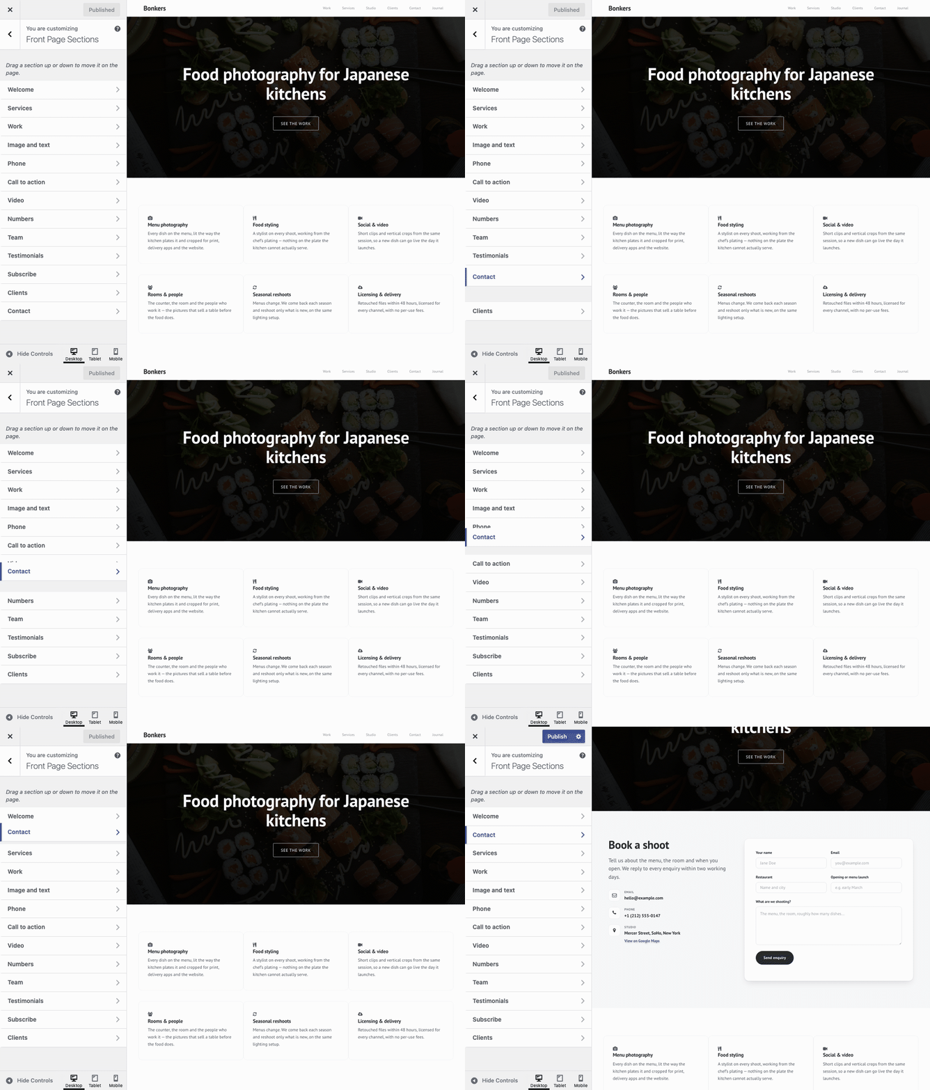
To hide a section, open it and turn off Show this section. Its content is kept, so switching it back on restores it exactly.
Fill sections with widgets
Services, phone features, numbers, team members, testimonials and client logos are widgets, one per card. Each section has its own widget area.
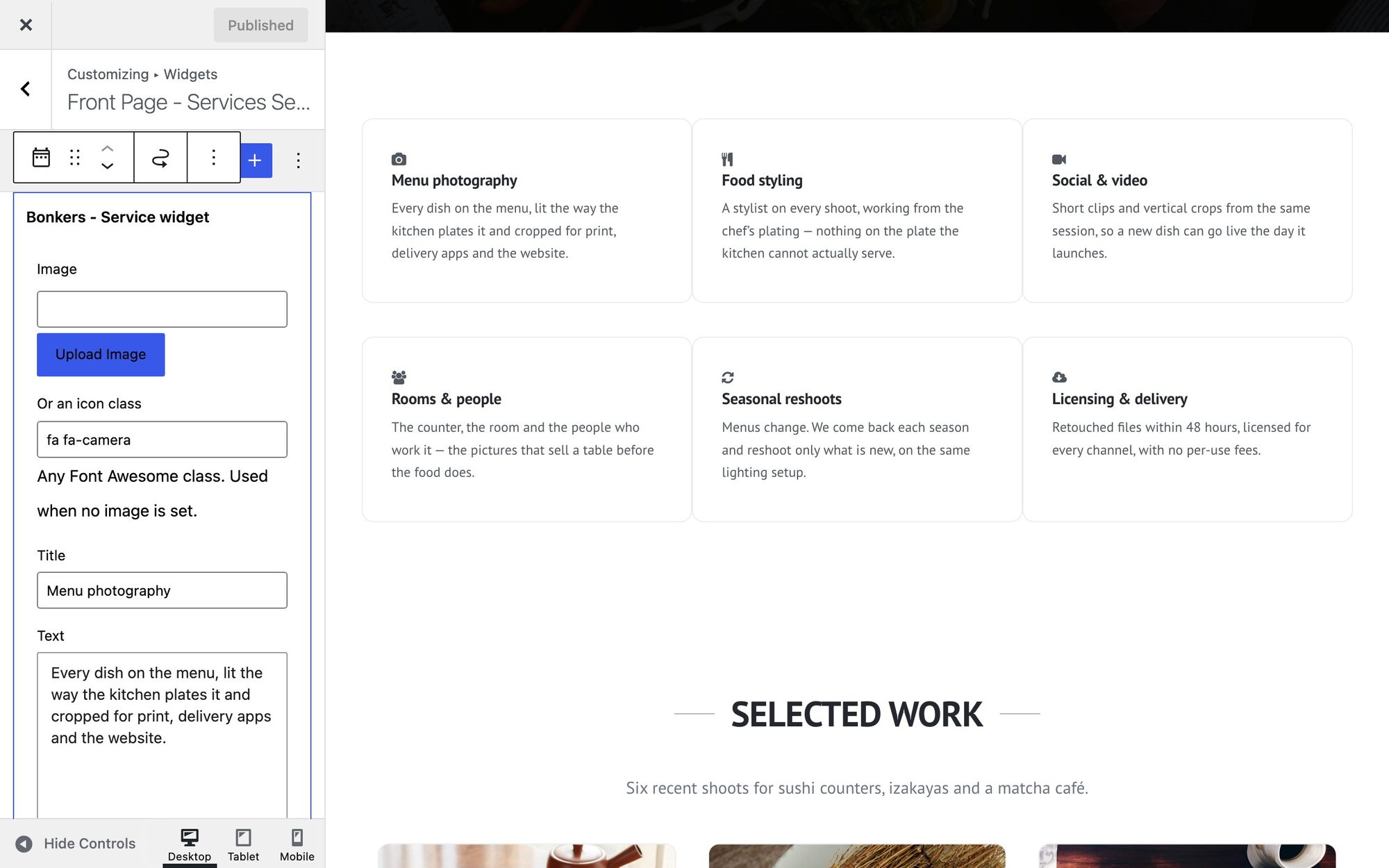
- Go to Appearance → Customize → Widgets and open the area, such as Front Page – Services Section. (Appearance → Widgets works too, without the preview.)
- Click + and choose the matching Bonkers widget — they are listed with the other blocks, all starting Bonkers –.
- Fill in its fields, then click Publish.
| Widget | Goes in | Fields |
|---|---|---|
| Bonkers – Service widget | Front Page – Services Section | Image or icon, title, text, link text and link. Three to a row. |
| Bonkers – Phone Feature | Front Page – Phone Section Left, and Right | Image or icon, title, text. Three a side fits the phone. |
| Bonkers – Number | Front Page: Numbers | Figure (240+, 48h) and caption. Four to a row. |
| Bonkers – Team Member | Front Page – Team Section | Square photo, name, position, and links to Facebook, Twitter, Instagram, Snapchat, Google Plus, LinkedIn, GitHub, WordPress, YouTube and Vimeo. Only links you fill in show an icon. |
| Bonkers – Testimonial | Front Page: Testimonials | Quote, name, role or company, photo address |
| Bonkers – Client Logo | Front Page – Clients Section | Logo image and an optional link |
| Bonkers – Contact Info | Any footer area, or the Sidebar | Title, address, email, phone, website |
Icons
Service and phone widgets take either an image or an icon. For an icon, leave Image empty and type a Font Awesome 4 class into Or an icon class: fa fa- followed by the icon’s name, as in fa fa-camera or fa fa-envelope-o. The names are listed on the Font Awesome 4 icons page. Icons take the theme’s colour; an image, if you set one, wins.
Photos in widgets
Click Upload Image to choose from the Media Library. The Testimonial widget asks for a photo address instead: open Media → Library, click the photo, click Copy URL to clipboard, and paste it in. Team photos should be square; client logos look best on a transparent or white background.
To change the order of cards, drag the widgets within their area. To remove a card, select the widget and choose Delete from its ⋮ menu.
The work grid
The Work section shows your six most recent posts as cards: the featured image, the post’s first category above its title, and a link to the post. So each project is a post.
- Go to Posts → Add New Post and write up the project.
- In the sidebar, set a Featured image — this is the picture on the card — and pick a category, such as Branding or Editorial.
- Publish it. The newest post comes first.
In Front Page Sections → Work you can change the heading and intro, show two, three or four cards to a row, and add a link under the grid — Link text plus Link URL, such as your blog page. The link only appears once it has an address.
Use a plugin that adds a Portfolio post type? If it registers one named portfolio, the grid shows those items instead of posts.
Phone and video sections
The phone
The picture on the phone’s screen is set in Front Page Sections → Phone → Screen image. Use a tall image — a phone screenshot is ideal, around 740 × 1560 pixels. It is cropped to fill the screen. The features either side are Phone Feature widgets, and the section appears once either side has one.
The video
Paste an address into Front Page Sections → Video → Video URL:
- YouTube — a normal,
youtu.beor Shorts link. It plays fromyoutube-nocookie.com, YouTube’s privacy-enhanced mode. - Vimeo — the video’s page address.
- Your own file — upload an MP4 to the Media Library and paste its address. Set a Poster image to show before it plays.
Text below the video accepts simple HTML, so you can link a credit or a source.
Contact: form, details and map
The form
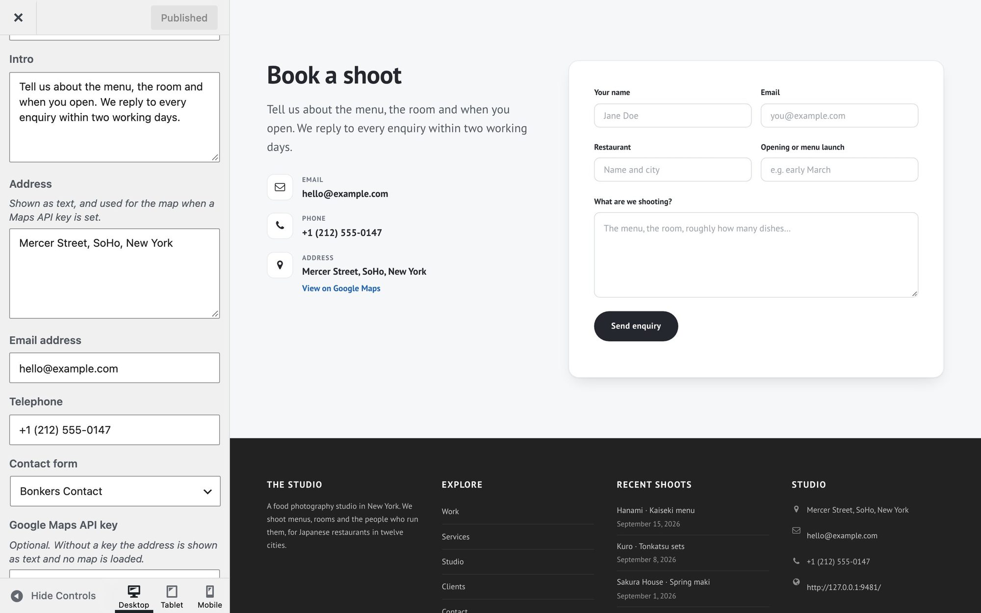
Bonkers shows a form made with one of three free plugins: Contact Form 7, WPForms or Kali Forms.
- Install one from Plugins → Add New Plugin and create a form — each comes with a ready-made contact form.
- In Front Page Sections → Contact, choose it under Contact form, and Publish.
- Send yourself a test message from a private browser window, and check it arrives — look in the spam folder too.
Where messages go is set in the form plugin, not in Bonkers. If none arrive, your host is probably not sending WordPress email: an SMTP plugin such as FluentSMTP or WP Mail SMTP fixes that.
Your details
Fill in Intro, Address, Email address and Telephone. The email and phone number become links that open a new message or a call, and the address gets a View on Google Maps link. Any you leave empty are not shown.
A map (optional)
With a Google Maps API key, the section shows a map of your address with the heading and form in a panel over it. That layout has no room for the intro and contact details, so they are not shown.
- In the Google Cloud console, create a project and add a billing account. Google charges nothing below its monthly free usage.
- Enable two APIs: Maps JavaScript API and Geocoding API.
- Create an API key and paste it into Google Maps API key, then Publish.
No map? Bonkers looks up your address from your server once and remembers where it is; the map itself loads in your visitors’ browsers. A key limited to websites blocks that server lookup. Limit the key to the two APIs instead — and if you want the website limit as well, add it after the map has appeared once. Change the address later and you will need to lift it again until the map shows.
Newsletter sign-up
The Subscribe section is an email field and a button that send the address straight to your newsletter service — Bonkers stores nothing. It stays hidden until you give it somewhere to send the address.
It is made for Mailchimp:
- In Mailchimp, go to Audience → Signup forms → Embedded forms.
- In the code it generates, find
action="…"near the top and copy the address between the quotes. It looks likehttps://yourname.us1.list-manage.com/subscribe/post?u=…&id=…. - Paste it into Front Page Sections → Subscribe → Form action URL, set the heading, text, button and placeholder, and Publish.
Other services work too if their sign-up form accepts the address in a field named EMAIL. A sign-up opens the service’s own confirmation page in a new tab.
Menus and links to sections
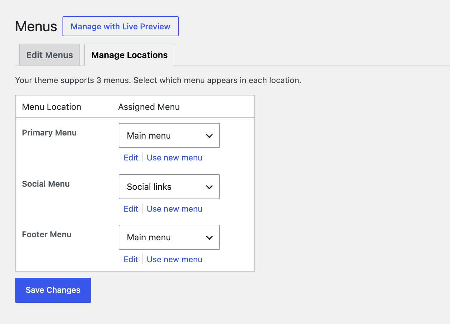
Bonkers has three menu locations. Create menus in Appearance → Menus, then assign them under Manage Locations:
- Primary Menu — across the header. Items with sub-items get a dropdown.
- Footer Menu — a single row under the copyright line.
- Social Menu — icons at the bottom right of the footer.
Links that scroll to a section
Add a Custom Link whose URL is your site’s address followed by the section’s anchor, such as https://example.com/#bonkers-work-section. Using the full address, not just the anchor, means the link also works from your blog and other pages.
| Section | Anchor |
|---|---|
| Welcome | #bonkers-welcome-section |
| Services | #bonkers-services-section |
| Work | #bonkers-work-section |
| Image and text | #bonkers-image-section |
| Phone | #bonkers-phone-section |
| Call to action | #bonkers-cta-section |
| Video | #bonkers-video-section |
| Numbers | #bonkers-stats-section |
| Team | #bonkers-team-section |
| Testimonials | #bonkers-testimonials-section |
| Subscribe | #bonkers-subscribe-section |
| Clients | #bonkers-clients-section |
| Contact | #bonkers-contact-section |
A hidden section has no anchor, so a link to it goes nowhere.
Social icons
Add a Custom Link to each profile. Bonkers picks the icon from the address, for 500px, Amazon, Behance, Dribbble, Facebook, Flickr, Foursquare, GitHub, Google+, Instagram, LinkedIn, Pinterest, Skype, Snapchat, TripAdvisor, Tumblr, Twitter, Vimeo, VK, WordPress, Yelp, YouTube, your RSS feed, tel: phone links and whatsapp: links. The link text is read out to screen reader users rather than shown, so make it the network’s name.
Logo, colours and fonts
Logo and site name
In Appearance → Customize → Site Identity, click Select logo. For a sharp logo on high-resolution screens, upload it at twice the size you want it shown and tick Is this image retina-ready?: Bonkers then shows it at half its width. Without a logo, your Site Title is shown in its place. Site Icon is the little picture in the browser tab.
Colours
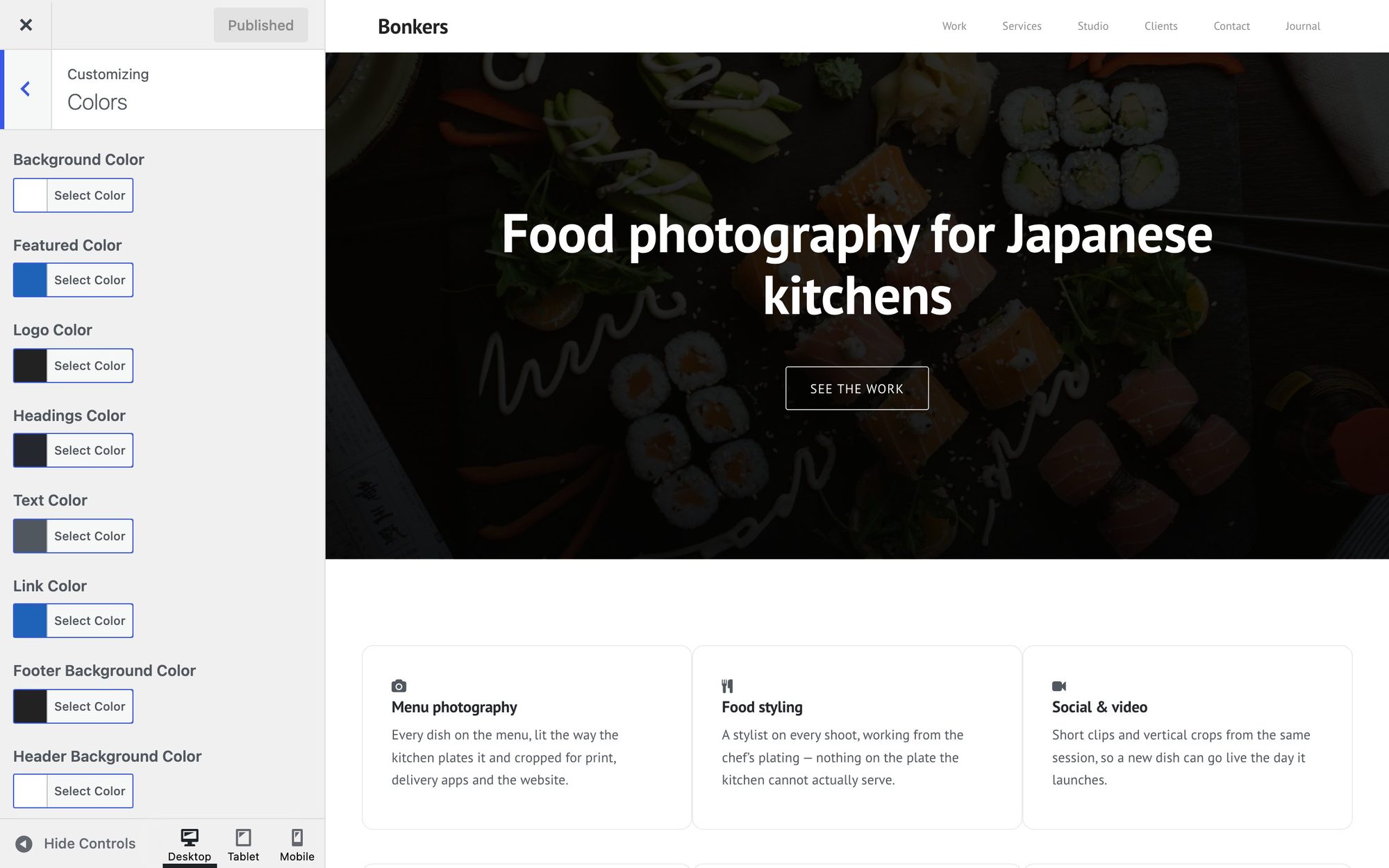
| Colour | Used for | Default |
|---|---|---|
| Featured Color | Buttons and accents | #1E63B8 |
| Link Color | Links in text | #1E63B8 |
| Headings Color | Headings | #24282E |
| Text Color | Body text | #50575F |
| Logo Color | The site title, when there is no logo | #222222 |
| Header Background Color | The header bar | #FFFFFF |
| Footer Background Color | The footer | #222222 |
| Background Color | The page behind everything | #FFFFFF |
The defaults meet WCAG AA contrast. If you change them, keep text dark enough to read: WebAIM’s contrast checker should report at least 4.5:1 against the background, and white button text needs a Featured Color at least that dark. Header Image and Background Image, in the Customizer too, put a photo behind the header or the page.
Fonts
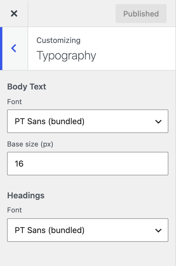
Typography sets the font and base size for body text, and the font for headings. Choose PT Sans, which comes with the theme, or one of each device’s own fonts: System UI, System serif or System monospace. None of them is fetched from Google or anywhere else.
The footer
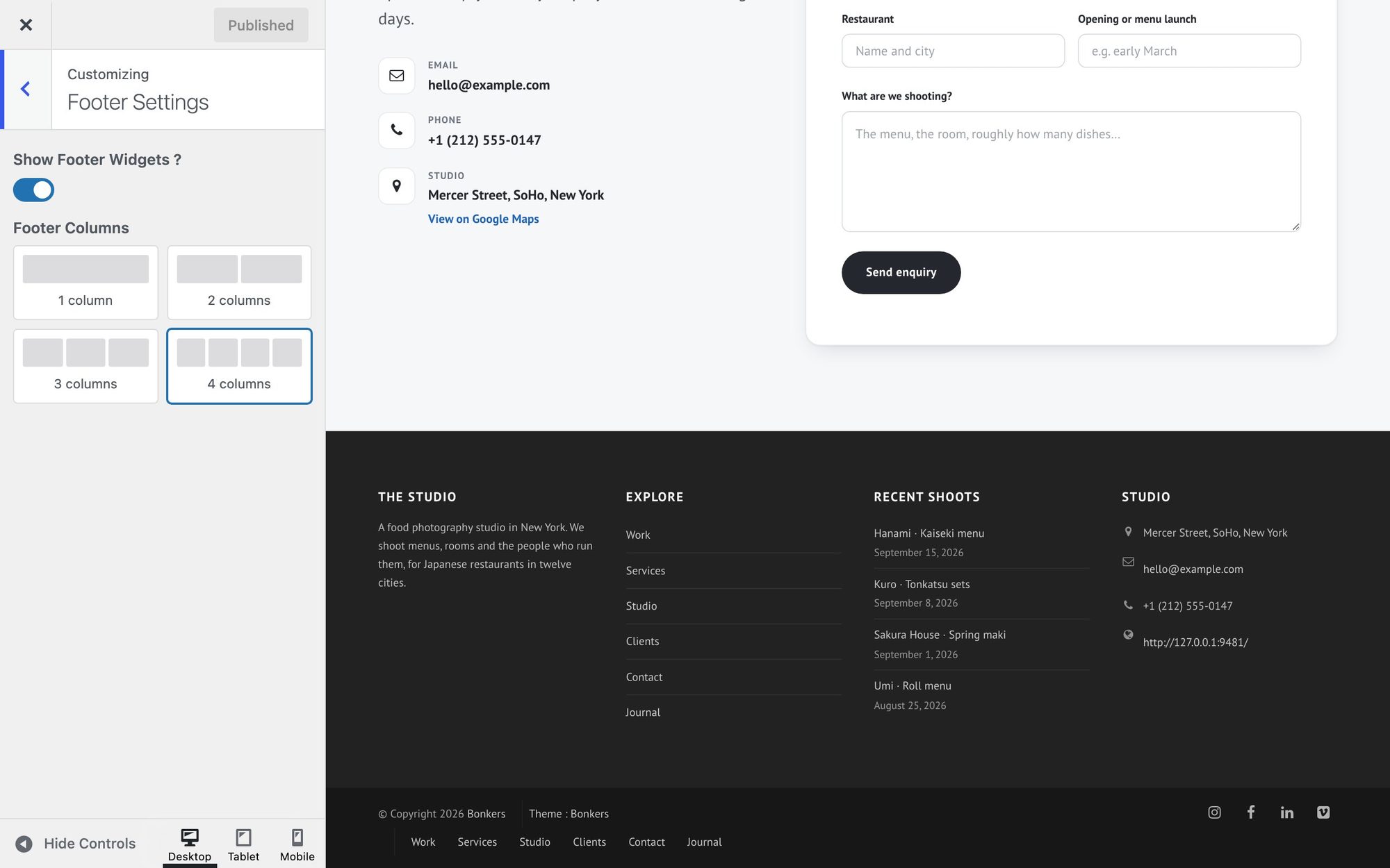
The footer has up to four columns of widgets. In Appearance → Customize → Footer Settings, choose how many columns you want, or turn off Show Footer Widgets to go without. Then fill First to Fourth Footer Widgets Area in Customize → Widgets: a text widget about you, a menu, recent posts, and Bonkers – Contact Info work well. An empty column is skipped, and the others share its space.
Under the columns sit the copyright line with your site title and the year, the Footer Menu, and the Social Menu icons.
Blog, pages and page templates
Posts appear on the page you chose as the Posts page, in cards with their featured images. Posts, archives and ordinary pages show the Sidebar widget area on the right when it has widgets; leave it empty to use the full width.
Pages have three templates, chosen as in Build the front page:
- Default template — the content, with the sidebar beside it when the sidebar has widgets.
- Full width — no sidebar, and room for wide and full-width blocks. Use it for landing pages built from patterns.
- Front Page — the thirteen sections, and nothing from the page itself.
Block patterns and styles
For pages beyond the front page, Bonkers adds ready-made layouts built from ordinary blocks. Click the blue + in the editor, open Patterns, and choose Bonkers.
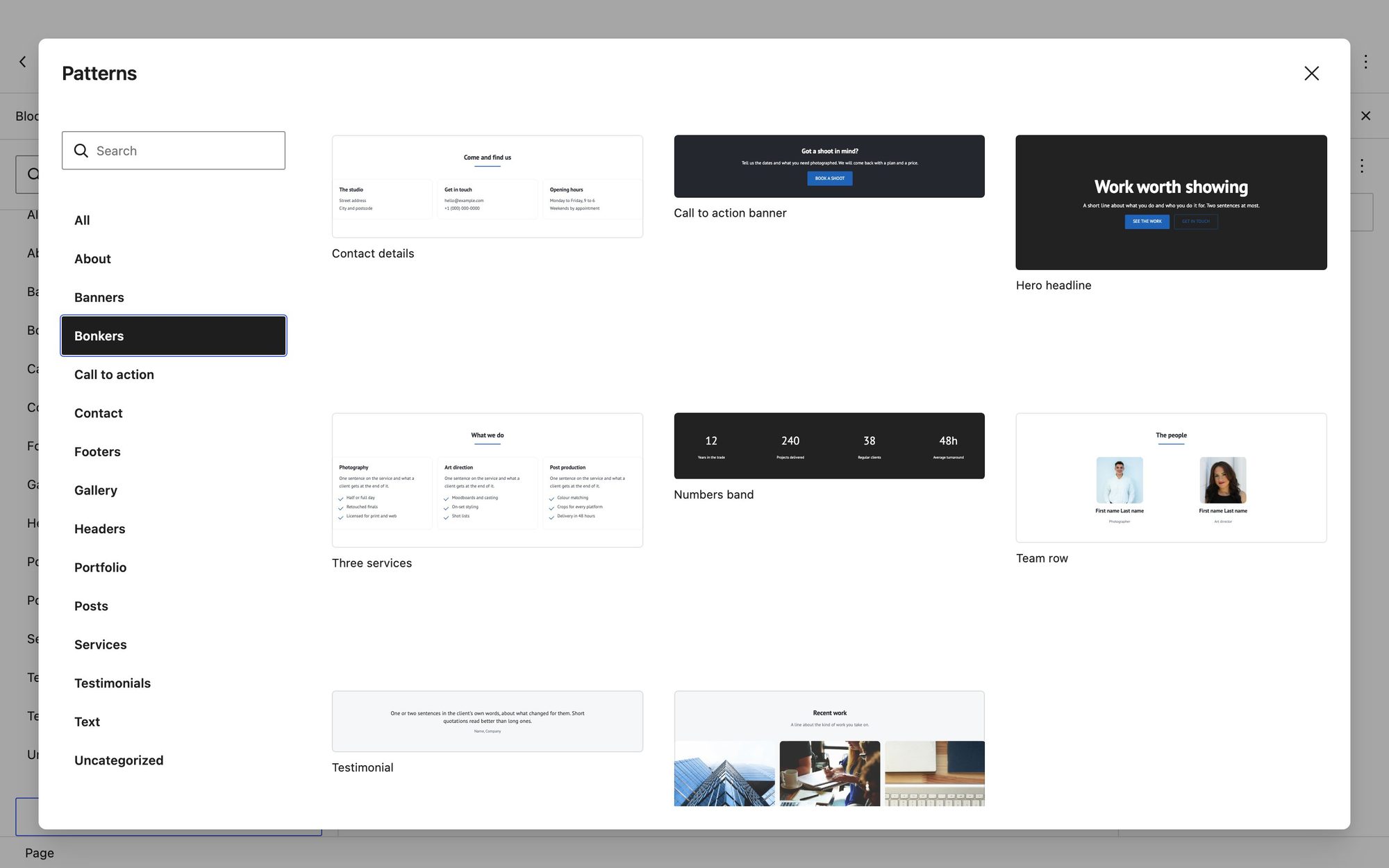
There are eight: Hero headline, Three services, Work grid, Team row, Numbers band, Testimonial, Call to action banner and Contact details. Insert one and type over it; nothing is linked to the front page’s settings.
Block styles
Some core blocks gain extra looks. Select the block, open the Styles tab in its settings, and click one.
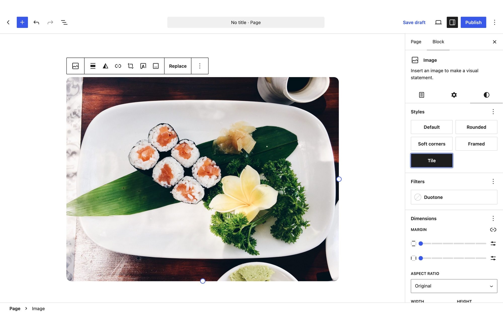
| Block | Style | Looks like |
|---|---|---|
| Button | Fill on hover | A thin outline that fills with the accent colour on hover |
| Image | Soft corners | Gently rounded corners (core’s Rounded makes a circle) |
| Image | Framed | Rounded corners and a soft shadow |
| Image | Tile | Cropped to 4:3, so a row of mixed photos lines up |
| Group | Card | A white card with a thin border and rounded corners |
| Columns | Cards | Each column as a card |
| Quote | Centered | Centred, with no side border |
| Separator | Short rule | A short, centred line in the accent colour |
| List | Checklist | Ticks in the accent colour instead of bullets |
The editor also offers the theme’s colours and font sizes, so a block looks the same in the editor as on the site.
Coming from Bonkers Addons
Bonkers once needed the Bonkers Addons plugin for its front page. Since version 1.1.0 the theme does everything itself, and updating keeps your site as it was:
- Your content stays. Headlines, photos, links and the section order saved by the plugin are still shown, and the Customizer starts from them. Once you change a field and Publish, the theme keeps its own copy of that field.
- Your widgets keep working. The theme’s versions replace the plugin’s, and add the icon fields.
- You can deactivate the plugin in Plugins. Nothing on the front page depends on it. The one thing it adds that Bonkers does not is a WooCommerce product carousel shortcode,
[shopapp_products_carousel]: keep the plugin if a page uses it.
Update to Bonkers 1.1.1 or newer if the plugin is still active: on 1.1.0, having both made Appearance → Customize show a critical error.
Updates, translations and customising
Updates come from WordPress.org and appear in Dashboard → Updates like any other theme. Updating changes the theme’s files, never your content, widgets or Customizer settings.
Translations are made by volunteers on translate.wordpress.org and installed automatically for your site’s language. To translate it yourself, use a plugin such as Loco Translate; the template is languages/bonkers.pot.
To change the design, add CSS in Appearance → Customize → Additional CSS; it survives updates. To change templates or PHP, use a child theme — edits made to Bonkers’ own files are lost at the next update.
If something is not where you expect
My homepage shows blog posts, not the sections. In Customize → Homepage Settings, choose A static page and pick your front page.
My homepage shows an empty page. The page is not using the Front Page template. Edit it and set Template to Front Page.
A section is missing. Check its Show this section switch, then what it needs to appear: Services, Phone, Numbers, Team, Testimonials and Clients need a widget; Work needs posts; Video needs a video address; Subscribe needs a form action URL; Contact needs at least one detail or a form. The table in How the front page is put together has the full list.
An icon shows as an empty square, or not at all. Check the class: it needs both parts, fa fa-camera, and a name from Font Awesome 4. Names from Font Awesome 5 or 6, such as fa-solid fa-camera, do not work.
My form is not in the Contact form list. Only Contact Form 7, WPForms and Kali Forms forms are listed. Check the plugin is active and the form has been created.
The map does not show. Check the key is pasted in full, both APIs are enabled, the Google Cloud project has billing, and the key is not limited to websites — see A map. Also check Google Maps can find your address as written.
A menu link to a section does nothing on other pages. Use the full address with the anchor, https://example.com/#bonkers-work-section, not just #bonkers-work-section.
A social link has no icon. The icon comes from the address, and only the networks listed under Social icons have one.
Appearance → Customize shows a critical error. Bonkers Addons is active on Bonkers 1.1.0. Update Bonkers to 1.1.1 or newer, or deactivate the plugin.
I published, but visitors still see the old version. A caching plugin or your host’s cache is serving a stored copy. Clear it from the plugin’s or host’s settings.
Still stuck?
Ask on the Colorlib support forum. Include your Bonkers, WordPress and PHP versions, what you did, and what you expected to happen — a screenshot helps.