DrPro
Template Details
Author: Colorlib
Updated: October 2026 · v3.0.0
Credits: Images from Unsplash
Description
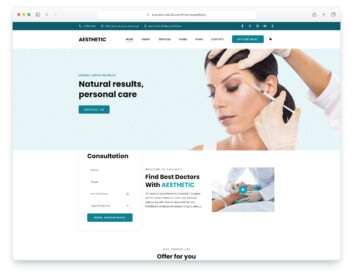
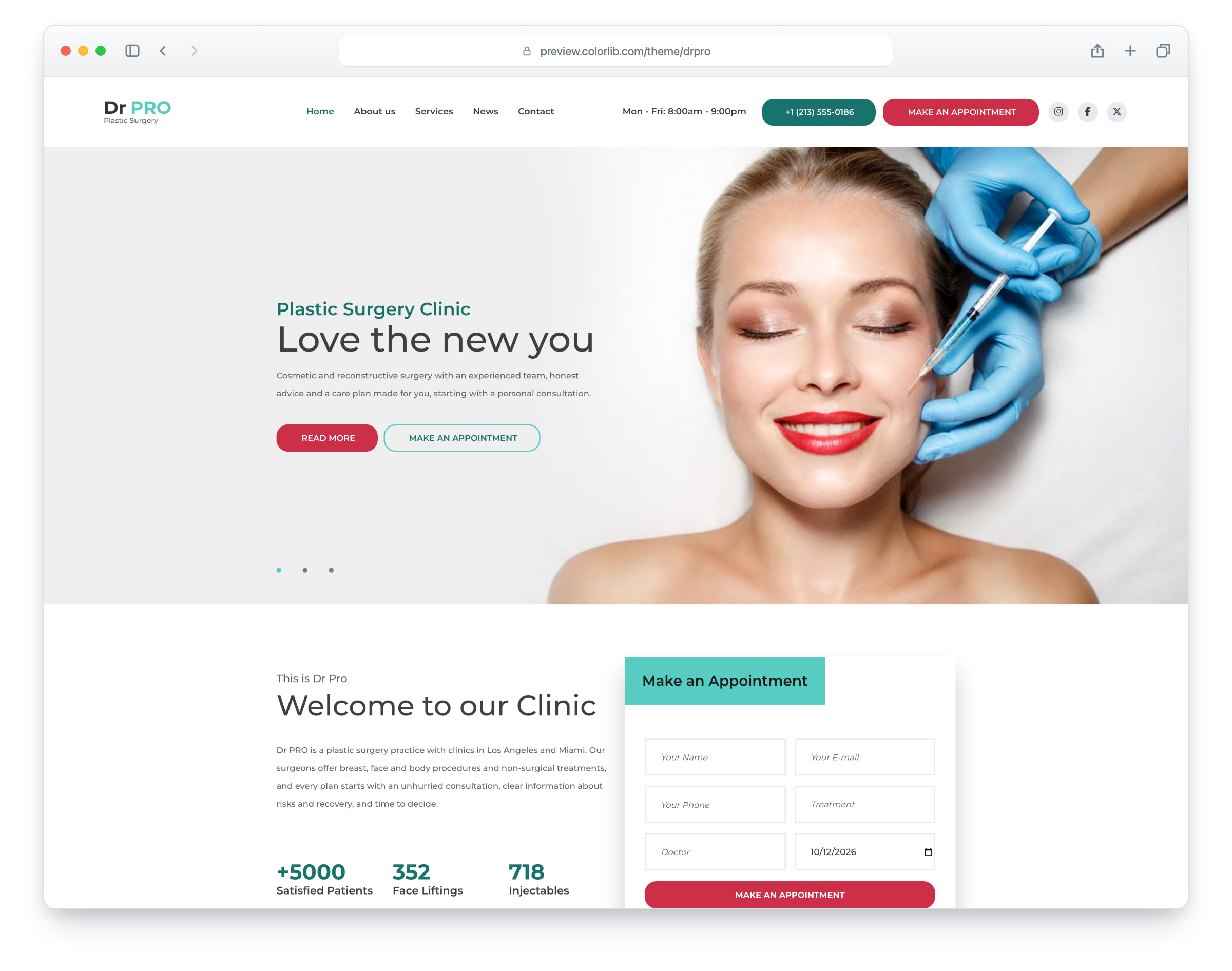
Dr PRO is a plastic surgery website template for surgeons and cosmetic clinics, built on Bootstrap 5. It has a light design in teal and pink, a fixed header that gets slimmer as you scroll, a side menu on smaller screens and a full-width hero slider with call-to-action buttons. The layout is responsive and mobile-ready. There are seven pages: home, about, services, news, news post (one page for each of the six posts), contact and elements.
The home page has the hero slider, a welcome section with animated counters, an appointment form, a why-choose-us section, a call-to-action band with the phone number, six services and a special offer band. The about page adds patient testimonials and the surgeons, the services page a before and after viewer and a price list, and the news section six posts over two list pages. The contact page has the appointment form, the contact details and a map that loads on click, and the elements page shows buttons, accordions, tabs, progress rings, counters and icon boxes. Every page ends with a newsletter form. Use Dr PRO for a plastic surgery practice, a cosmetic clinic or an aesthetic medicine centre.
What’s new in 3.0
- Bootstrap 5.3.8 (the earlier release used Bootstrap 4.1.2 and jQuery), compiled from Sass with the original grid proportions, and plain JavaScript with no jQuery. Swiper 14 replaces Owl Carousel on the hero slider and the testimonials, Jarallax replaces the old parallax plugin, native counters and SVG progress rings replace the animation and progress-bar plugins, a native date field replaces the jQuery date picker, and the before and after viewer is rewritten without plugins. Lucide SVG icons replace Font Awesome 4.7 and the old SVG icons, with a small Font Awesome 7 Brands subset for the social logos. npm run build (Dart Sass and esbuild) compiles the minified stylesheets and one script.
- Lighter pages: the home page went from 1.97 MB and 39 requests to 0.67 MB and 26 requests, and the contact page from about 2.9 MB and 100 requests to 0.43 MB and 22 requests. Every photo has an AVIF version with a JPEG or PNG fallback, real dimensions and lazy loading below the first screen. The download is 2.91 MB (it was 3.03 MB) and includes the Sass sources and the build scripts.
- No third-party requests: Montserrat is self-hosted, the icons are inline SVG, and a Google Analytics 4 snippet stays commented out until you add your own ID. The contact page’s map loads OpenStreetMap only after a visitor clicks “Show map”. Before, every page loaded Google Fonts and an analytics tag, and the contact page loaded Google Maps.
- Working forms: the appointment form on the home and contact pages and the newsletter form on every page send through php/send-email.php, a safe mailer with validation, a spam trap and an in-page message. The appointment form has labelled fields, the six treatments and three surgeons as options, and a date field that accepts weekdays only, from today to a year ahead, checked again on the server. Before, the forms posted nowhere, the options read “Speciality 1” and “Doctor 1”, and on the contact page the required treatment and doctor could be left unchosen.
- Distinct content: six services with their own icons, descriptions and prices, three different hero slides, three patient testimonials shown with initials, and six news posts, each on its own page with older and newer links, over two list pages. Neutral clinic copy replaces the placeholder text, and fictional contact details and one set of opening hours (Monday to Friday, 8:00am to 9:00pm) appear throughout. Before, every service card showed the same service, the slides and testimonials repeated one another, and the header and footer gave different opening hours.
- Accessibility: a skip link and a main landmark, one h1 per page, labelled form fields, a menu button whose panel keeps focus inside and closes with Esc, keyboard support for the slider dots, accordions and tabs, a before and after viewer that works by drag, tap or arrow keys (it was mouse only), visible focus rings, 44 px touch targets and WCAG AA text contrast: dark text on the bright teal menu, the teal form headers and the pink call-to-action band, deeper teal and pink for small buttons and badges, and darker greys.
- Fixed: on phones the page hero text sat across the photo and was hard to read (a soft shade now sits behind it); on screens wider than 1920 px the wave over the page heroes ended in a hard edge; the date field on the contact page was a plain text box; and every link that went nowhere, from the logo, buttons and team names to the news pagination and read-more links, now opens a real page (the social icons link to the networks as placeholders for your own profiles).
Pricing DrPro
Single
$19
- Premium support
- Template updates
- For 1 year
- Access all templates
Membership
$129
- Premium support
- Template updates
- For 1 year
- For 1 year
Lifetime
$349
- Premium support
- Template updates
- For life
- For life
Similar Templates