Belara
Template Details
Author: Colorlib
Updated: November 2026 · v3.1.0
Description
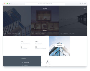
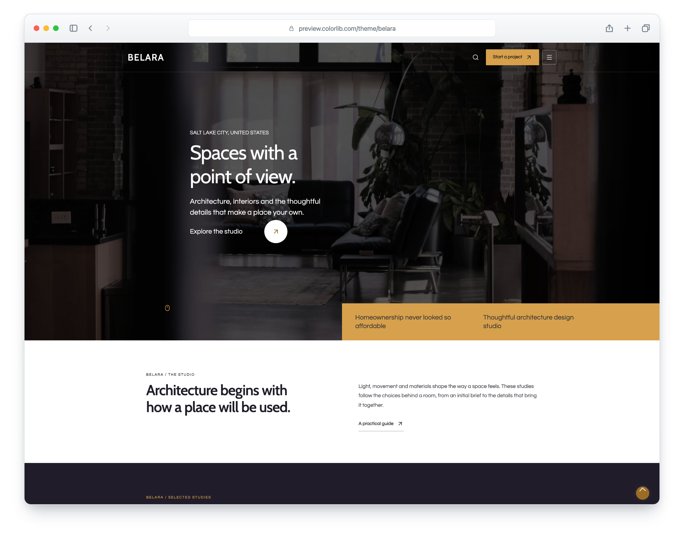
Belara is a responsive HTML website template for architecture and interior design. Its updated design keeps the original idea and colour palette while improving typography, spacing, navigation, content layouts and form controls.
The package includes 12 website pages plus setup documentation. An image-led studio homepage, selected projects, three detailed project and process studies, studio information and a project-planning guide.
What’s new in 3.1
- An image-led studio homepage, selected projects, three detailed project and process studies, studio information and a project-planning guide.
- Responsive desktop, tablet and phone layouts, the template’s own typography and colours, keyboard navigation, visible focus and reviewed contrast.
- A redesigned local site search with relevant page and section results, useful summaries, topic suggestions, direct links and clear no-results recovery.
- Suitable original imagery, AVIF delivery and original-format image fallbacks.
- Bootstrap 5.3.8, vanilla JavaScript, self-hosted fonts, Lucide SVG icons and official brand SVGs.
- Validated enquiry forms with pending, error and success feedback. Configure the included PHP mail handler on your own server before deployment. Email-only newsletter forms are included, with validation and delivery feedback.
- Compiled assets, editable source files, Sass and documented build tools. Download size: 5.3 MB; original package: 5.1 MB.
Pricing Belara
Single
$19
- Premium support
- Template updates
- For 1 year
- Access all templates
Membership
$129
- Premium support
- Template updates
- For 1 year
- For 1 year
Lifetime
$349
- Premium support
- Template updates
- For life
- For life
Similar Architecture Templates View all 30 architecture templates →