
22 Examples Of Bad Websites 2024
Are you ready to see some of the best examples of bad websites?
While this list was actually more challenging to curate than not, we finally made it happen.
Surprisingly, there are still very many websites with the absolute worst design.
It’s hard to believe that these types of websites even exist these days with the availability of amazing WordPress themes and convenient mobile-friendly website builders.
When reviewing pages to create a collection of the worst websites, we paid special attention to design, user experience, loading time, content and readability.
Bad Websites (So You Don’t Make The Same Mistake)
1. Pacific Northweast X-Ray Inc.

Pacific Northweast X-Ray is one of the lowest-quality websites that we stumbled across. You don’t really know what the website/business is all about. Plus, the website gives you no reason to want to learn more about it.
The page is as old-school as possible – making you want to leave it as quickly as possible, not bothering with typing in your search query or clicking any links.
2. Blinkee

While Blinkee’s desktop version is somewhat OK (not really), it offers a really low mobile user experience.
The hero section is very beginner-ish that would be a lot better if the elements were static. Also, the choice of branding and colors is off, not following any patterns.
The only good things about Blinkee is the live chat function and the decent multi-level drop-down menu.
3. Ling’s Cars
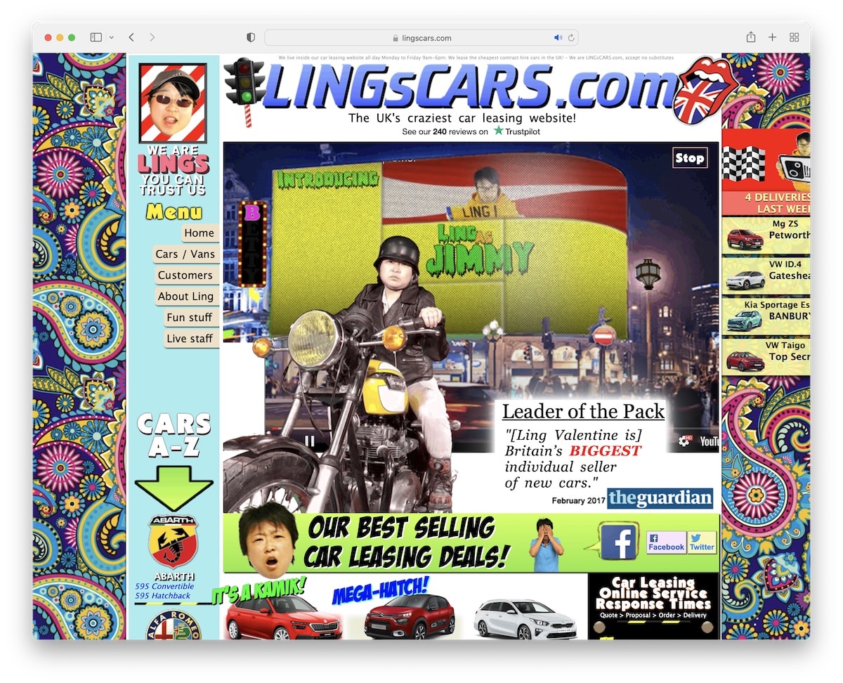
Ling’s Cars’ extreme flashiness makes you unsure of what to look at. It’s way too distracting (but sometimes Asian/Japanese websites are exactly like that). Also, the layout is not responsive, giving you a hard time finding the information and items on mobile.
The video gets completely lost in all the animations, so it’d be much better off without it.
4. The Big Ugly Website
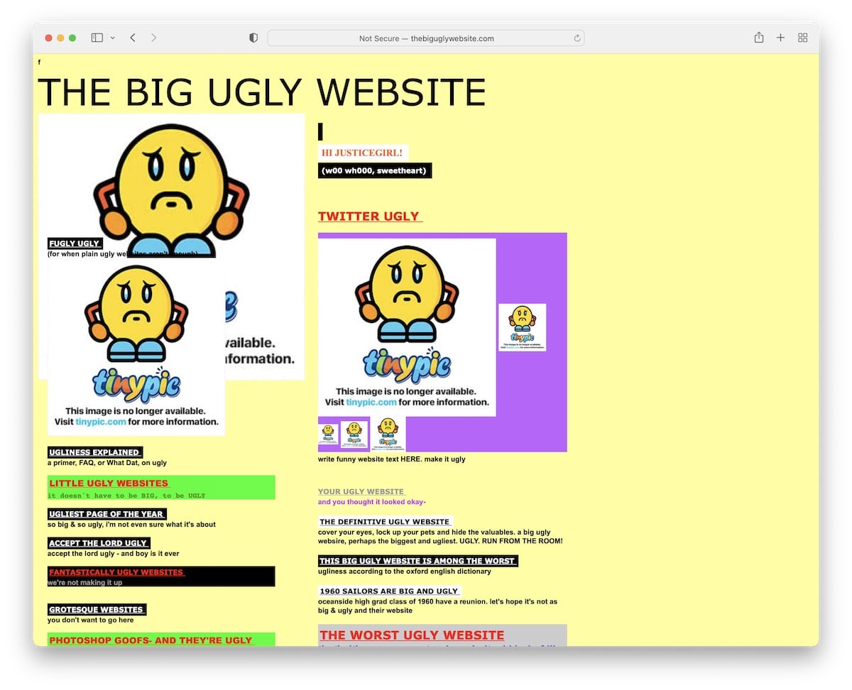
I’m not sure what the purpose of The Big Ugly Website is, but they nailed it if they wanted to give an example of a really bad website. And things get even worse when you start clicking links.
This one-page website lacks overall design because of the color choices, and the mobile look is nonexistent.
Lastly, the little “f” icon in the top left corner isn’t clickable.
5. Arngren
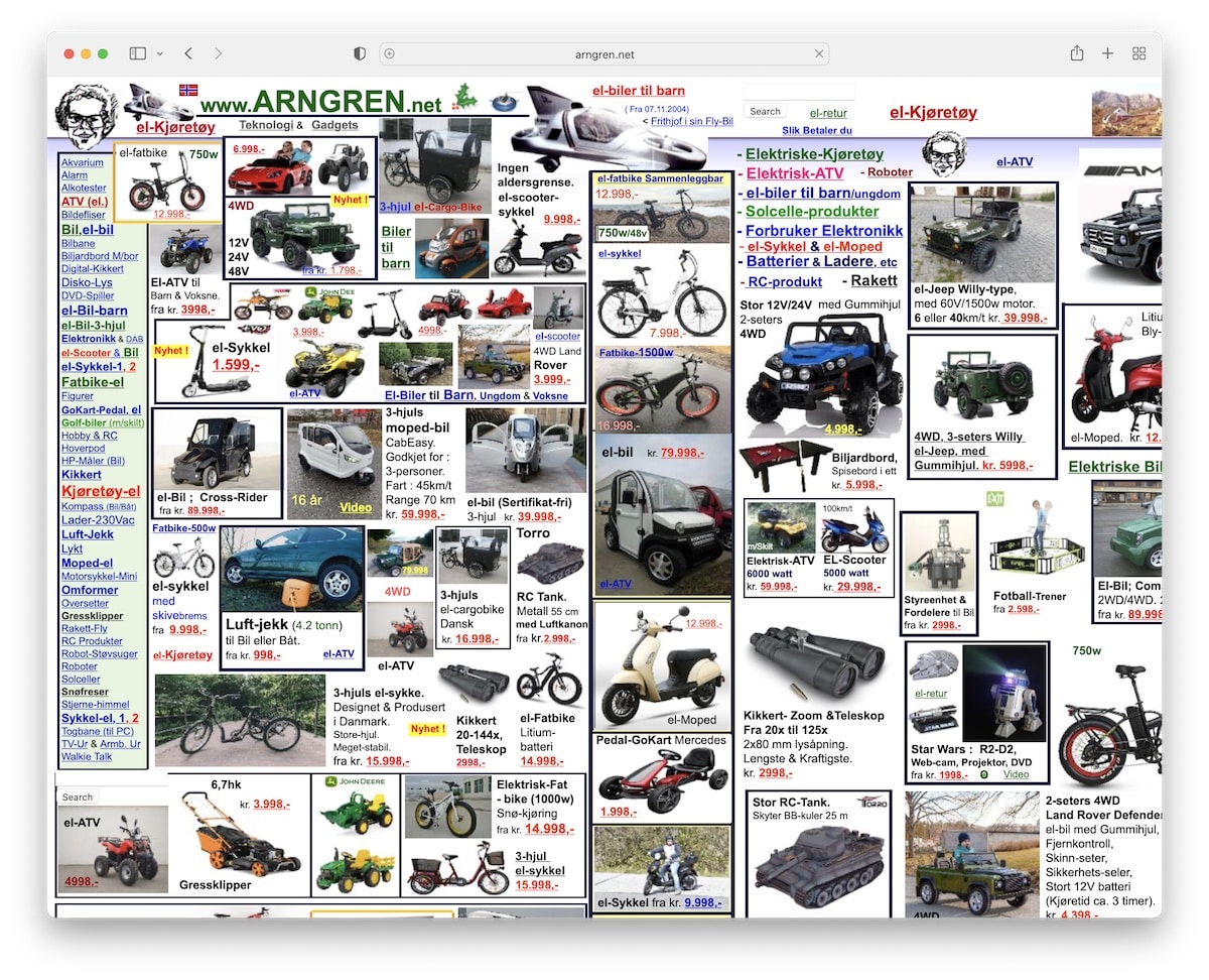
Are we looking at an old-school yellow page or a website? Arngren is a bad website example that put 0 thought into creating a good user experience.
The collage of images with tiny fonts doesn’t change its shape on mobile. You even need to scroll it left and right on the desktop (unless you’re using a really large screen).
Even if you would like to skim through it quickly – you can’t.
6. CAVS
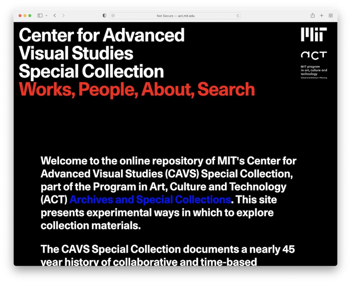
CAVS made a bad choice when doing animation for their texts and images. However, it’s not even that awful for the images, but it makes the text a lot harder to read.
What’s more, the website is SO long you will want to stop scrolling it sooner rather than later.
7. Tag Team Signs
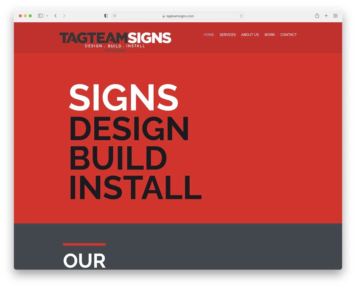
While the big and bold web design can work really well, Tag Team Signs didn’t do it right. The choice of colors, typography and background images don’t show the slightest sign of professionalism. And that comes from people who are designing signs.
Doesn’t make sense to me.
The only good page element is the “Get in touch” section with a clean contact form and company details (but you won’t see all of it on mobile).
8. The World’s Worst Website Ever
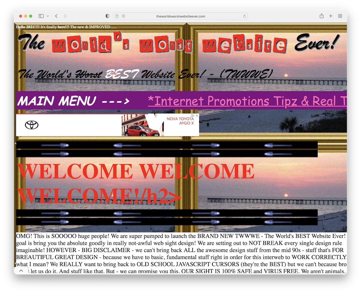
If The World’s Worst Website Ever’s main purpose is to show how NOT TO DO web design, they sure succeeded at it.
Flashy details, irrelevant white space, banner ads, bright colors and complete unresponsiveness are some of the bad features you can see.
The only thing that may cheer you up when browsing the page is after you play the song – but the player is hard to find.
9. Goodreads
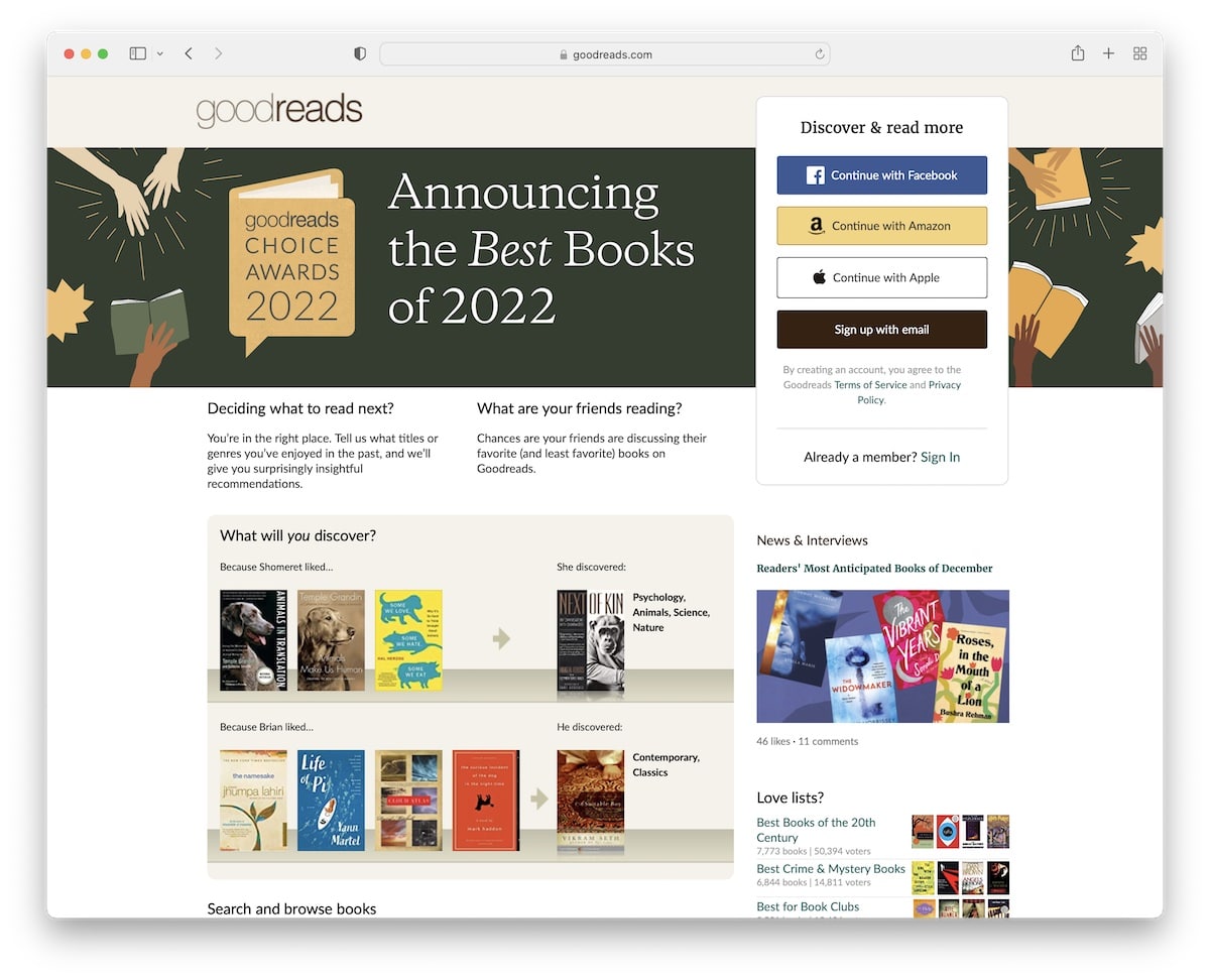
It’s hard to believe that the desktop design and the user experience of Goodreads is so low. Hey, we’re speaking of a really huge business.
Even though it’s far from being the worst on this list, it features a way too basic design with terrible navigation.
Luckily, the mobile layout is a lot better – but it’s still better to download the app to get the most out of the platform.
10. Bella De Soto
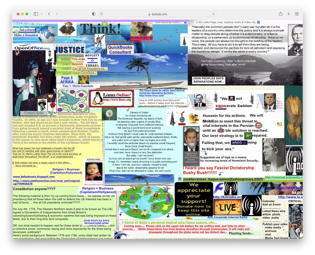
Yikes! You want to stay away from a website that forces you to auto-download files. I’m not saying they mean to harm your device, but it’s just a bad practice (hey, spammers, thanks for ruining our trustworthiness).
But that’s not the only bad thing Bella De Soto’s website does. Content on top of content, poor-quality animations, hard-to-find navigation – this is all bad.
Responsiveness? Lost in space.
11. Suzanne Collins
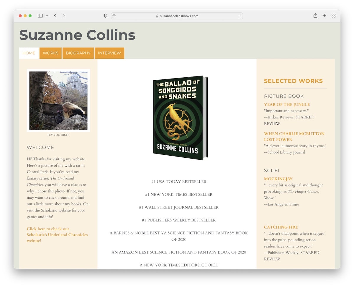
Suzanne Collins’ website isn’t necessarily an example of a bad website, but a basic one without giving you any reasons what to do with it.
The website could be improved design and performance-wise. (This is something we shouldn’t even be speaking about when it comes to an author like Suzanne Collins.)
And when it comes to her books, there aren’t any call-to-action (CTA) buttons where you can get them. But the testimonials from many authorities are great.
12. Berkshire Hathaway
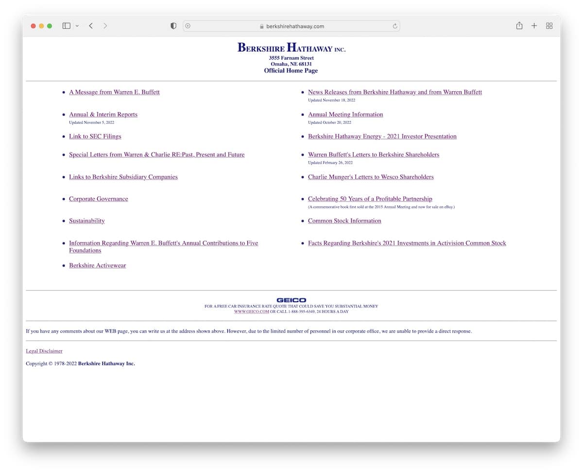
Berkshire Hathaway gives a feel of a directory with a poor look, no images, just hyperlinks.
This website may be useful only to those who know exactly what they’re looking for and are familiar with Berkshire Hathaway in the first place.
Surprisingly, it performs okay on mobile, but it’s hard to find anything.
13. Yale School Of Art
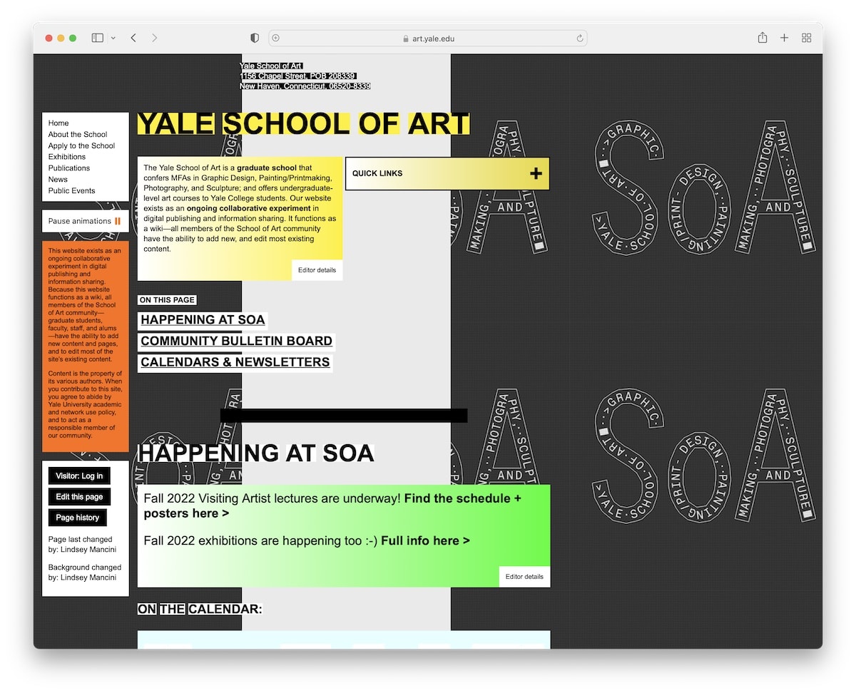
I hardly believe that I’m adding Yale School Of Art to the list of the worst websites (in the world). If they’d only rely on the website, the school wouldn’t be as popular as it is.
The background, the color choices, the content formatting and the painful navigation are too outdated to come even close to modern standards.
And while the website is mobile-friendly, the experience is not.
14. Life Action Revival
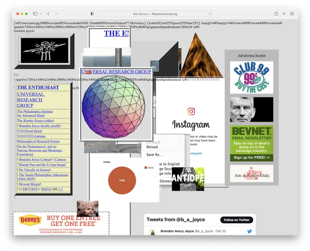
We’ve seen the practice of placing content on top of content before, and here’s another example.
Life Action Revival is a bad website design that shouldn’t exist in this day and age.
If nobody told you what they’re all about, you couldn’t figure it out by visiting the page.
Furthermore, while the choice of elements is useless, the code snippets/broken code make it even worse.
15. Ryder Ripps
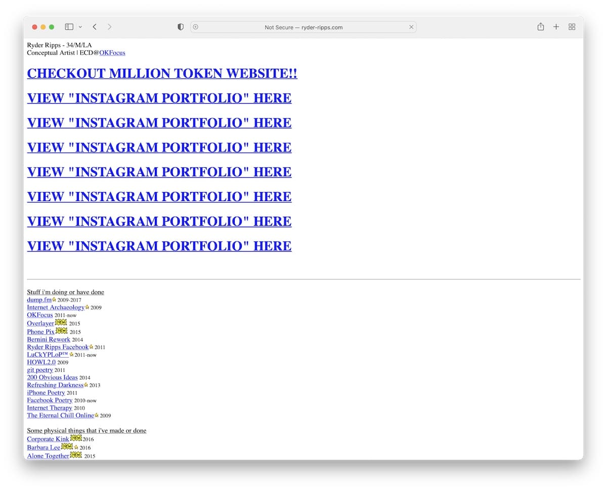
Ryder Ripps is nothing but a ton of white space with (many broken) hyperlinks and a couple of images. The website also doesn’t have an SSL certificate, which gives an immediate impression of poor quality.
And this is a website that comes from a conceptual artist with 10k+ followers on IG.
16. Hacker News
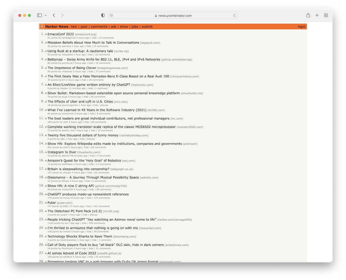
If it were 20+ years ago, then I’d be completely fine with Hacker News – but not today!
An old-school forum/message-style page that has no navigation or header to tell you more information about it.
Also, links redirect you to another website (and don’t open in a new tab), which decreases the likelihood of returning to Hacker News.
17. Penny Juice
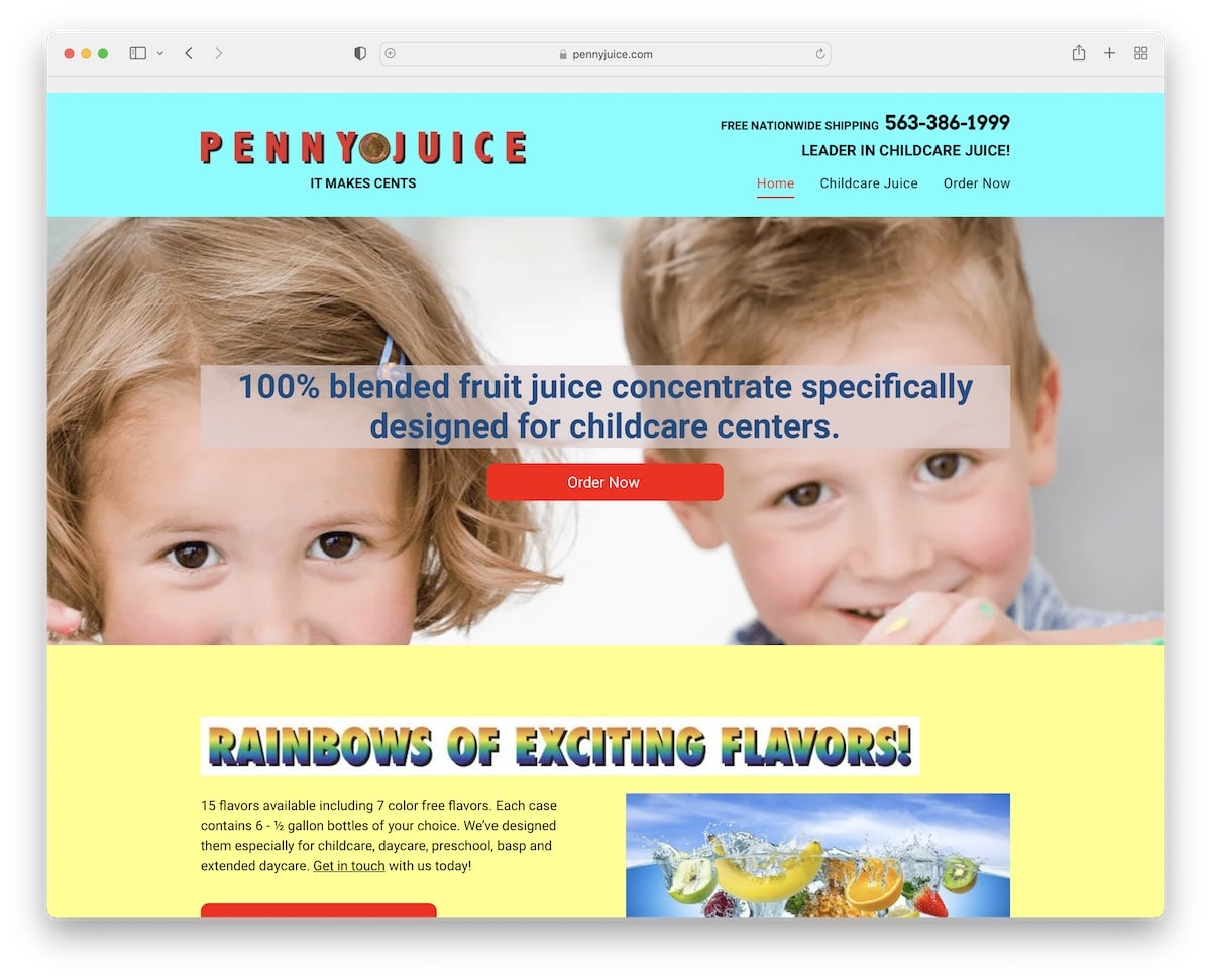
Penny Juice is a great example of a bad and unprofessional website. And if it weren’t for the name, you’d have difficulty figuring out what this business does.
There’s a lot of room for design improvement, from header to footer to the choice of images (stock images are a no-no) and mobile performance – it’s all low-grade.
18. Drudge Report
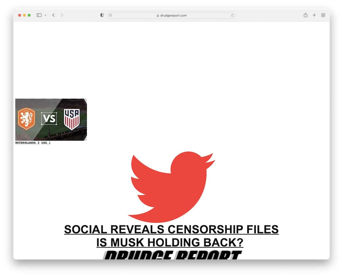
Drudge Report has been around for a very long time, and while they’re publishing new content regularly, its design seems to be from the year it initially launched.
The design is a great example of a bad website without navigation and a hard-fo-find search bar.
In short, if you’re unaware of what Drudge Report is about, it’ll be challenging to find anything (and the tiny text size contributes to that greatly).
19. Toronto Cupcake
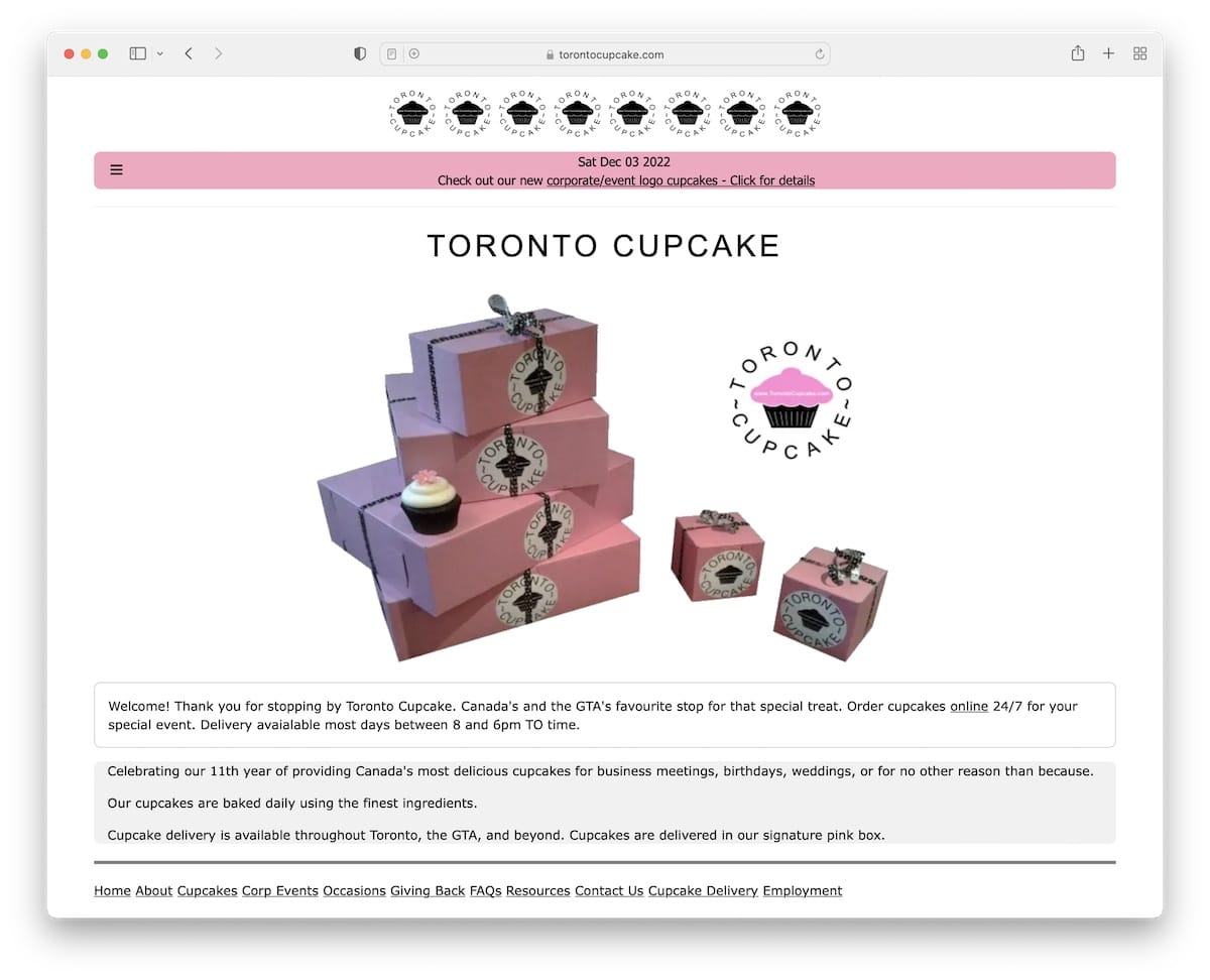
While food images usually make the dish look tastier than the actual product, I doubt that’s the case for Toronto Cupcake. And that’s just one factor that makes this a bad website example.
The web design also feels vintage (not in a good way), with a super basic product page and cart. It’s not appealing; the opposite, it’s discouraging, while it could be so fun and engaging.
20. 007 Museum
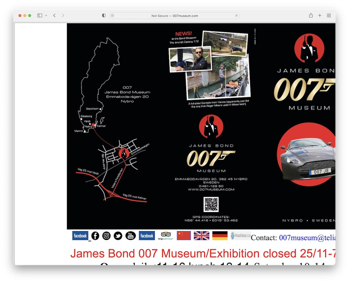
I think James Bond deserves a lot better than 007 Museum. This great example of a bad website ticks many boxes regarding what you shouldn’t do.
The page is not responsive and takes forever to load. The choice of fonts and the uneven structure, in combination with the way too long landing page, create an unpleasant experience.
Like the Toronto Cupcake, 007 Museum could be much more fun and engaging.
21. Lipton
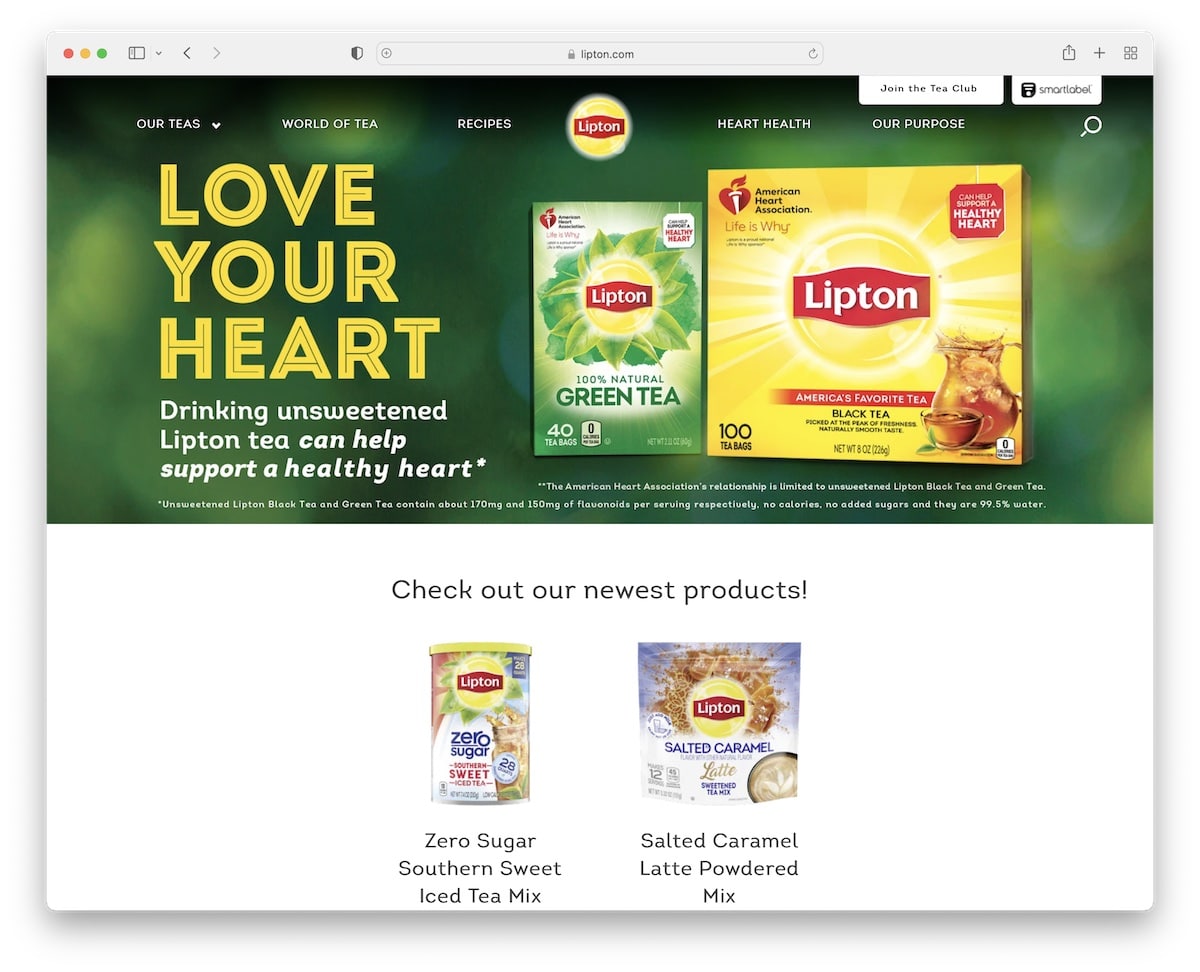
Lipton is a gigantic brand, but you don’t get that impression by visiting its website. The poor-quality product and stock images should all be redone/retaken because they put a poor light on the brand.
It’s not a bad website per se, but a great example that even the largest businesses in the world can lack a great online presence.
There’s always room for improvement.
22. Yahoo!
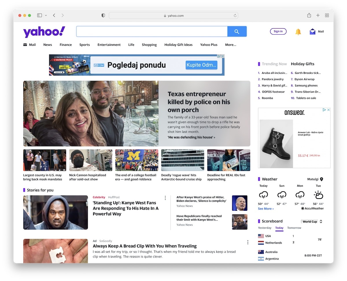
I’ve never been a fan of the Yahoo! website. It’s just stuffed with so much material that it makes the experience of browsing its content unpleasant and disturbing.
They sure are working on improving the overall design and UX, but it’s taking them too long. However, it’s one of the rare bad websites that works much better on mobile than on desktop.
What’s next?
Now that you have seen the worst websites, how about browsing creepy and scary websites? Once you are done there, make sure to check out the weirdest websites ever.
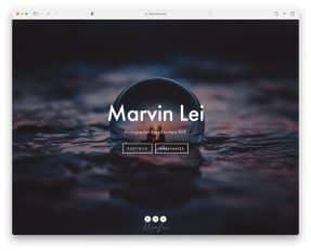
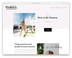
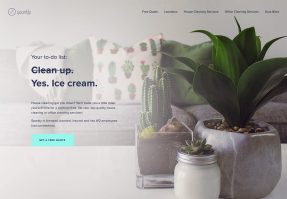
What Makes A Good Website?
Here are just a few of the key characteristics that you need to follow to create an awesome site that’ll make visitors want to return:
- Mobile and speed optimization: One of the first things you must ensure when building any type of website is excellent performance. You achieve this with a responsive and fast-loading page that guarantees a top-notch user experience. Plus, you’ll get a lot more Google juice.
- Simple and clean look: You must aim at a simple, minimalist web design instead of a heavily creative one stuffed with animations and special effects (unless you know exactly what you want). White space is also important and will contribute to better UX.
- Navigation: Give your website or blog great navigability with a practical menu and search bar.
- Quality images/content: Never use poor-quality visual content on your website or some overused stock images and videos. Preferably create your own content.
- Reliable web hosting: Great hosting with an SSL certificate are a must-have if you’d like to achieve the success you want. Hosting also plays a big part in making your website load fast.
- Branding: Enrich your page theme with the branding you use (or at least use branded detailing) to keep reminding everyone of your business.
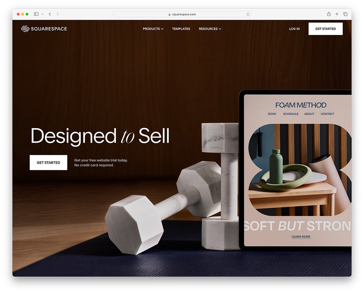
You have endless options to create a website these days.
You can either opt for a multipurpose WordPress theme or pick website builder software, both offering you all the resources you need to build a great website.
Of course, without coding and design knowledge!
Related Posts


Lings website is the best thing i have ever seen i bought 8 cars just because of the website