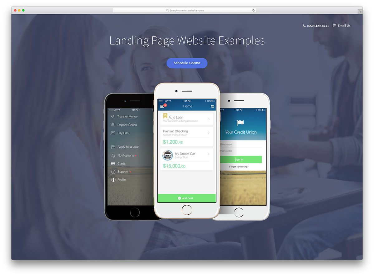
25 Best Landing Page Examples 2024
Here are the best landing page examples to get new ideas for your web design projects.
Landing pages are digital storefronts that act as individual entities for promoting and selling products. A good landing page can drastically change the course of your business. Creating a good landing page that talks to your customers is challenging. The elements that go into designing a landing page greatly exceed the traditional values that older-generation websites have. For example, when Internet marketing was just starting, a typical landing page consisted of a big heading, a video file embedded with Flash, and a big wall of text that included promises and other garbage messages.
We live in 2024, when a startup/small business is willing to spend $10,000 to $50,000 on unique website designs with built-in management platforms. There’s a reason a front-end developer can earn up to $100,000 if he is persistent with his career choice. While you won’t be able to replicate a design word for code, you will be able to yield some significant understanding of how certain web design aesthetics work; the last time we checked, doing this was completely legal.
More on Landing Pages
The homepage of Colorlib is a landing page. Our responsive WordPress themes page is also a landing page. Even our Blog can be seen as a landing page, because it is. We know a little bit about landing pages; some of that knowledge has led to several blog posts about landing pages:
- Themes for WordPress Landing Pages
- Landing page templates built with HTML5
- Landing Page WordPress Plugins
- Landing page templates built with Bootstrap
When working on this idea for a collection of inspiring designs, it is very important to outline the context for these designs, and we decided on: small businesses selling physical and digital products using an online medium, with a large number of existing customers — a large proportion of these inspiring designs will reflect all of those standards. We also were careful to include designs that are pleasing as far as UI and UX go. We are talking about landing pages that attract hundreds, if not more, customers every day, and while many of those sales are thanks to marketing, many are thanks to well-rounded web design.
In modern times, creating a design isn’t all that difficult. A traditional blogging (CMS) platform like WordPress, combined with WPBakery Page Builder, will do the job for you. With some inspirational designs, we need to note what we would like to extend in our designs or, even better — what we want our design to look like in the first draft.
Explore 2.5 Million Digital Assets including 1,000+ Landing Page Templates
More than 2,500,000 items from the world’s largest marketplace for Landing Page Templates, Themes & Design Assets. Whether that’s what you need, or you’re just after a few Stock Photos, you can find all of it here at Envato Market.
Best Landing Page Examples
1. Coinbase
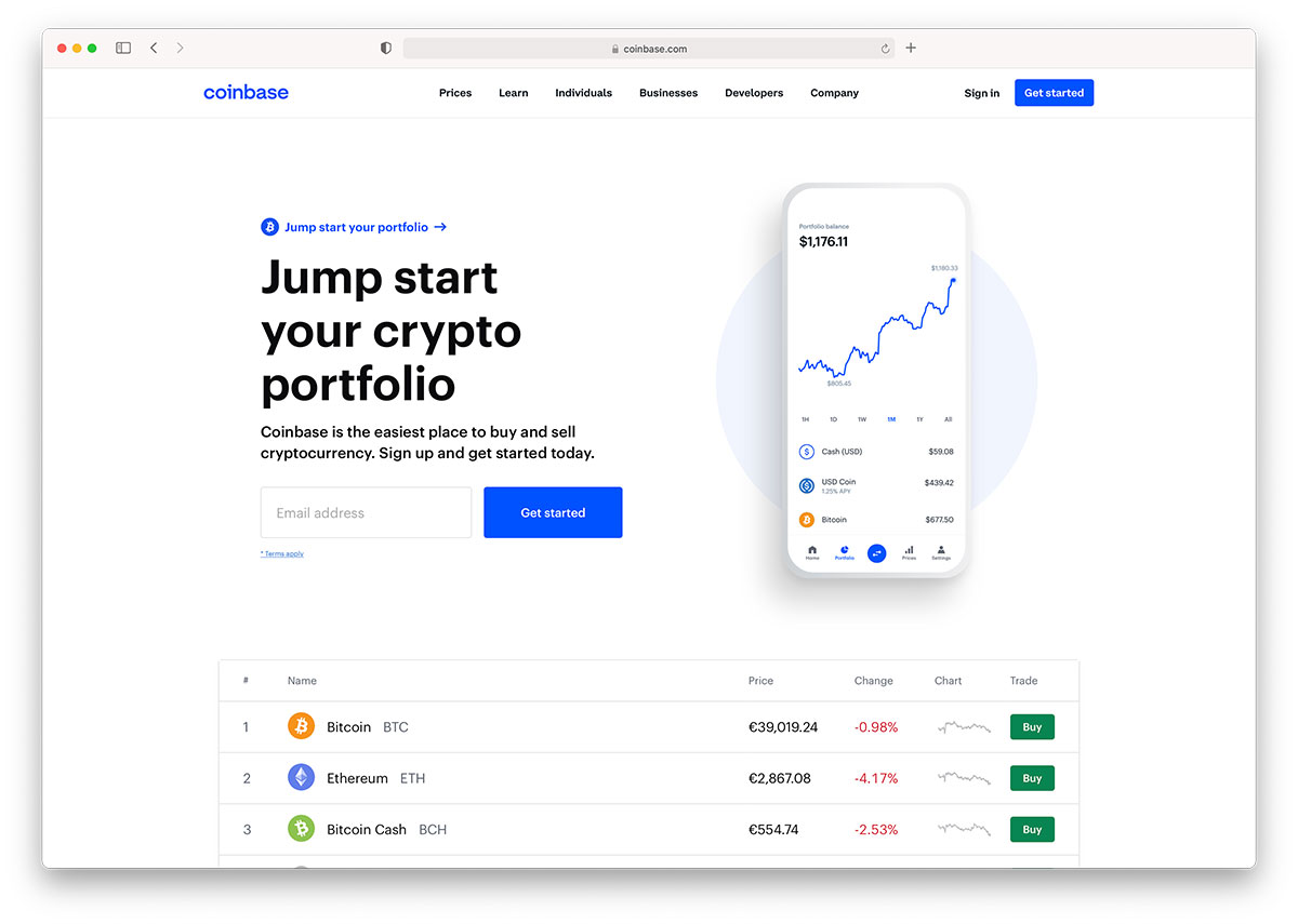
Bitcoin has been a trending topic for many years, at its prime, Bitcoin stirred up some serious conversations about secure payments, and general anonymity as far as online payments are concerned. These days, services like Coinbase help anyone manage their Bitcoin wallet to the best ability, knowing that hackers are eager to target platforms like Coinbase for their immense monetary value.
Coinbase sells its product through analytical data shown on the front page, they also list important security features which any Bitcoin user is going to be concerned about. Their Charts page uses JavaScript to allow you to use a sliding chart that shows how many Bitcoins have entered the rotation for the past 5-6 years. Bitcoin business owners note how a professionally established company uses its design to instill security and trust into their customers.
2. BuzzSumo
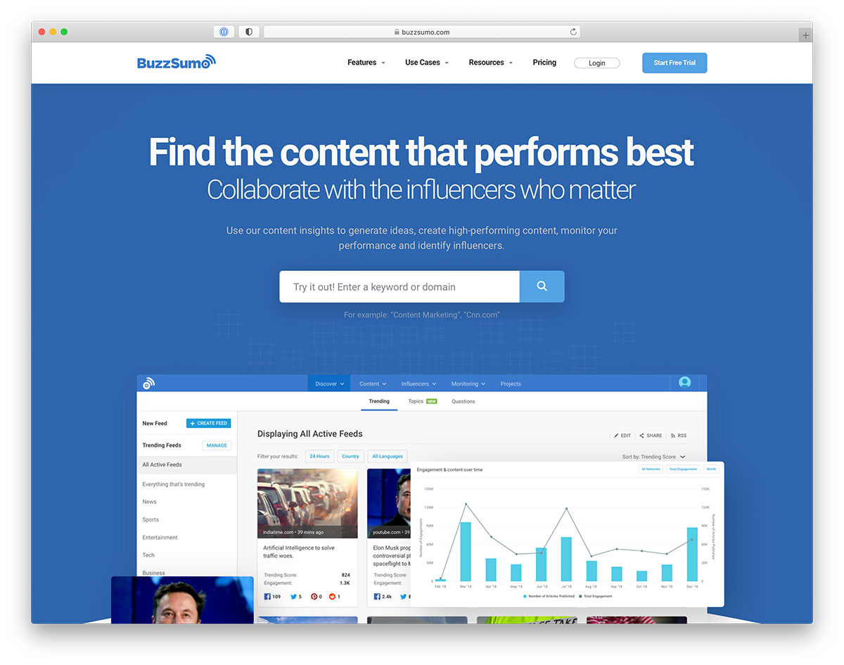
Buzzsumo changed the landscape of monitoring individual content for its performance on social media. It also enabled content creators to track content influencers more effectively and productively. These days, Buzzsumo has become an invaluable asset for marketers, content creators, and bloggers. They wish to make their content a step further towards excellence, and performance.
Buzzsumo is modest to when it comes to promoting its product on the homepage. They let you try out the app as the first thing. This lets you have a firsthand experience of what the results will look like. From there, the acquisition process begins based on limiting results that free users can experience. But even then, the demo preview is enough to capture new leads and customers. Are you allowing customers to experience your product for free before signing up? This model seems particularly popular among businesses that operate strictly within the scope of online data.
3. Bankjoy
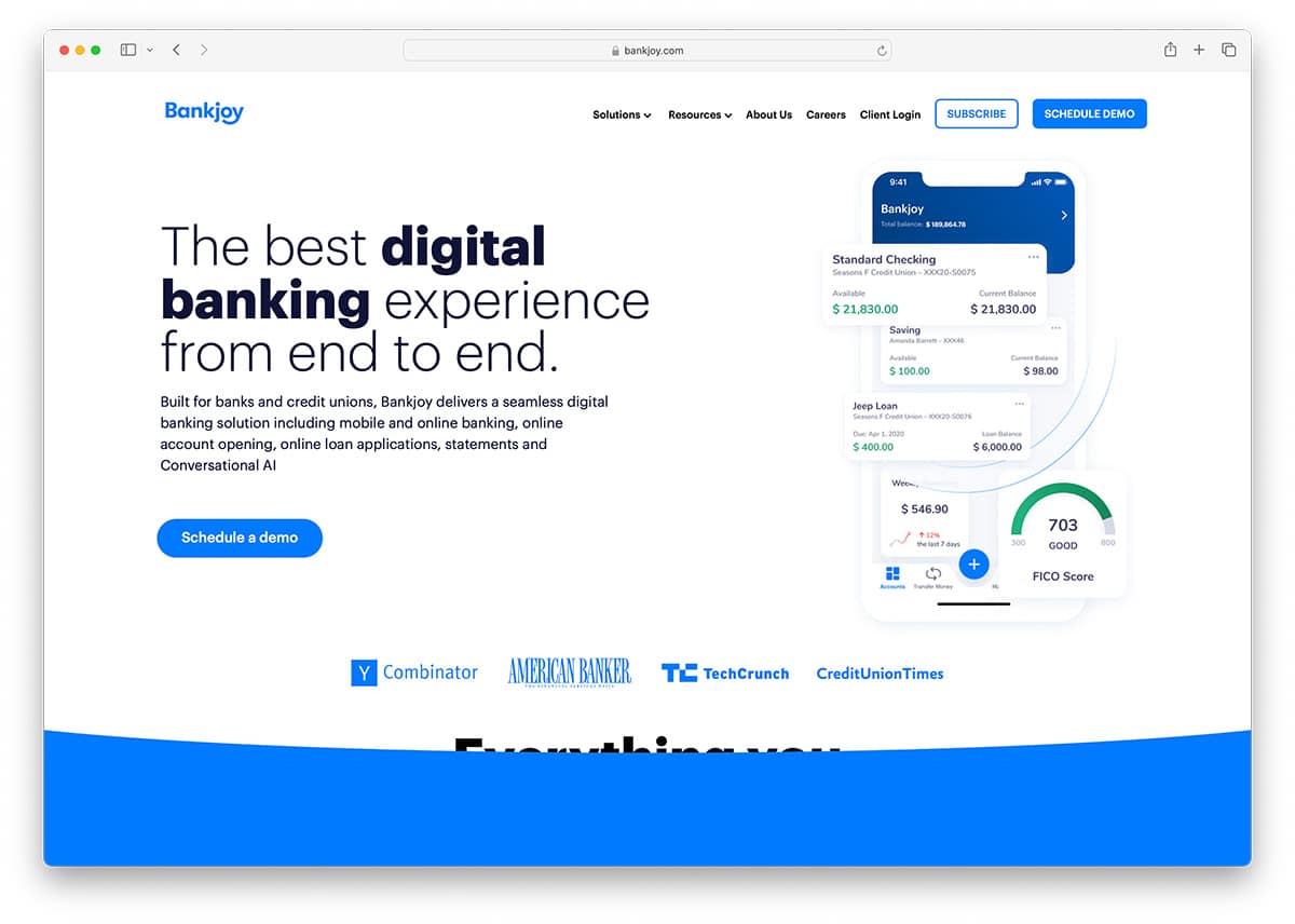
Bankjoy offers mobile banking services for credit unions. Although they have limited services as far as exposure goes, their main selling focus is to have interested clients to reach out to them directly. But first, they talk a little about their platform in a few descriptive element boxes. The home intro consists of the business name and description, a call to action to schedule a preview, and three individual snapshots of what the application looks in use.
The landing page already covers so much with just a single header introduction. Moving forward, Bankjoy uses three other modern front-end elements to show more in-app screenshots, and point out the leading features. You can sign up for the demo at the footer, where there’s a simple input form for your email address. A beautiful design could inspire you to take a similar route with your business services or apps for big brands and companies.
4. Fundera

Funder is the guardian angel of investment for small business owners. Funder has funded over 3,000 small businesses, with more than 150,000,000 million of dollars given out. Their quickest funding project took only 10 minutes to process. These guys want to give you affordable loans and do it fast but conveniently. Small business is a huge deal in United States. Fundera wants to make it easier to acquire funding to grow your business. Of course, this boosts the economy and the job market.
The way Fundera learns about you initially is through a simple signup form. This is where you specify the amount you’re after and the time you’ve spent developing your business. You must also include your loan’s purpose and credit score, which helps you understand your eligibility. The developers dedicated its design to discussing getting Fundera to hand you a loan. It also includes what you can expect in the long term.
5. Final

Final wants to change the landscape of banking, prevent fraud, and improve your peace of mind with modern security features that will make the process of banking and banking management ten times easier. Think of it as a personal finance manager that ensures complete transparency regarding protection. With Final, you get a full overview of where most of your money goes to purchases, spending habits, and subscriptions. So, how does one market this sort of a product through web design?
Final uses a common approach of showing you what the product is about through video. They also let you quickly subscribe to early access of Final with a massive input form below the video. All this is served from the moment you enter the website. The design flows smoothly and uses colorful colors to create a statement of modernization and user experience. Meanwhile, screenshots show what the inside of the platform looks like.
Furthermore, the navigation menu is also made sticky to scroll with you as you go. This allows users to be more in charge of their next step. The blog design complements all other design features of Final’s vision, making for yet another transparent browsing experience.
6. BlockScore
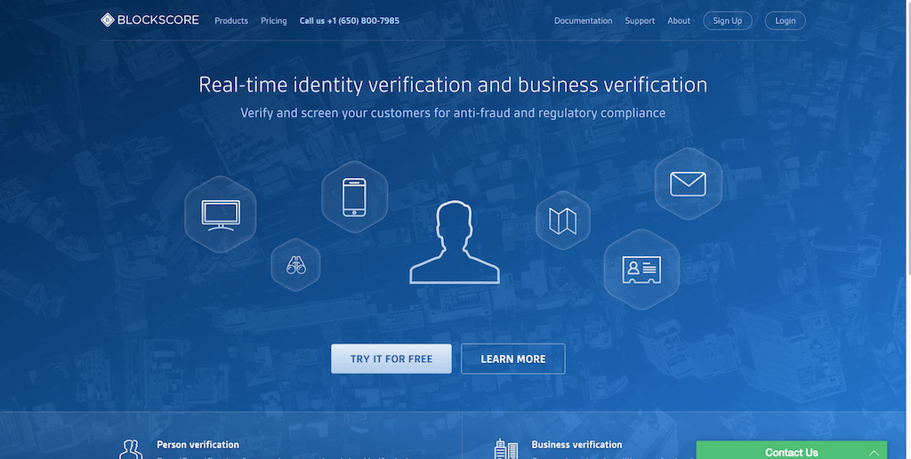
Fraud on the web is such a huge deal right now. Startups are jumping at the opportunity to get funded from capitalists to help them become a little more secure. BlockScore is one of those companies that wants to pioneer real-time user and business verification principles. BlockScore analyzes your user/business signups through a complex data algorithm that can match fraudulent flags and give your customers according to fraud ratings.
Their design focuses on talking about each of their products (person and business verification) in separate pages because both are unique products. A list that scrolls down the page features their products. A font icon accompanies each item to make the experience seem more lively. A documentation page is built separately to support developers in learning how BlockScore works, and what engineering platforms it supports.
7. Checkr
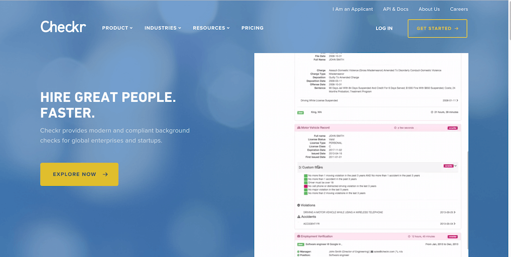
You’re a business or a startup needing new talent for your project! Developers have crafted Checkr to help businesses conclude more thorough background checks for the people they want to hire. This provides another layer of security against potential employees who could damage the company. However, we’re not as interested in the product as in the design to help you inspire yourself with new ideas and concepts to try.
Checkr has an amazing approach to showing the product’s appearance before trying it yourself. They use a huge GIF image on the front page that you can click on and stop loading anytime to inspect what each section looks like. Scroll down and get an outline of features and a detailed review of the categories that Checkr supports for screening. The footer consists of many important pages and resources to help navigate the website and for customer FAQs.
8. Flynn
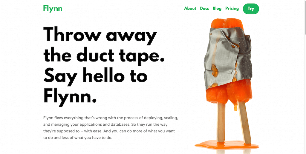
Flynn has a big vision on its mind: to become the only tool developers and ops teams needed to develop, deploy, and manage running software. The creators designed it to run anything that can run on Linux, not just stateless web apps. Flynn also includes built-in database appliances (just Postgres now) and handles TCP traffic, HTTP, and HTTPS.
The project has already accumulated the liking of tens of thousands of engineers and developers, but what surprised us the most was the simplicity of the web design they use and how well it can work for your open-source projects, or software-related design projects where most of the learning happens when you start using the actual software. We have a traditional grid design focusing on clear and concise text over a white background. Big headings and aligned text elements, with a couple of call to action buttons to try the product and subscribe to the email list. What more does a project like this need?
9. CodeCombat
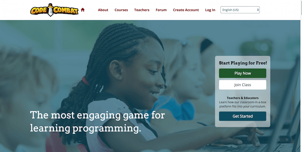
CodeCombat has a huge mission: to help anyone learn programming by playing an interactive browser game that responds to the programming commands you input. Millions have already established a solid foundation for their JavaScript knowledge using CodeCombat, and so many are beginning their learning curve each day. CodeCombat uses its design approach to introduce newcomers to the platform and expect from the learning process. They have user reviews presented that inspire further action. Still, they’re also diligent about explaining the actual use of gamified learning and how beneficial it can be, especially for children of young age.
CodeCombat also caters to teachers who wish to bring interactive programming into the classrooms. The design becomes more gaming-oriented as you switch over to the Courses page. That is where the journey of coding begins. The design doesn’t lose momentum even inside the platform, appealing and friendly to the eyes.
10. TrueVault
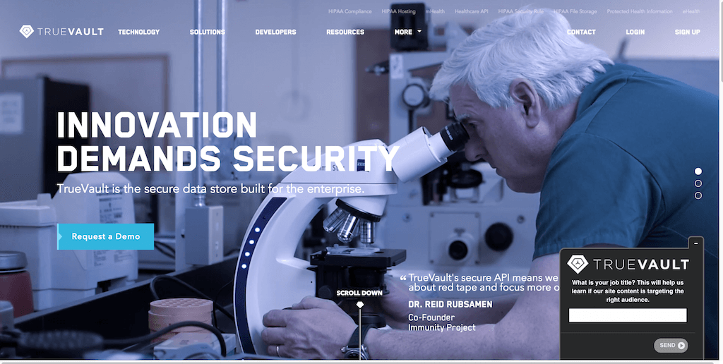
TrueVault brings a layer of security to your databases. Particularly popular in healthcare, TrueVault ensures that all customer data are thoroughly secured and optimized for maximum potential. We love TrueVault’s design because of the futuristic feel that they manage to add to such a high-level service. The site has an animated background video with overlay text and a built-in down-scroll slider. Visit the homepage and scroll down; you get three unique views of the TrueVault members working hard to create such a dedicated service.
Keep scrolling and you get a complex widget that talks you through the layers of what TrueVault does and how it can be helpful to your business. A big counter is also present to show just how many records have been taken care of since the platform’s inception. It is simply another trust indicator for those considering availing their services. Modern web design and web development have a lot of potential under their sleeve. Websites like this allow us to understand the capabilities of creation, and how we can also recreate those same experiences.
11. Tectonic
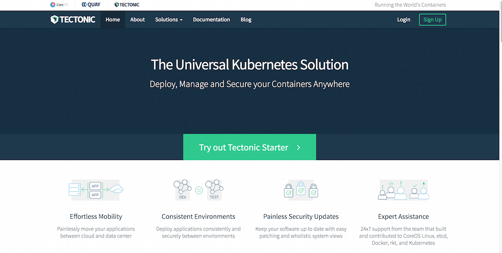
Tectonic also specializes in security; this time, it’s about Containers. If you have a business that needs to be transported from one place to another, cloud → data center, then Tectonic is the company that will help make that process as secure and painless as possible. Their web design choice is a complex combination of important business values and video content that engages the customer in the product’s performance and how it will operate once you sign up. Navigation menu takes an extra turn to deliver individual landing pages for individual product features and capabilities. The more informed your customers are about their choices, the more likely a sale will be finalized.
12. Bitnami
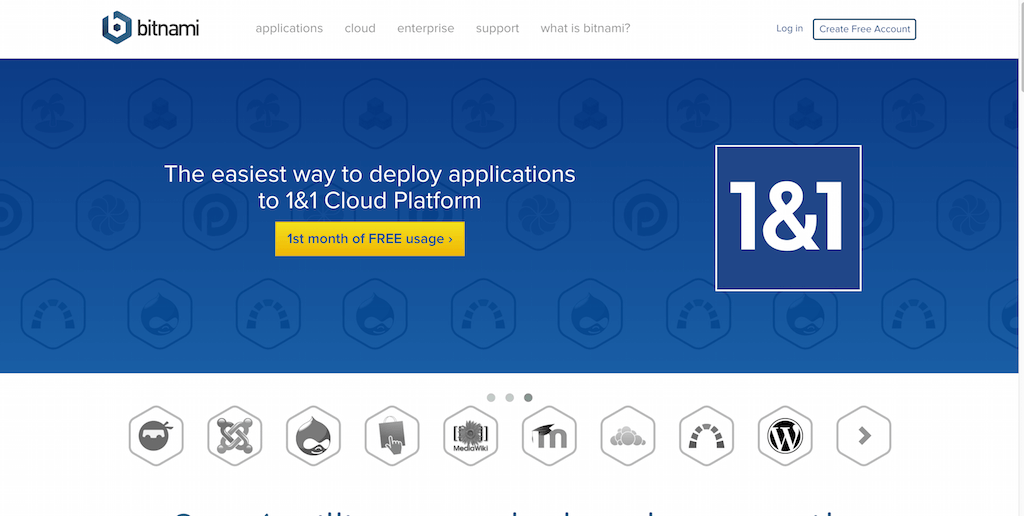
Bitnami is a library of popular server applications and development environments that you can install with one click, either in your laptop, in a virtual machine or the Cloud. Bitnami’s promise is a secure and flexible installation of modern application software for the web. It will eliminate the need to compile and configure each of your app setups individually to focus more on what is important — creating business pages, content, marketing, and communicating.
These guys are heavily tech-oriented, so their website should reflect the common usability of tech websites. The index page talks about the service in detail and offers a selection of icons for standard web software that once you hover over an icon, it gives you the option to “launch” the software directly. The software pages contain detailed information about the particular software; for example, WordPress or MediaWiki. Bitnami also lets you preview the software, launch it in the Cloud, and download the installation package to launch your stuff locally, which you can then transport online. Customer reviews are plentiful, discussing their experience with the Bitnami installers for each package.
13. Strikingly
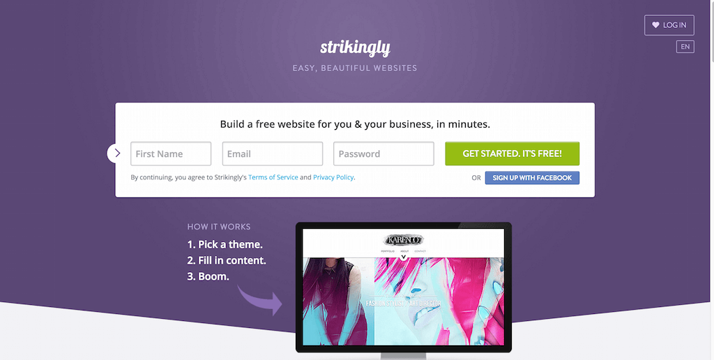
When your business model is about helping others build their websites, you better ensure that your website is of phenomenal quality. Otherwise, people will quickly become discouraged by what you offer. Strikingly doesn’t shy away from making their website design look like an expression of the state of the art thinking and creative analysis.
The main focus is to help customers get started as quickly as possible, with a slightly interactive form asking for customers’ names, emails, and passwords. (Or you can signup using the Facebook OAuth widget.) They tell you how it works in three simple steps, not that more information should be required for this platform. They show users some amazing design examples that are possible to achieve using Strikingly — which is one of the crucial points in web design too, you want users to experience the product and its features even before they start the on-boarding process, good tips to take from Strikingly here.
14. Svbtle
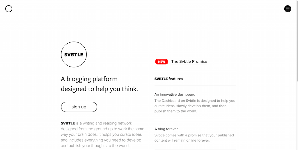
Svbtle takes customer needs seriously. It’s a small company that depends on the paid subscriptions of the users who wish to use a simple, writing-oriented blogging platform. Popular amongst developers, designers, and creative minds who seek simplicity, Svbtle makes blogging a more personal experience. From the moment you open the Svbtle websites, it’s clear that these guys don’t mess around with complexity and favor simplicity on all occasions. They use their About page to point out what makes their platform so appealing to thousands of bloggers and why you need to become a customer as well.
15. Rackspace
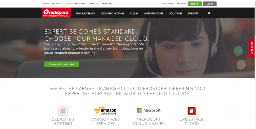
Rackspace has been offering dedicated hosting solutions for a long time and now has transitioned into the Cloud sector. The design speaks for itself. First, you focus on how well your product is supported and how much experience you have in each area. You list the possible scenarios that a user might be interested in using your product for. In this case, Rackspace offers solutions for eCommerce, web content management, email, productivity, website hosting, web application hosting, database services, and managed security services.
All of the individual mentions are clickable design elements, giving the homepage more of a sitemap-like feel to it. And if that wasn’t enough, a separate container with a contact form will put you in touch with one of Rackspace’s experts, which could be one of the experts on your platform. We must remember that companies like Rackspace deal with millions of customers, and surely the flow and design of the website has a lot to do in the overall customer acquisition process.
16. Ahrefs
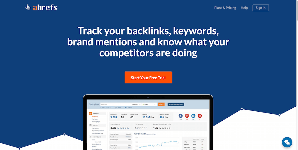
Backlink monitoring, brand monitoring, and competitor analysis has never been easier thanks to Ahrefs, the SEO industries favorite tool for analyzing and monitoring anything concerning search engine marketing. The design here far exceeds the traditional values of a website, these guys run a back-end platform that is a design wonder in its own right. They make a selection of product features available through icons, making room for more design space with jQuery navigations. As far as the homepage is concerned, a concise header accompanied by product preview in visual format seems to be enough to lure in thousands of new customers each day.
For example, each of the features: site explorer, positions explorer, content explorer, position tracker, crawl reports, and Ahrefs alerts are all individual design elements that are populated with feature description, and screenshot that shows how the feature looks. The more customers experience the product directly without subscribers, the more likely they will want to convert to the free trial and become paying customers. Data is also important, so Ahrefs isn’t shy about discussing their database size and how many links and domains they track daily.
All this adds to the excitement of a tool tracking the whole web for potential marketing opportunities. Reviews from leading industry experts help compliment the platform’s trust, yielding new customers based on their admiration for the experts who can vouch for the product.
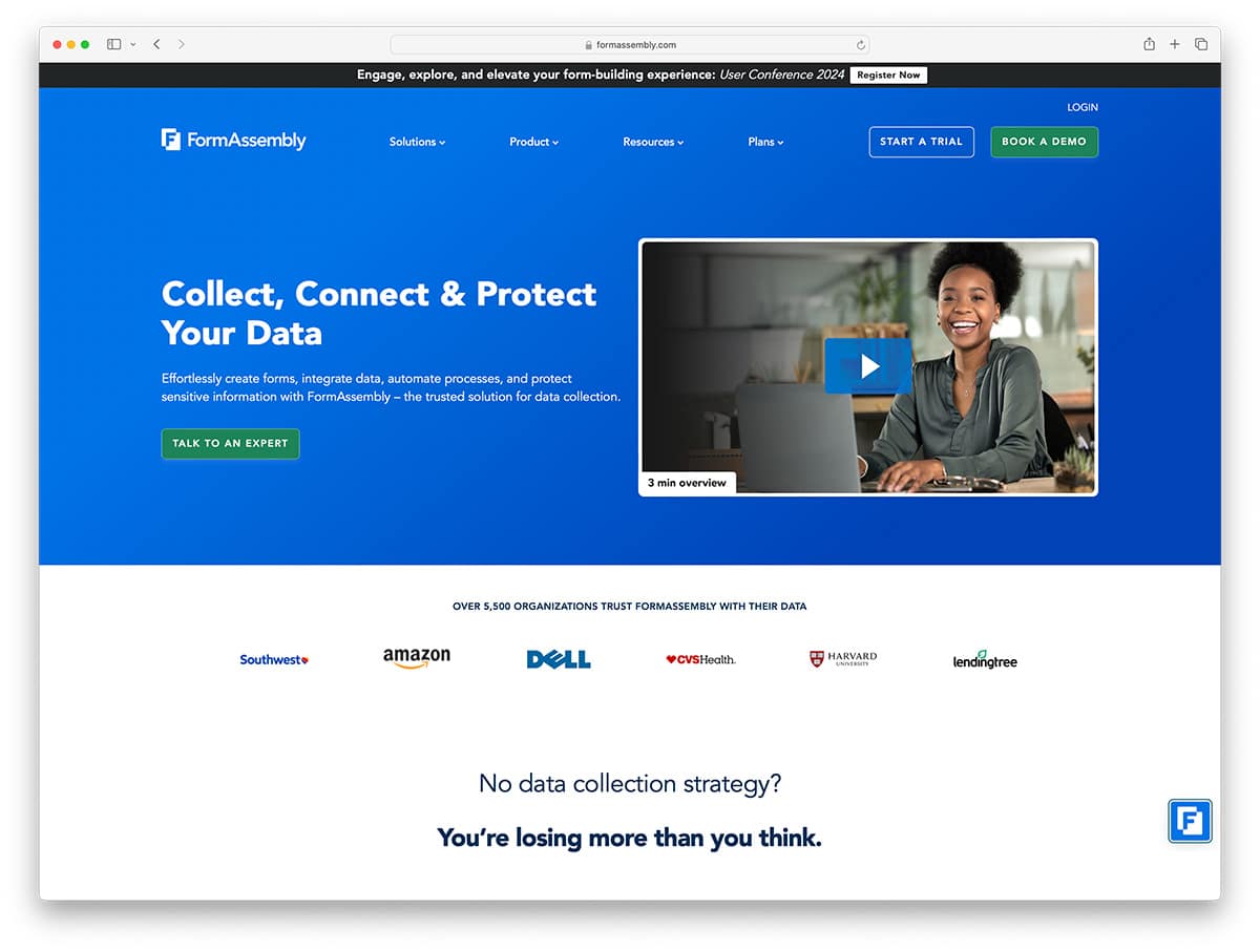
17. FormAssembly
FormAssembly wants to help businesses, website owners, and enterprise businesses to create better forms. Forms that are reliable, design-friendly, and most of all; secure. Their design type is compact; they explain as much as they can about the product in a single container where you get the general product information, the kind of things you can achieve with the platform (the forms builder), and also a widget embed of a customer review that was left on Twitter. They aren’t shy to tell you that leading brands like PayPal, and Amazon also use their services. This instills customer trust, an important aspect of design. Footer is a friendly collection of links to important FormAssembly pages to help you get started.
18. Sharethis
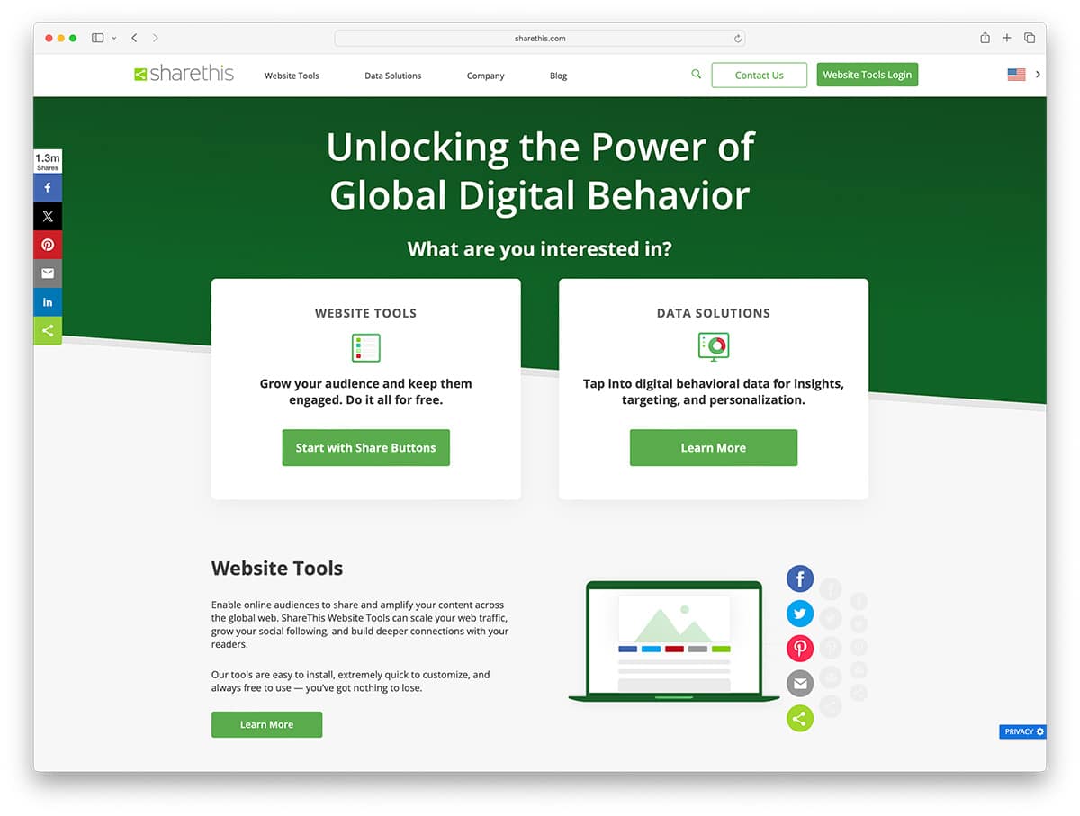
You can never go wrong with a little bit of social media marketing, or a lot of it. Sharethis was one of the pioneers of multi-versed social sharing widgets that would integrate in any website design. And to this day, Sharethis continues to serve millions of websites and helps them earn social shares through useful, compact, and beautifully designed social sharing buttons, floating widgets, and follow buttons. They recently added the capability to do content popups and recommendations, two emerging features in modern design.
So in their design context, they want you to learn about these features individually, which means clicking from the homepage to inspect all features individually. We clicked on the Follow Tools widget, and it opened up a new landing page that beautifully narrates how the social buttons will look like on your website, and the kind of positions you can create using the Sharethis widget. And this same design approach goes for all of their other features. Individual simplicity is very heavily favored here, and it seems to work well for Sharethis and its parent tools.
19. Adobe Express
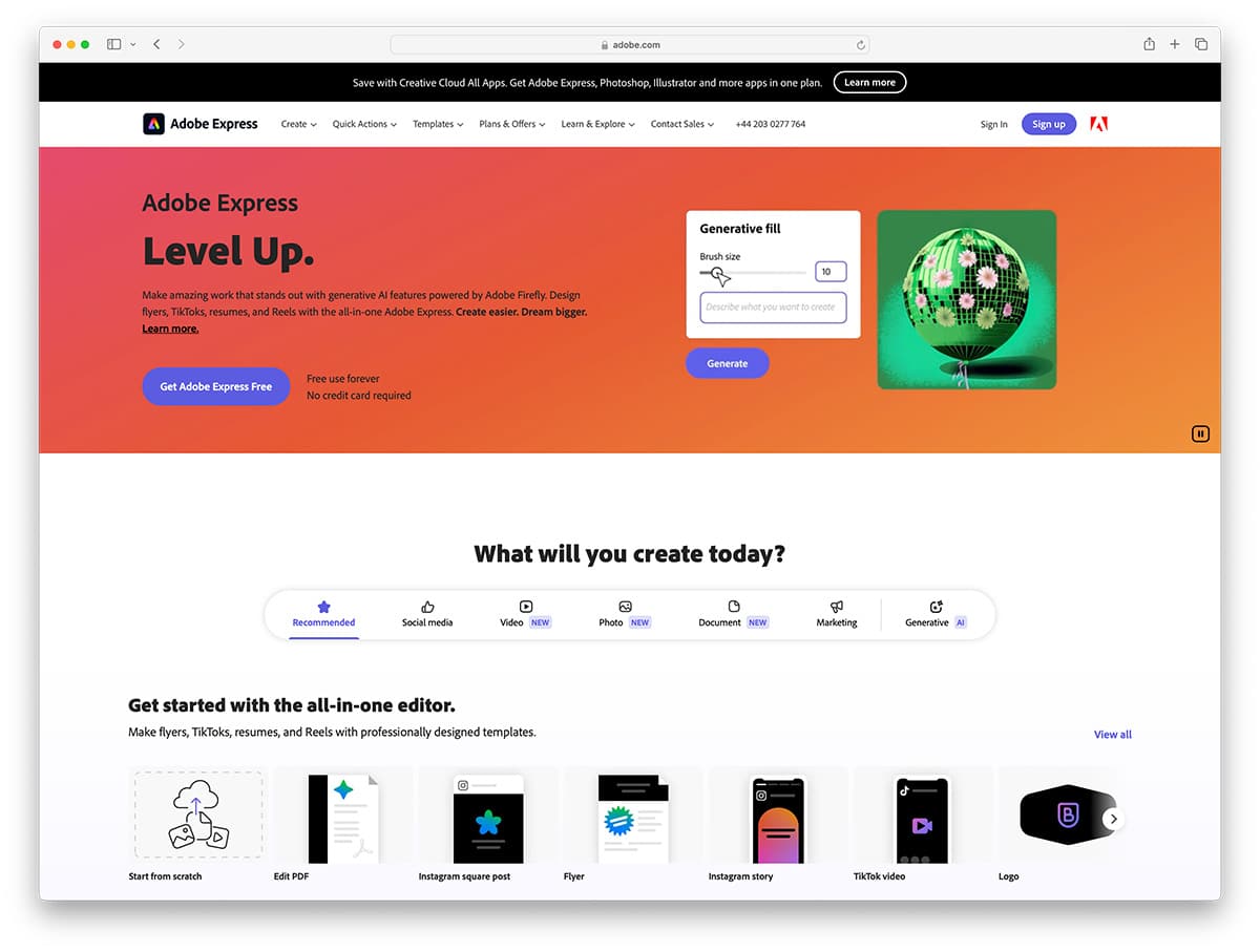
We at Colorlib are very proud to have landed a customer such as Adobe for one of their blogs. It shows how much Adobe appreciates good design and that they are not afraid to experiment with freely available WordPress themes that yours have crafted. The creators developed Adobe Voice to allow creative people to create beautiful animated videos. You can use these videos to create stories, depict ideas, or simply to inspire. Content creators have been waiting decades for this kind of platform.
Adobe Voice allows you to record your voice-over with a click of a button, then use that segment you recorded and populate it with visual content from the Adobe Voice library. We have been inspired by how elegant the Adobe Voice website looks, given that their product is of such extraordinary value to content creators all over the planet. They give you enough examples to preview to get you hooked on the platform. Voice helps you create stunning animated videos in minutes. No filming – just talk to tell your story. Pick from over 25,000 beautiful iconic images to show your ideas and Voice automatically adds cinematic motion and a soundtrack. Persuade, inform and inspire anyone online. Make an impact.
20. Contently
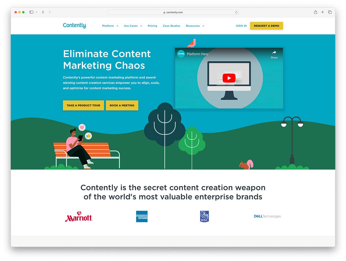
Contently is your best friend as far as content crafting and marketing is concerned. It’s an award-winning content marketing platform that takes you from having an idea to having a fully furnished content piece that will perform outstandingly well in front of your audience. Their approach to a design that can sell their idea is fairly simple: give customers some data, a preview of the platform, a freebie of the best content marketing tips, and a review to reassure your reliability in the actual modern-day marketing field. All this happens thanks to their spectacular analytics platform that gives real-time feedback on each step you take to finalize a new content piece. Big pictures, big statements, and huge headings is what make the Contently website perform so well. Will you take inspiration from these guys or leave it be?
Are you looking to build a similar website? Here are simple Squarespace sales page templates to get started today.
21. Curata
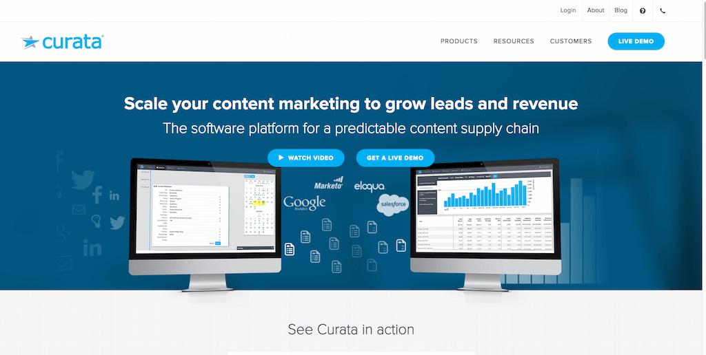
Platforms like Curata is the real proof of how big the content marketing field has become, and how difficult it can be for a single marketer to manage content analysis, research, and marketing without the use of a single platform such as Curata — which ties together multiple aspects of content marketing into a single software, allowing marketers focus on what their best strengths are; content, and marketing.
Curatas selling point is their introductory video that’s 2 minutes long. It is detailed enough to talk about the ins and outs of Curata and how it can help content marketers be more consistent with their content delivery and more productive regarding direct content marketing. To complement the vision, they list their most prominent and reputable customers to reassure potential customers that they are the real deal. The developers give away stuff for free as a part of their design strategy. You can use this perfect example to land new leads and it’s all based on the context of your content.
22. MailChimp
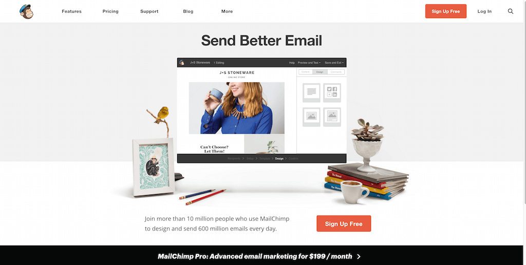
MailChimp doesn’t mess around with email marketing. These guys are the number #1 email marketing platform on the planet. They are particularly famous for their free plan that allows 2k emails within an email list. The awesome thing is this list has no restrictions on how many emails you can send out. That’s 2k emails before you have to start being a paying customer. You won’t want to pass on that easily that type of deal. MailChimp, strangely enough, recognizes this colossal success they have. They dedicate their homepage to a simple photo of what a part of their platform looks like. They also added a bold Sign Up button that begins the onboarding process.
When you have more than 10 million customers, little else needs to be said to. As for all else, the navigation menu takes care of that. Each of their Pricing plans has individual pages that show what the plan will get you. It also shows how you can scale each plan according to the number of email subscribers you have. A popular model for attracting customers is to let them have a specific amount of needed resources. You can charge them accordingly after that.
23. Benchmark
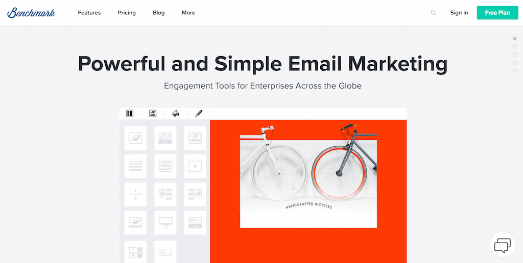
Benchmark is another email marketing platform. Because MailChimp’s main design was so slim, we thought it wouldn’t be bad to include another alternative. This time, they gave the alternative a unique design. This platform uses sliding navigation that slides through 5 different page elements. Each of the elements has something to show from the product experience. It also has an important feature or aspect of the platform that you will gain access to. These guys also have a free plan up for grabs. Their technique for letting people know about this is simple. They created a CTA button that says exactly that: Free Plan! Mention the word free anywhere; customers will jump all over your offers.
Benchmarks pricing page is also interactive. This allows you to scale the number of resources that you will require. At his point, Benchmark will give you an automatic quote that you can begin the signup process with. They’re also friendly and want to talk with you through an automated live-chat widget. The experts are there waiting to answer your questions. Their way of talking about the features of their email platform is firsthand video, and a lot of examples.
24. CodeFights
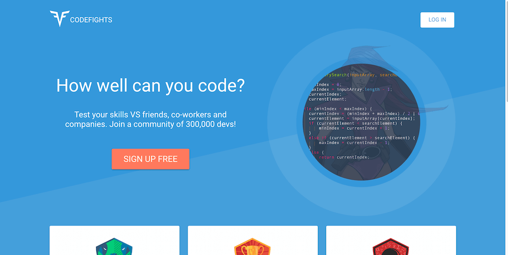
CodeFights helps coders test their skills in an interactive battle game that proposes challenges and rewards people recognition. We love the amazing and sleek blue-colored design that’s going on here. You have this amazing animation that showcases different Heroes of the site. The creators built this platform for friendship and generally for having fun. They also implemented a huge CTA button with red color to let people signup right away.
They didn’t show much on the platform regarding the actual challenge process. If you’re a programmer and found this page, you’ll know what will happen next. You could use this approach if you build an app/platform/software that caters to specific and self-aware people.
25. Thumbtack
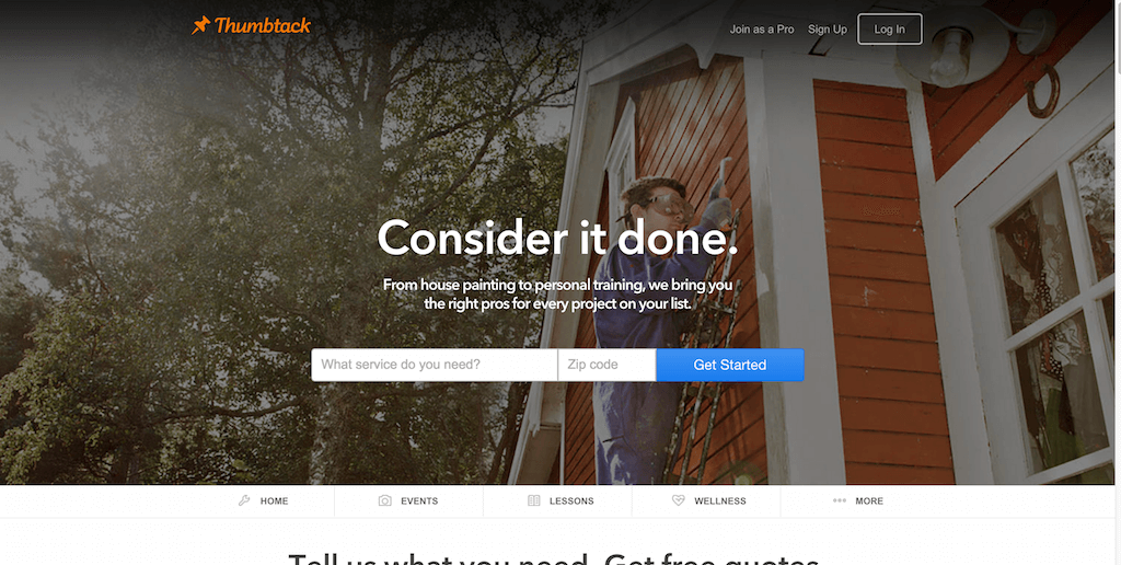
Thumbtack lets homeowners to find people for the job, be it painting or reorganizing the garden. Experts and professionals on Thumbtack are waiting for someone like you to hire them. That’s the business model. So how do you go about building a website for such a model? You take the Airbnb approach, once again. Thumbtack narrows down the process of hiring someone in three simple steps. Then, it gives you access to links from all 50 US states where you can find these professionals in.
And they understand the importance of customer reviews too. This is the reason why they show six of them on their homepage. It helps potential users of the platform to understand the process better. Of course, it also shows the kind of results people have been able to achieve. A unique feature we’ve seen up until now is the input form at the footer of the homepage. This form lets you input your mobile phone number and get a direct link for downloading the mobile application. This is taking mobile marketing to a new plane of existence. Thumbtack can tap into the potential of mobile and how you can make a mobile acquisition.
FAQ
A landing page is a web page designed specifically for a marketing or advertising campaign. It’s where a user “lands” after clicking on a link in an email, social media post, or online advertisement. The goal of a landing page is to convert visitors into leads or customers by guiding them towards a specific action.
A successful landing page should have a clear and compelling headline, a concise message, a strong call-to-action, and an easy-to-use form. It should also have relevant and visually appealing images or videos, and should be optimized for fast loading speeds.
To make your landing page stand out, you should create a unique and memorable design that aligns with your brand. Use high-quality images and videos, bold typography, and vibrant colors to capture your audience’s attention. You can also incorporate social proof, such as customer testimonials or trust badges, to build credibility and trust.
The choice between using a template or creating a custom design for your landing page will depend on your budget and design needs. Templates are a cost-effective option and can be easily customized to fit your brand. On the other hand, custom designs offer more flexibility and can be tailored to your specific campaign goals and target audience.
Mobile responsiveness is critical for landing pages as most internet users access the web through smartphones. A mobile-friendly landing page will ensure that your page looks and functions well on any device, which can lead to higher engagement and conversions.
To measure the success of your landing page, you should track metrics such as conversion rates, click-through rates, bounce rates, and engagement rates. These metrics will help you understand how well your landing page is performing and identify areas for improvement. You can use tools like Google Analytics or heat mapping software to collect and analyze this data. There are many WordPress visitor counter plugins that integrates with Google Analytics and other 3rd party tracking tools.
Wrapping Up: Best Landing Page Designs
The design doesn’t need to be difficult. The design needs to be simple. It’s how things work. We want our customers to understand how our designs work. We can do this by knowing what they tell us and enabling us to do it. The landing pages we listed have helped these businesses earn hundreds of thousands.
In many cases, millions of dollars in revenue is a statement. There’s something about knowing what your audience likes and then using that knowledge to create a user-friendly web page. This will make the customer acquisition process seamless, friendly, and rewarding.
Related Posts


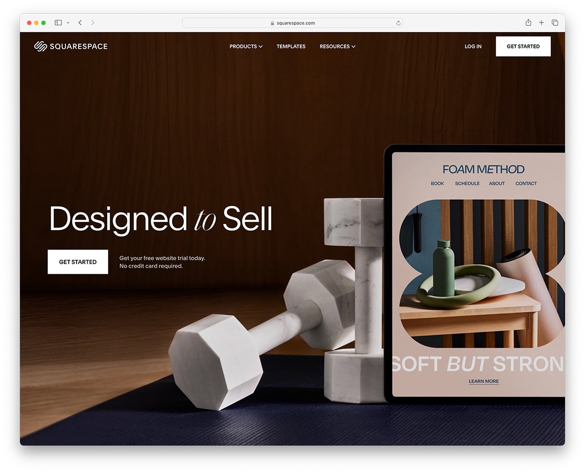 Create a Website in Minutes With Squarespace!
Landing pages ought to be attractive as they can seal the deal and turn prospects into customers. The examples you’ve come up with are really inspirational. Thanks a lot.
My favorite one is Coinbase’s landing page. Although it looks so simple, it has one clear goal: to get you to sign up.
Plus, I also love their new dashboard design. I think it complements their landing page really well.
Thanks for this post. I’m actually ‘stuck’ on how I’m going to design a landing page at the moment. This gave me a clear idea.
Good instance for landing pages. Landing pages should be the good and informative content. Create your landing pages mobile friendly and based on your audience’s need.
What should be the most preferred landing page for a high cost hardware product? How you should showcase them?
Richa,
The best landing page WordPress themes for any products or business can be found here.
All designs are great. CodeFights have some great design.
So many good ideas listed! Thanks for sharing Alex. You have just given me something to do this afternoon, as I explore many of these. I also see a lot of great examples of solid design here. Good stuff!