25 Best eCommerce Websites for Your Inspiration 2024
Are you searching for the ultimate list of the best eCommerce website examples because you want to build an epic one yourself?
The eCommerce industry is growing year in and year out, and it’s valued well into trillions of dollars, with an expected annual growth rate of 14.7%.
Yes, this makes it competitive, but you can easily build a stand-out online shop with this collection of phenomenal web designs.
Learn from the best, takes notes, copy and improve with your creative touches that’ll make your eCommerce site EXTRA special.
While we listed some of the key features of each website, we also added six must-haves that make a great eCommerce website for your convenience.
Take your online selling to the next level!
Best 25 eCommerce Websites To Inspire You:
- Brew Tea Co
- Farm To People
- Due Lune
- Kettle & Fire
- Wild
- Romagnoli
- Laird Superfood
- ManiLife
- Ocelot Chocolate
- Supernatural
- Sakara
- UpNature
- Feastables
- Huel
- ETQ
- Finisterre
- Fred Perry
- Byredo
- Bliss
- Etnies
- Velasca
- Shoepassion
- Sophie Ratner
- Nalen Ayurveda
- Bremont
Best 25 eCommerce Websites To Inspire You
Whether you want to create a minimalist eCommerce site or such with animations and effects, we have an example for you. Enjoy.
1. Brew Tea Co
Built with: Squarespace
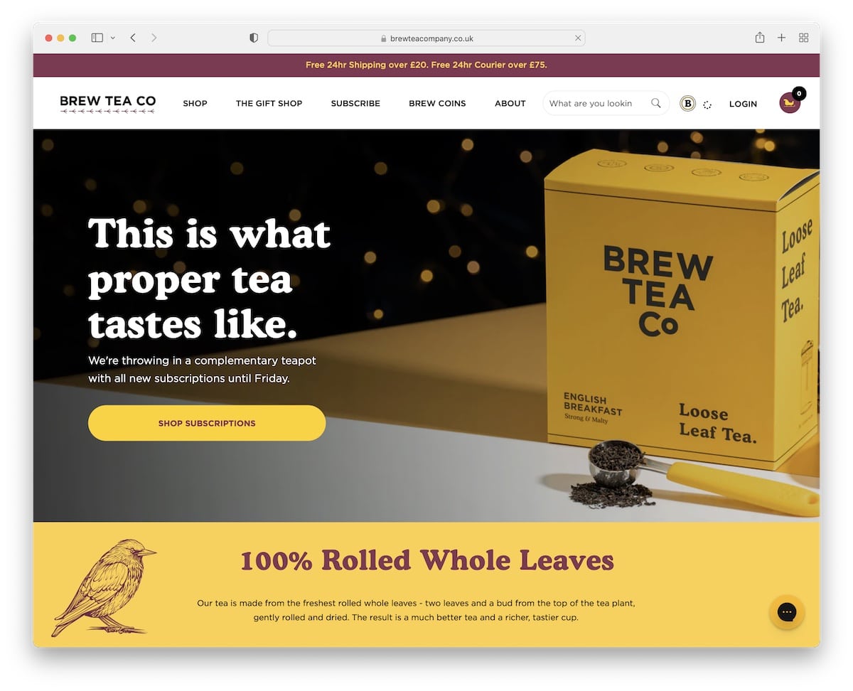
Brew Tea Co is a modern website with a vibrant color scheme that captures your attention immediately upon loading. The site uses a top bar notification and an expandable menu with links and images.
Additionally, the footer has extra quick links, social media icons, a newsletter subscription widget and contact details.
Best Design Elements:
- Live chat: Integrate a messaging widget to offer better customer service.
- Product carousel: Showcase best sellers (latest drops, etc.) with a product carousel.
- Popup: Use a popup window to collect visitors’ emails by offering them a discount. (You can also use a sticky call-to-action button reminder (at the bottom of the screen) for everyone who doesn’t opt in.)
Key Takeaways:
Let every part of your eCommerce website speak your branding, reminding the visitors/potential customers of your brand.
Finally, don’t miss checking other fantastic Squarespace website examples.
2. Farm To People
Built with: Node.js
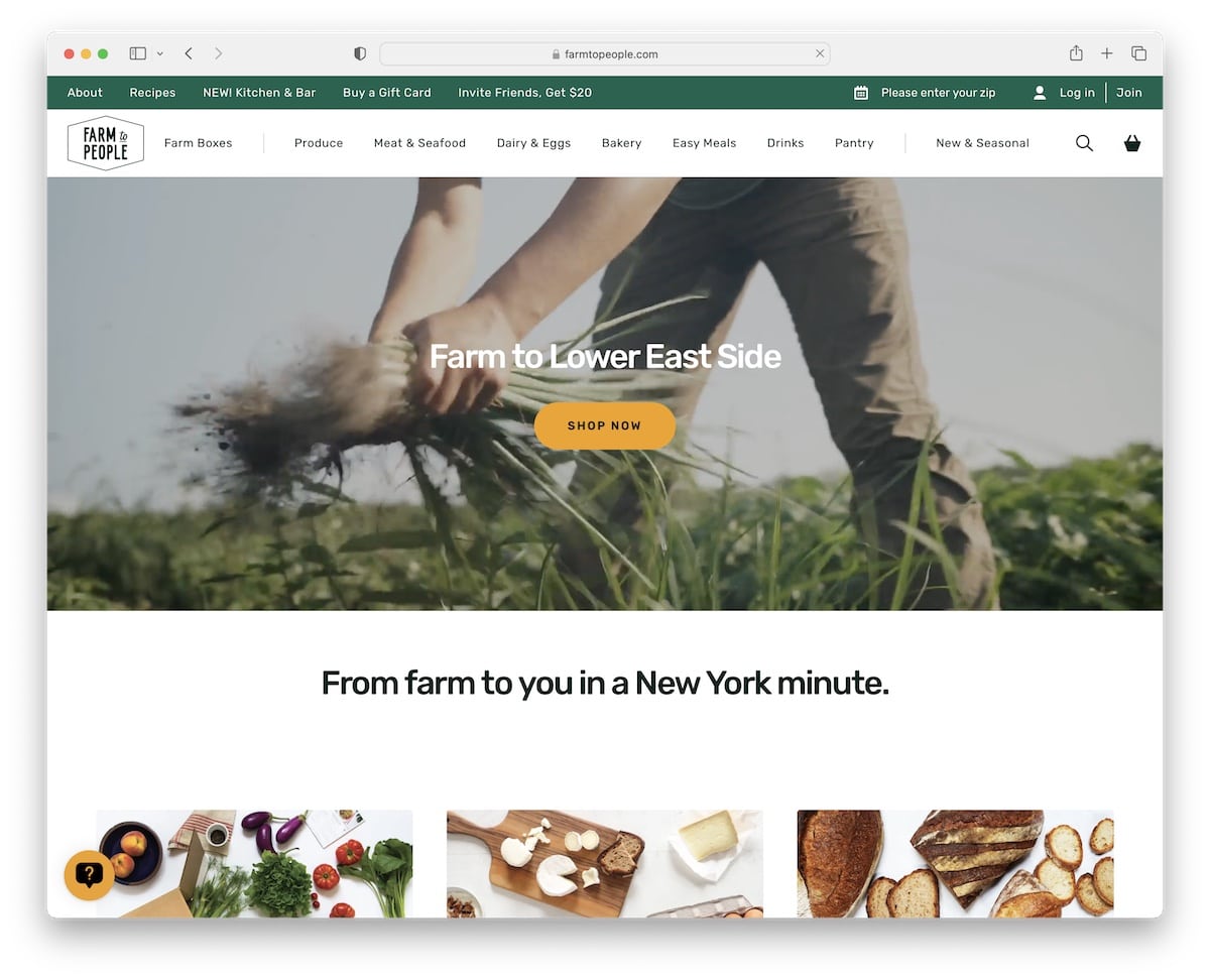
Farm To People triggers everyone’s attention with an engaging hero video (with text animation and a CTA button). The site uses a floating header so everyone can continue searching, find products, and more without returning to the top.
The use of interchanging section background colors also contributes to a better user experience to ensure visitors’ focus doesn’t decline during scrolling.
Best Design Elements:
- Sticky header: Create a better site navigation with a floating header/menu, so there’s no need to scroll back to the top.
- Video above the fold: Add more engagement to your website’s initial load with a hero video (and use a CTA button).
- Subscription form: Add a global search form in the footer to increase your potential of scoring more emails.
Key Takeaways:
The first few seconds matter A LOT, so use an attention-grabbing element (like a video) above the fold.
3. Due Lune
Built with: Node.js
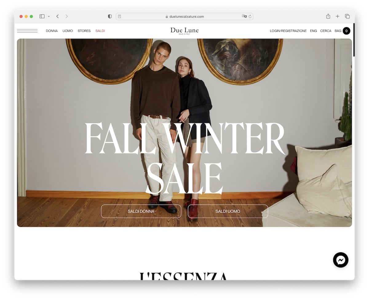
Due Lune creates a pleasant atmosphere with a light design and white space. It starts with a large banner and two CTA buttons to go directly to the store, so users don’t have to search if they like what they see.
However, the floating header is always present with quick menu links and extra hamburger navigation.
Moreover, the sliding text for different categories adds a level of engagement to the overall simplistic web design.
Best Design Elements:
- Framed layout: A unique detail that makes the website pop more.
- Contrasting footer background: Due Lune uses a black background footer, which is a nice contrast to their main light website.
- Image banner above the fold: A hero image with larger text/title and CTA buttons ensures more eyeballs are on your (special) offering(s).
Key Takeaways:
Simple details like the framed layout and contrasting background can make your eCommerce website stand out more.
4. Kettle & Fire
Built with: Shopify
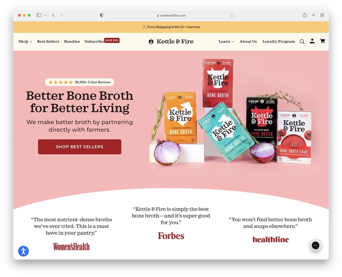
Kettle & Fire is a clean and creative online store with lots of social proof elements, like star ratings, authority mentions and client reviews. It also uses a top bar notification for free shipping and a quiz that adds a layer of interactivity.
We also like the minimalist mega menu, so searching for bestsellers, finding categories, etc., is simplified.
Best Design Elements:
- Top bar: It appears above the header that you can use for adding a notification, like free shipping.
- Modal window: Offer a special deal/discount with a modal window (with custom timing).
- Accessibility menu: Let your visitors customize their website experience with the accessibility adjustments.
Key Takeaways:
Ensure everyone gets the most out of your website (even those with disabilities) by integrating the accessibility menu/configurator.
5. Wild
Built with: Node.js
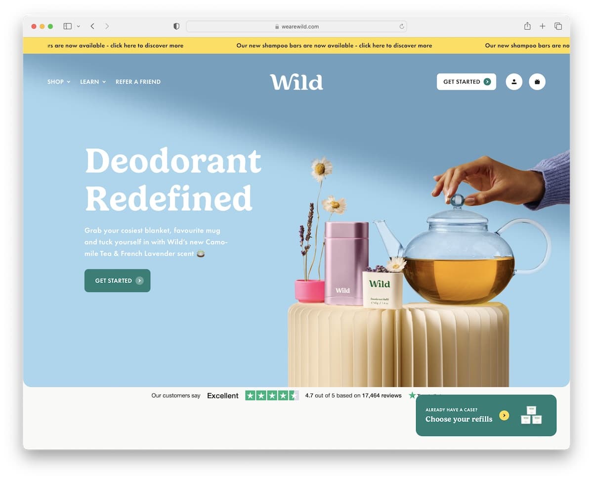
Instead of a static top bar notification, like most use, Wild has an animated one, which definitely grabs more attention. The header is fully transparent and disappears when you scroll but reappears immediately on a back/scroll.
Wild uses a sticky button in the bottom right corner for existing customers to get to the products (refills) without the need to search for them.
Best Design Elements:
- Disappears/reappearing header: Improve scrolling with a menu that reacts to scrolling movement – disappears on the down scroll and reappears on the up scroll.
- Trustpilot reviews/ratings: Build social proof with 3rd-party review services like Trustpilot.
- How it works (GIF): Demonstrate how your product works in written and GIF form.
Key Takeaways:
Besides using custom reviews and ratings, you can also display a 3rd-party “badge.”
6. Romagnoli
Built with: Node.js
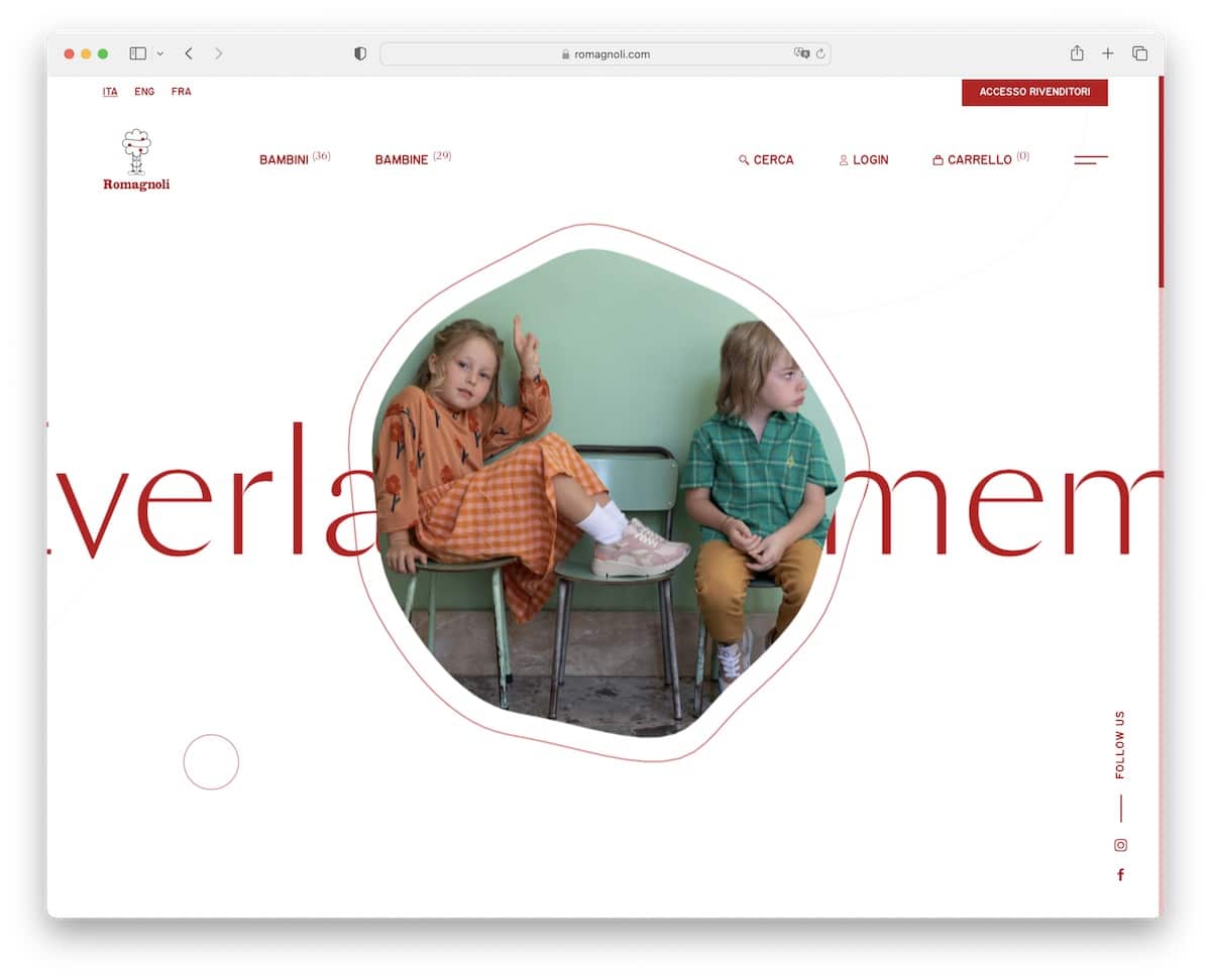
Romagnoli stands out from the masses because it almost doesn’t feel like you’re on an eCommerce website.
Their simplistic yet animated above-the-fold section sparks curiosity. At the same time, the transparent floating header with a hamburger menu icon ensures easy navigation (including access to the customer profile and shopping cart).
Best Design Elements:
- Clean design: It’s always better to aim for simplicity and cleanliness in online shops.
- Animated text: Spice things up with animated text for catchy details.
- Transparent header: Make a transparent header to remove clutter.
Key Takeaways:
Mixing simplicity with animations can elevate user experience, making your website more enjoyable to view.
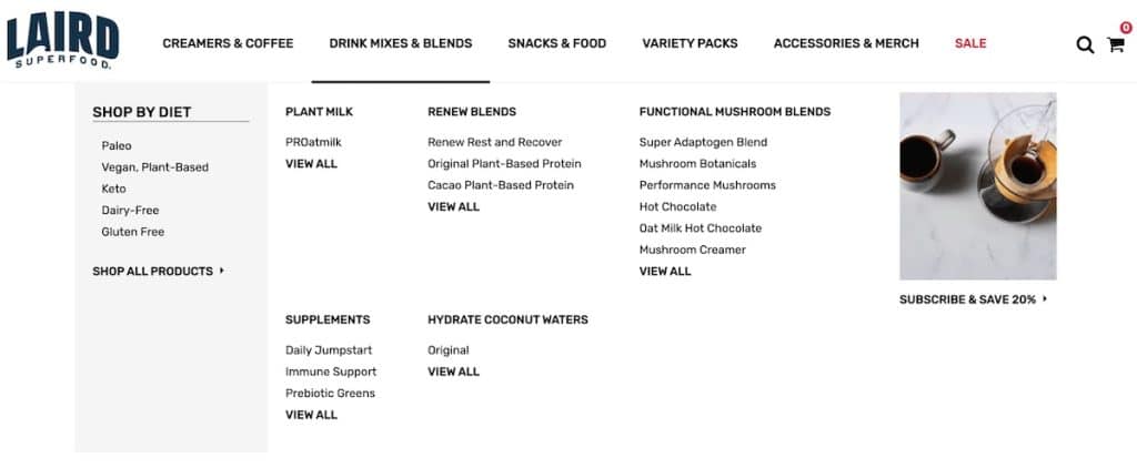
7. Laird Superfood
Built with: Shopify
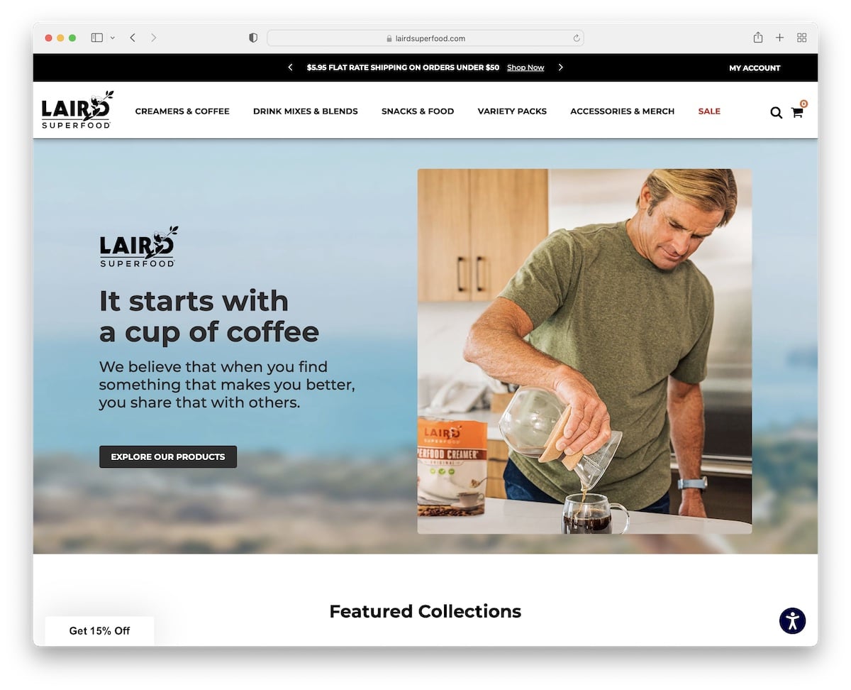
Laird Superfood’s eCommerce website has a unique background that reflects the owner’s (Laird Hamilton) surfing passion. You’ll see a top notification bar with a text slider promoting free shipping, a discount, and more.
One of the more original features of this page is the chat widget in the bottom right corner that plays a video of Laird. This immediately gives it a more personal feel because Laird “talks” to you.
Best Design Elements:
- Text slider in the top bar: The sliding text adds more engagement to the site and allows you to display extra information and details without taking up too much space.
- Chat box with video background: Make it more personal with a messaging widget with a video background.
- Custom background: Let your website shine with your custom branding across all parts of it, including the background.
Key Takeaways:
Invest a little extra time by filming yourself addressing potential customers to ask any questions they have. (Show them you care.)
8. ManiLife
Built with: Shopify
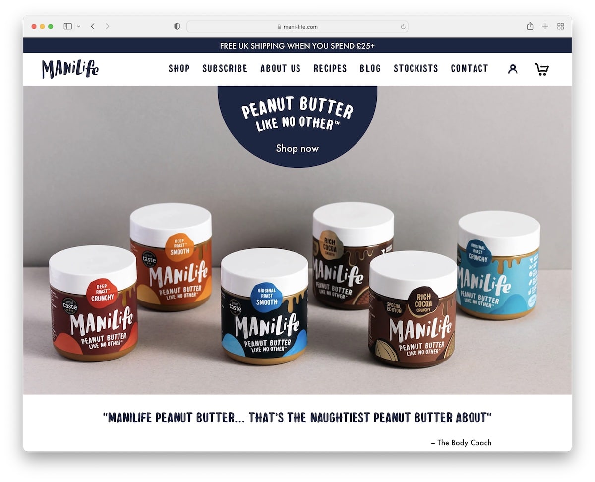
ManiLife has a massive full-screen slider above the fold with text and a CTA button that takes the visitors directly to the shop.
Below the fold is a featured product carousel for quick picks, and one section below is a “flavor picker” with a hover effect.
Additional sliders are used for client testimonials and authority logos, which both add a layer of trust.
Best Design Elements:
- Hover effects: Make the initial appearance cleaner using hover effects for specific elements.
- Sliders for social proof: Create sliders for reviews, testimonials and PR logos.
- Instagram feed: If you want to add more content to your website and show how sociable you are, integrate an IG feed.
Key Takeaways:
Don’t forget to add trust elements to your online store because they can drastically boost conversion rates.
9. Ocelot Chocolate
Built with: Squarespace
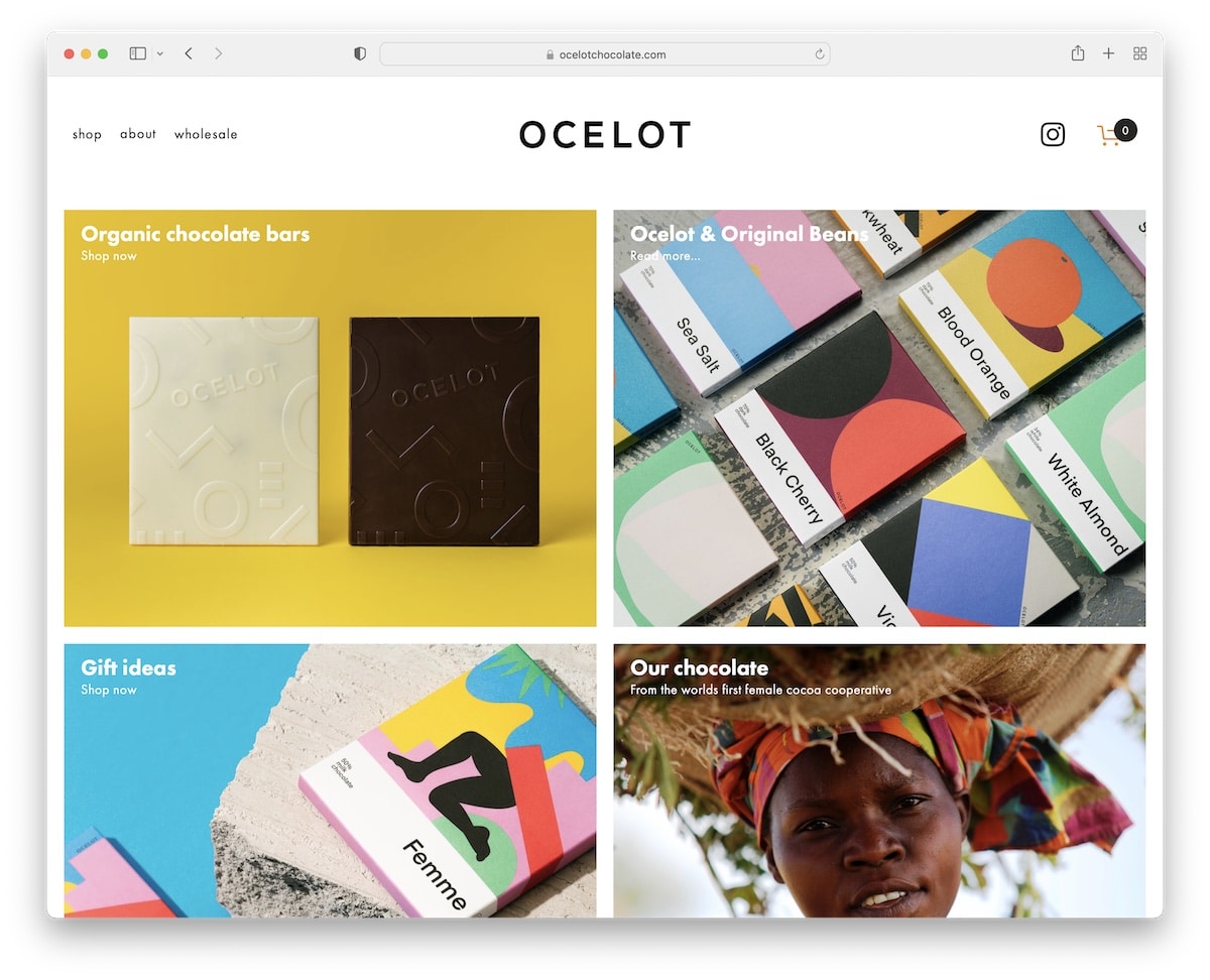
Ocelot Chocolate sticks to simplicity with a large grid layout and a minimalist header and footer.
The header has a basic drop-down menu, an Instagram icon and a shopping cart. And the footer consists of a newsletter subscription form (that promotes a 10% discount) plus organic badges.
The cleanness is also used for product pages with an image, a description, size and quantity selectors, “add to cart” button and social share buttons.
Best Design Elements:
- Undisrupted background: Use the same background color for the header, footer and site’s base.
- Grid layout: A grid layout can break things down nicely to make the content more organized and easy to skim.
- Social share functionality: Let your visitors promote your products by adding social share icons on product pages.
Key Takeaways:
Give your eCommerce website an uncluttered appearance with the continual use of the same background color where all parts of it work in unison (don’t separate header and footer from the base).
10. Supernatural
Built with: Squarespace
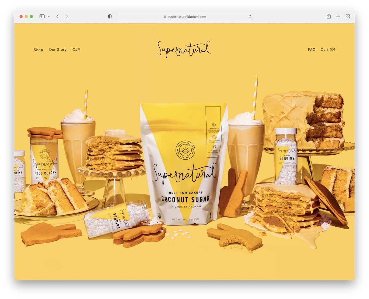
Supernatural uses a vibrant hero image with a parallax effect and a transparent header (with a drop-down menu).
The use of extra white space and different backgrounds for each section make this page easily scannable, which improves user experience.
Moreover, the product category grid features a hover effect with an additional, life-like product image.
Best Design Elements:
- White space: Make your website more “readable” by creating large chunks of white space (which works even better if you plan to add plenty of text.)
- Sectioned layout: Keep your website more organized by breaking it down into sections (and use different backgrounds for each to make it more dynamic).
- Parallax effect: You can make your website grippier by introducing the parallax effect to your background (images).
Key Takeaways:
White space makes your website more appealing to the eye and can put an extra shine on your products and content (makes them pop more).
11. Sakara
Built with: Shopify

What’s interesting about Sakara is that they use two popups, one on top of the other, once the website loads. However, one only appears if you visit their website outside the US, informing you about shipping.
Furthermore, the slider they use above the fold has a split design, with an image on one side and text and CTA (on a solid background) on the other. Also, the slider has a pause/play button if you want to swipe through them manually.
Best Design Elements:
- Two-part slides: Make each slide pop more with an image on one side and text and CTA on the other.
- Search bar: Allow visitors to search for something more specific by adding a search bar in the menu section.
- Multi-column footer: Arrange quick links, social media, newsletter subscription form, etc., into multiple columns for a more organized structure.
Key Takeaways:
Create a slider that stands out more by using images and solid color backgrounds for each slide. This can also make the text and the CTA buttons more visible.
12. UpNature
Built with: Shopify
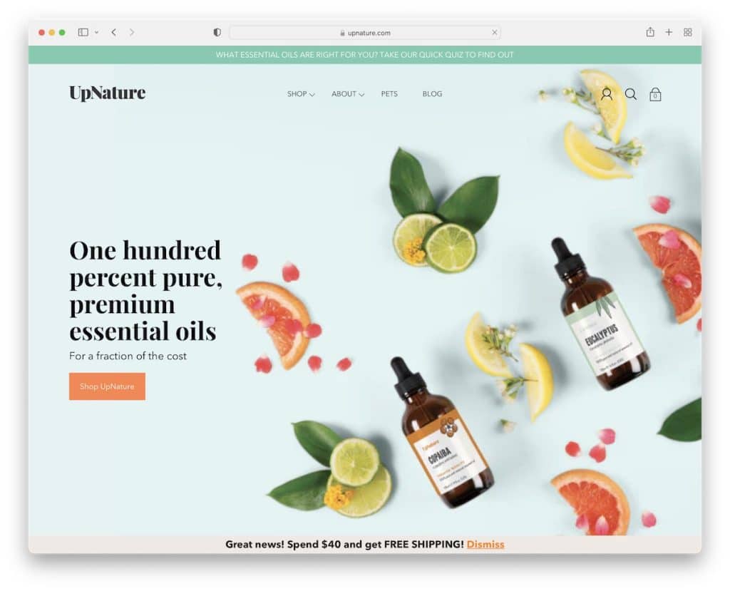
While UpNature’s header is transparent to blend with the background image more, it turns solid as soon as you start scrolling. The navigation bar is a mixture of a mega menu and a drop-down to improve exploring the page.
This eCommerce website loads some of its content on scroll to make it livelier and then uses a customer testimonial slider where each slide has a different background.
Best Design Elements:
- Product page with a gallery: Instead of using only one product image, add more and group them in a gallery.
- Sticky bottom bar for “add to cart”: Elevate the potential of getting more visitors to click the “add to cart” button by creating a floating bar on product pages.
- Plain footer: You can create a simple footer when you use a floating header/menu with all the links and a search bar easily accessible – all the time.
Key Takeaways:
Improve your product pages with great (and compelling) descriptions and galleries. Give potential customers as much content and as many reasons as possible to buy from you.
13. Feastables
Built with: Shopify
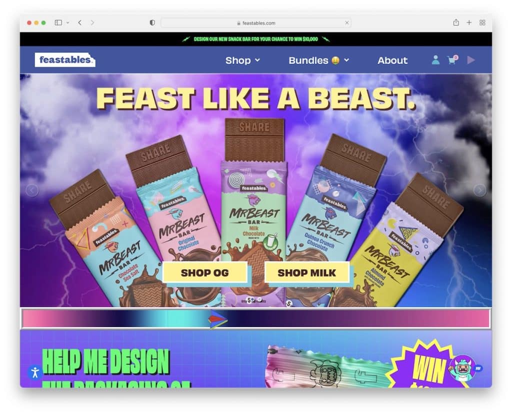
Feastables is one of the COOLEST eCommerce website examples with an energetic and vibrant design that you must experience. It features lots of moving elements, catchy graphics, unique hover effects and an image slider with customers promoting Feastables products.
You need to be a little bit daring to create a web design like this, but it can be advantageous.
Best Design Elements:
- Play button: If you have a theme song or a song you’d particularly like your visitors to listen to, add a play button in the navigation bar.
- Game: Take engagement to the next level by integrating a simple yet fun game – yes, into your website.
- One-of-a-kind design: There really is no right or wrong approach when designing an eCom site – feel free to go entirely against the grain.
Key Takeaways:
You can easily stand out from the masses with a second-to-none online store that will create a strong and lasting first impression.
14. Huel
Built with: Shopify
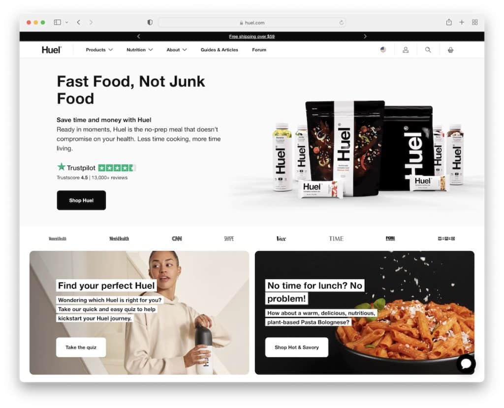
With customers from around the world, Huel lets you select your location with a selector at the top of the screen for a better online shopping experience.
Once the language selector closes, a top bar notification reveals, followed by a minimalist mega menu navigation.
Moreover, Huel has a banner above the fold with a title, text, a Trustpilot badge (for social proof) and a CTA button. Additionally, they also embedded Trustpilot reviews into a slider with a link to all the ratings and reviews.
Best Design Elements:
- Language selector: Allow visitors to enjoy a better experience by selecting their region for smoother shopping.
- 3rd-party reviews: Use a 3rd-party platform for your reviews and ratings and embed them into your site.
- IG feed featuring customers: Instead of creating your official IG feed, showcase your customers “modeling” your products.
Key Takeaways:
Improve your eCommerce website’s shopping experience with a region selector that at least changes the currency and pre-fills shipping address, if not translating the entire website.
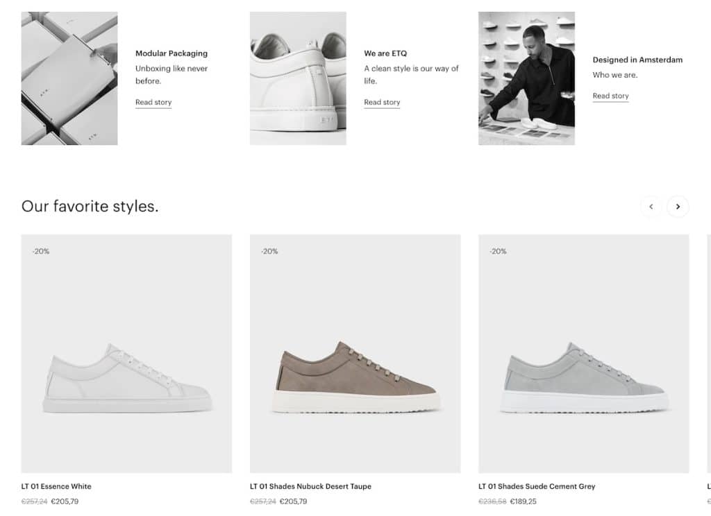
15. ETQ
Built with: Shopify
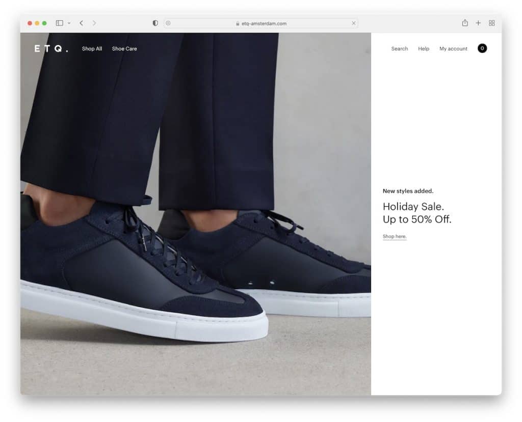
ETQ is a minimalist shoe website with a full-screen above-the-fold section that features a large image on the left and text (with a link) on a solid background on the right.
The menu disappears and reappears depending on the scrolling movement, so quick links, search, account and shopping cart are always at your fingertips.
Product pages come with a clean design, a gallery with a lightbox, accordions for additional details, color swatches and a size selector. The checkout is a simple three-step process with an optional express checkout.
Best Design Elements:
- Lightbox product gallery: Create a lightbox gallery so shoppers can view additional images without leaving the current page.
- Multi-column footer: This allows you to add more helpful widgets for menu links, contact details, a subscription form, social media, etc.
- Express checkout: Not everyone has time to fill out the information, so offering an express checkout can improve conversion rates.
Key Takeaways:
A minimalist web design can bring your products front and center in a distraction-free environment.
16. Finisterre
Built with: Shopify
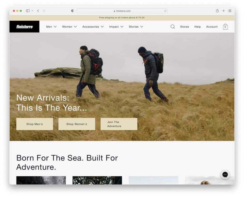
Finisterre has a newsletter popup with an option to choose what kind of emails you’d like to receive. Once the popup closes, you’ll notice a secondary one for the location/currency selector.
The home page features multiple sections, including a carousel, video background, an Instagram feed slider, and more.
Besides the header that disappears and reappears, Finisterre also uses a floating chat box widget for improved customer service.
What you don’t see very often is a footer menu with drop-down functionality, which works really well in its neat environment.
Best Design Elements:
- Video background: Make your sections more exciting by mixing in video backgrounds.
- Images of models wearing your products: Don’t create product images only; let a model wear the product (+ add the model’s height/waist and the item’s size he or she wears).
- “Complete the look”: Help shoppers find the perfect look by recommending products that go well with the one they’re interested in.
Key Takeaways:
Boost your product pages with models wearing the products and the convenient “complete the look” section with links to other items.
17. Fred Perry
Built with: Adobe Commerce

Fred Perry’s home page is pretty long, but thanks to the clean appearance, scrolling it and finding information and products doesn’t feel a burden. However, whenever you want to access the menu or search bar, you start scrolling back to the top and it’ll appear.
Instead of a popup, Fred Perry uses a floating bottom bar for newsletter opt-in (but only appears below the fold).
A great element we really liked when reviewing this eCommerce website is the typewriter effect on product pages for delivery, returns and payment notifications.
Best Design Elements:
- Sticky newsletter bar: Keep reminding visitors to subscribe to your newsletter with a floating bottom screen bar.
- Typewriter effect: Add life to your website (product pages) with the catchy typewriter effect.
- Multi-column drop-down menu: It works great if you have many product categories and want to display them in an organized structure.
Key Takeaways:
It’s important that you create a user-friendly navigation (including adding a search bar) that simplifies the process of finding categories and products.
18. Byredo
Built with: Adobe Commerce
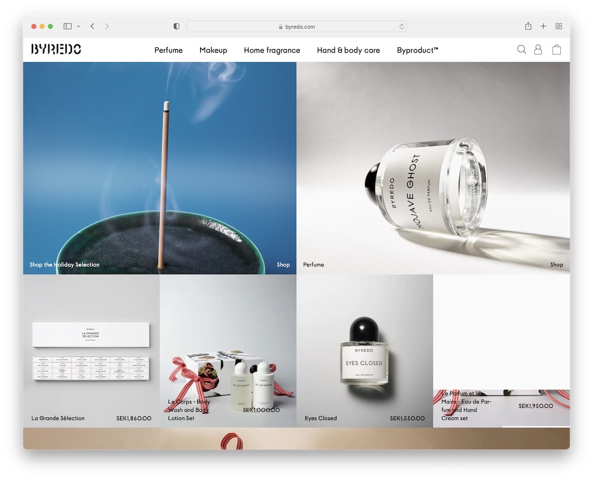
Byredo has a hero banner and a grid layout without spacing where each element either links to the product page or a category. The floating header has a basic menu (but reveals a mega menu when you click the link), while the footer contains multiple links, clickable email, telephone number and live chat.
Product pages maintain an uncluttered look, thanks to accordions that reveal more information once you click them. The “goes well with” section below each item also helps shoppers pair products more easily.
Best Design Elements:
- Accordions: Allow you to create a cleaner look while ensuring the additional information is available.
- Mega menu: Group links, images and other useful elements.
- Shopping cart icon: Make it always available by adding an icon in the navigation bar.
Key Takeaways:
Improve your navigation with a floating mega menu that makes finding products a breeze.
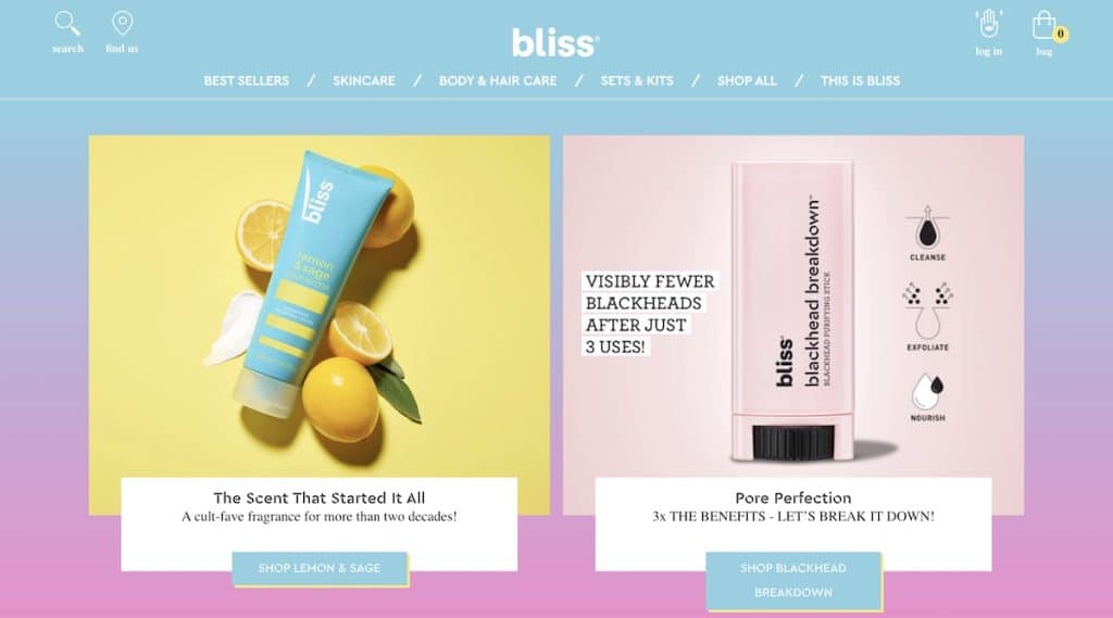
19. Bliss
Built with: BigCommerce
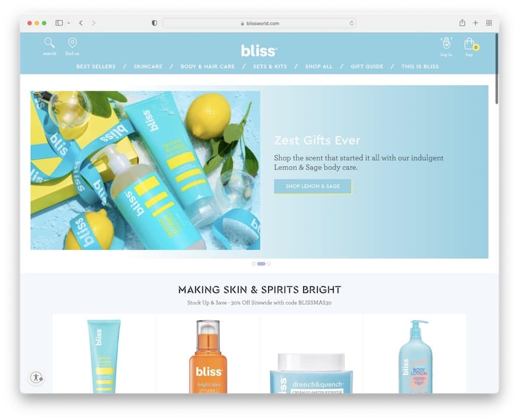
Bliss has a slider with CTA buttons that react on hover and a more basic mega menu with all the necessary links at your fingertips. The header also has additional links/icons for search, “find us,” log in and shopping bag – always available to you because it floats.
The product category pages also have the “quick view” option, so shoppers can learn more about the items without leaving the current page.
Best Design Elements:
- Product quick view: Helps customers find (and add to their shopping cart) the right products faster.
- Product videos: Instead of using images and text only, create a promotional (“in use”) video of your products.
- Floating “add to bag” banner: If your product pages are longer, remind shoppers to add the item to their cart with a sticky banner
Key Takeaways:
You can save your potential customers plenty of time with excellent navigation and product “quick view.”
We also have an extensive list of the best BigCommerce websites if you need more ideas.
20. Etnies
Built with: Shopify
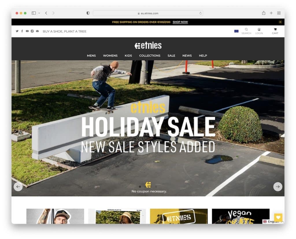
Etnies has a three-part header section; a notification bar, a top bar and a mega menu navigation (but only the notification bar and menu stick to the screen).
Two more floating elements follow you: the wishlist icon and the language switcher, both in the bottom right corner. Additionally, you can also choose the preferred currency in the footer section.
Etnies’ product pages have a lightbox gallery with additional item views and integrated customer reviews.
Best Design Elements:
- Currency switcher: Integrate a currency switcher, so your shoppers don’t have to calculate the prices.
- Product reviews/ratings: Improve conversions with customer reviews and ratings on product pages.
- Wishlist icon: Not everyone will buy from you on your first visit, but they may add items to their wishlist. And the wishlist can always be accessible with a floating icon.
Key Takeaways:
Create a more personalized user experience with language and currency selectors, which can improve your conversion rates.
21. Velasca
Built with: Shopify
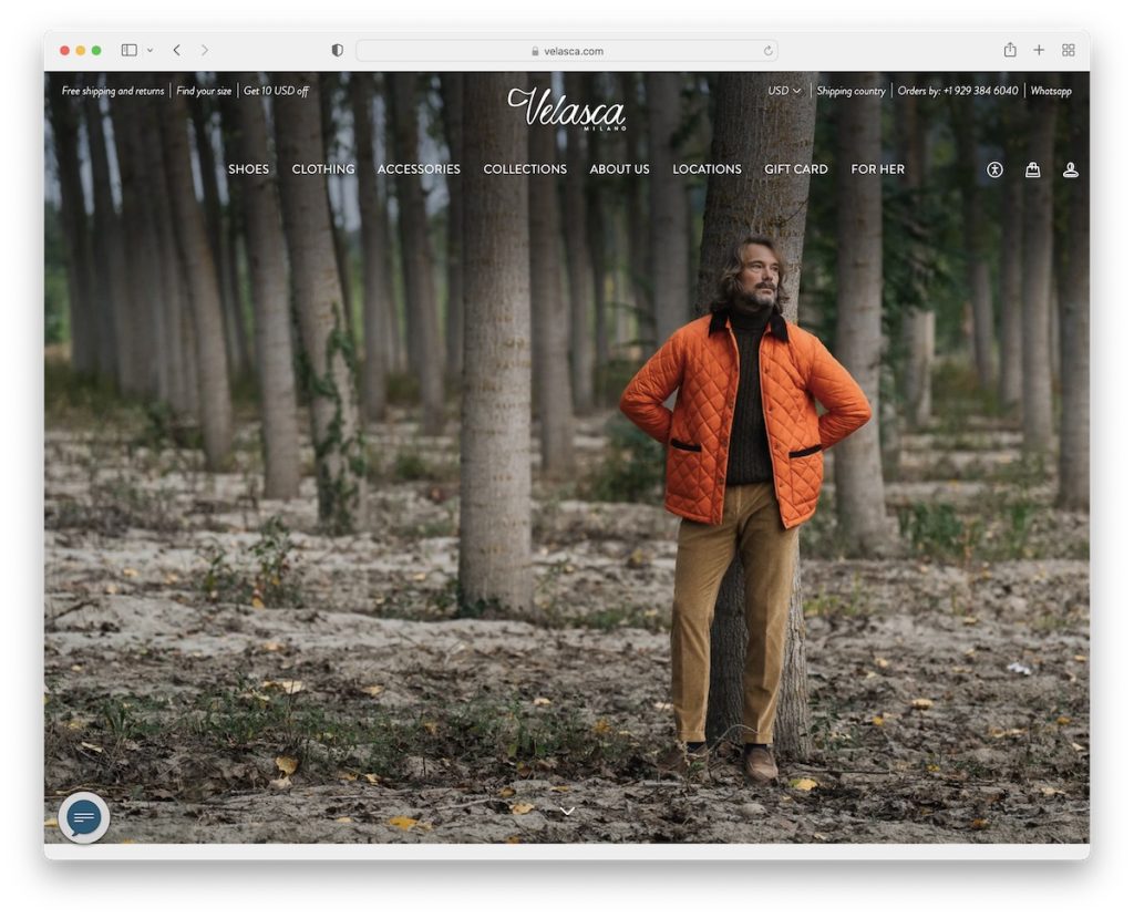
Velasca has a very non-salesy above-the-fold section with a full-screen background image.
This eCommerce website also has a transparent header and top bar notification for a neater presence. However, once you hover over the header, it turns solid, with menu links revealing a multi-column drop-down on click.
Moreover, in the bottom left corner is a messaging icon and in the right corner is a back-to-top button, so all the must-haves are always available (including navigation and top bar notification).
Best Design Elements:
- Full-screen hero image: Create a pleasant atmosphere with a full-screen background image.
- Transparent header: Make the first-time experience lovelier with a transparent header (so the background image pops more).
- Back-to-top button: Improve UX with a back-to-top button, so visitors don’t need to scroll back to the top.
Key Takeaways:
You can test creating an unfussy above-the-fold section with an image (or a slider, video), avoiding using sales elements, text and CTAs.
22. Shoepassion
Built with: Shopify
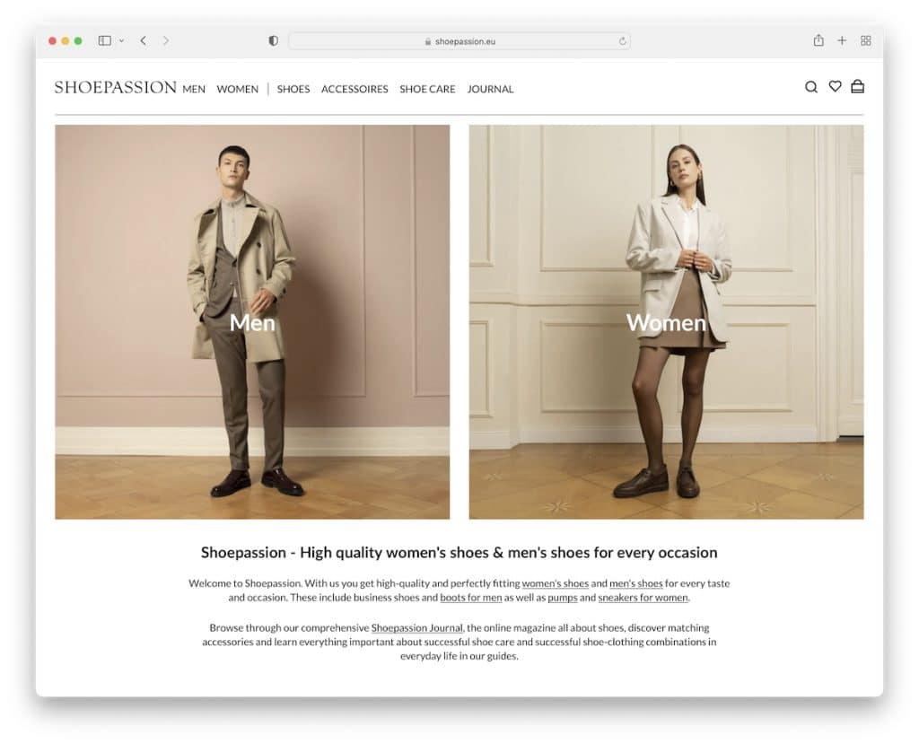
What’s handy about Shoepassion is that they give you the option to choose either men’s or women’s category immediately. Of course, the mega menu navigation is available for a more refined search (including the search bar).
Regarding product pages, they use a sticky right part where you can pick the right size and add the product to the cart (or pre-order it), while the left side is scrollable, showcasing product images. You can also click on each image to open a lightbox with an option to zoom it in for a more detailed look.
Best Design Elements:
- Zoom-in images: Use high-resolution product images with a zoom-in/zoom-out function.
- Blog: Write about your philosophy, new product drops, special deals, etc.
- Light design: Using a light design for the header, the footer and the base can make the products and content pop more.
Key Takeaways:
You can enjoy more (organic) traffic with a regularly updated blog that’ll positively impact your overall SEO strategy.
23. Sophie Ratner
Built with: Shopify
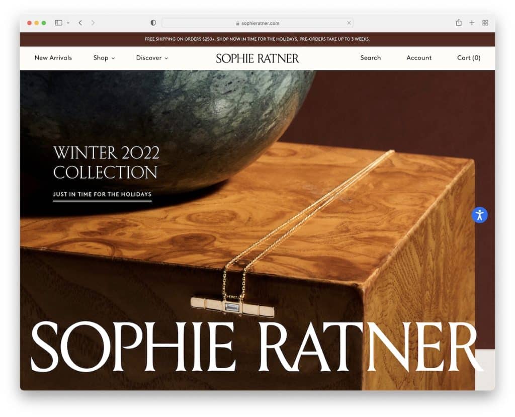
Sophie Ratner has a minimalist style with large images that offer an excellent browsing experience. Plus, the larger text and extra white space make the page more appealing to the eye. Very likable!
The massive image slider above-the-fold creates a strong first impression with simple text and links for everyone who wants to take immediate action.
You can also change your region anytime by clicking on the floating flag icon in the bottom right corner.
Best Design Elements:
- Massive/full-screen image slider: Grab visitors’ attention with a large slideshow.
- Large text: Make the content more readable with larger typography (and more white space).
- Recently viewed products: Add a “recently viewed” section to product pages and remind the potential shoppers of the items they already viewed. A simple reminder can score you more sales.
Key Takeaways:
Product page sections like “recently viewed” and “you may also like” can help you sell more items.
24. Nalen Ayurveda
Built with: Shopify
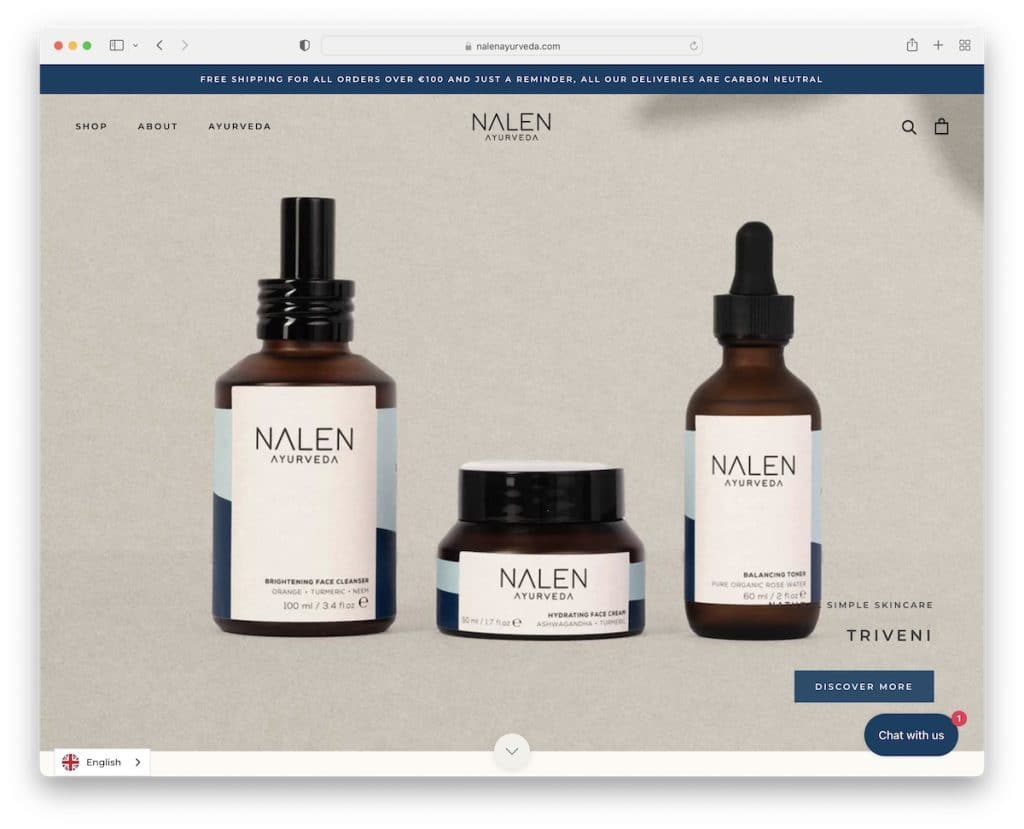
Like Sophie Ratner, Nalen Ayurveda also features a large image slider with text and CTA buttons. Below the slider (you can also click the scroll-down button to access it) is the “in the news section,” showcasing logos of various authorities for social proof.
This eCommerce website has a soothing color scheme, which goes well with their Ayurveda-based products.
The floating header consists of a mega menu and a practical search bar with live results that display products with direct links.
Best Design Elements:
- Live search results: Help visitors find the products they’re after with live search results. (The results can showcase the items and link directly to product pages.)
- Color scheme: Brand your website’s color scheme for a more immersive experience.
- PR mentions: Besides customer reviews and ratings, PR mentions can promote social proof. (Go the extra step by linking to the articles and mentions.)
Key Takeaways:
A search bar with live results and recommendations can save your potential shoppers time, which is a big plus.
25. Bremont
Built with: Shopify
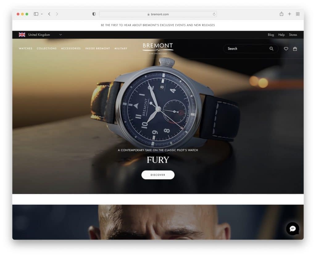
While many websites would start with a video (for added engagement) and then add an image banner below it, Bremont does the opposite.
The page has an elegant mega menu, a search bar (with popular search recommendations), a notification bar at the top with text animation and a product carousel.
Product pages have extensive presentations with text and images (and sometimes videos) to get to know you with their timepieces almost on a “personal” level.
Last but not least, their newsletter subscription form informs you about the type of emails they send beforehand.
Best Design Elements:
- In-depth product presentations: Create knowledgeable and extensive product presentations, especially regarding higher-priced items.
- Search recommendations: Speed up the search process with recommendations.
- Educational pages: Create a compelling about page, share your company history, write about technologies, etc.
Key Takeaways:
Give visitors a reason to purchase your high-end product through comprehensive product presentations, which Bremont does a great job at.
What Makes A Great eCommerce Website?
1. Excellent Mobile Shopping Experience
Smooth, quick and easy mobile shopping is a must these days. Why? Because nearly 80% of customers made an online purchase using their mobile device. Plus, over 67% of all eCommerce is mobile!
Additionally, Google is also a FAN of mobile-friendly websites.
With a responsive web design, you’ll contribute to a better user experience and SEO, two key factors for achieving success in eCommerce.
You can easily create a website with terrific mobile performance using a mobile-friendly website builder or a mobile-friendly WordPress theme.
One of the simplest ways to test responsiveness is using Google’s Mobile-Friendly Test tool.
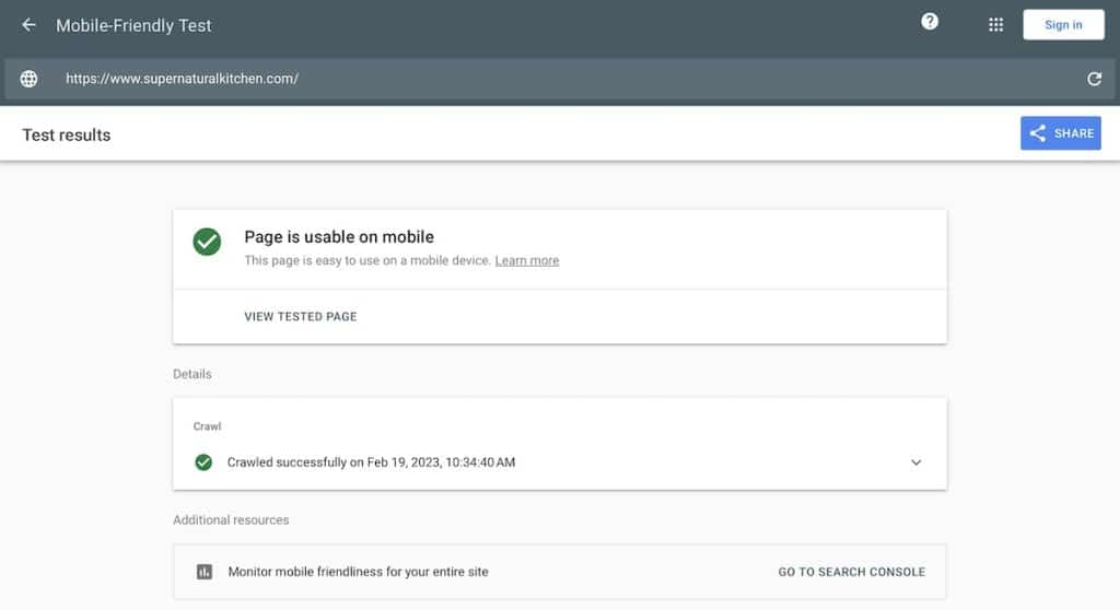
Note: Everything needs to be responsive, swipeable and touch-sensitive – from the smallest to the largest elements.
2. Easy Online Store Navigation & Searching
Your navigation must be clean and transparent, preferably always accessible with the sticky function.
Moreover, if you use a lot of categories, create a mega menu to organize them into columns, adding links, images, etc.
Moreover, some users will want to find something specific that your menu may not reveal, so a visible search bar is mandatory. Go one step further and add live results and recommendations functionality for quick finds.
Besides the header part, you can also create a valuable footer with quick links, business details, contacts, and more.
In short, ensure it takes the least amount of time to find products and categories with the combination of an excellent menu and search bar.
3. Branded Color Scheme/Design
With a branded color scheme and consistency (even when it comes to the smallest details), you share your identity and messaging.
This applies to all your channels, including the website, social media, newsletters, blogs, and anywhere else you’re present.
In other words, keep reminding your visitors of your brand at every interaction with it.
Create a strong and memorable first impression and address the target audience with impactful messages, visuals, catchy elements and other unique characteristics that make you stand out.
4. Clean Shopping Cart & Checkout
These are the two crucial eCommerce elements if you want to enjoy more sales.
Unfortunately, many online business owners are still trying to figure out shopping carts and checkouts, failing at adopting a simple strategy: Keep it simple.
With a challenging, multi-step checkout, many potential customers may decide to leave the website without making a purchase. Thus, simplifying (test one-page checkout) the process and keeping the design minimalist will benefit you greatly.

What’s more, the shopping cart’s best location is the top right corner (just because we’re all used to it).
The icon can then showcase the number of items in the cart and open a drop-down on click with a link to the checkout page.
5. Simple Is Better
We’ve said it earlier, and we’ll say it again because it’s so important – aim for a simple and clean design.
Many eCommerce website owners start complicating things with wild color schemes, animations and special effects.
This can work well when done in moderation, but many webmasters overdo it, which ruins their site’s UX. Plus, their page may start loading slower due to all these extra elements, which is a big NO-NO.
Also, make your website more readable and your products easily scannable with white space and simple typography (which doesn’t necessarily need to be large, but it’s worth testing).
6. Integrate Social Proof
Over 80% of customers reported that they trust user reviews and ratings as much as they trust personal suggestions.
This means adding customer reviews and ratings is key to increasing your sales. You can collect feedback by sending an email with a form or even guide the buyer to a 3d-party platform, like Trustpilot or Google Reviews, and embed it into your website.
Another way of building social proof is by using a custom hashtag on Instagram and then building a feed into your eCommerce website, showcasing customer content.
And if you can get them to film a video you’ll boost your potential even further.
Tip: You can offer a discount on their next order in exchange for a review.
Conclusion
Instead of relying on third-party platforms and marketplaces, which give you little control over your web presence, create your eCommerce website and take your business to the next level.
You have the freedom to create, brand and personalize the exact online store you want.
And what’s even more exciting – you can make it happen even if you have zero experience with eCommerce and building websites.
One of the easiest ways is to use an eCommerce website builder. But we recommend choosing an eCommerce WordPress theme if you want to control EVERYTHING.
Moreover, these 25 examples will fill you with new ideas and inspirations that broaden the possibilities. Be you!
And hey(!), eCommerce website owners, we want to see your store designs. Thus, share your inspiring designs in the comments section below; we’d love to check them out.
FAQs About eCommerce Websites
What are the 10 top eCommerce sites globally?
- Amazon
- eBay
- AliExpress
- Target
- Walmart
- Alibaba
- Rakuten
- JD.com
- Newegg
- Mercado Libre
How to make an eCommerce website?
The easiest way to build an eCommerce website is by using Shopify. It is a dedicated website builder for online stores that doesn’t require any knowledge and experience. And even some of the biggest brands use it.
Is eCommerce profitable?
Yes, eCommerce can be extremely profitable. With billions of online shoppers, the eCommerce market is expected to reach 8.1 trillion US dollars by 2026.
What is an eCommerce business?
It is a business model where buying and selling products and services happen exclusively online (over the internet). There are three main types of eCommerce businesses: Business-to-business (Shopify selling their services to store owners), business-to-consumer (Huel selling products to consumers) and consumer-to-consumer (eBay, where consumers list their products and sell them to other consumers).
How much does it cost to build an eCommerce website?
It costs as little as $24 per month to get your website up un running using Shopify (but you can try it for free). However, custom design and functionality require a web designer and developer, which significantly increases the costs.
Can you create an eCommerce website with WordPress?
WordPress is an excellent platform for building an eCommerce website, thanks to its flexibility and the powerful plugin WooCommerce. WooCommerce seamlessly integrates with WordPress, allowing users to sell products and services, manage inventory, accept payments, and more, all within the familiar WordPress environment. With a vast array of customizable themes and extensions, creating a professional and fully functional online store is straightforward, making it a popular choice for businesses of all sizes. Here are some examples of WordPress eCommerce websites to see what is possible.
Related Posts


 Create a Website in Minutes With Squarespace!
Boring same old template designs. I’m really looking for “different” and none of these came close.
Want something different? Make it.
A website needs to represent the same values as that of an off line store. The user experience part needs to be designed in a seamless way that the online visitor should be able to interact, engage, and convert freely. A douby/ confusion is all what a prospect needs to exit the cart.
In case of an eCommerce store its important to build a customer centric engagement platform. One good example would be how eCommerce platforms nowadays are bale to make up-selling and cross-selling based on customer interactions (with the help of an intelligent algorithm).